


Client: Vela Days
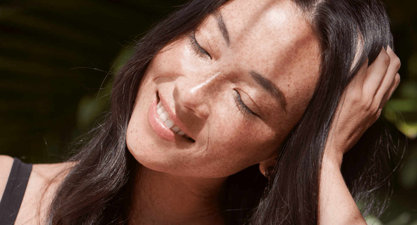
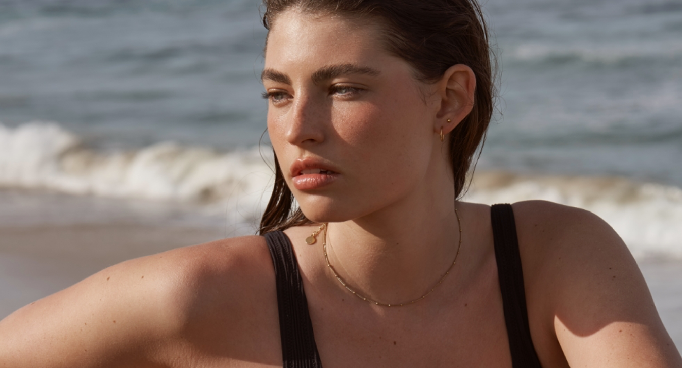
What they needed: Serendipity, bottled. Vela Days, a cosmeceutical-grade hemp-based skincare brand needed a creative platform, tone of voice, visual identity, packaging, website and social presence that flowed as smoothly as their products did. One that worked seamlessly, luxuriously and effortlessly.
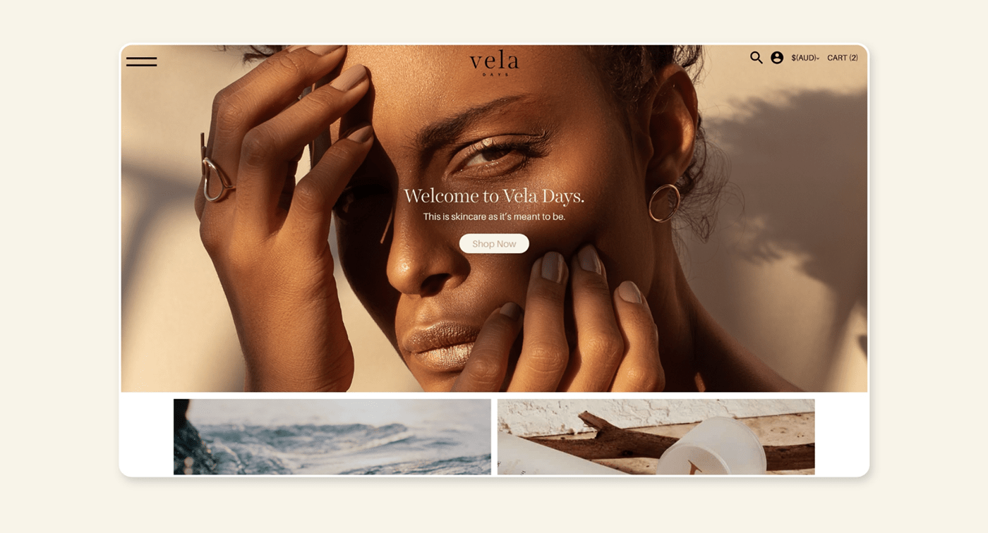
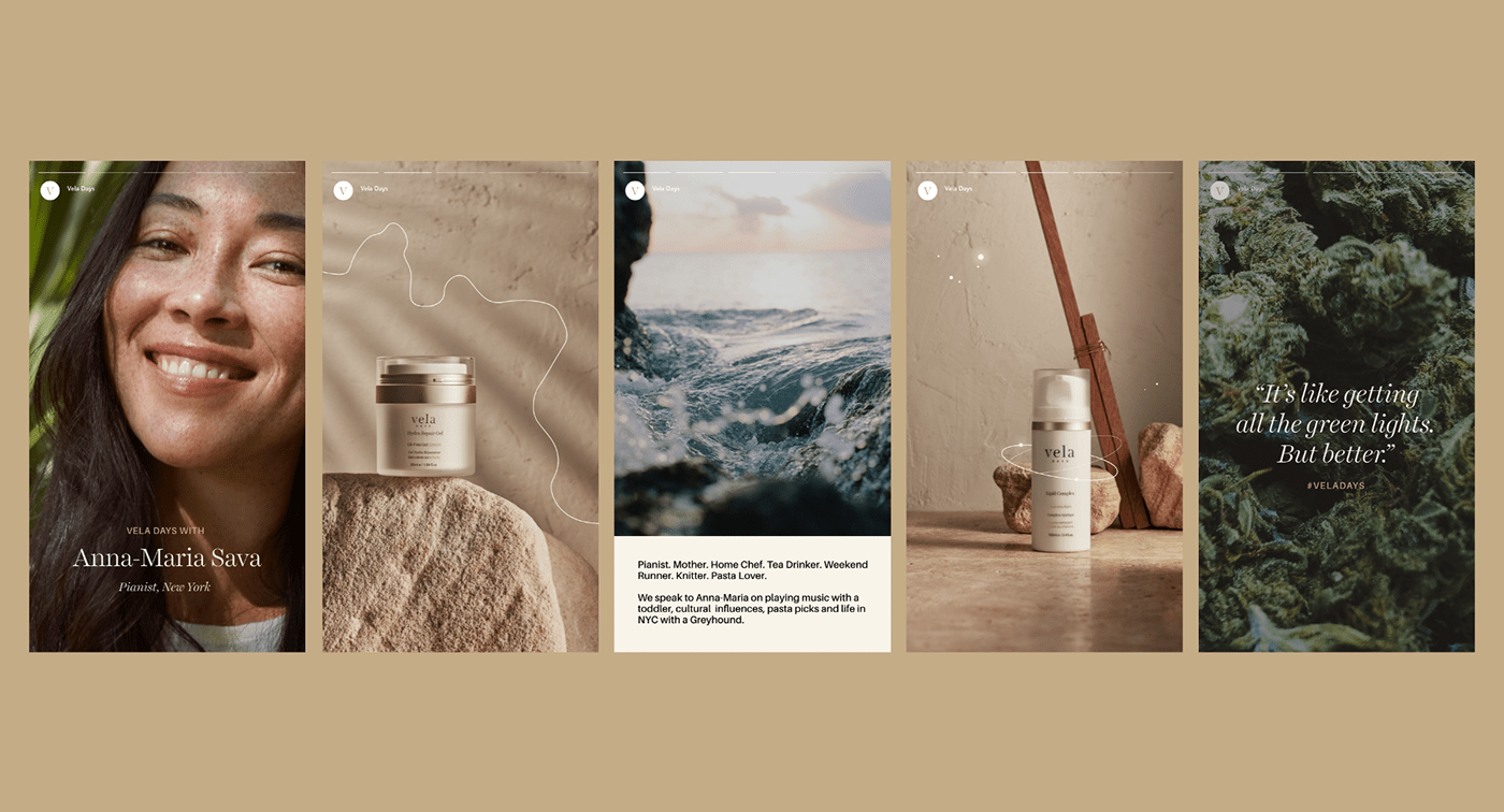
What we did: Brand Strategy, Brand Voice, Naming, Creative Concept, Visual Identity Design, Web Copy, Web Design, Art Direction, Packaging Copy, Packaging Design, eDM Design, Social Media Strategy
How we went: So good, we named a day after them. A Vela Day is where everything comes together in perfect synchronicity, because your skincare has been sorted. From this philosophy, we created a tone of voice that was just as charming, encouraging customers to do more with less – no matter where their day took them. We took the same approach (ethereal, yet grounded) for our visual identity, website and packaging – referencing the marriage of earth and sky – speaking to the natural elements that nurture the hero ingredient: hemp. Numerals inject a location based marque, a nod to their Sydney foundations, while a constellation motif represents the namesake 'Vela' – a constellation seen only in the sky. This is Vela Days. Skincare as it’s meant to be.
Made lovingly with our friends:
Cry Baby Productions
Bone Digital
Bone Digital


