老茶匠心,敬每一段惜茶如金的時代
in honor of great times that tea is like gold
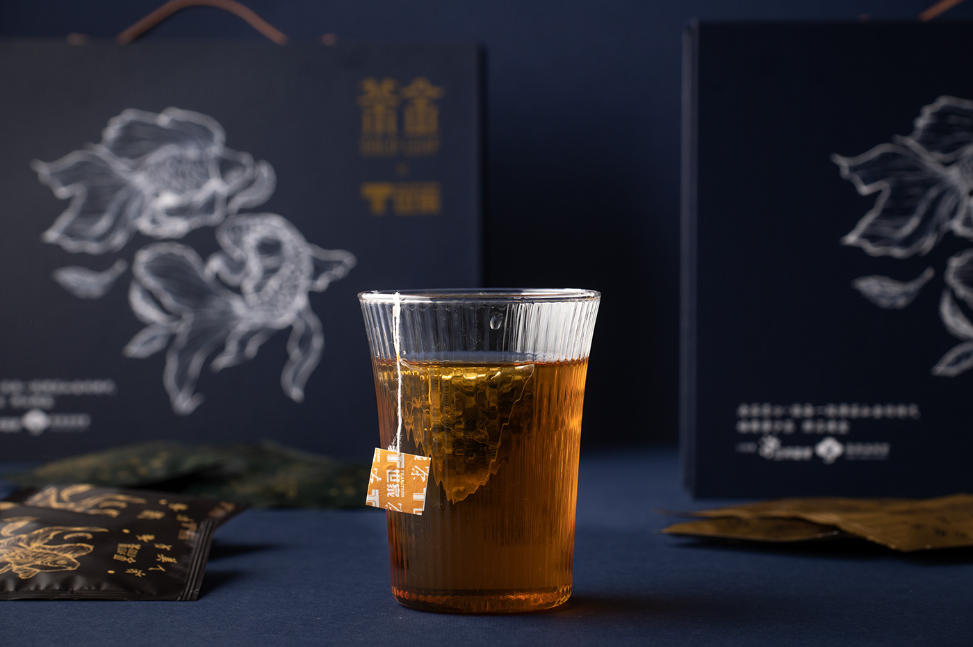
以手繪方式進行金魚上的視覺創作,柔美與堅毅進,如劇中的女性,青澀、剛毅、堅強。 女人如水,與金魚悠游的形似呼應,力爭上游,全力以赴。 在大時代的洪流中脫胎換骨,透過客庄家庭與女性奮鬥的故事進行視覺化的包裝設計。
從產品到視覺,每一步都反映本劇女性獨立的面向與大時代的無可奈何,以金魚為核心,象徵「茶金」,結合藝術融入包裝主視覺。
The visual design of hand drawn goldfish symbolizes gentleness and perseverance, just like the female characters in the play , who are green but tough and persistent.
The woman is like water, in response to the goldfish swimming against the current and striving for the best.
The visual packaging design presents not only the Hackzhuang women’s struggle and reborn but also the independent appearance and helplessness in the torrent of the great times.
With goldfish as the core, it symbolizes "tea is like gold ", and combines art into the main vision of the packaging.

以毛筆與針筆手繪為主要視覺創作,融入東方韻味的金魚與茶葉共舞,有吉祥的象徵—金玉。
讓線條去帶動水,讓水去推動台灣的歷史洪流,象徵女性的美好與剛毅並存
溫潤如水,剛毅如筆,線條互相交融呈現台灣歷史與劇中女性的堅忍。
Worked in Chinese brush and technical pen,the main visual creation blends the goldfish with tea leaves, and makes them dancing together. It is also a symbol of‘’gold and jade’’, which means “auspicious and abundant’’.
Sketch lines flows like water, and water drives the flow of Taiwan's history, symbolizing the beauty and history that just happened.
With the staggered lines as tender as the water but resolute like a pen, it aptly express the history of Taiwan and the tenacity of the women in the play.


Thanks For Watching
2021公視xT世家:茶金聯名禮盒特優正選
Project Director:吳金融
Product Concept:吳金融 洪晨睿
Design:吳金融 洪晨睿
Copy:吳金融
Design:吳金融 洪晨睿
Copy:吳金融
Photography:百香果影像工作室
特別感謝:翻譯-黃慧心


