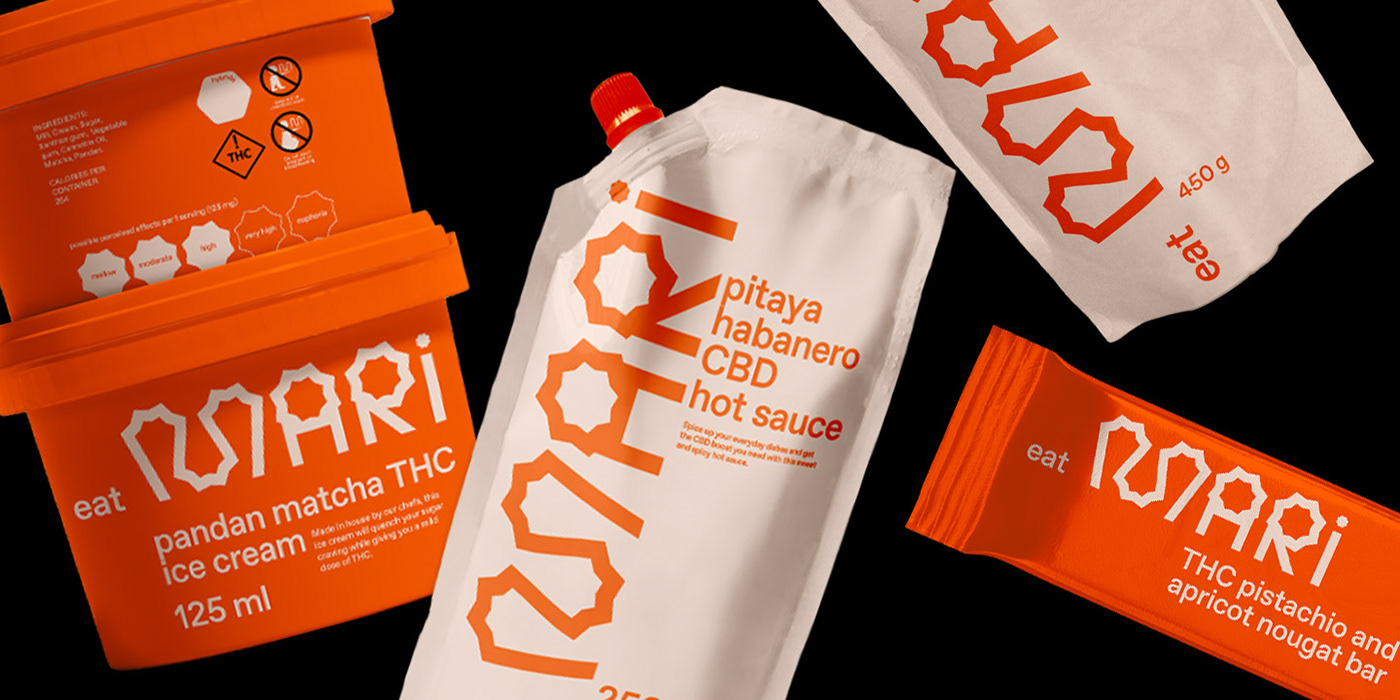
The MARI
The MARI is a fictional marijuana research center.
The name stands for the Marijuana Alternative Research Institute.
The goal here was to create a brand identity that would break the stereotypes
associated with marijuana while preserving an approachable image.
The logo was made by creating a custom typography that would change
with each sub-brand of the company.
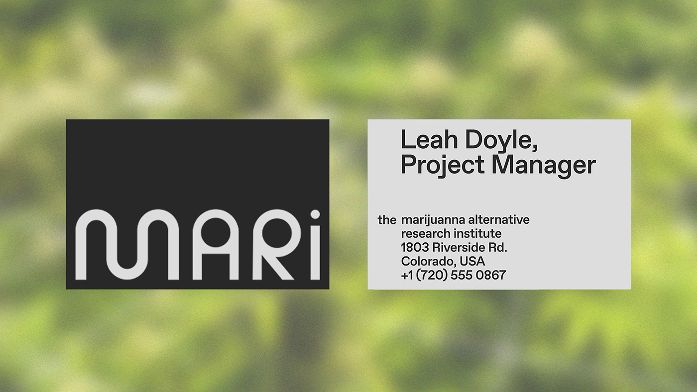
The project was created for the class
DES32BW Design Graphique: Système d'identité visuelle at UQÀM
given by Marie-Elaine Benoit.
One part of the project was to build a series of icons to help with directions in the institute. Instead of creating a grid,
I used the first letter of each area in our custom typography to base the illustration of each icon.


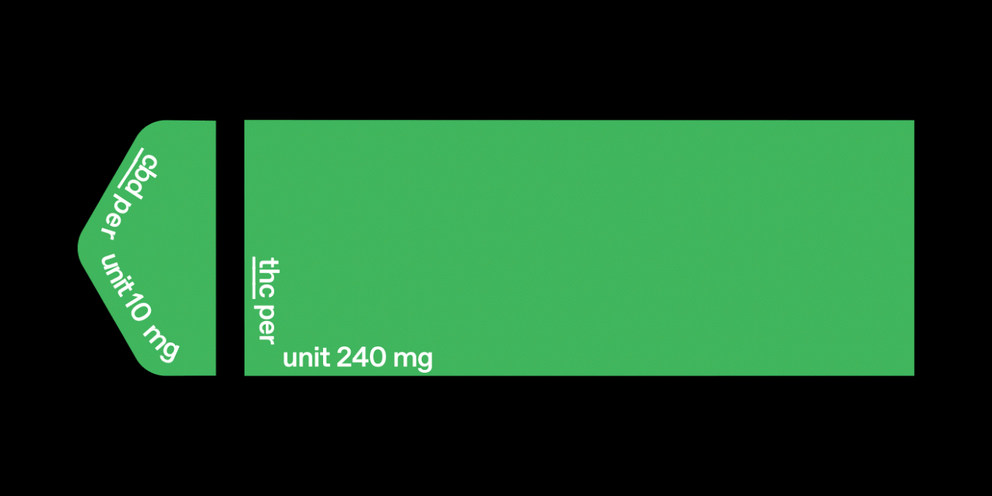
One important aspect I wanted to tackle with this project was to create a system that could help visualize the concentrations
of cbd and thc in the products offered. This systems offers a graphic that helps to see the both elements in ratio to each other.