Restyling of package and logo of restaurant chain "Esushi"
Esushi is one of the largest restaurant chains of japanese chicken on all territory of Moldova.
Our goal was to create a brand-strategy, restyle the logo and the package for delivery.
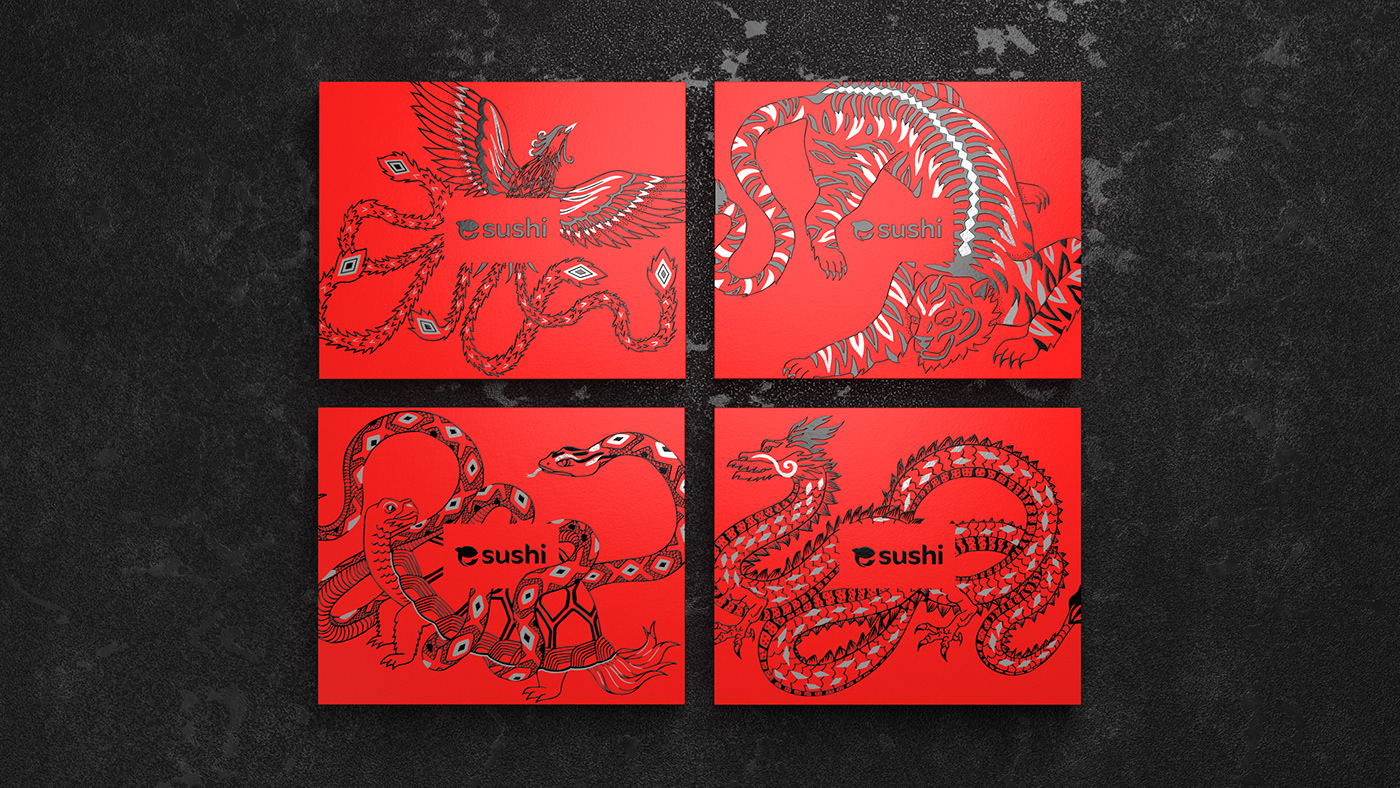
We created a brand-strategy, restyled the logo and visual component of the package, also created a new construction, which allows us to place the dish and the necessary ingredients and accessories in the most convenient place.
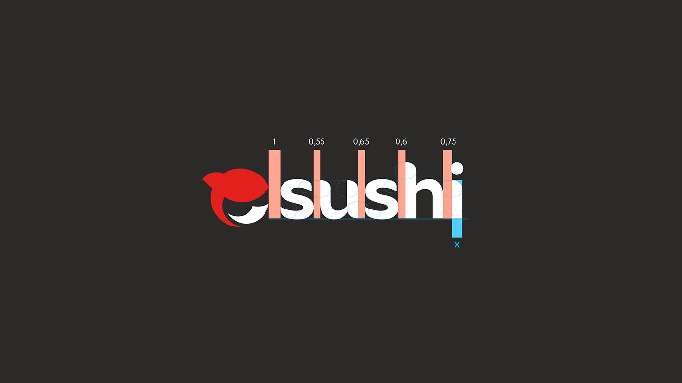
The existing logo created some difficulties in its use in printing, positioning in space and reading.
Our task was to increase brand awareness, refresh the logo and enhance its readability. We slightly changed the color palette, changed the font part of the logo, corrected the sign, removing unnecessary details from it.


When developing the packaging, we took as a basis the oriental myth of four animals, guarding the four corners of the world: the north is guarded by the Turtle-Snake, the east by the Blue Dragon, the south by the Red Phoenix, and the west by the White Tiger.