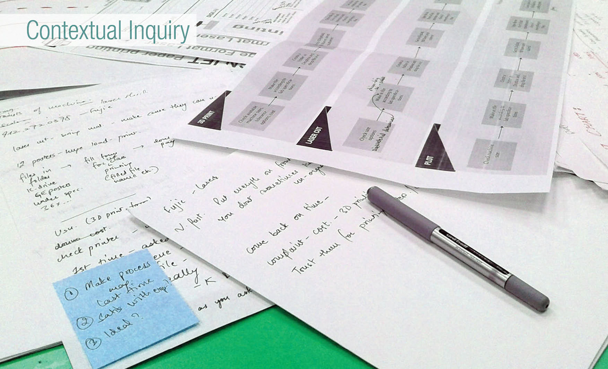
Contextual Interviews:
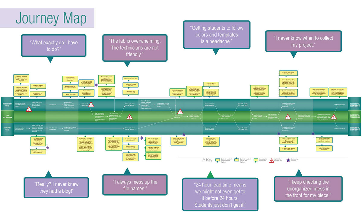
I interviewed students and technicians to understand the existing usage scenarios of the lab and the kind of problems they face, and summarized their experiences in a journey map which includes the stages of the process and the corresponding pain points substantiated by quotes.
User Pain Points:
Students-
Feel uninformed, confused and wrong-footed
Don’t know/ find it difficult to locate the K Drive on SCAD campus computers to submit files
Don’t know about the lab’s blog which contains self-explanatory instructions
Feel lab technicians are not friendly
Lab forms have seemingly unnecessary and ambiguous information
Never know when their product is ready to be picked
Technicians-
Have to put in a lot of time and effort to check files for 3d printing and laser cutting
Deal with students repeating the same mistakes over and over
Feel frustrated by the clutter in the lab
User Archetypes:
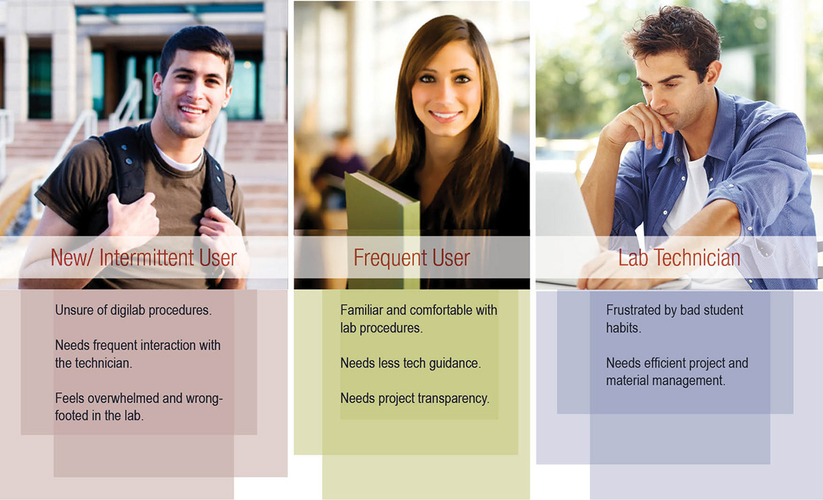
On analyzing the interview data, I noticed that there were 3 main types of players in the field; the new/ intermittent user, the frequent user and the lab technician.
New/ intermittent user: This type of student is unsure of the lab procedures, needs frequent interaction with the technician, and feels overwhelmed and wrong-footed in the lab.
Frequent user: This type of student has used the lab multiple times and is familiar and comfortable with the process.
Lab technician: The technician works within the constraints of the outdated systems and bad student habits to churn out projects.
Solutions:
-Having a poster on the DigiLab entrance directing students to the lab’s blog will make the new users aware about the lab’s capabilities and procedures.
-Revised lab layout and a shelf/ rack system with tagged raw material (submitted by student) and processed products from machines will keep things organized and the lab clean.
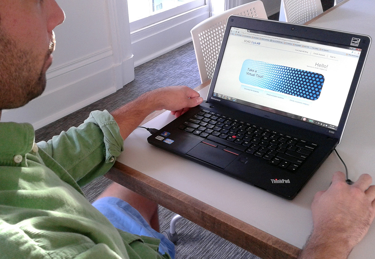
-Accepting software files through a website could simplify the submission process while also making the system transparent.

User Testing Phase I:
The first round was conducted with a low-fi PowerPoint prototype on 5 campus students. It led me to reword certain instructions, smoothen many micro interactions, reduce text-based information, refine features like material tagging and project folders, and emphasize the tips and warnings. Students liked that they had a lot of information and instructions on hand throughout the process, and that the transparency of the process would keep them informed and updated.
User Testing Phase II:
Cognitive walkthrough
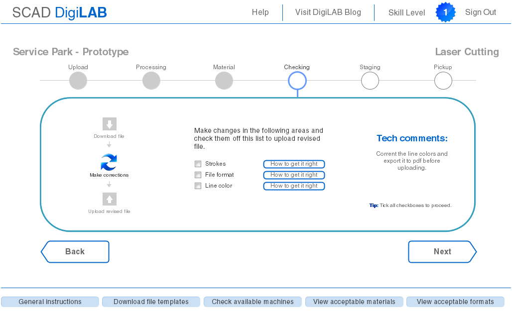
Six days of continuous iteration led to the development of an Axure mid-fi prototype. To encourage students to solve basic file and software problems without taking up much time with the technician, a skill level badge was introduced which allowed the technicians to refer new students to the experienced ones. Links to instructions and information were added to the homepage so that students would have access to information right away. I realized that the steps could never be as linear as I had projected them to be. Most students, new or experienced, rather did need the to-and-forth interaction with technicians to get their files corrected.
User Testing Phase III:
Through in person testing on campus and Five Second, Click and NavFlow tests on Usabilityhub.com, I refined the prototype to the next level.
Link to Axure Prototype- http://c4p1oo.axshare.com/


