


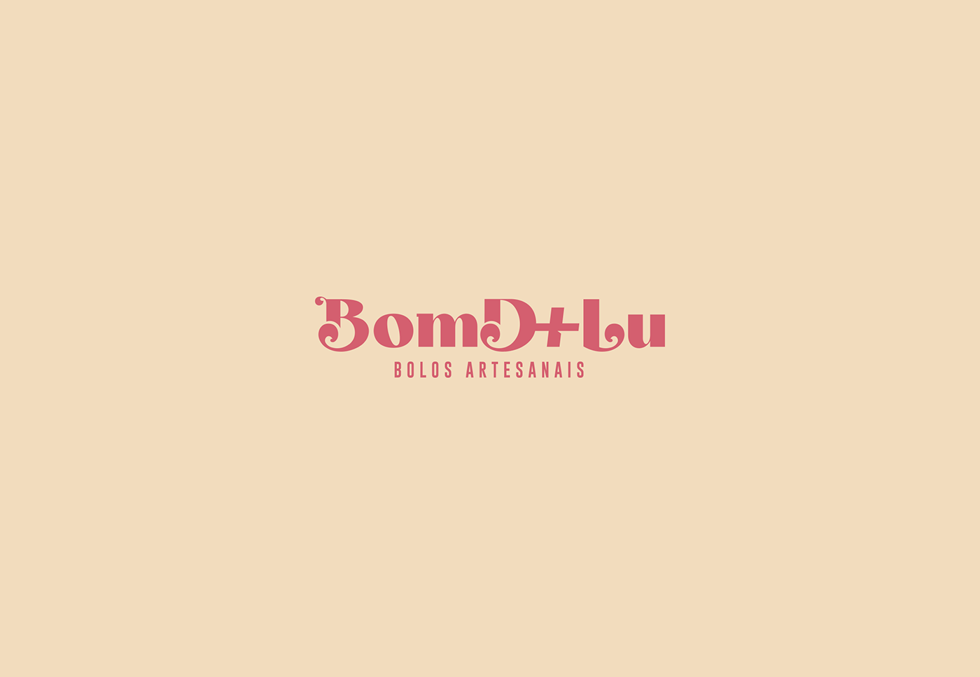
EN | BomD+Lu is a confectionery company from Guarapuava/PR that mainly works with the production of artisanal cakes and fine sweets. The brand started its trajectory by calling itself Marcato bolos finos, but the owner decided to change the name so that it could create more identification with the public. The company's main objective is to deliver the highest quality products, made with selected ingredients to offer not only an incredible taste, but a unique experience for customers, taking care of every detail.

EN | As the company name already has the plus symbol, the challenge was to create a typographic-only logo, with characteristics that could refer to the segment in which it operates and represent the brand in the best way. Thinking about the brand attributes, a high-contrast, classic-style font was used, with adjustments to the strokes and changes in the structure of the letters B, D and L. The objective was to give the idea that they were made with a pastry bag, with rounded shapes in crescent motion.
PT-BR | Como o nome da empresa já possui o símbolo de adição, o desafio foi criar um logotipo apenas tipográfico, com características que pudessem remeter ao segmento de atuação e representar a marca da melhor forma. Pensando nos atributos da marca, foi utilizada uma fonte de estilo clássico e de alto contraste, com ajustes nos traços e modificações na estrutura das letras B, D e L. O objetivo nelas foi dar a ideia de que foram feitas com um bico de confeitar, com formas arredondadas em movimento crescente.
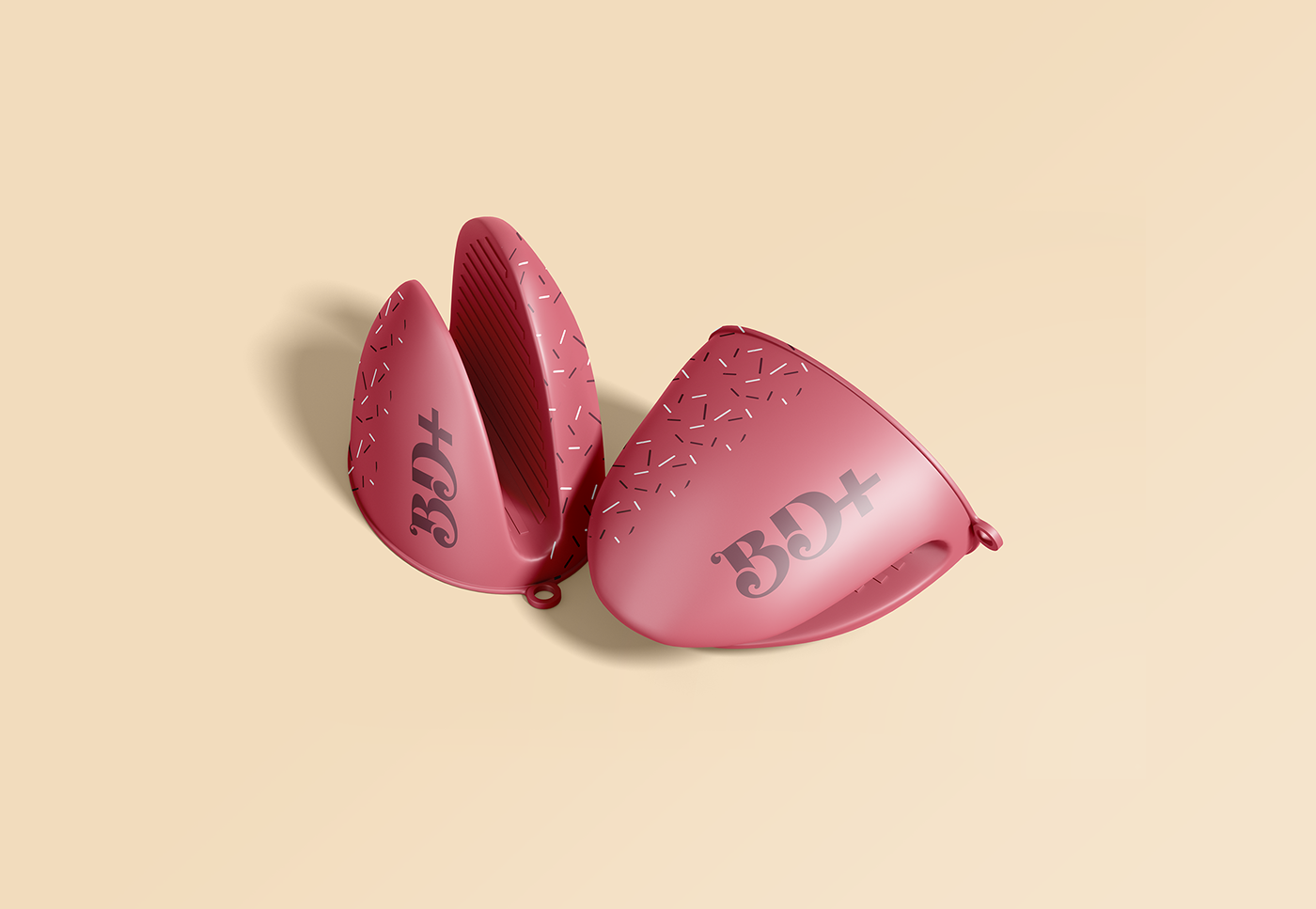
EN | The colors and textures were defined considering the characteristics of the ingredients that make up the products offered by the company.
Brown represents chocolate, which is one of the most used ingredients in confectionery, pink refers to delicacy and sweetness, and beige represents the creams used in fillings and toppings. The patterns allude to the sprinkles and the texture of the sweets.
PT-BR | As cores e texturas foram definidas pensando nas características dos ingredientes que compõe os produtos oferecidos pela empresa.
O marrom representa o chocolate que é um dos ingredientes mais utilizados na confeitaria, o rosa remete à delicadeza e a doçura e o bege representa os cremes utilizados em recheios e coberturas. Os patterns fazem alusão aos granulados e à textura dos doces.


Agência: Mattos e Martins
Diretor de Criação: Rogério Mattos
Designer: Gabriel Cruz
Obrigado pela visita!
Thanks for watching!


