Establishment of creative direction for Westlake Chemical's emerging visual brand.
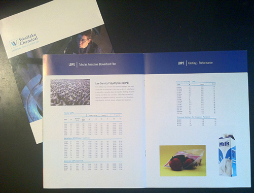
These brochures provide a proof-of-concept initial application of the corporation's emerging brand identity and design standards.
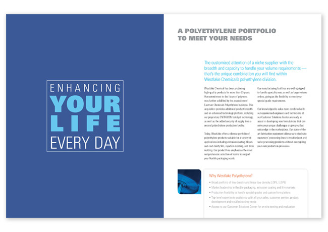
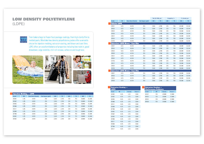
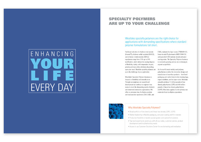
The tagline was given a graphic treatment—and used boldly, confidently, and consistently—to lend intentionality and committment to this brand promise. The photography direction supports the freshly revived brand promise by portaying glimpses of everyday folks using everyday consumer goods (made possible by Westlake products) in their everyday lives.
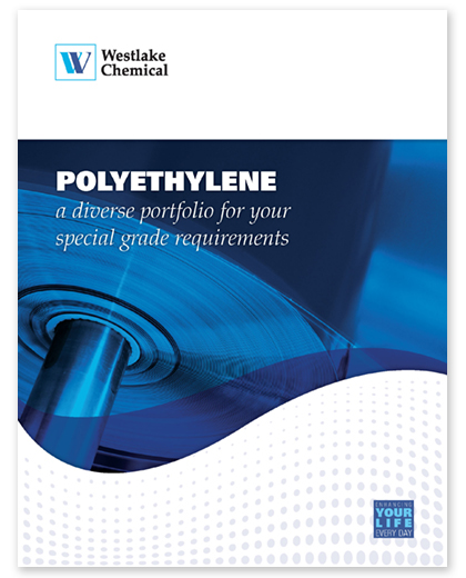
The Westlake "wave" element on the cover unifies previously disparate and uncoordinated graphic directions. On the text pages, the underlying 5-column grid provides structure, flexibiliy, and openness.


Before my brand refinement and redesign of the Westlake print collateral: