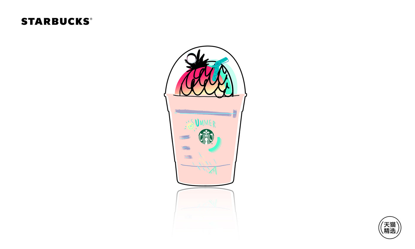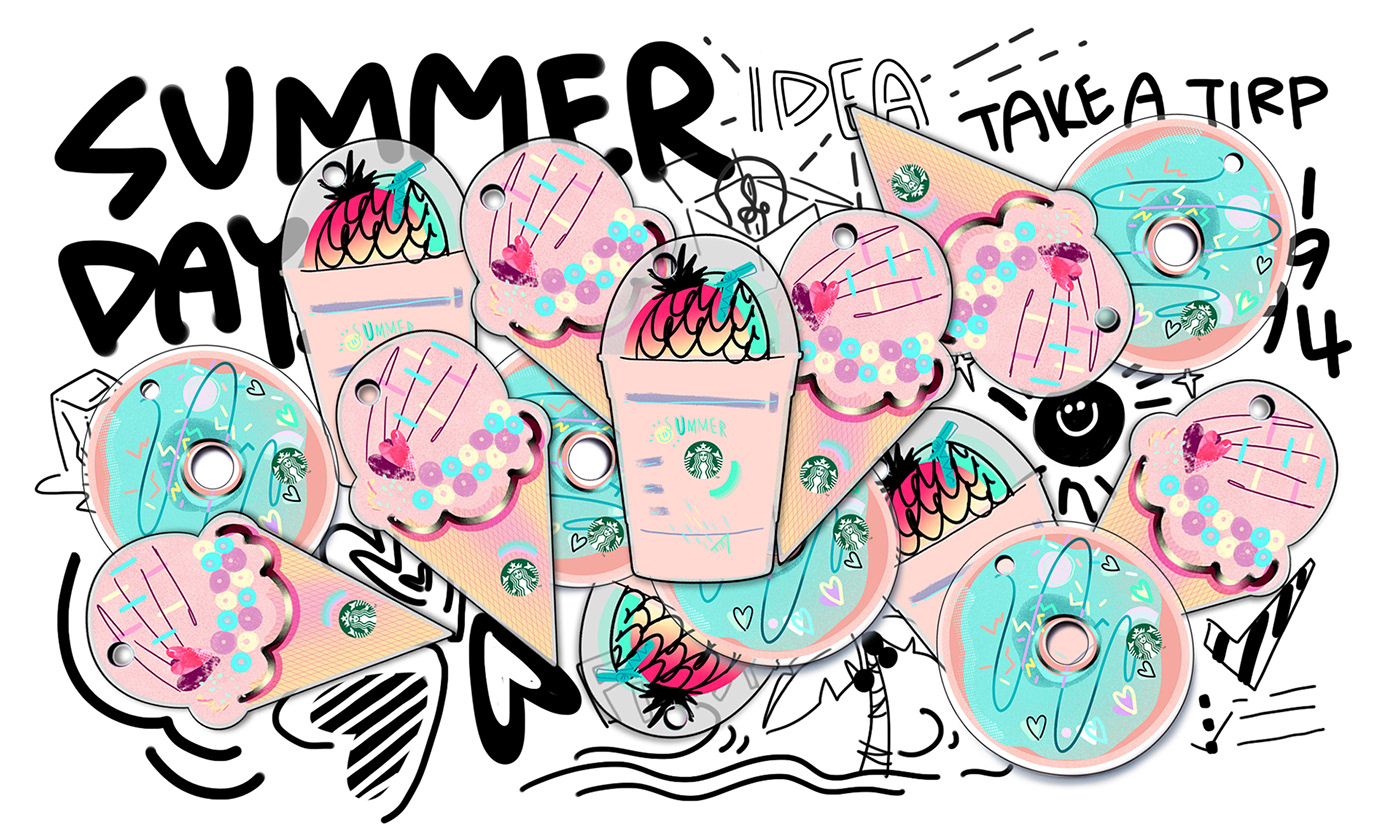
这套卡片选用冰激凌 / 甜甜圈 / 冰摇茶作为外型,加入线条、几何形状等图案,表现轻松悠闲的夏日感受。
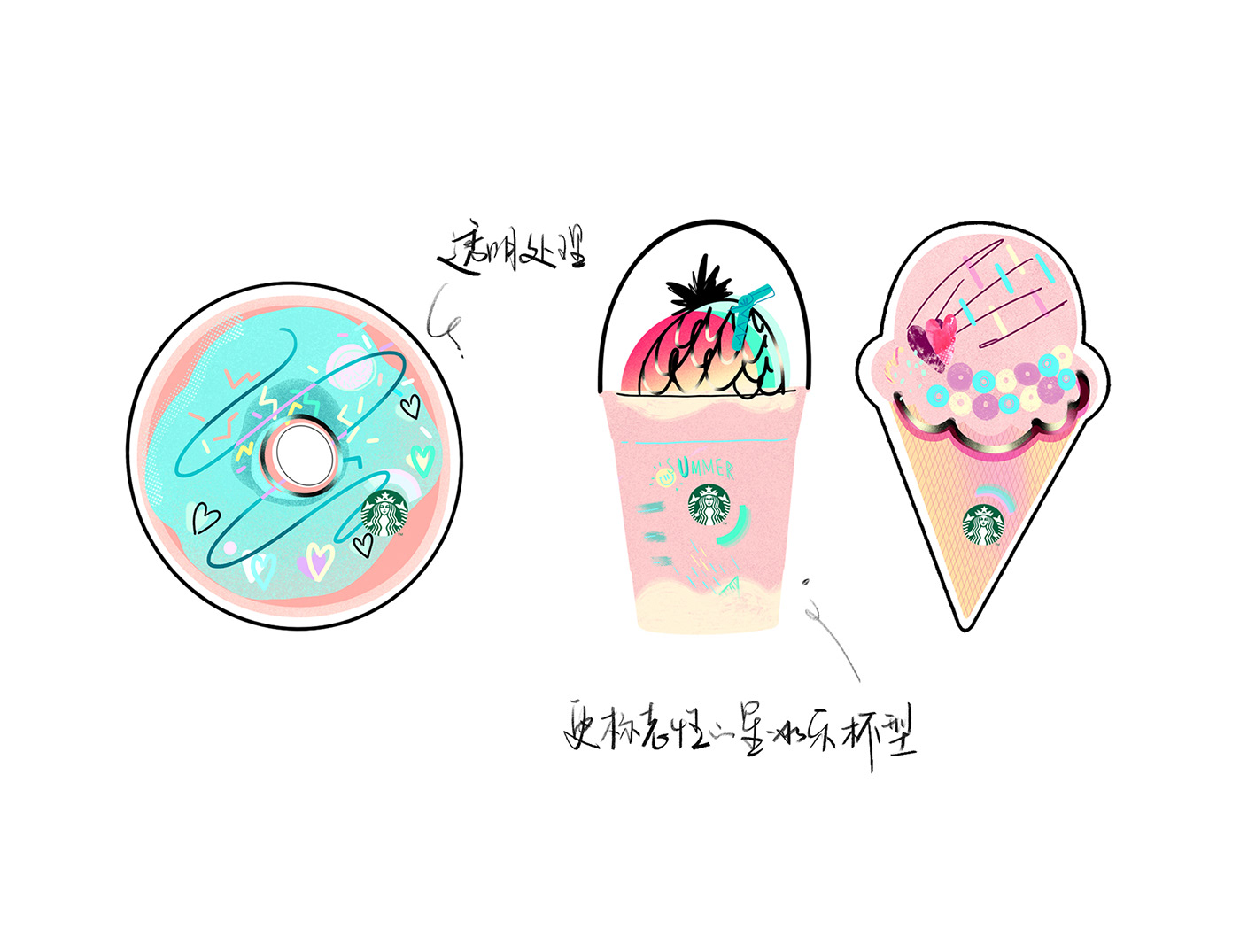
在设计的初期阶段,尝试过很多组合效果,例如考虑改变造型、色调,或者常规元素如何有新的表现形式等;期间也推翻了不少方向,最终磨出2-3版供客户选择。虽说自己最满意的配色没通过,客户更倾向于出街版的薄荷绿与珊瑚橘;冰激凌最初设计的是双球造型,但客户认为不够标志性,改为了终稿的单球版本。
由于制作工艺等原因,原先设计更加随性的造型,需要改得规整化,便于工厂打型生产;在材质选择方面,曾建议工厂可以选择半透明磨砂亚克力材质,表现卡面中的留白部分,但出街版还是定了白色作底部背景。
以上是这次工作中没能避免的遗憾,希望以后的项目里会越来越少
The summer cards has three shapes as ice cream cone,doughnut,Frappuccino and they are decorated by patterns like lines,circles,squares,triangles etc,for drawing a relax and activity summer
At the beginning of designing the cards I had tried many different versions,as different shapes,different colors and different elements,till l had been assured that two or three versions could be presented to Starbucks. They could chose one from them
It made me regret that the final color of the cards were not the one I like best and the shapes had to be changed more uniform for been produced
Although I had gave a advice that the empty parts could be made of frosting and translucent Acrylic backboards,the final version were printed onto the white background
I hope that the following projects shall get the more excellent results and the less pity