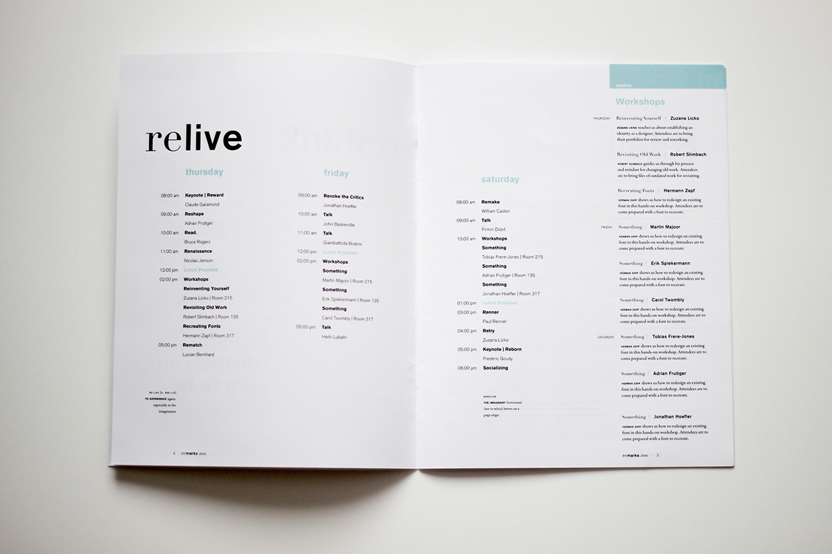
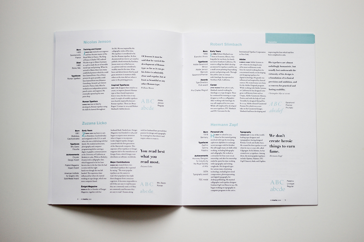
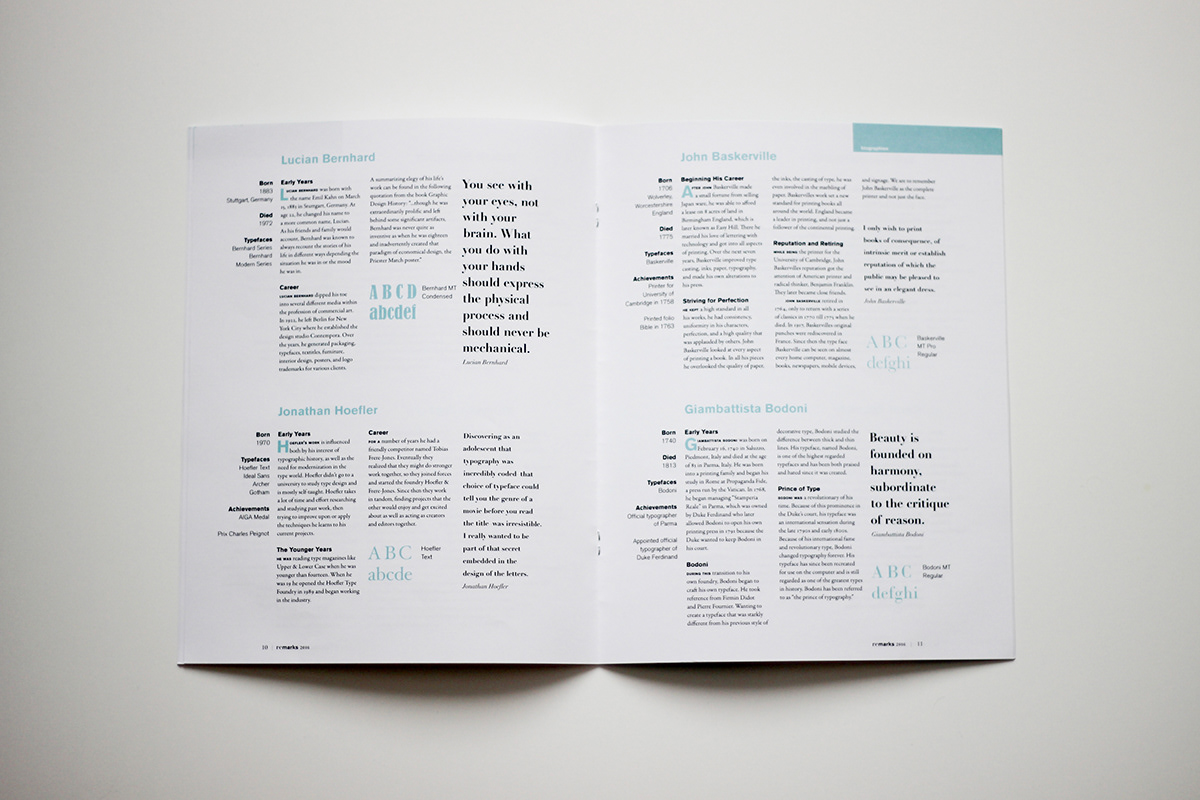
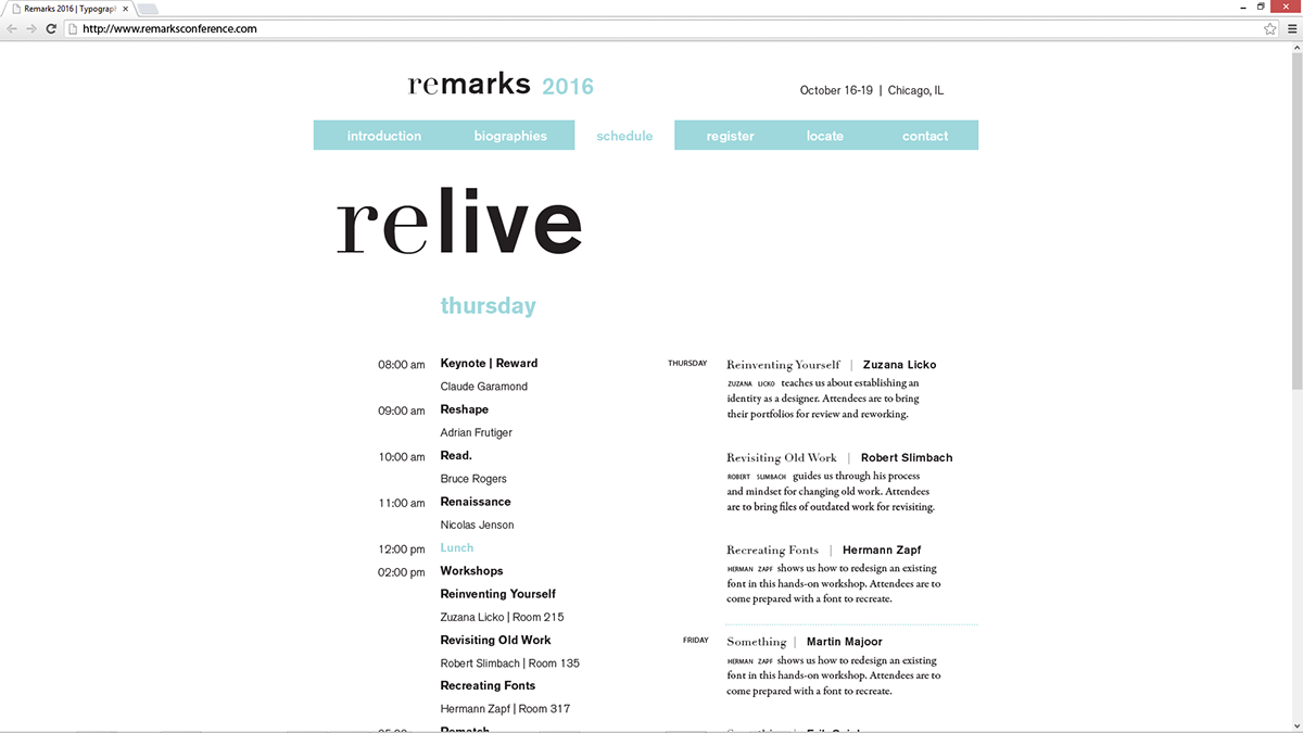
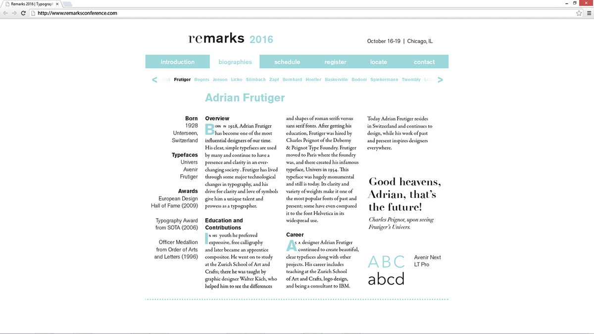
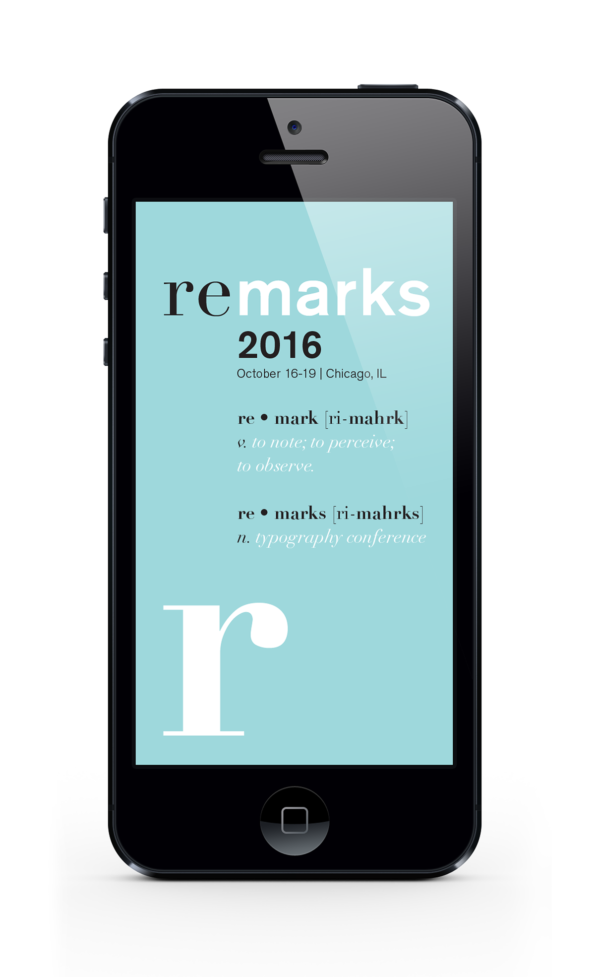
For this project I created a three-day typography conference that designers could attend to learn from living industry leaders as well as actors who would portray famous typographers throughout history.
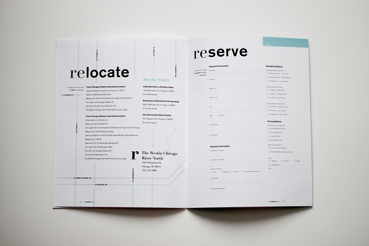
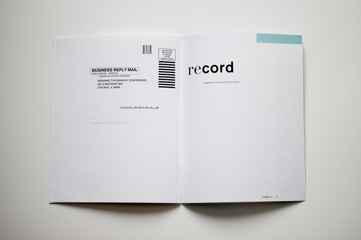
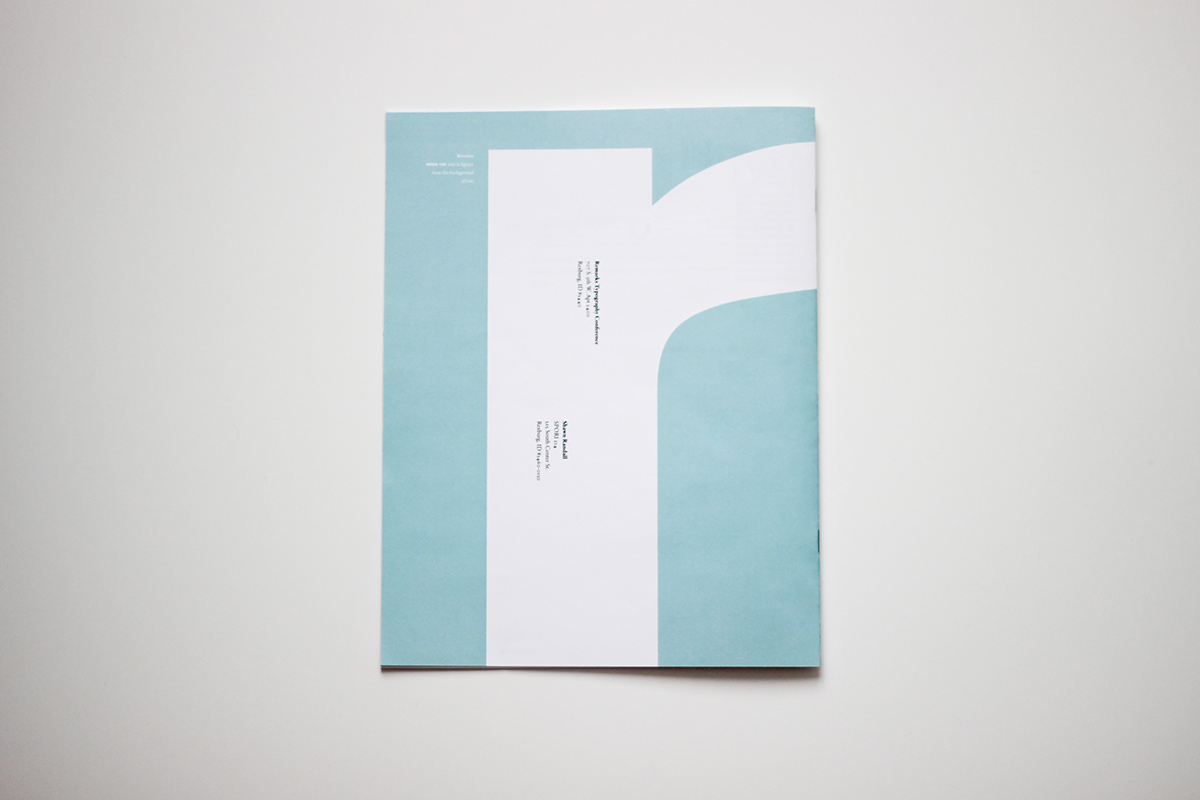
The final deliverables included a saddle-stitch booklet with a tear-out registration form as well as an app and a website to accompany it.

Here is some of my typeface pairing research. I wanted to find a few faces or families to use throughout the conference.
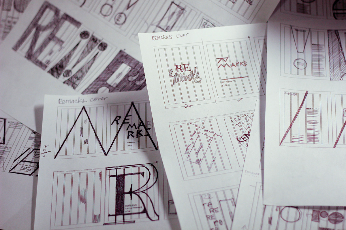
A brief look at some early concept sketches.
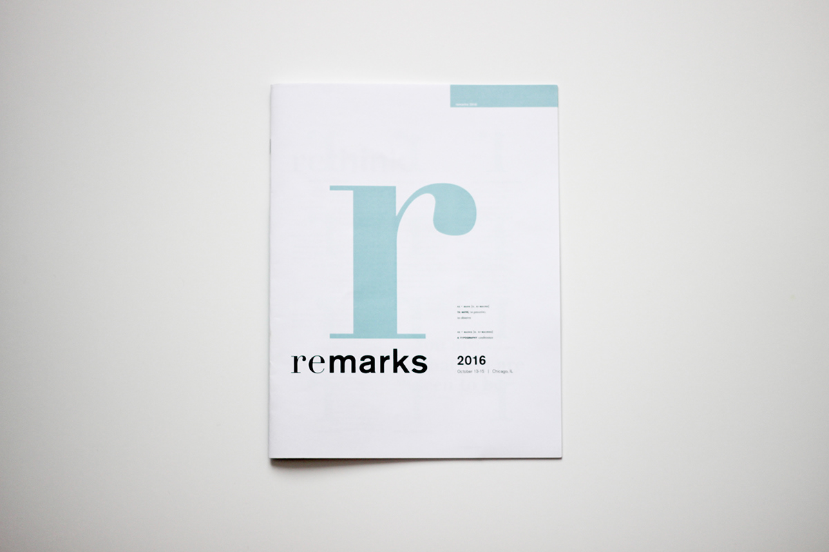
I created three optional directions to choose from. This one was the one that I ended up fleshing out a little more. The concept was really about "Re," because it's a review of history and learning how to contribute successes similar to the work of other designers who came before us, as well as learning from their mistakes.
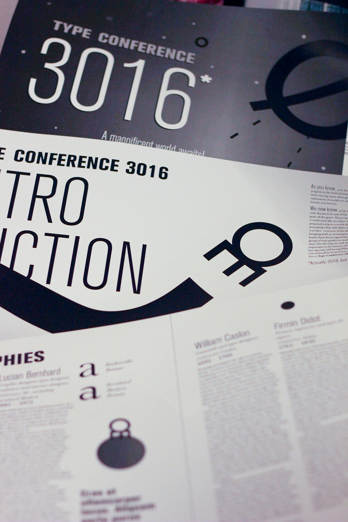
This direction was about a fictional trip to the year 3016, and explored the idea that all of these past designers have been brought back to life through new technology.

The theme of this direction was exploration. I wanted to portray it as the early years when much of the world was a mystery and there were still many lands to discover, because my experience with typography has been like that.

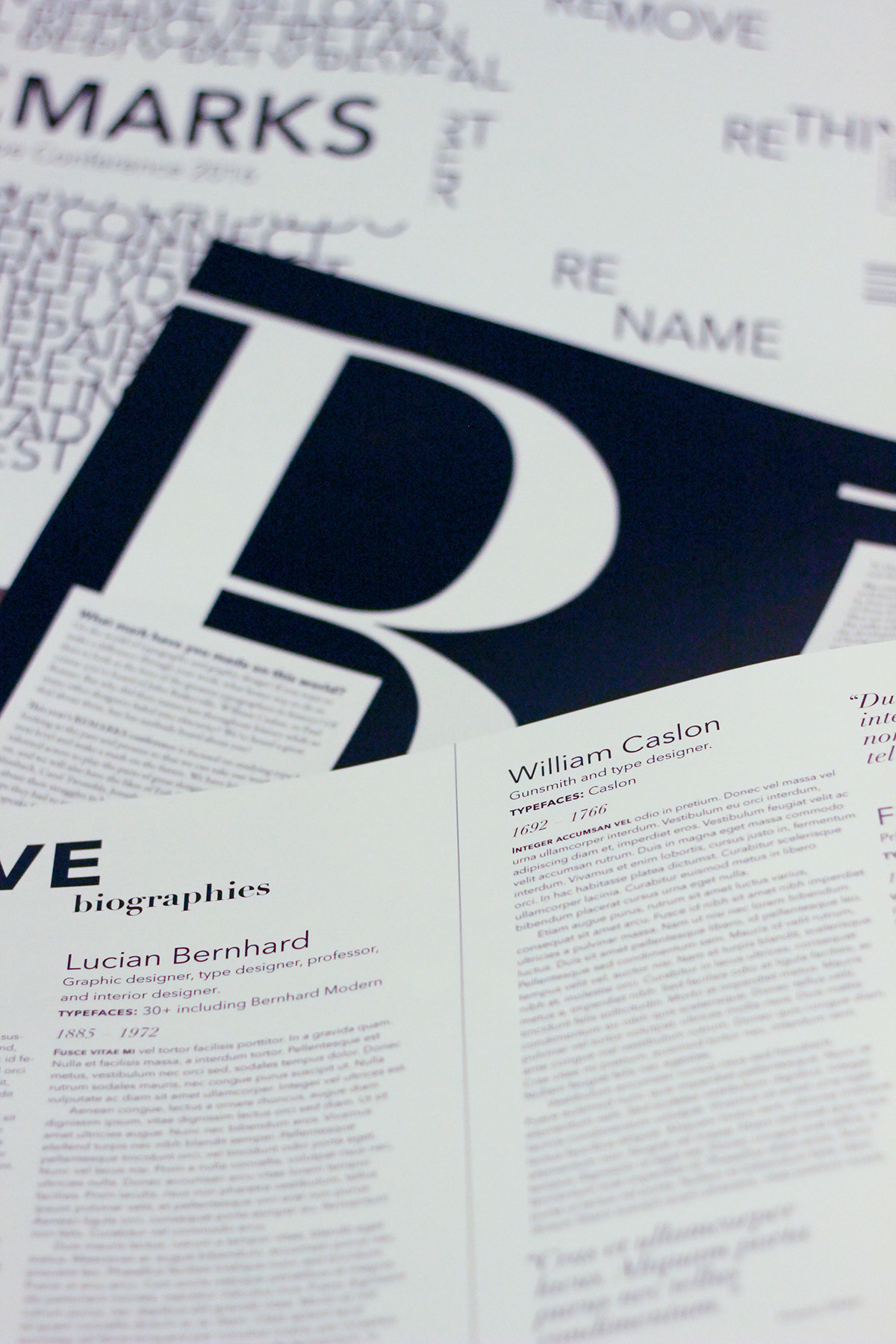
This is a brief view of some of the refinements I went through while pursuing the "Re" concept.

Above is a spread from the "Remarks" concept, marked up after collaborating with my colleagues about what to improve.
And without further ado...