








For our Intro to Graphic Design class we had to create logos from a list of 11 case studies of companies in need of new logos. I chose to work on Weber Grills and designed the logo based on the letterforms. The logo resembles the letters W & E which are prominent in the brand name. It was also to show progressive rhythm and to give a sense of a spatula.



This was a front spread to a 6 panel brochure on the artist Mark Rothko that I designed. It explains his transition as an artist and finding his style in minimal "Transcendent Fields of Color." The brochure describes a brief historical background of Rothko, his influences and a fictional gallery showing of his early to most recent work in the Getty Museum.
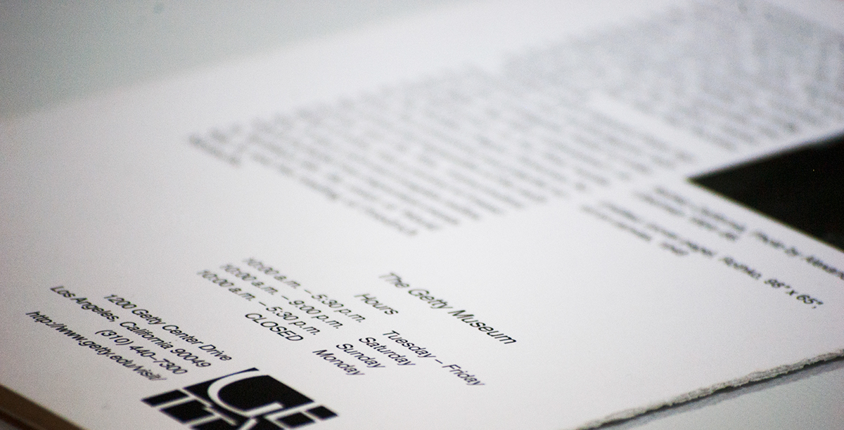

Back spread to the 6 panel brochure on the artist Mark Rothko that I designed. It explains his transition as an artist and finding his style in a minimal "Transcendent Fields of Color." The brochure describes a brief historical background of Rothko, his influences and a fictional gallery showing of his early to most recent work in the Getty Museum.


