
崎寻是在2020年在厦门成立的全新品牌,主打让年轻人轻松喝上品质好茶。在茶类商品的选择中,如何提供给消费者品质得到保证的产品,需要大量的付出精力与时间。这里面精心“寻觅”是品牌想传达给消费者的状态,我们抓住崎寻字面意思的特点,选取了准星这一符号并作为标志与延展图形的使用。
Taymeet is a new brand established in Xiamen in 2020, which focuses on making it easy for young people to drink high-quality tea. In the choice of tea products, how to provide consumers with products of guaranteed quality requires a lot of energy and time. In the connotation of the brand, meticulous "search" is the state that the brand wants to convey to consumers. We seize the characteristics of the literal meaning of Taymeet, select the symbol of the “sight bead” and use it as the logo and extended graphics.
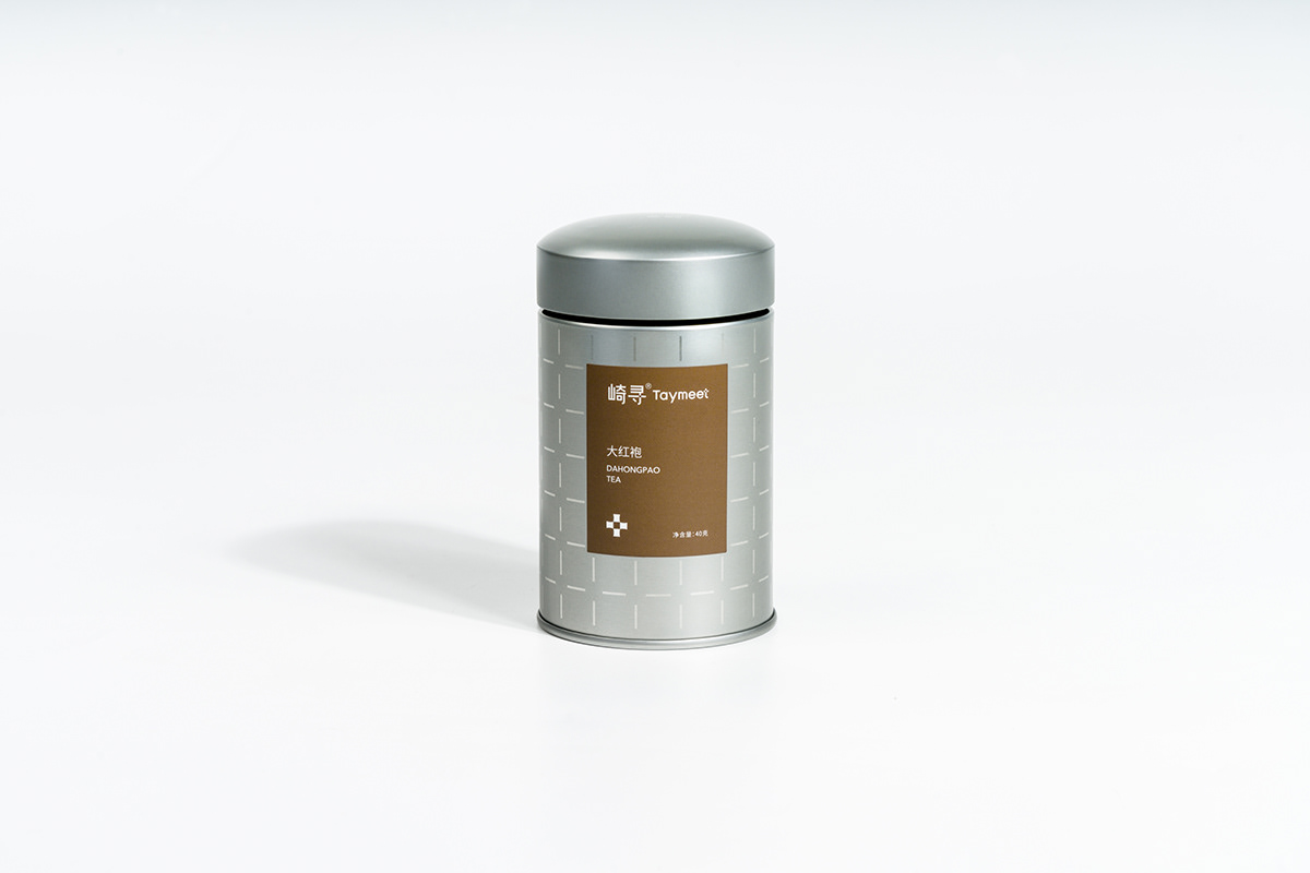
包装的设计上选择直接简洁的方案,在满足功能性与密封性的基础上,造型参考中国宋代茶罐设计,同时強调现代铁罐本身的质感。用透铁的工艺将品牌符号排列成星芒效果,在不同角度呈现出不同的光影流转。并刻意将罐盖与罐身留有缝隙,透出不同茶类的颜色,可以在不打开罐盖的情况下速用来区分茶的品类。外包装选择透明材质,将尺寸控制在能单手握持的大小,方便零售的同时将产品直接大方的呈现给消费者。使得消费者能所见即所得并能直观的感受到产品的尺度。
A direct and simple scheme is chosen as the design of the packaging. On the basis of satisfying the functionality and tightness, the styling refers to the design of the tea pot in the Song Dynasty of China, and at the same time, the texture of the modern tin can itself is strongly emphasized. The brand symbols are arranged into asterism effect with the technology of iron penetration, showing different light and shadow circulation at different angles.


包装作为崎寻品牌识别中重要的部分,整体设计遵循崎寻品牌定位中年轻时尚的特点。将主打的8款茶整合成了一个整体的方案,希望以此带给年轻人不一样的茶类品牌体验。
ately left to reveal the colors of different kinds of tea, which could help quickly distinguish the types of tea without opening the lid. The transparent material is used for the outer packaging and the size is controlled to be held with one hand, which is convenient for retail while presenting the product directly and generously to consumers.


And then, onsumers can see what they get and feel the scale of the product intuitively. As an important part of Taymeet brand recognition, the overall design of packaging follows the young and fashionable characteristics of Taymeet brand positioning. The eight main types of tea have been integrated into a whole plan, hoping to bring young people a different tea brand experience.

https://qixuncy.tmall.com/shop/view_shop.htm?spm=a230r.1.14.4.359178d8TntksZ&user_number_id=2211975802456
Design Agency:Infuture未設計
Creative Director:Sensen
Designer(s):ZKTAO / Danxin / Kaiting
Photographer:Calea
Client:Xiamen Qixun Food Co., Ltd.


