
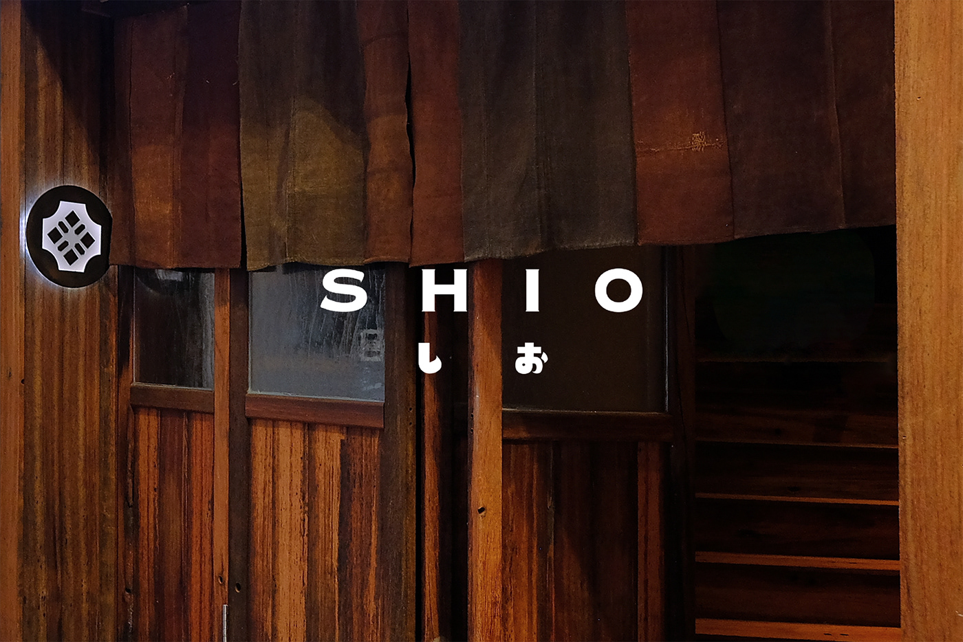
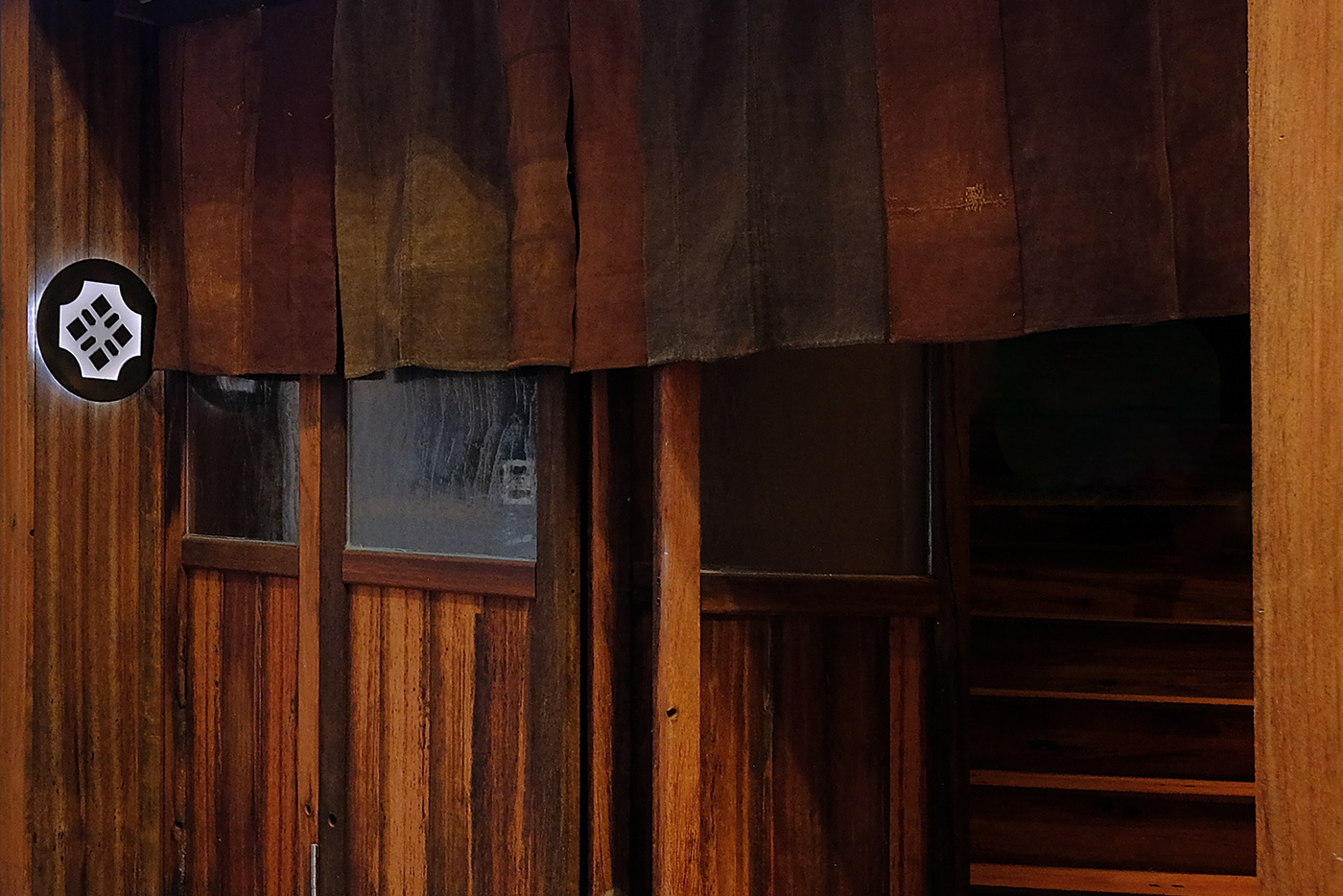
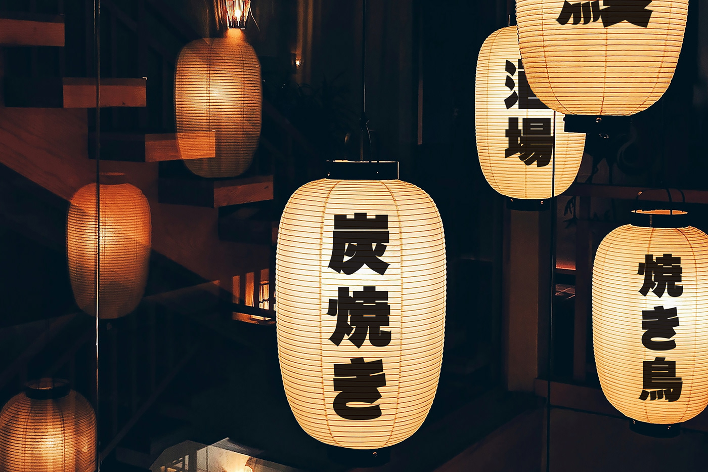
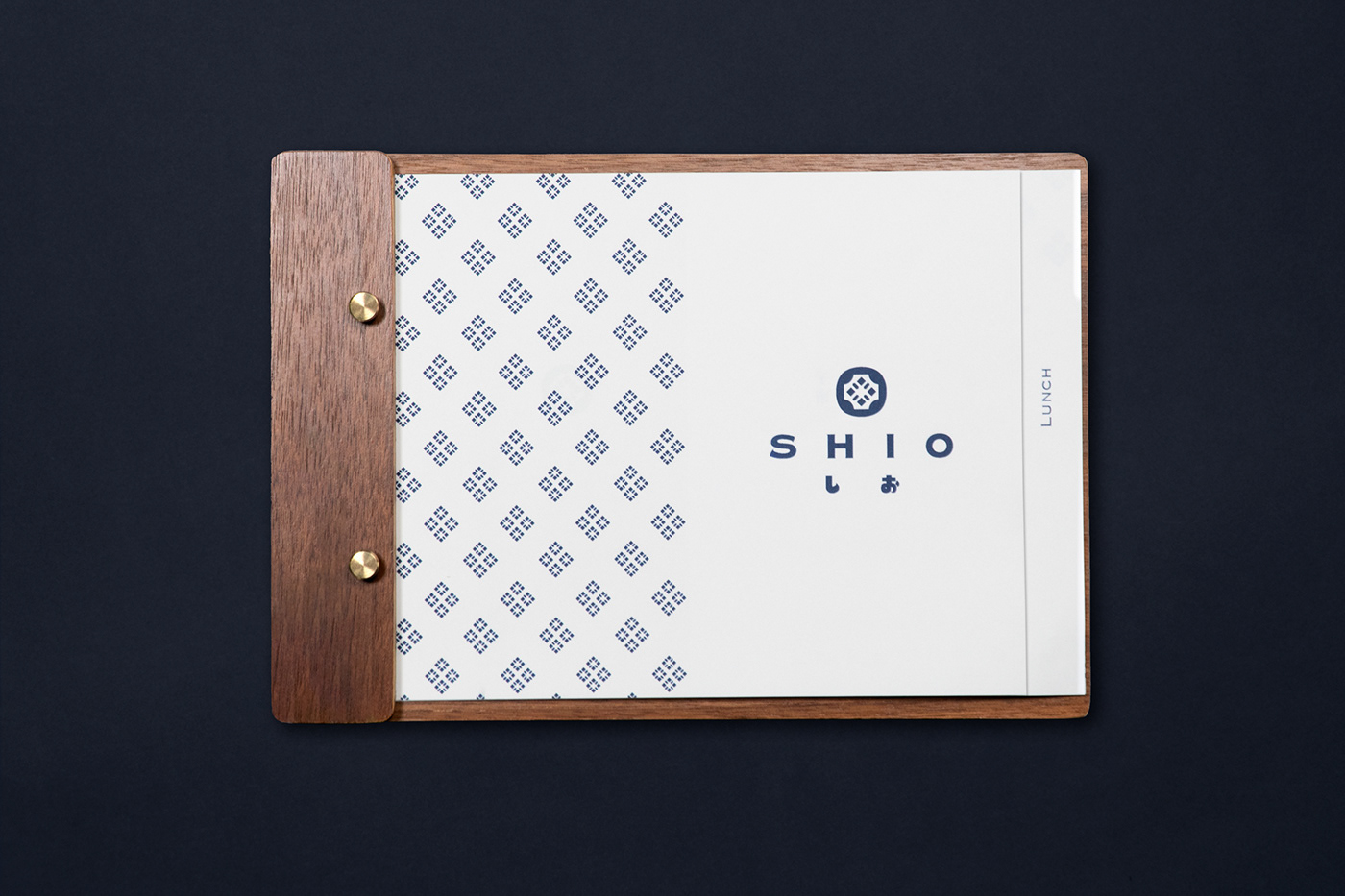
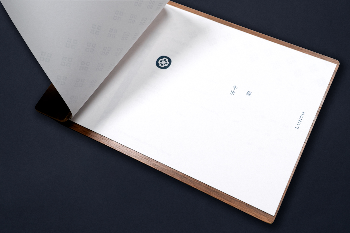
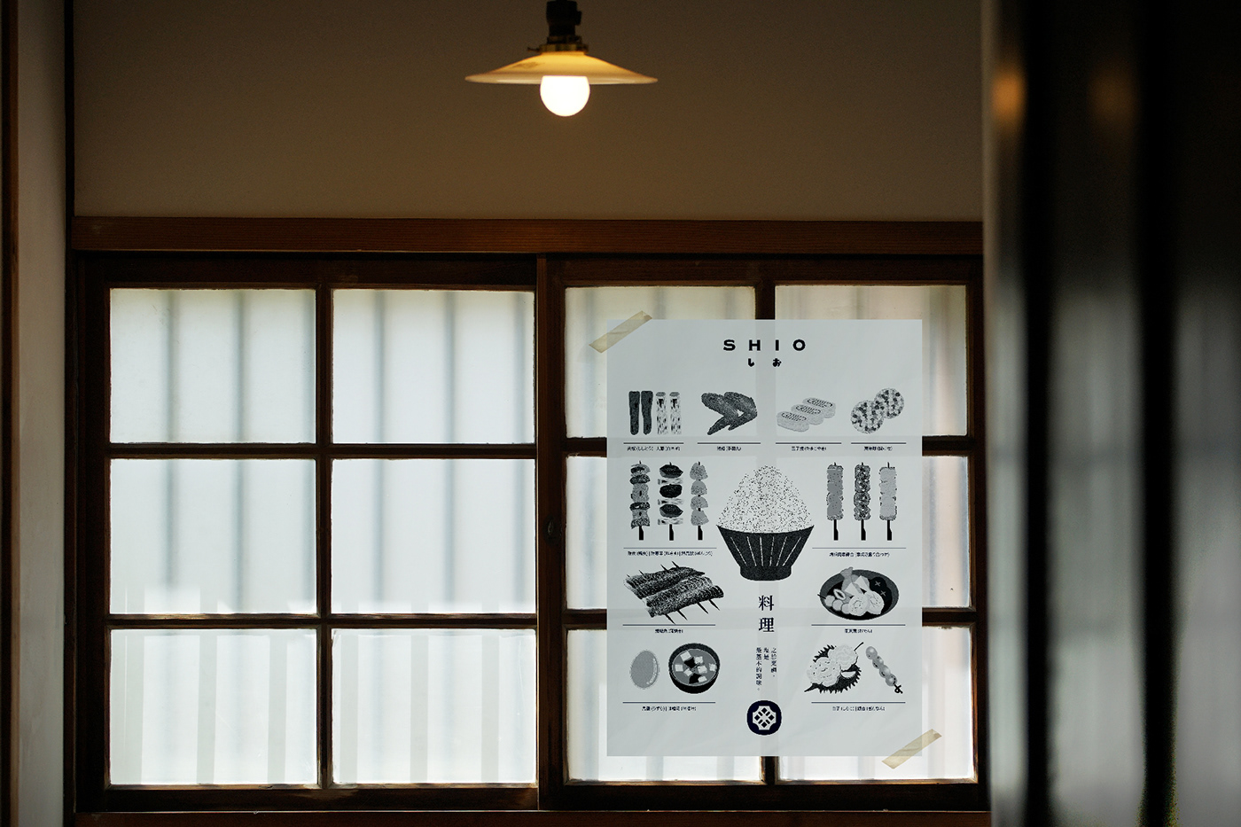
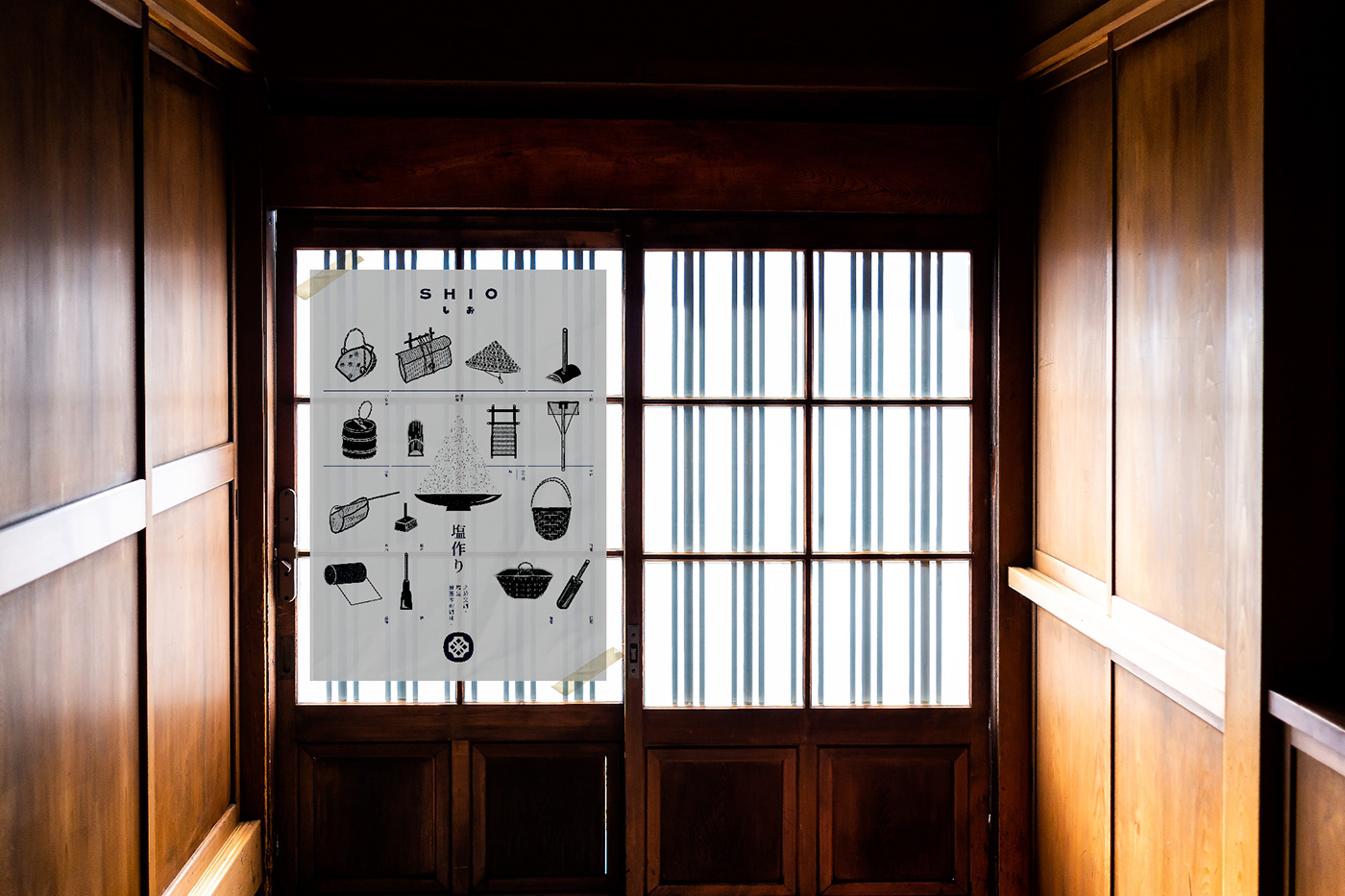
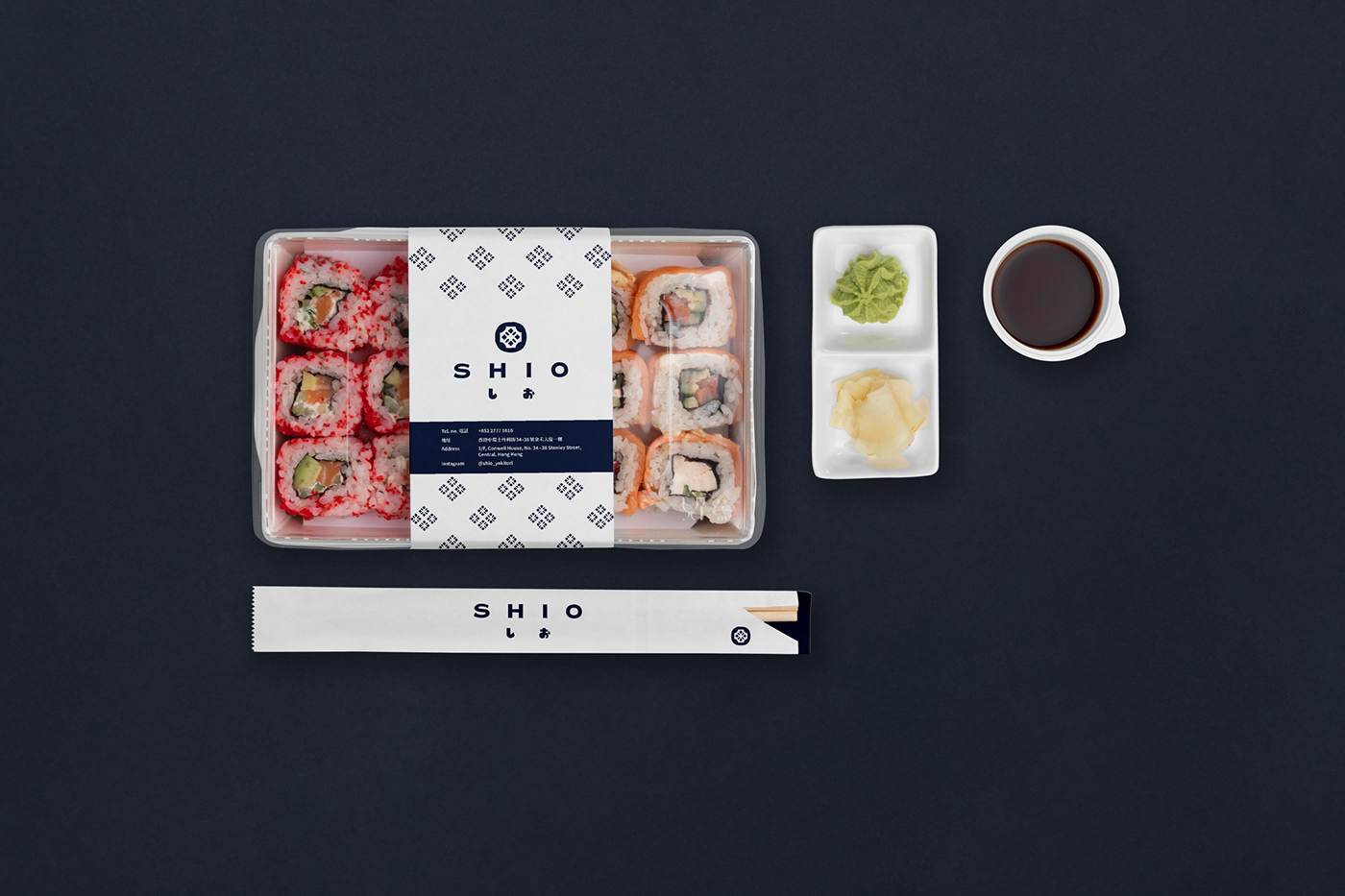
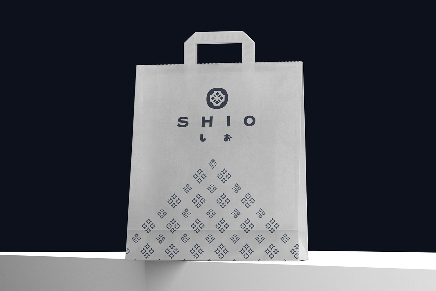
Brand identity for SHIO, a Japanese yakitori restaurant in Hong Kong.
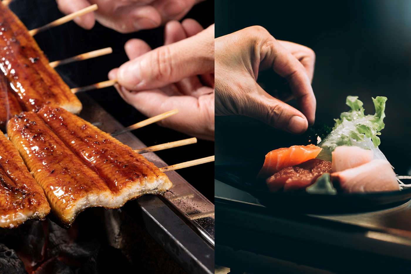
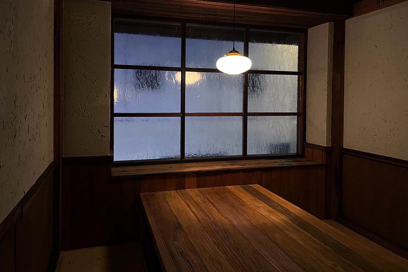
Located in the finance hub of the city Central, SHIO offers a unique blend of experience, encompasses the original tastes of Japanese yakitori.
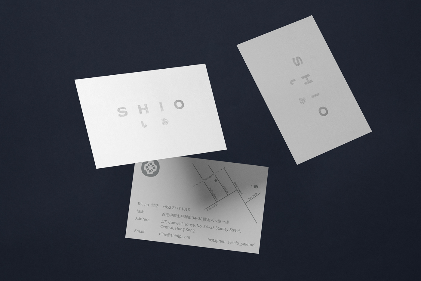
The naming was an initiation from the Japanese word "salt", it was derived from the Japanese words "shio" (塩) meaning salt and "yaki" (焼) meaning barbecue. In the Japanese language, SHIO (しお) has the meaning of "salt", it is the fundamental ingredient for seasoning in cookery.
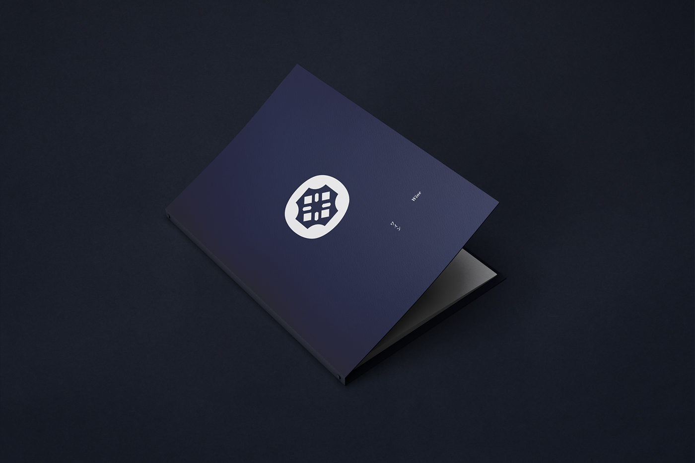
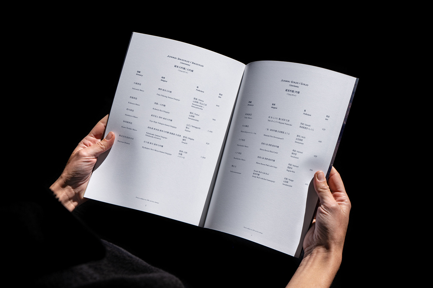
As a sensational touch, the brand identity is defined by a logo mark of graphic and type pronounced by the modeling of a castor with pepper and salt. The brand identity is extented across print, packaging and interior to create a initmate and peaceful atmosphere that brings customers a perfect escape from the city's hustle.


Year: 2020
Client: SHIO
CD: Billy Cheung
D: Billy Cheung
CD: Billy Cheung
D: Billy Cheung
ILLSTR: Gloria Mak
PM: Vincent Hung, Poon
ID: Make A Nice Place
P: 感官文化印刷、杰隆印刷、慶三堂印刷廠、瑞安印刷
PHOTOG: Kobe Kung, Augustine Huang
P: 感官文化印刷、杰隆印刷、慶三堂印刷廠、瑞安印刷
PHOTOG: Kobe Kung, Augustine Huang


