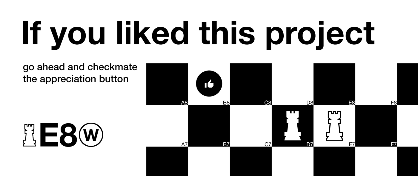
Chessvetica
(Try it out yourself at the bottom of this project!)
Chess is for the people.
Chess is a game played by many. Everyone knows it, everyone has heard of it. Unfortunately not many are able to talk about it due to the (lack of) integration into the modern world of webpages and information sharing services.
Unfortunately the only websites actively supporting the use of chess notation are chess websites themselves. The only other way people can use icons to increase readability are Unicode characters for the basic chess pieces:
♔, ♕ , ♖ , ♗ , ♘ , ♙ , ♚ , ♛ , ♜ , ♝ , ♞ , ♟︎
However, to me they stayed behind the constantly modernizing webdesign trends and so I set out to create a new system with more features that would be easy to use and read.
The Outset
In Chess it is especially important that anyone can immediately recognize a piece simply by looking at it. Furthermore, pieces have specific elements, such as the king possessing a crown, that would have to be included as well.
I started planning out what the pieces should look like, as well as what they would be used for. There are already established websites for playing chess and the lack of attention is in writing legible chess notation.
Therefore my approach to this was going to be an iconset that could be combined with the coordinates in order to make it immediately clear what is displayed on screen.
The inspiration for the style of the pieces largely consists of the
International Typographic Style, also known as "Swiss Type". It emphasizes cleanness, readability, and a sense of neutrality.Fitting to this style are two typefaces that can be found on largely all devices in the world:
Helvetica and Arial.
Helvetica and Arial.
As they both share a common cap height and similar features they were perfect references for the style of the project I would now call "Chessvetica".

The Pieces
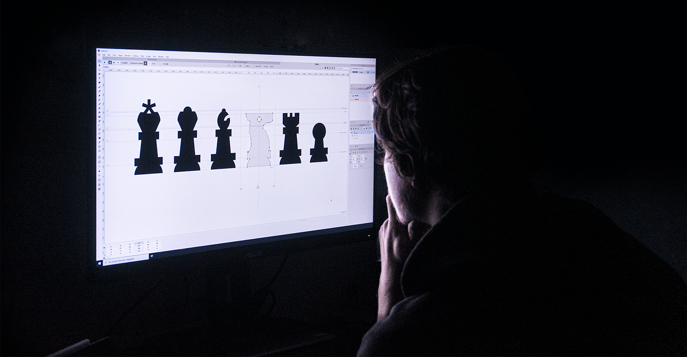
When creating the pieces I focused on keeping the signature shapes and elements that can be found in the regular chess pieces. As an example, Kings always have a cross on the top and are the largest pieces on the board.
I first measured the general size of the typefaces used as inspiration. I decided that the pawns would be an excellent starting point and would be the same height as the o-height of the two typefaces. This was due to the round head of pawns that would require overshoot, similar to the way rounded characters work in typefaces.

First versions of pawns; Chessvetica 1.001
After determining that pawns would be the size of lowercase characters, I pinpointed the biggest piece of the set, the king. The flat part of the kings and queens heads would be the same height as the cap-height in Helvetica and Arial with the head decorations serving as overshoot to make them stand out next to written text.
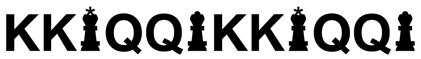


Photo Credit: Praveen Thirumurugan
One of the most distinct pieces of a set is arguably the king. The icon of which has been modified with a redrawn asterisk from Helvetica to serve as the mandatory cross, which is a required element of the king piece in chess. The bottom stems have been widened to give more strength to the connection and the arms of the asterisk have also been widened to balance the slim silhouette of the glyph with the otherwise bold icon
For the bishop, rook and knight a similar principle was applied. To visualize the difference between the importance of the king and queen the other pieces are made slightly smaller so that they don't fully reach the cap height. Bishops are more tall and thin and are therefore able to just barely reach the cap-height with the overshoot, while knights and rooks terminate on the same height just before.

In order to use the webfont correctly, each piece also needs a corresponding negative-part to serve as the opposite color. Those icons have been designed to increase readability while staying in the same set-style of Chessvetica Regular.


Chessvetica figures not only exist in 2d, but also as a concept for actual chess pieces in 3D! Take a look!
3D Models created by Jagresion


Chess websites not only allow you to play and export games but also to analyze them via annotations. In order to make readability as good as possible, the focus of Chessvetica is to also allow players to indicate good or bad moves when typing out the moves.
Do you see the difference?
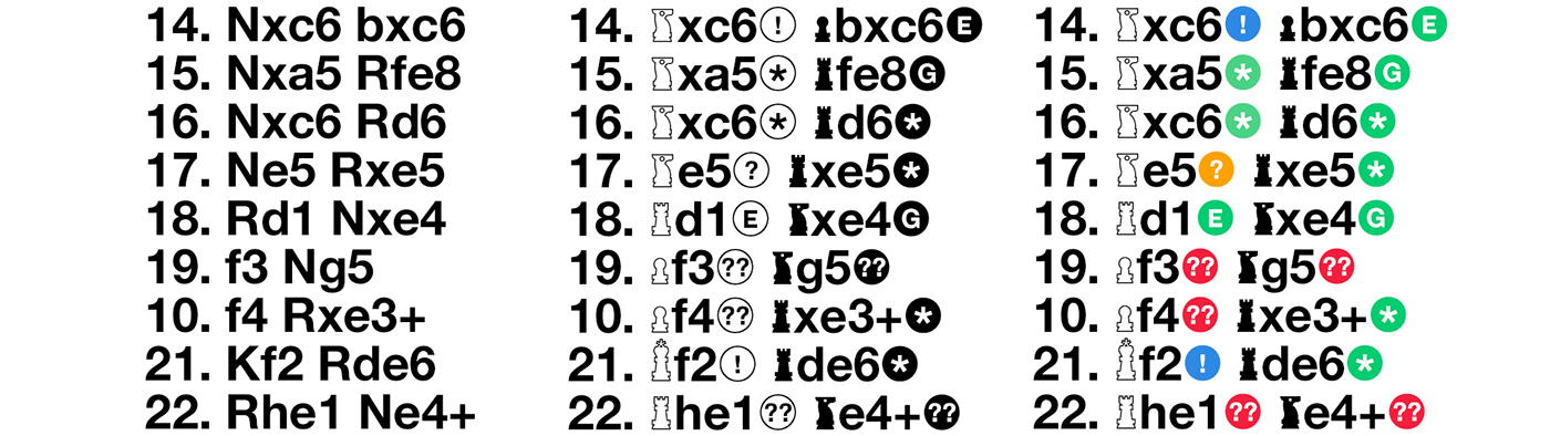
Left to right: Without Chessvetica — Chessvetica in black & white — Chessvetica in color

Animation of KE2blunder
Chessvetica includes 17 chess move indicators, ranging from common ones such as a Checkmate or a Blunder all the way to Forks and a wide range of regular indicators such as Brilliant, Great or Good moves.
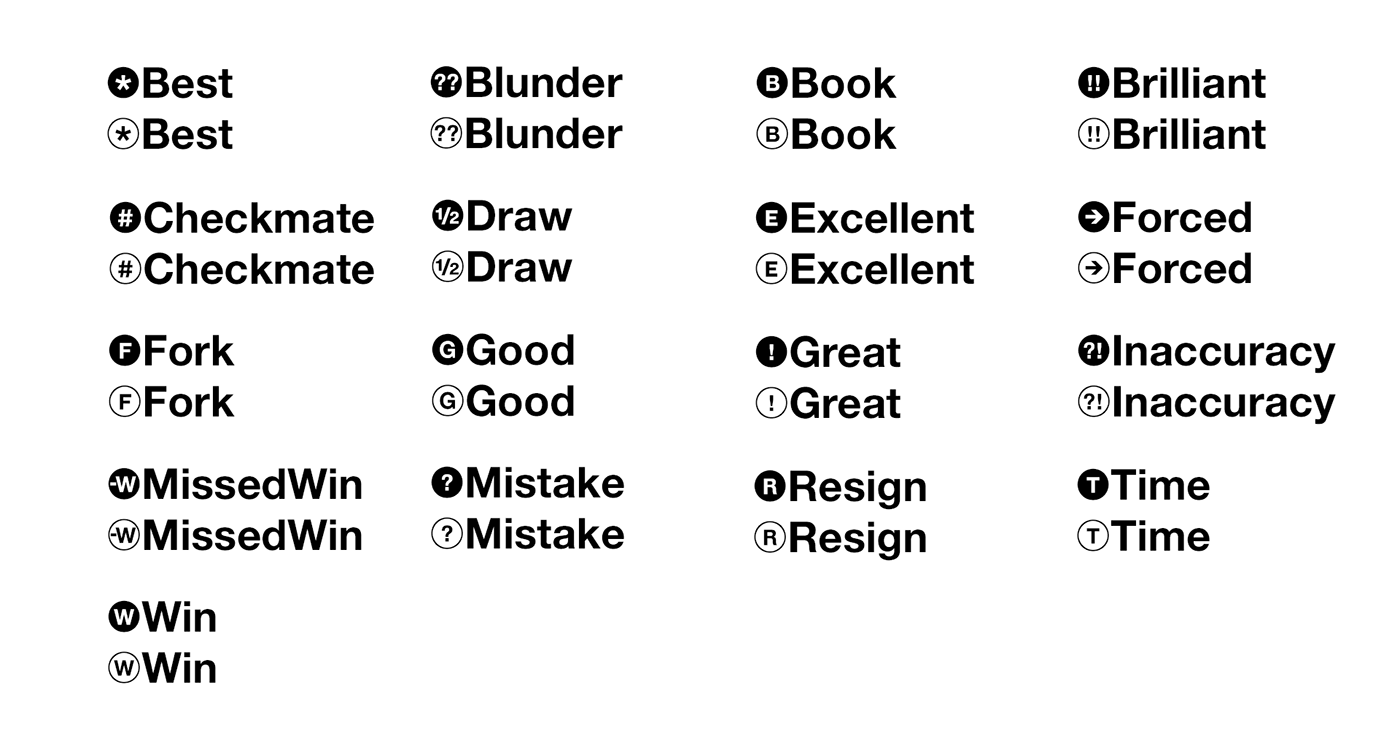
Furthermore: Chessvetica Annotation-ligatures allow you to write them in all common ways of writing text: first letter capitalized, full caps, or none at all!


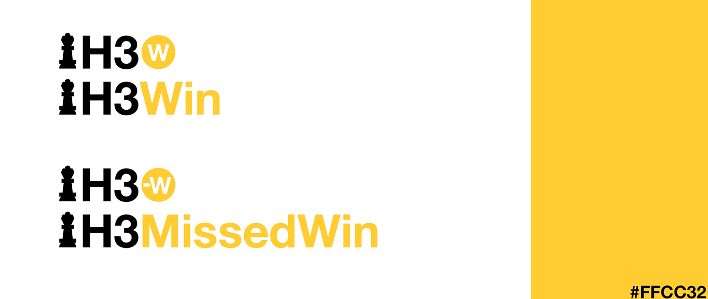
In order to give the annotations another option to be used a color system was developed. Inspired by the NCYTA Design Manual specific colors were chosen to aid the readability of the symbols.

Yellow is used to signalize wins or missed wins.
Orange and red tones signalize "bad" moves. Orange moves, such as Inaccuracies or Mistakes are less significant than blunders, the worst moves you could make / that put you at a significant disadvantage.


On the contrary cold tones such as green and blue tones are used to signal the opposite, a good move. Best, Excellent and Good moves are therefore colored green.
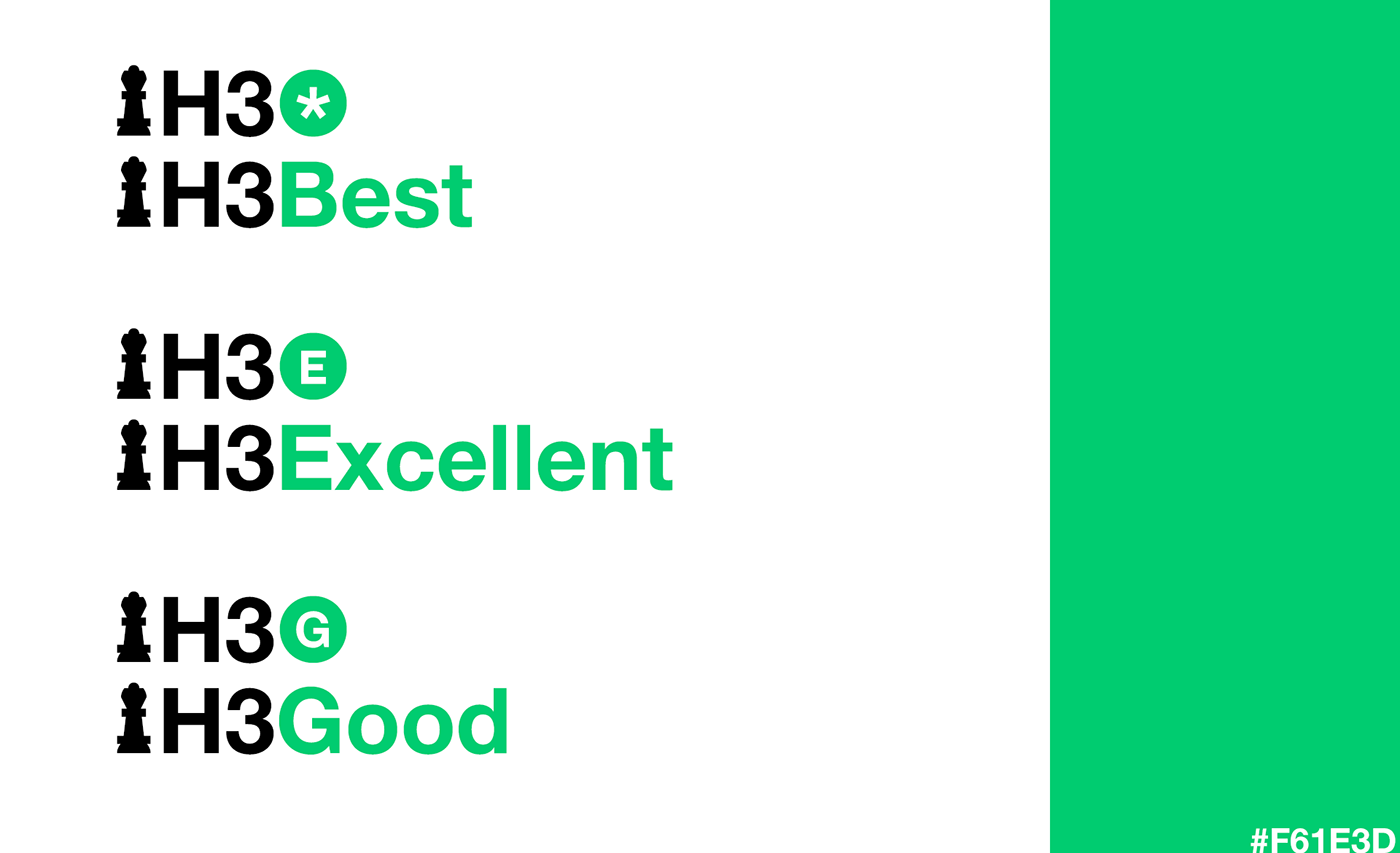
Surprisingly Great and Brilliant moves are one and two steps above the "Best" moves and have therefore been given other colors to differentiate the two.


Moves that are colored black (or white depending on the background) signalize the end of a game that does not mention a win, such as a draw or timeout.
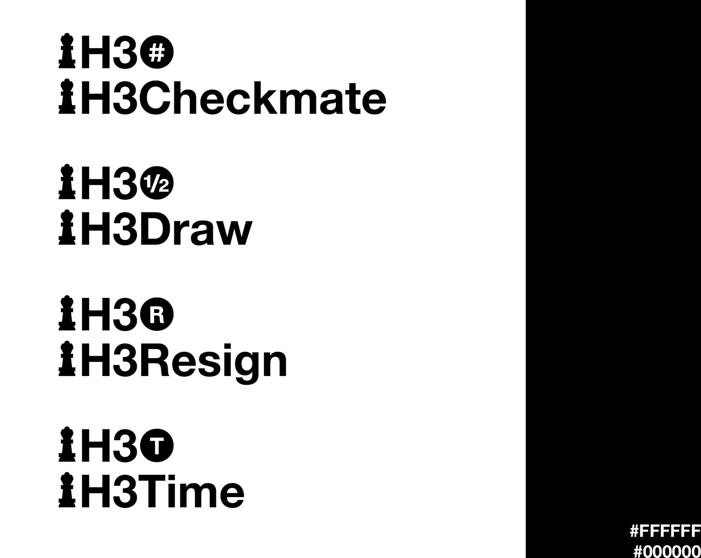
Grey colored moves describe moves not based on the quality of the move but rather the classification of it. Book moves describe moves that belong to a certain standardized practice / opening. Forced moves are moves that have to be made (such as the King being in check and is only able to move to one specific square) and Fork moves are moves that attack 2 or more pieces at the time where one piece has to be saved while the other is lost by the attacking piece.

In order to use the colors online I have put together a few HTML / CSS examples including class names and variables. Please take a look, enjoy and feel free to use them in your own project:
(Click on "Edit on Codepen" in order to get to the original project!)
(Click on "Edit on Codepen" in order to get to the original project!)
Try it out yourself!
Thank you very much for reading through this project. Here you can try out Chessvetica Regular directly inside the project without needing to download anything. Please enjoy!