


Uni Roar 2021
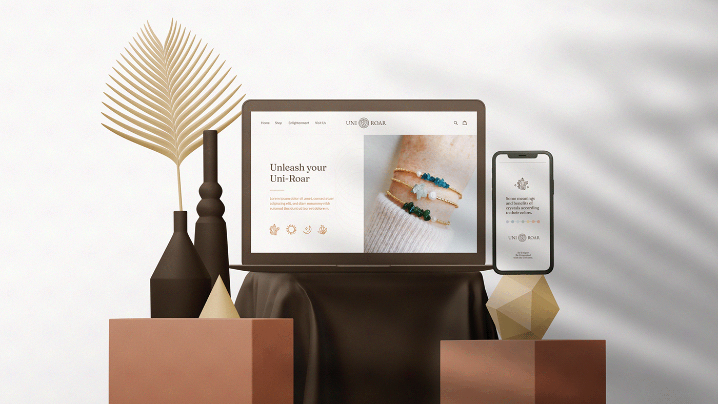
EN | Uni Roar is a company focused on curating stones, minerals and real jewels that help people of all ages to find spiritual healing, expanding these benefits sometimes to physical and psychological healing. Natural stones and crystals have energies and capacities known since ancient times. They can be used for therapies, energy protection, spiritual uplift and are able to help attract prosperity and awaken higher capacities.
PT-BR | Uni Roar é uma empresa focada na curadoria de pedras, minerais e jóias reais que auxiliam pessoas de todas as idades a encontrarem a cura espiritual, expandindo esses benefícios alguma das vezes à cura física e psicológica. As pedras e cristais naturais possuem energias e capacidades conhecidas desde a antiguidade. Podem ser usadas para terapias, proteção energética, elevação espiritual e são capazes de ajudar a atrair prosperidade e despertar capacidades superiores.

Creative Solutions: 1. Symbolically represent sovereignty and the lion's self-control and also making an analogy the very meaning of the brand name; 2. Assign strong expressions and elements that have connection with geometric shapes present in nature and in the universe; 3. Highlight in the symbol the power attributed to minerals found in nature, matter that is offered by the company.

Brand voice: Helping people of all ages to find alternative ways to unlock and rebalance energies and emotions with the help of minerals and precious stones, relieving negative sensations and activating good ones. Making room for the inner voice that seeks answers, healing and balance in life.


EN | Based on the idea of a defined symbol, the grid construction process was initiated using the grid of the well-known “the flower of life” as a base. Horizontal and vertical lines were also added at the intersections of the grid to arrive at a pleasant and visually harmonic symbol. Through the study of forms and gestalt, we are able to perfectly see the face of a lion with a precious stone on its forehead, which can also represent the connection with the universe.
PT-BR | A partir da ideia de símbolo definida, o processo de construção do grid foi iniciado utilizando a grade da conhecida “a flor da vida” como base. Também foram acrescentadas linhas horizontais e verticais nas intersecções da grade para chegar em um símbolo agradável e visualmente harmônico. Através do estudo das formas e da gestalt, conseguimos ver perfeitamente o rosto de um leão com uma pedra preciosa na testa, que também pode representar a conexão com o universo.

EN | The lion symbolizes power, royalty, wisdom, authority, youth, resurrection, security, protection and justice. Associated with lust and pride, in addition to being a combative animal but it can suggest healthy aggressive impulses.
PT-BR | O leão simboliza o poder, a realeza, a sabedoria, a autoridade, a juventude, a ressurreição, a segurança, a proteção e a justiça. Associado à luxúria e ao orgulho, além de ser um animal combativo mas que pode sugerir impulsos agressivos saudáveis.


EN | The typography chosen to compose the logo is a serif called “EB Garamond”. A font that was modified in order to keep shapes that represented the idea of a more elegant, mystical and delicate brand. The optical adjustment was applied visually forming a fit between them and making the reading more pleasant. Many luxury brands use capital letters to show their grandeur and also empower their users.
PT-BR | A tipografia escolhida para compor o logotipo é uma serifada chamada “EB Garamond”. Uma fonte que foi modificada buscando manter formas que representassem a ideia de uma marca mais elegante, mística e delicada. O ajuste óptico foi aplicado formando visualmente um encaixe entre elas e tornando a leitura mais agradável. Muitas marcas de luxo usam maiúsculas para mostrar sua imponência e também empoderar seus usuários.


EN | The main palette chosen to compose the brand is accompanied by earthy tones, such as beige, brown and gold. These are colors that convey simplicity and peace, but we also have the feeling of something valuable, wise and spiritual. A secondary palette was also defined, which serves as a support to compose the application of visual identity, especially in digital media.
PT-BR | A paleta principal escolhida para compor a marca é acompanhada por tons terrosos, como bege, marrom e dourado. São cores que transmitem simplicidade e pacividade, porém, também temos a sensação de algo valioso, sábio e espiritual. Também foi definido uma paleta secundária, que serve de apoio para compor a aplicação da identidade visual, principalmente nos meios digitais.


EN | Geometric patterns are at the base of all forms found in nature, from the structure of the atom to the formation of galaxies, through flowers and animals, including the human being itself. It represents the connection of the human with the sacred, the universe with its perfect circle shape and its geometric elements inside representing the cosmos.
PT-BR | Os padrões geométricos estão na base de todas as formas encontradas na natureza, desde a estrutura do átomo até a formação de galáxias, passando pelas flores e animais, incluindo o próprio ser humano. Representa a conexão do humano com o sagrado, o universo com sua forma em circulo perfeito e seus elementos geométricos no interior representando o cosmos.


Director/Designer: Vitor Linhares
Pesquisa e redação: Ellen Ventura
© Studio Vitor Linhares
Obrigado pela visita!
Thanks for watching
Follow me on Instagram


