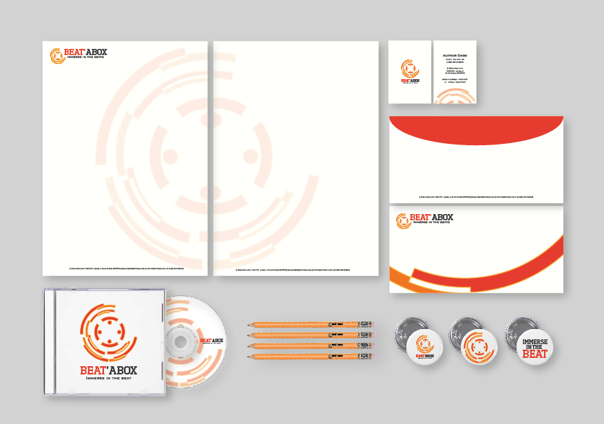
The symbol of the logo is mainly represented by music beats curved in a circular shape. roundness of the logo represents unity and being all-rounded. The logo together with the vibrant colours reflects movement and energy, potraying dynamism. Right in the middle of the logo, is 4 human figures with their hands stretched out towards one another to form a circle. They represent music enthusiasts coming together, young or old.


