


Busup
Busup is a mobility service provider specialized in efficient and flexible commuting that wanted to update its proposal to go from a local B2C approach to a global B2B. We worked on a new strategy, and a new visual and verbal identity.
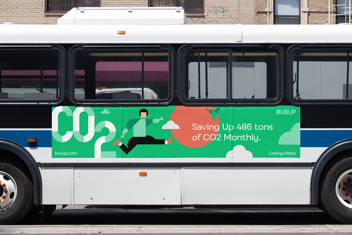
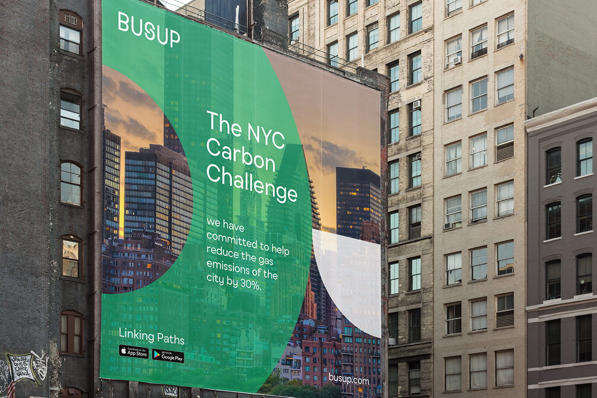
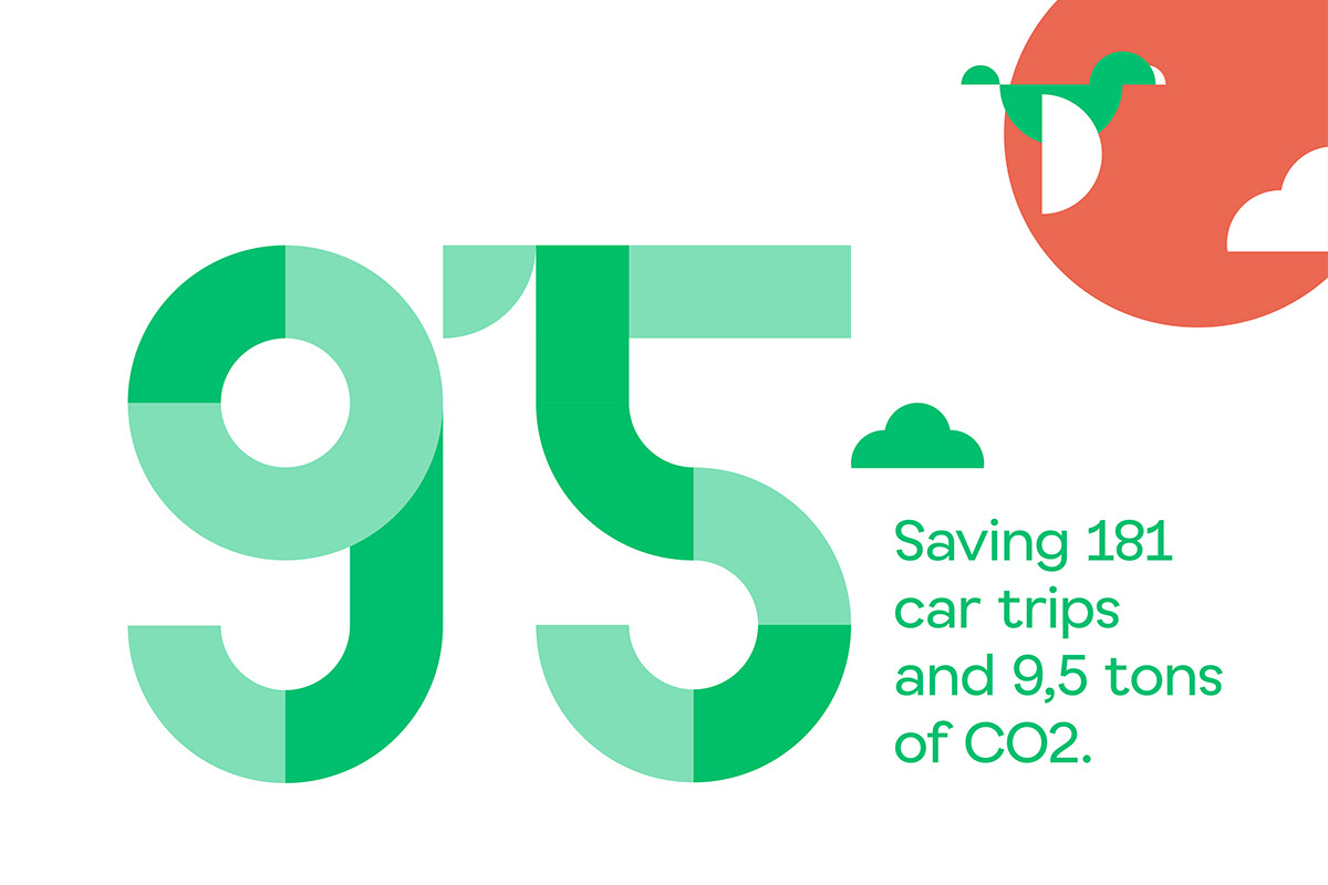
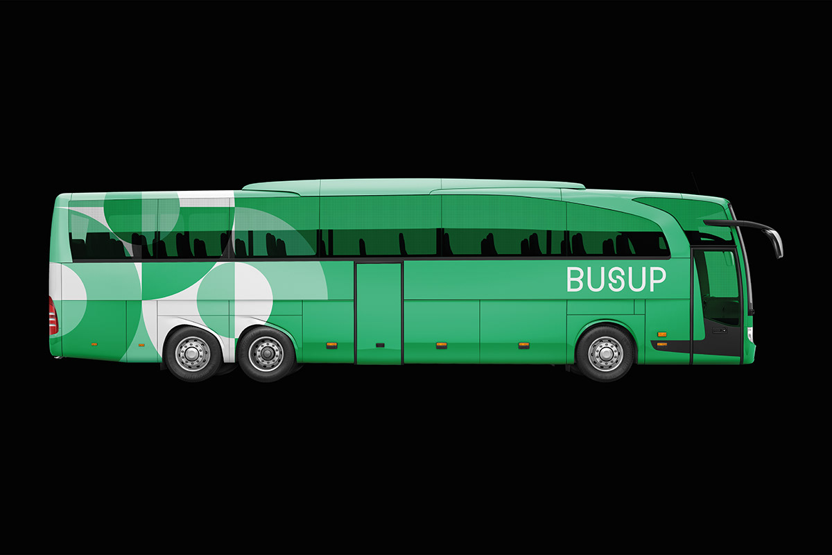
To do so, we created a new prominent brand under the big idea of Busup as a link. A link between cities, people, companies, and sustainability. We know that brands are not static, they must go further than expected. Hence, we shaped a dynamic logotype built through the “S”, a way to ground the brand's disruptive proposal of sharing mobility. Moreover, to adapt the brand to its different audiences, we developed two visual languages: one for companies built through fragments of Busup's symbol, and another for the existing Busup users, based on ad hoc illustrations with a friendly approach.

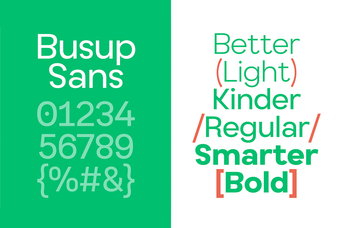
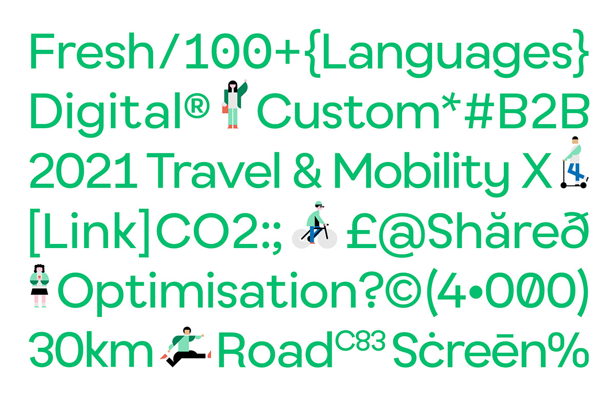
Busup bet on its typography to reinforce its own identity. In this way borns Busup Sans, created in collaboration with Pedro Arilla. A geometric typeface with a colorful dress, and a digital-first approach, shaping a font optimized for legibility on screen. We can highlight its ample proportions, the large x-height, or how we added some bold nature to its terminals.