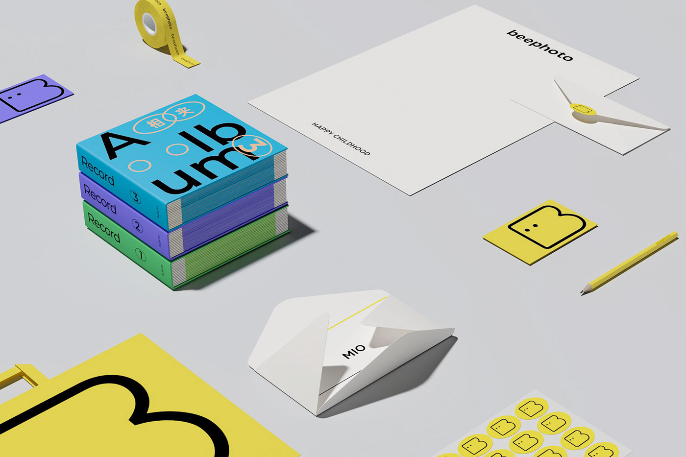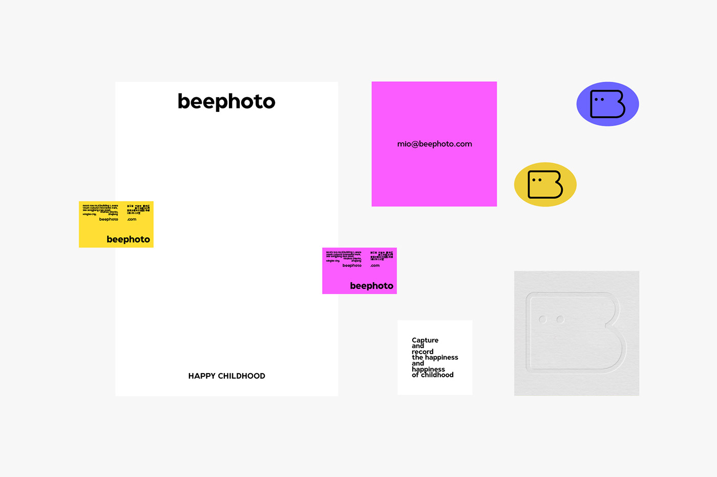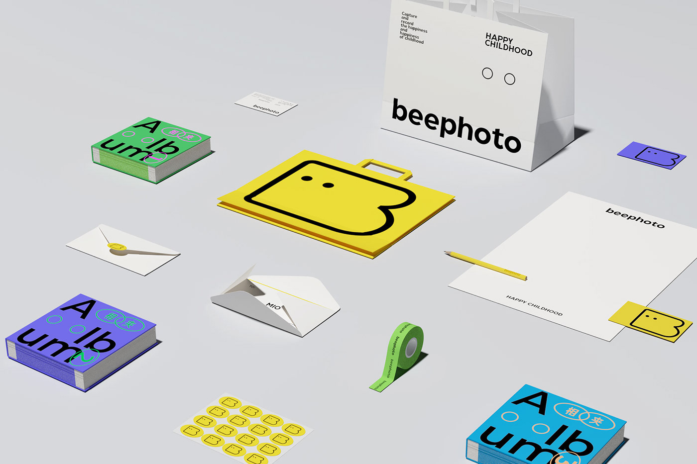
beephoto是一家以新生儿、儿童、亲子为主的儿童摄影店,店铺位于浙江宁波。
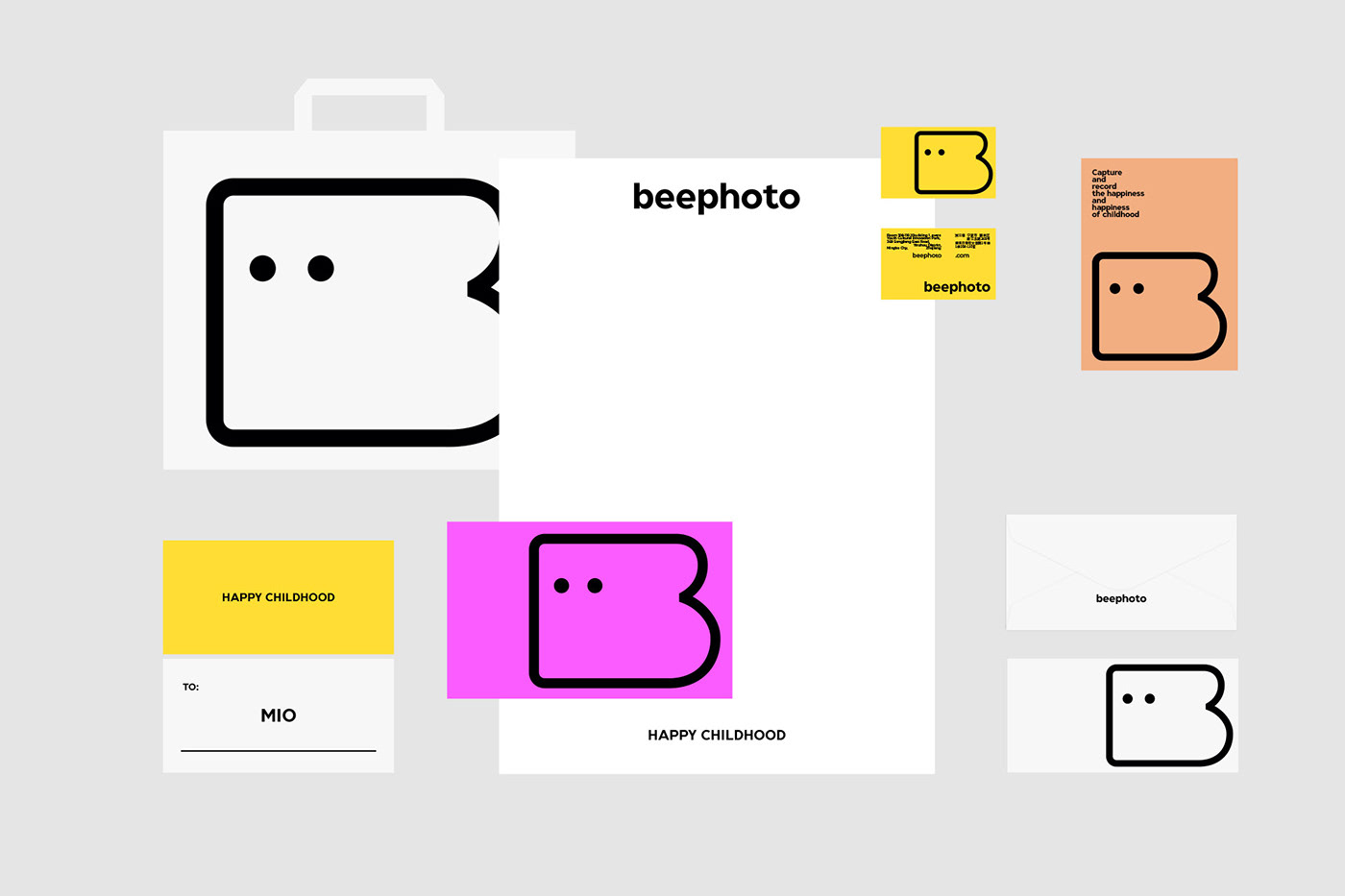
以高收入人群为主,私人定制化高端影像记录服务。
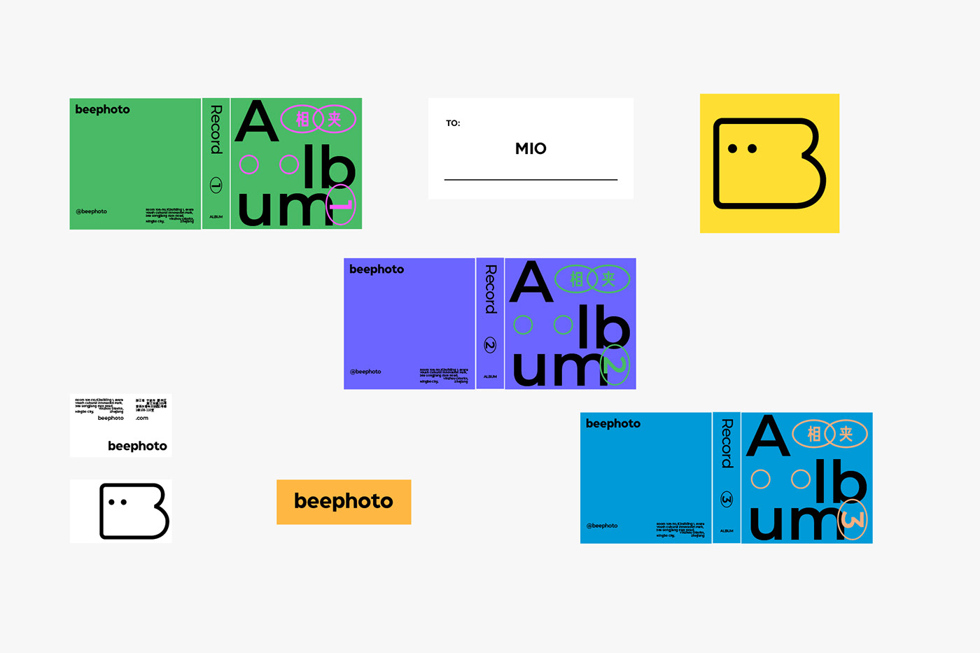
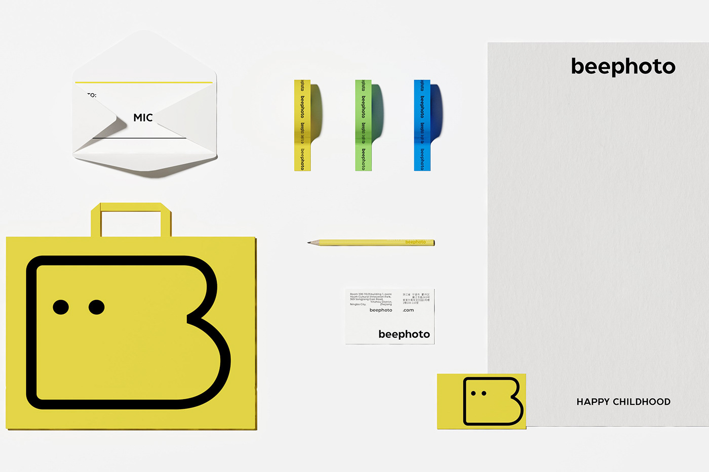
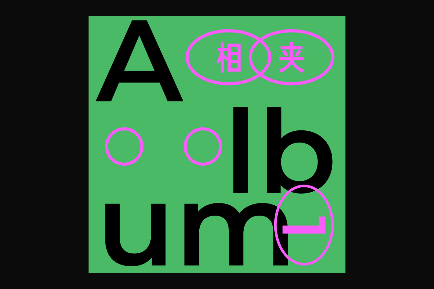
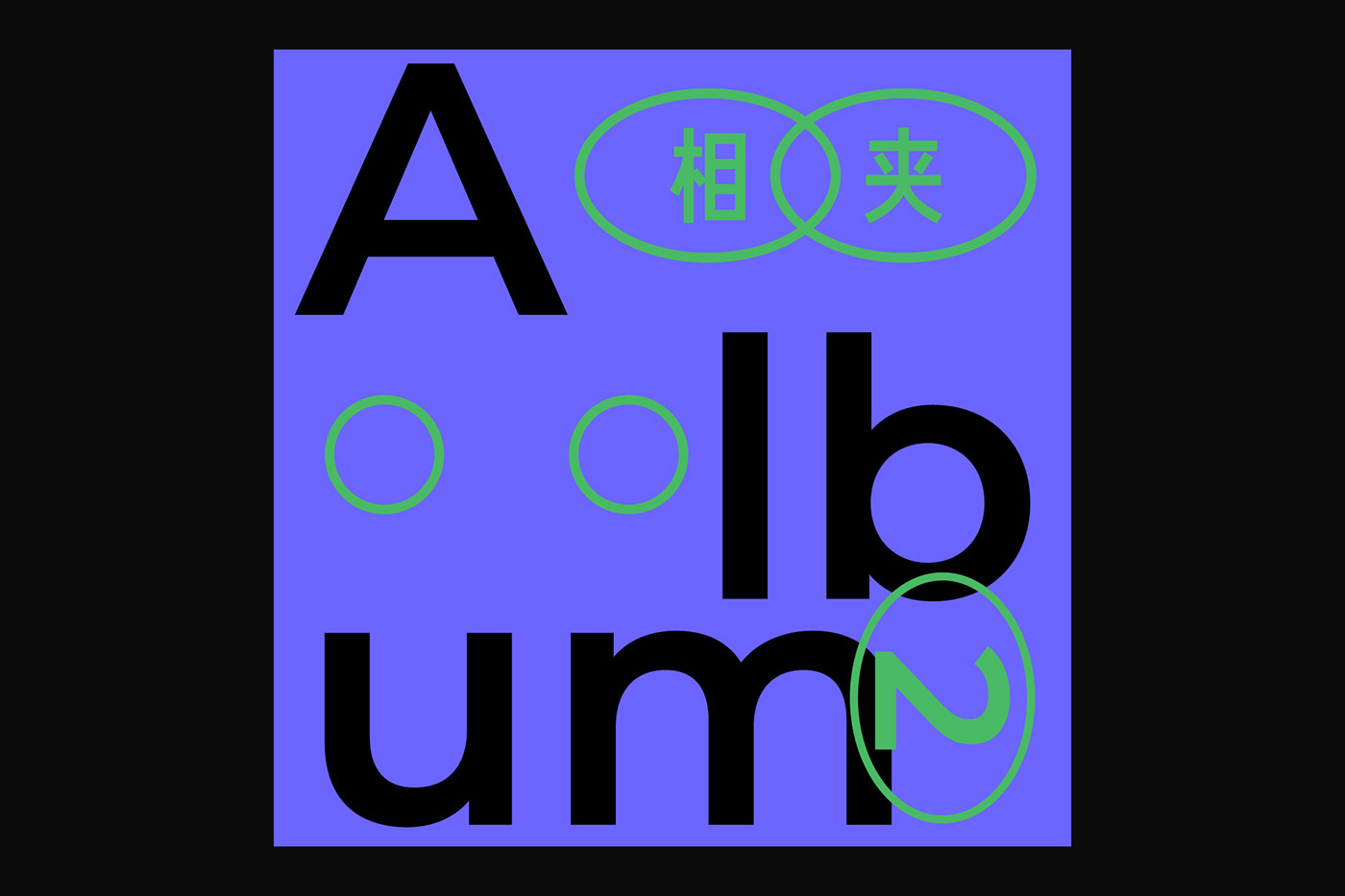
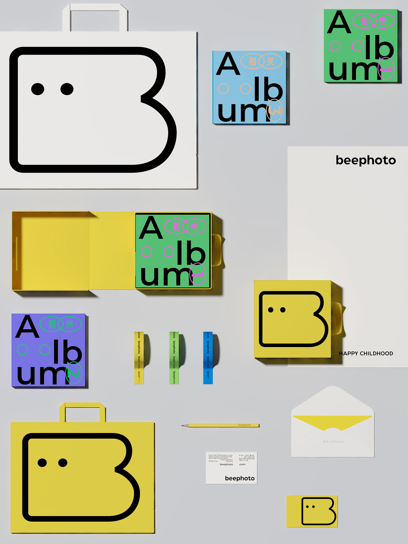
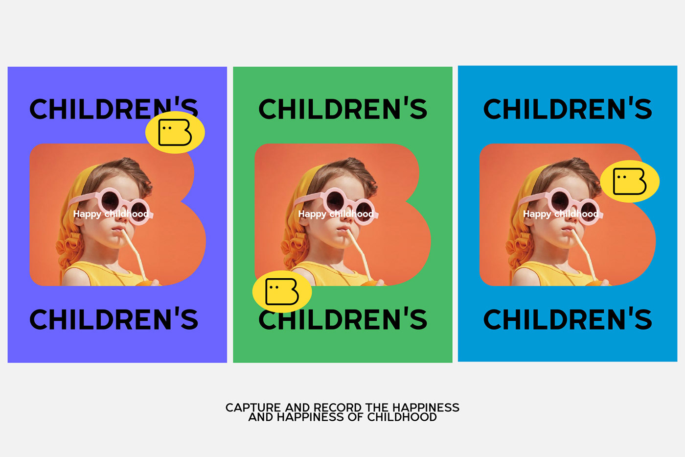
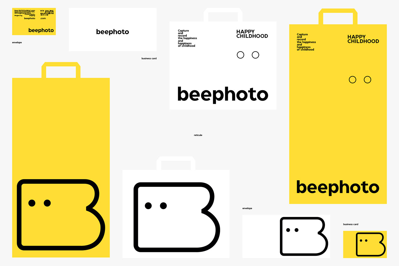
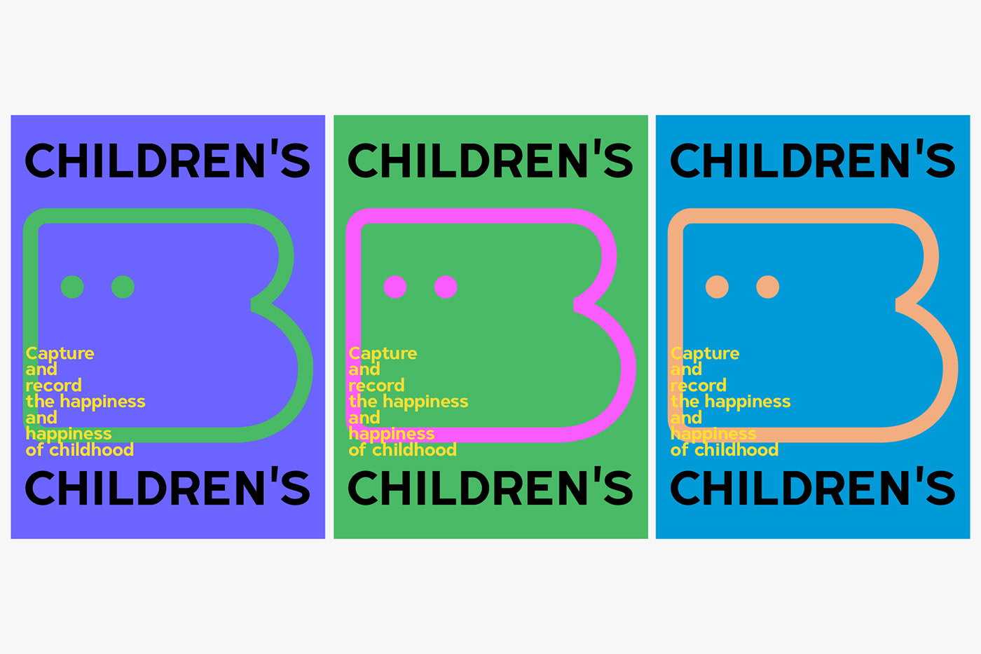
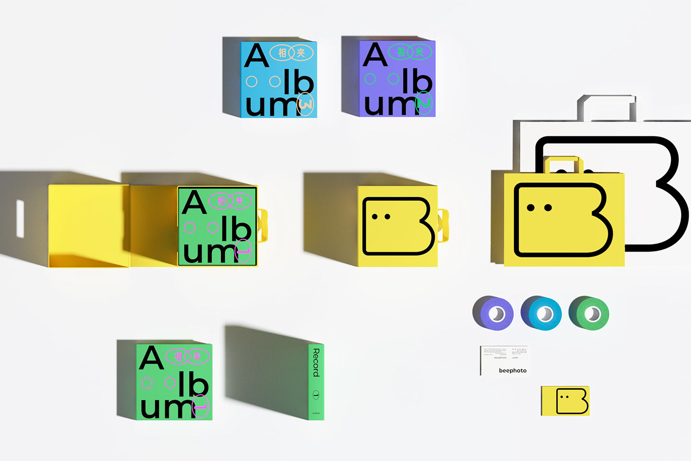
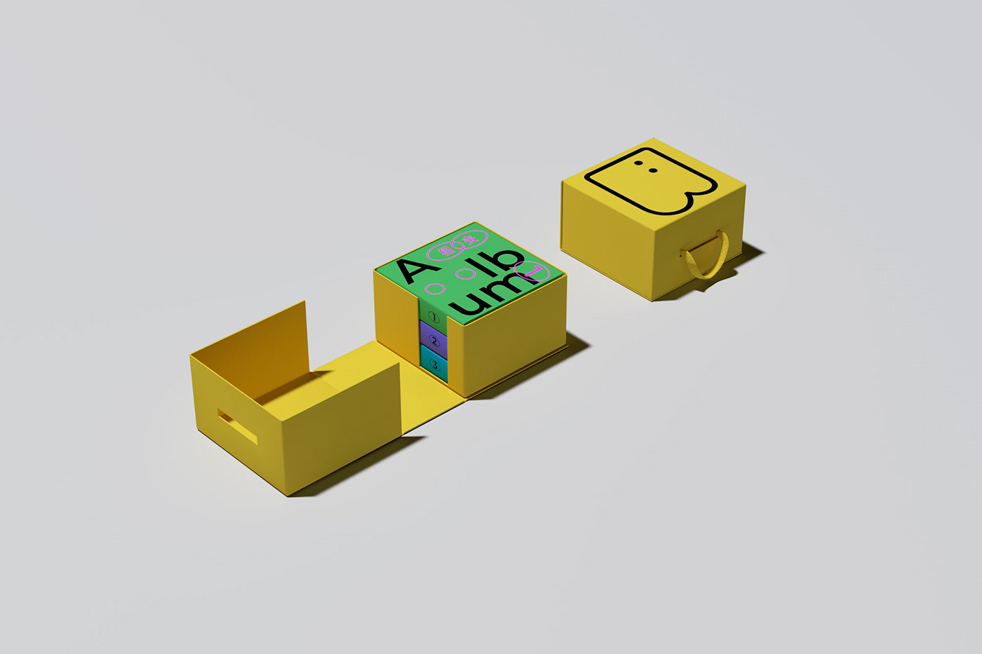
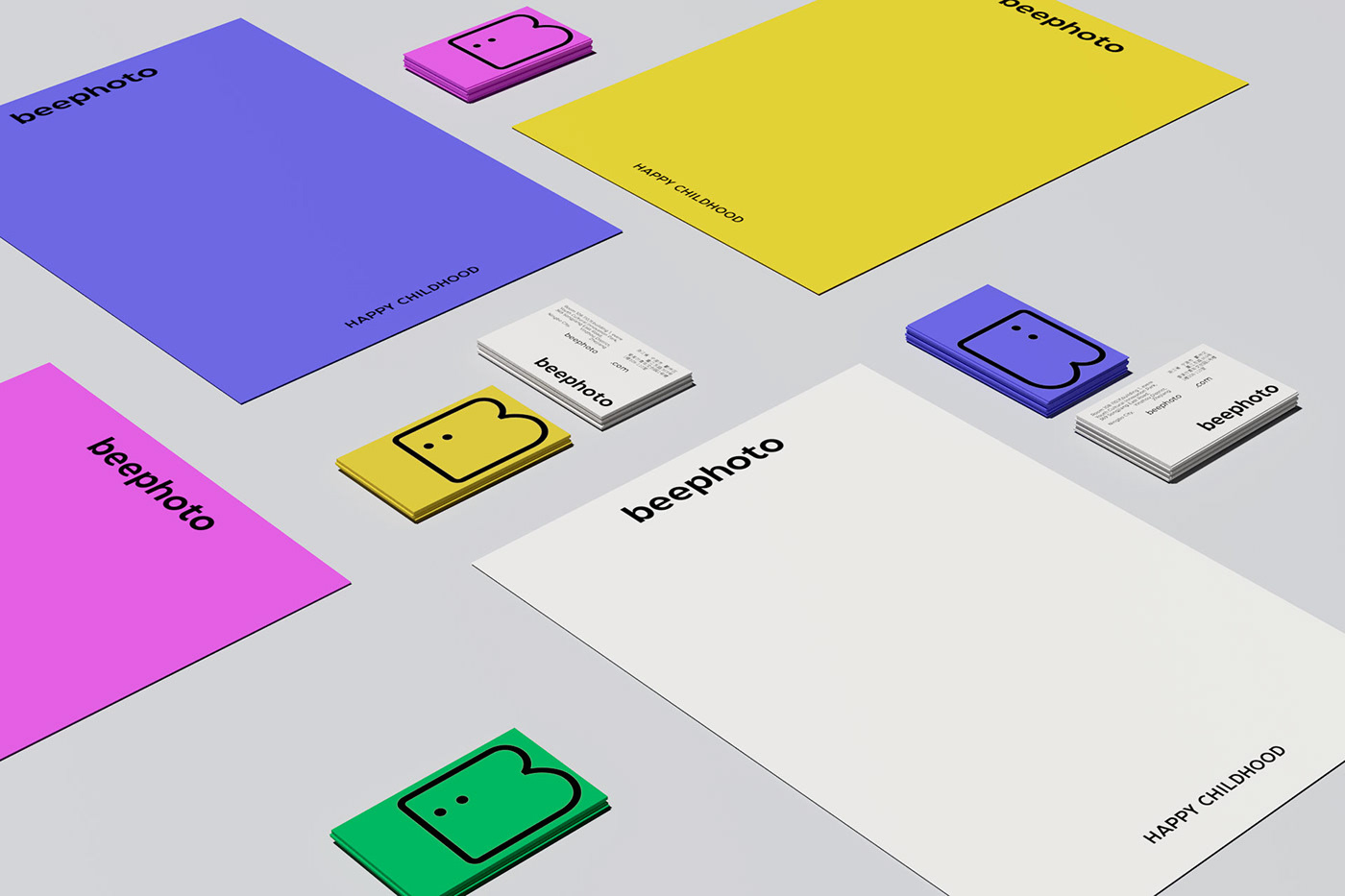
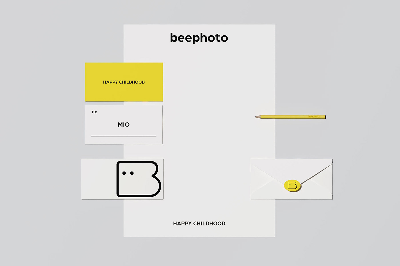
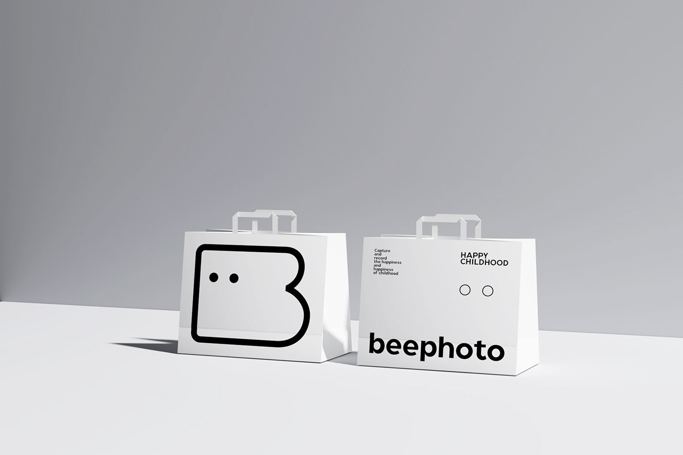
为了展现beephoto的服务核心特点,设计采用了简单直接的视觉沟通方式。
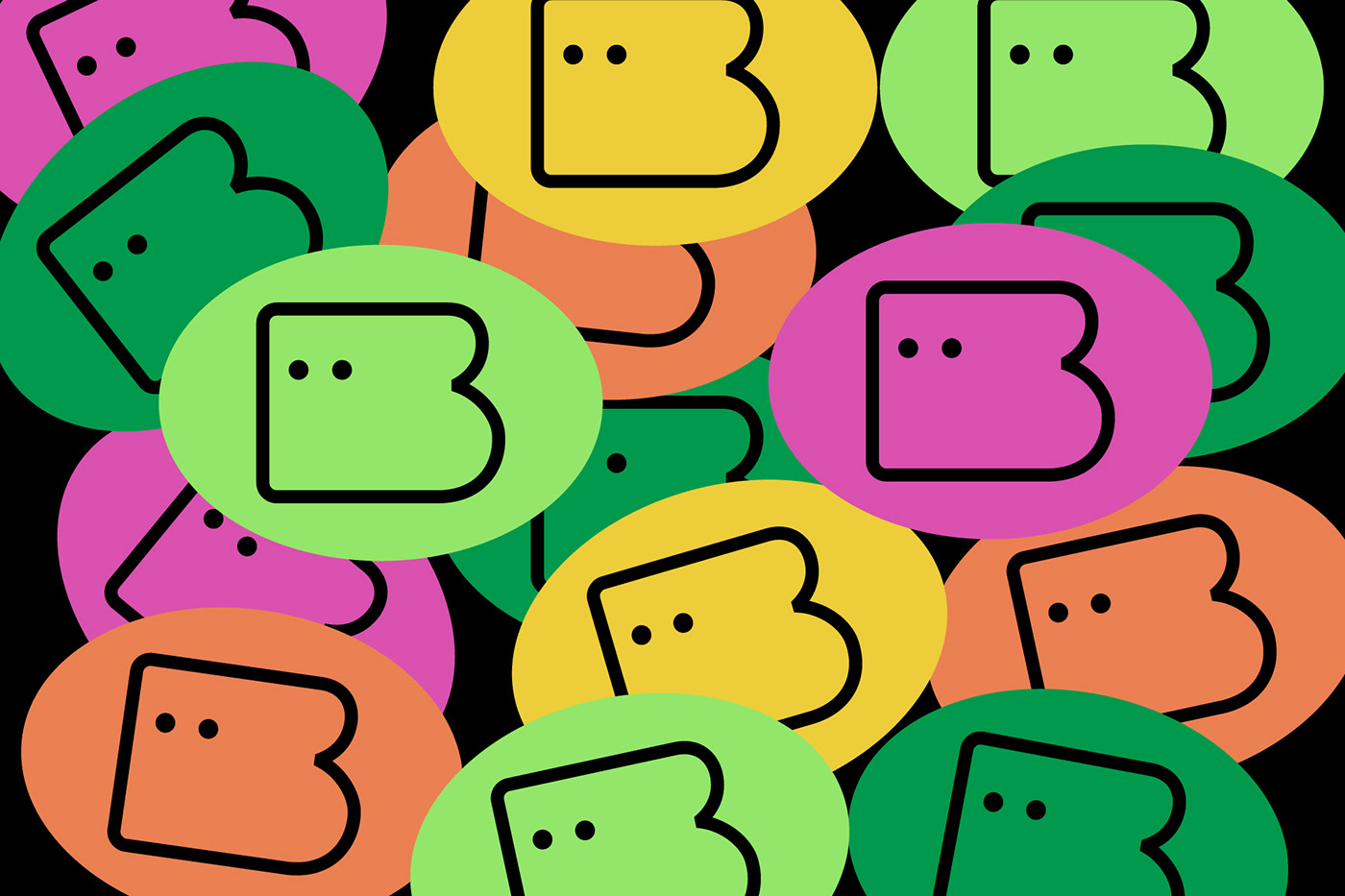
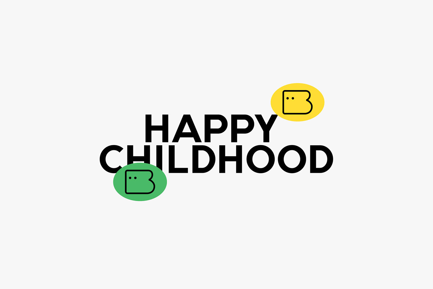
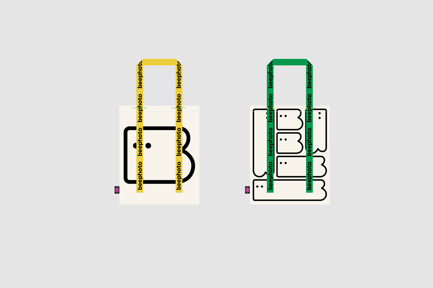
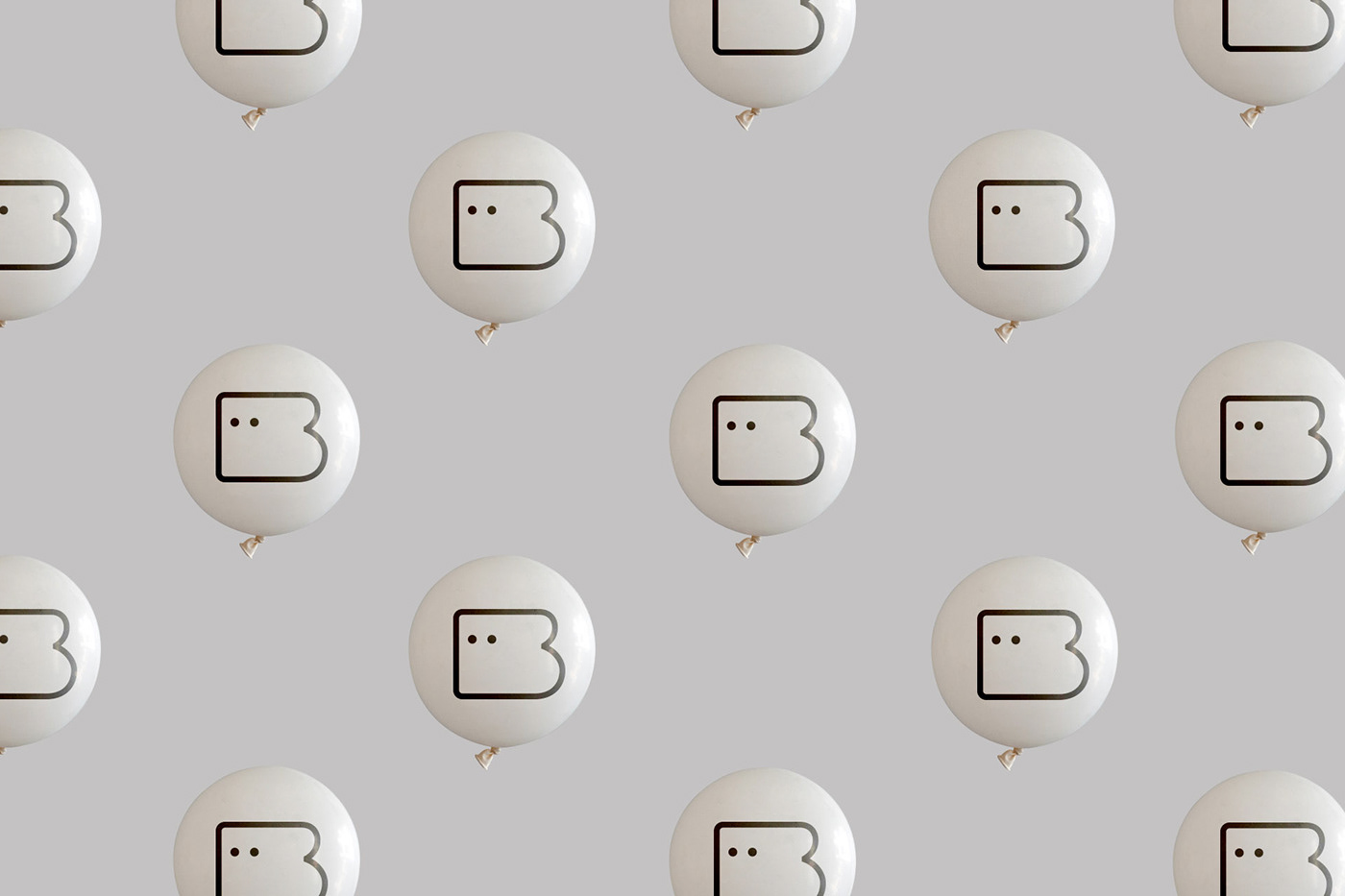
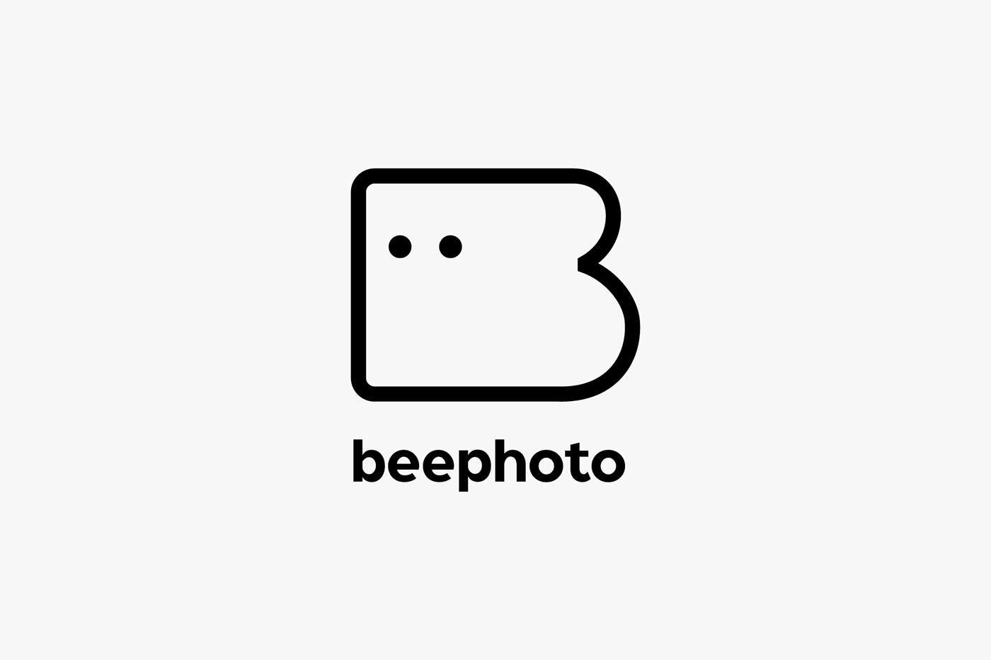
标识外轮廓处理是一个B的形状,两个圆点(这里转化为眼睛,重叠后又是一个镜头)为字母“OO”的融合。
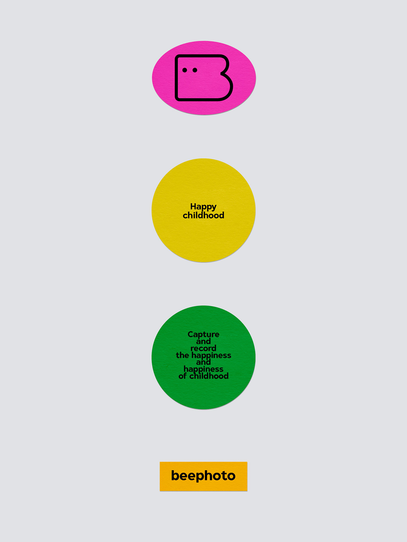
来承载记录幸福。非常友好和平易近人。 造型是极简的,清晰不失童趣。
以高收入人群为主,私人定制化高端影像记录服务。
为了展现beephoto的服务核心特点,设计采用了简单直接的视觉沟通方式。
标识外轮廓处理是一个B的形状,两个圆点(这里转化为眼睛,重叠后又是一个镜头)为字母“OO”的融合。
来承载记录幸福。非常友好和平易近人。 造型是极简的,清晰不失童趣。
Beephoto is a children's photography shop focusing on newborns, children and parents and children. The shop is located in Ningbo, Zhejiang Province.
Private customized high-end image recording services mainly for high-income people.
In order to show the core characteristics of beephoto service, the design adopts a simple and direct visual communication method.
The outer contour processing of the logo is a B shape, and the two dots (converted into eyes here, and then a lens after overlapping) are the fusion of the letter "OO".
To record happiness. Very friendly and approachable. The shape is simple, clear and childlike.