


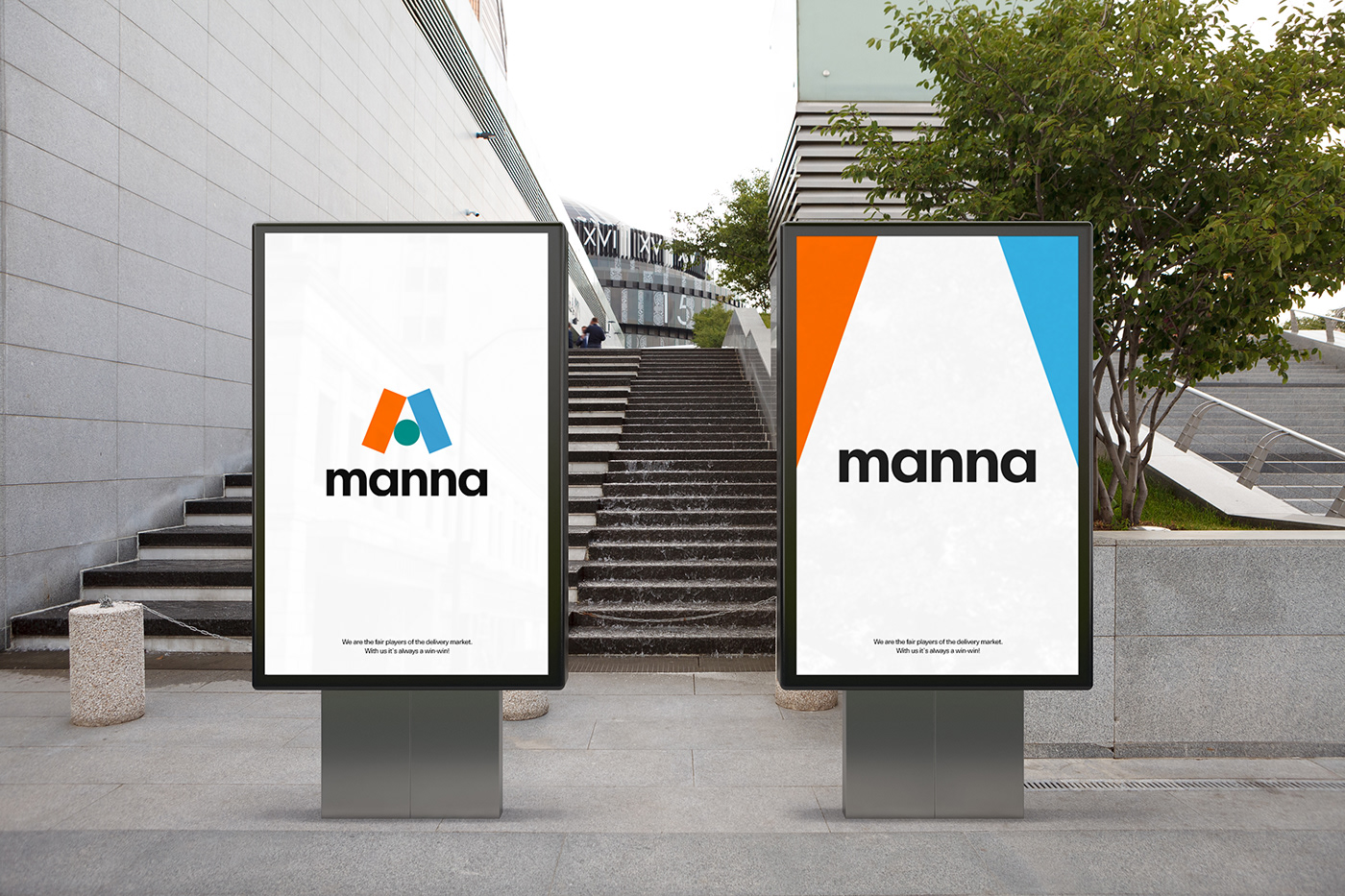
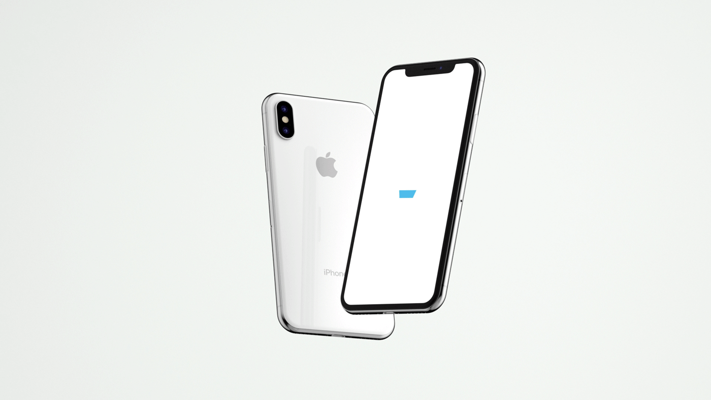
Brand Overview
We have developed a total brand identity system for Manna Company, which successfully operates the nationwide delivery agency service brand Manna Plus and the same-day delivery service Manna Flex. As the delivery market grows, we represented the philosophy of Manna: freedom, fairness, and sharing in various business areas through logo variations and multiple applications to create a system where small businesses owners and customers can coexist.

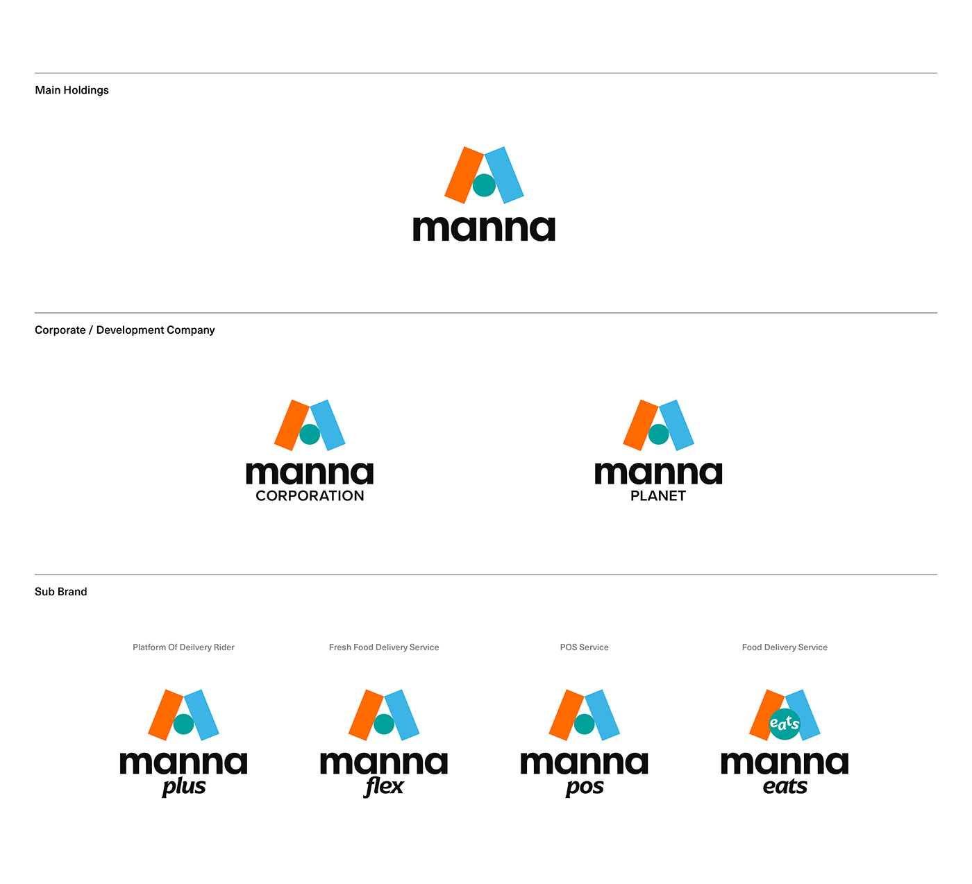
Brand Architecture
Four family brands are closely connected and operated, centering on Manna's holdings company and the IT solution company, Manna Planet. The design accurately specifies each brand while maintaining a consistent identity of a "mobility service company that creates co-prosperity amongst small businesses."


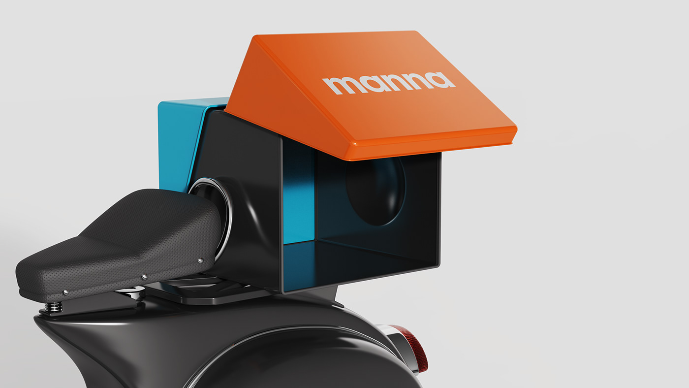
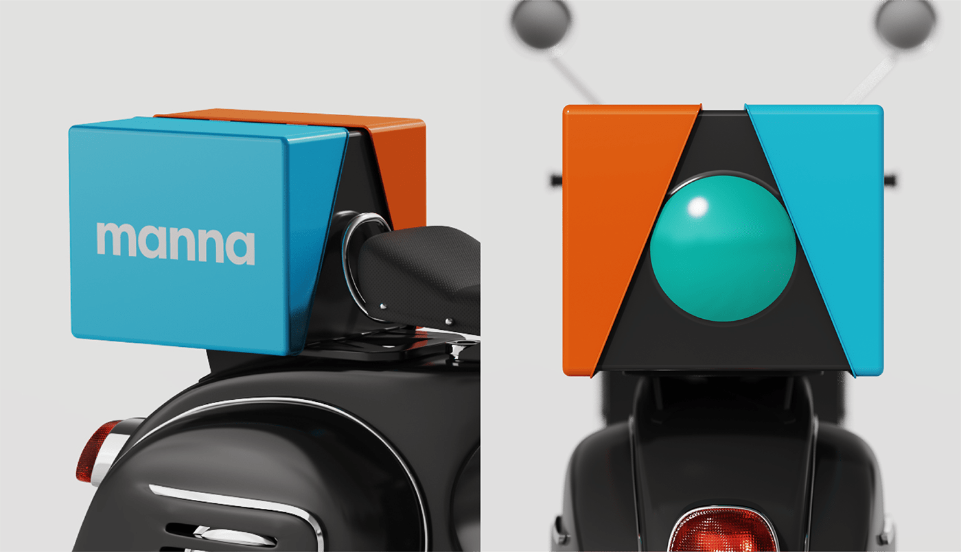
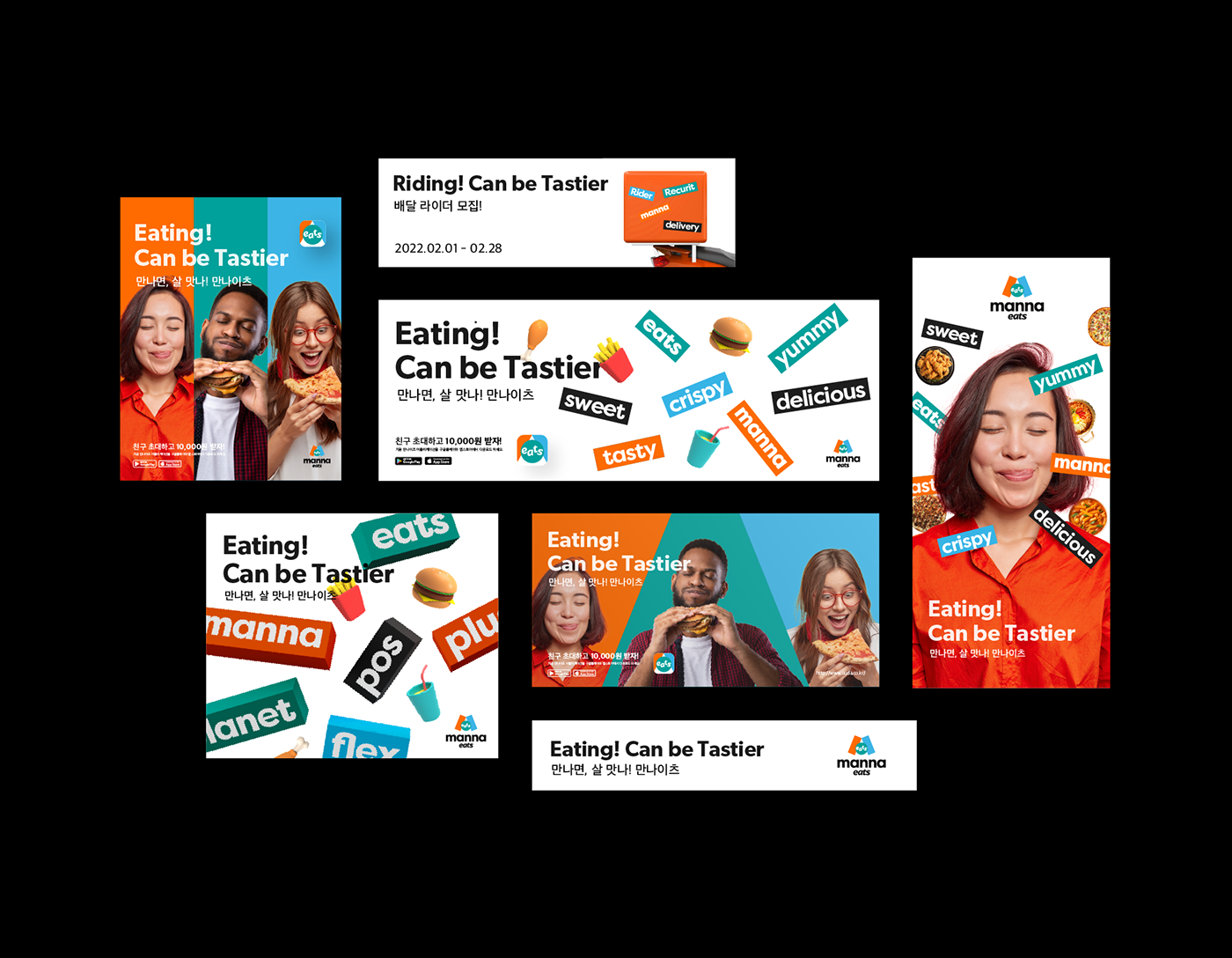
Key Visual 1
Manna's Persona is the "fair player" who creates co-prosperity through free and fair competition in small business communities.
Sportsmanship is a concept that effectively conveys the fair player image.
We expressed this energy and sportiness through design. The three-color line and shape&rotate graphics become colorful motifs, enabling fun and accessible communication with customers.
Sportsmanship is a concept that effectively conveys the fair player image.
We expressed this energy and sportiness through design. The three-color line and shape&rotate graphics become colorful motifs, enabling fun and accessible communication with customers.


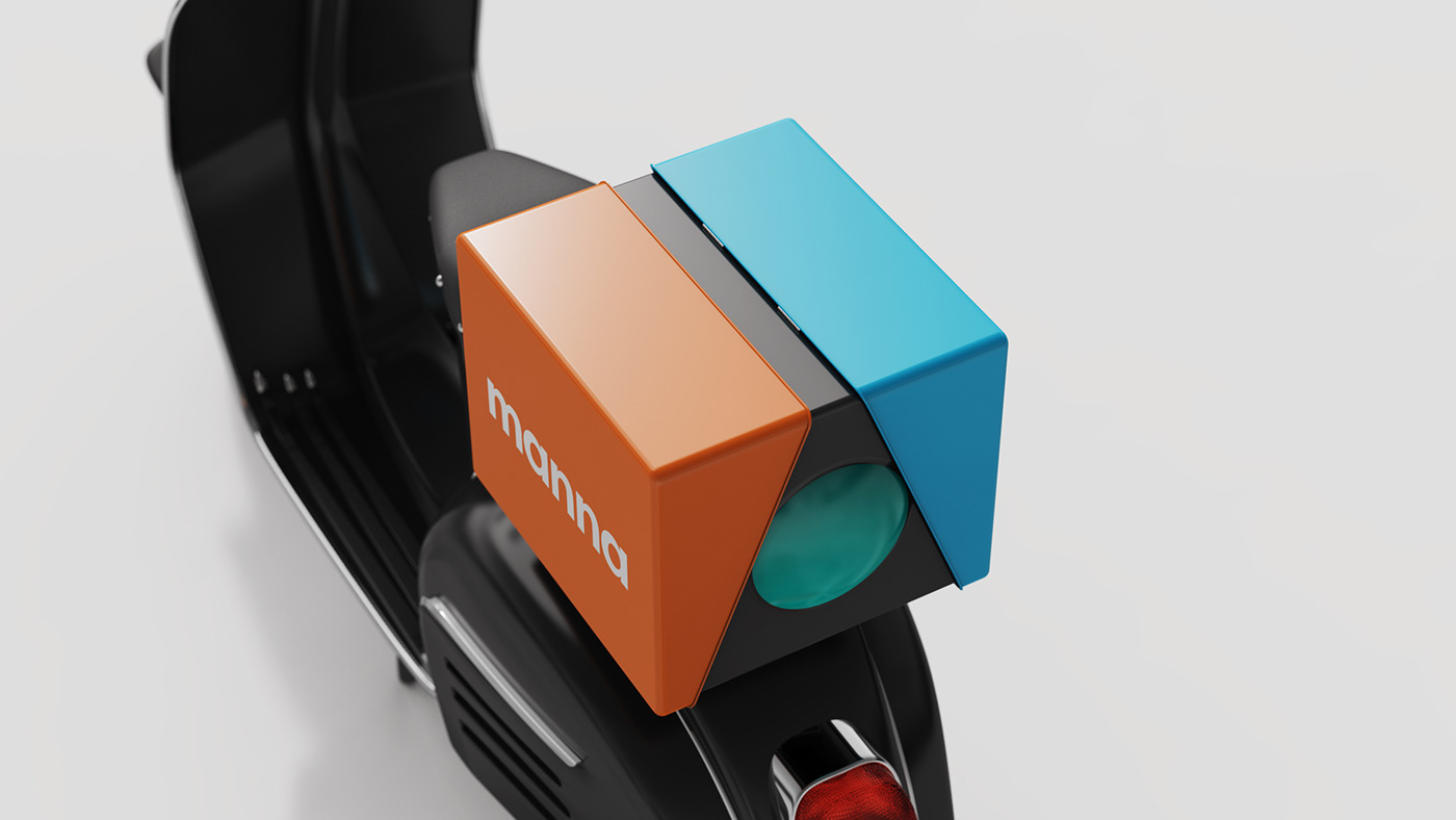
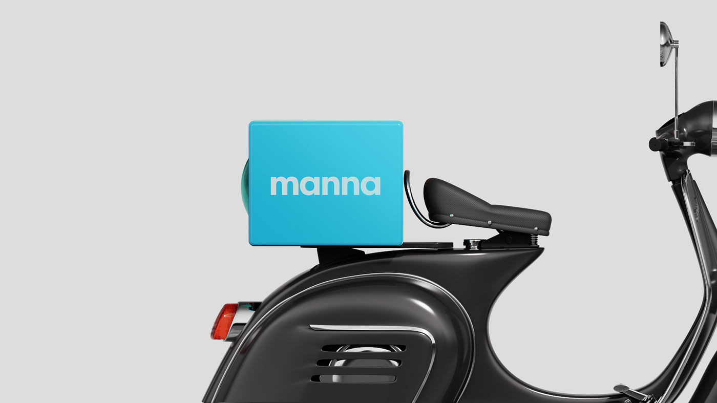
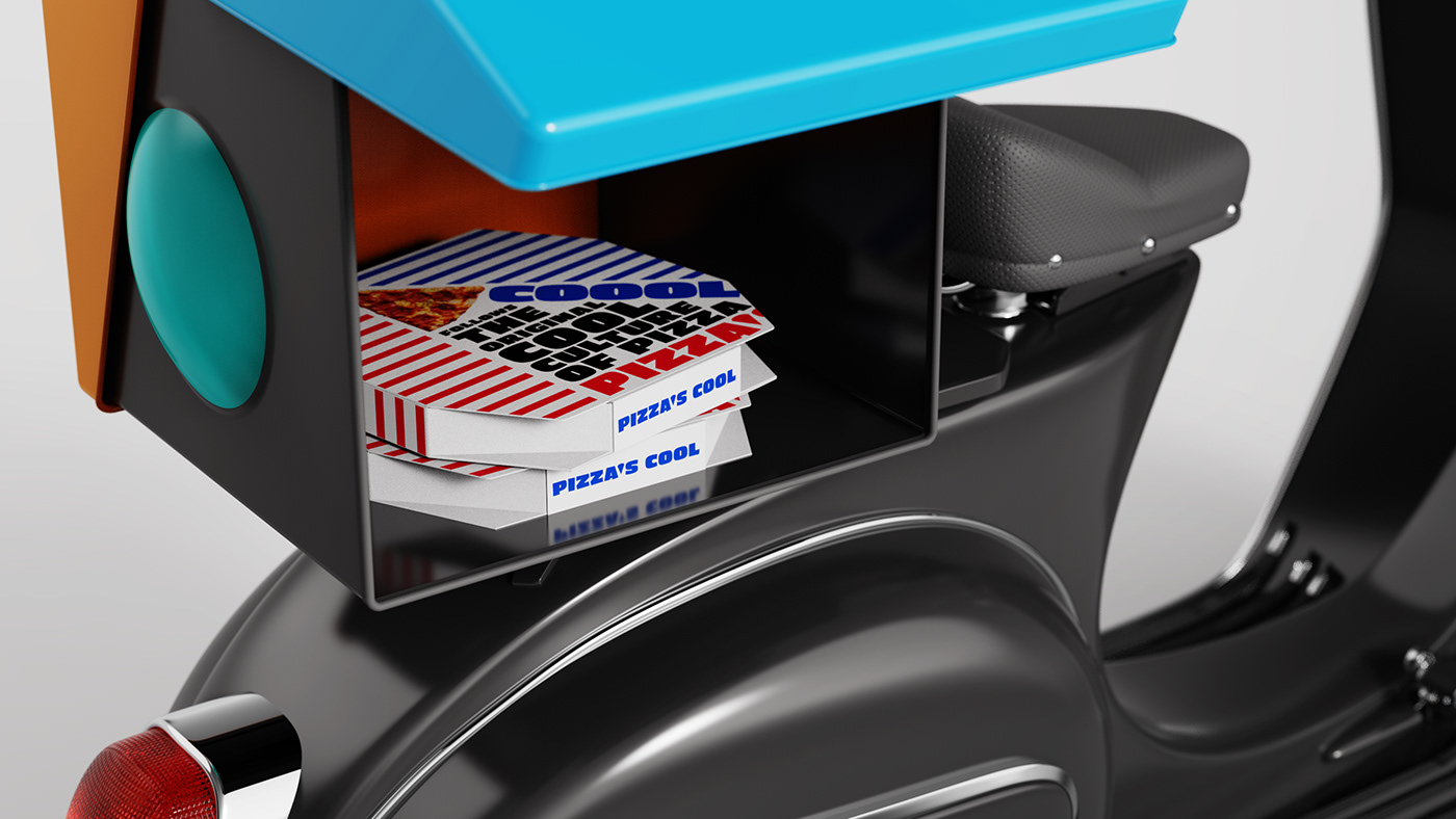
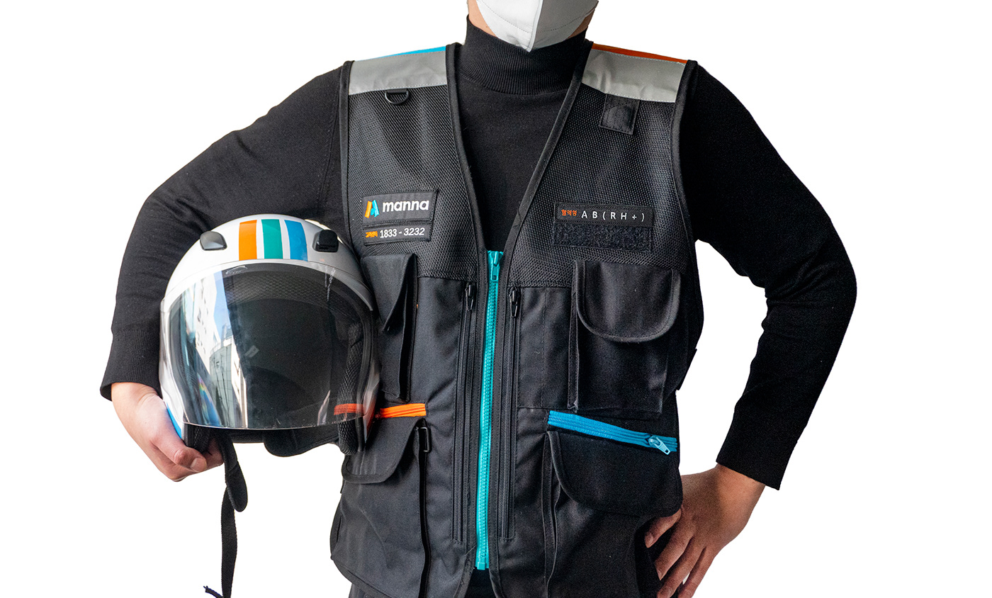
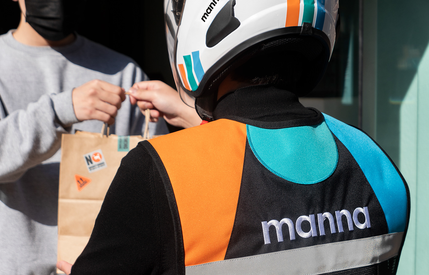
Delivery Rider Applicaitons
We gave the Manna rider application special attention. Not only do they unify the graphic language, but they also act as a creative safety resource through vests and delivery boxes.
The rider's blood type is attached with velcro to the vest for easy recognition. The customer center contact information is designed to protect the rider's life in case of accidents.
The rider's blood type is attached with velcro to the vest for easy recognition. The customer center contact information is designed to protect the rider's life in case of accidents.

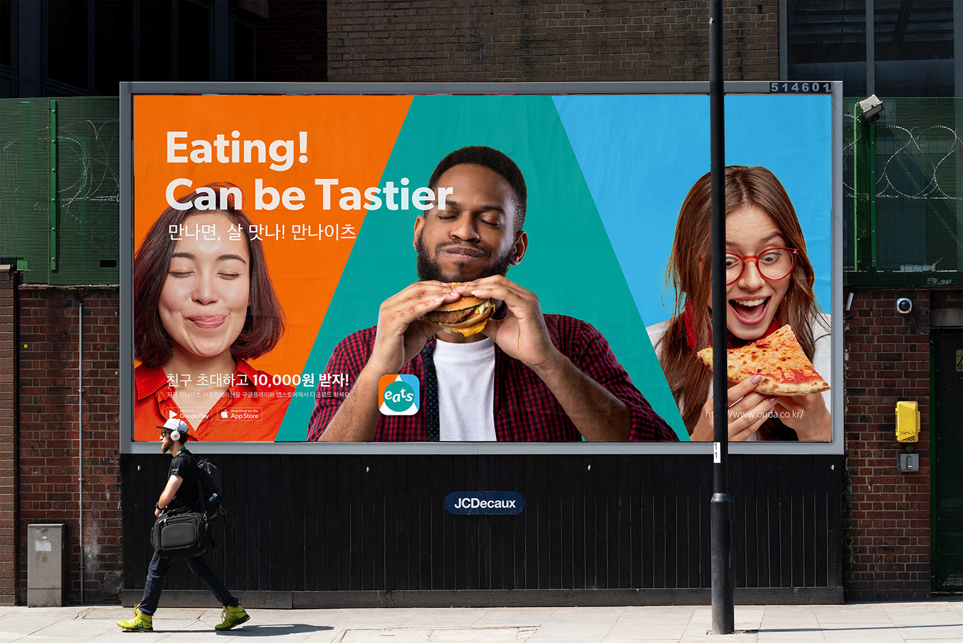
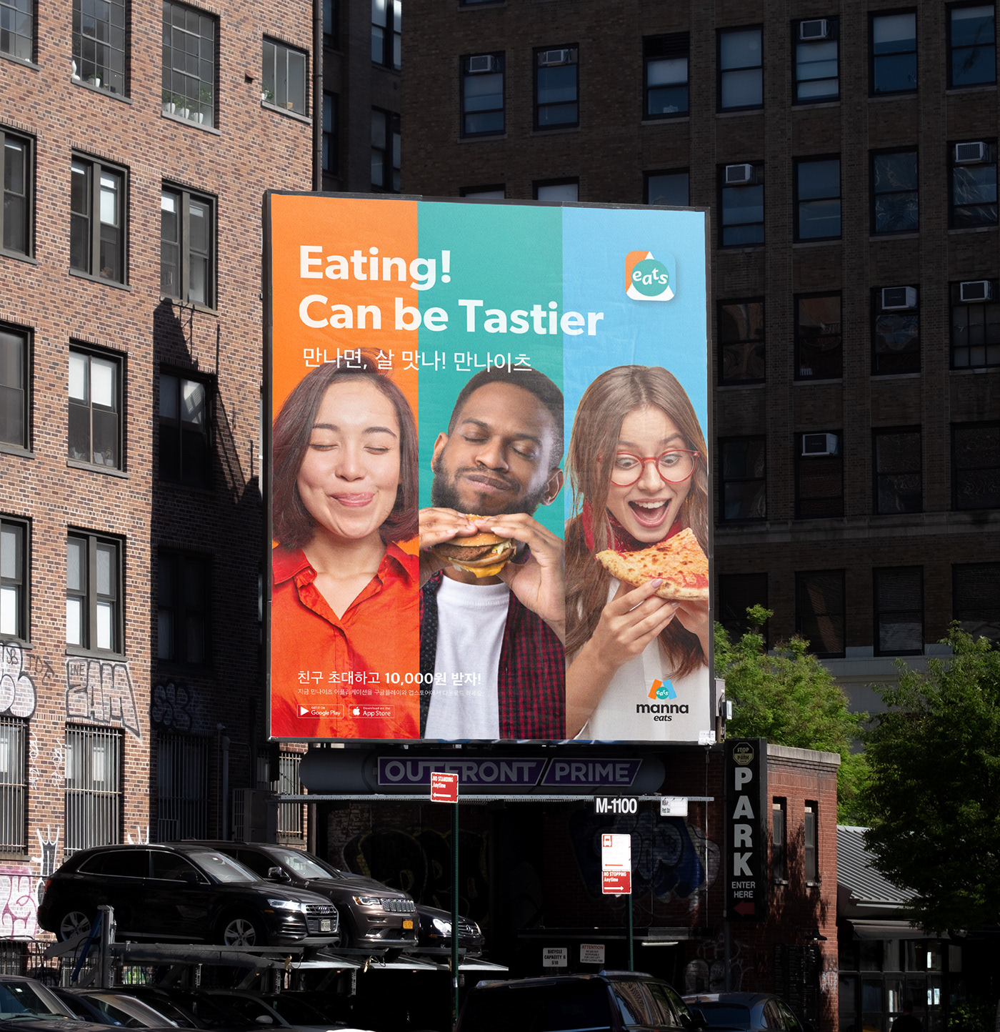
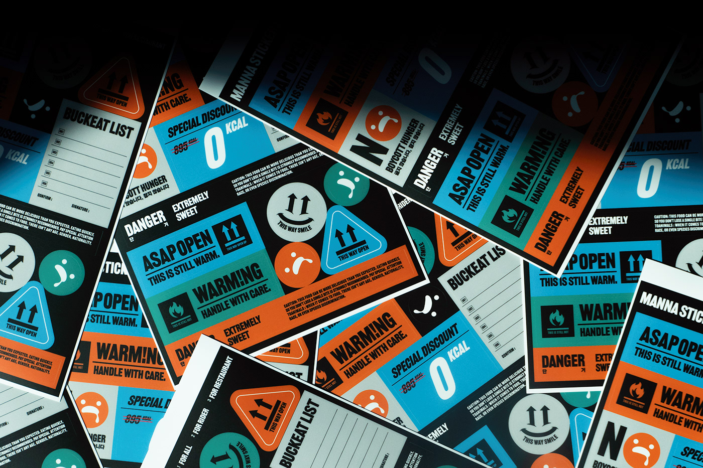
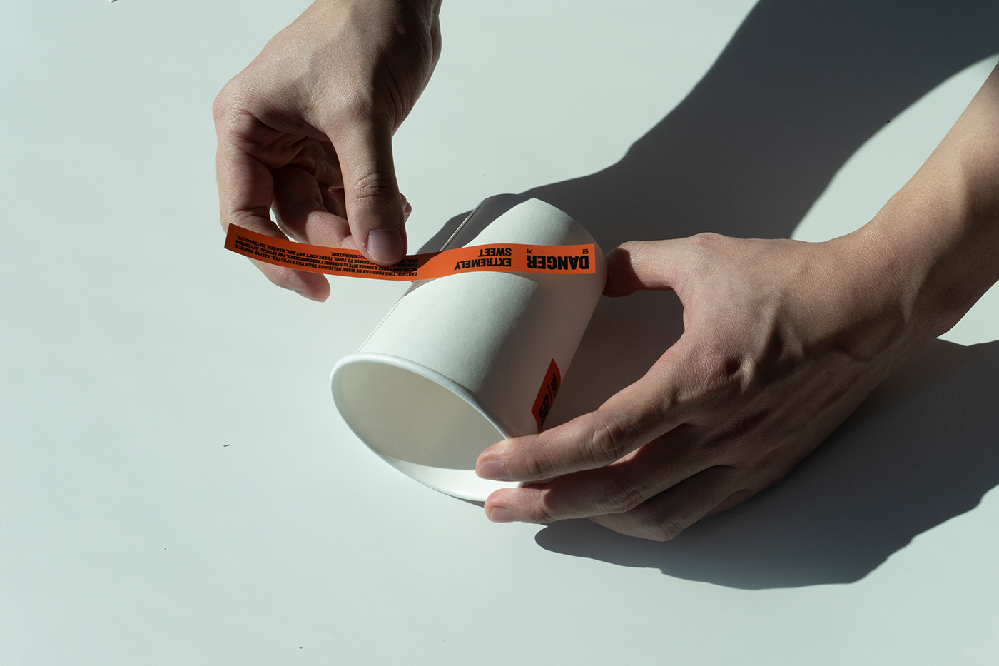
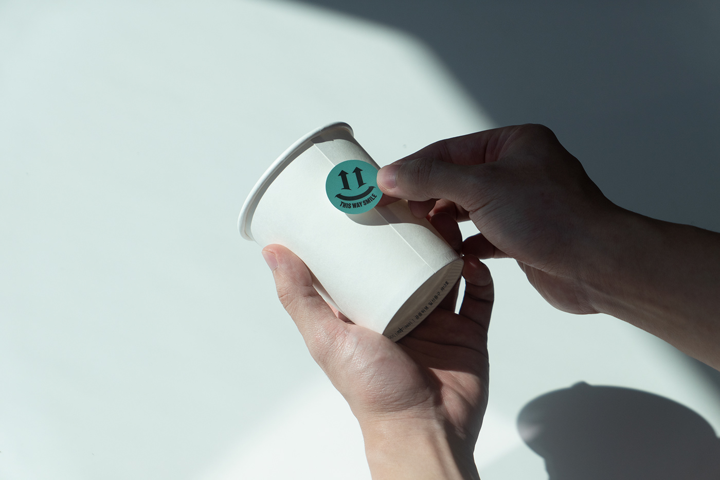
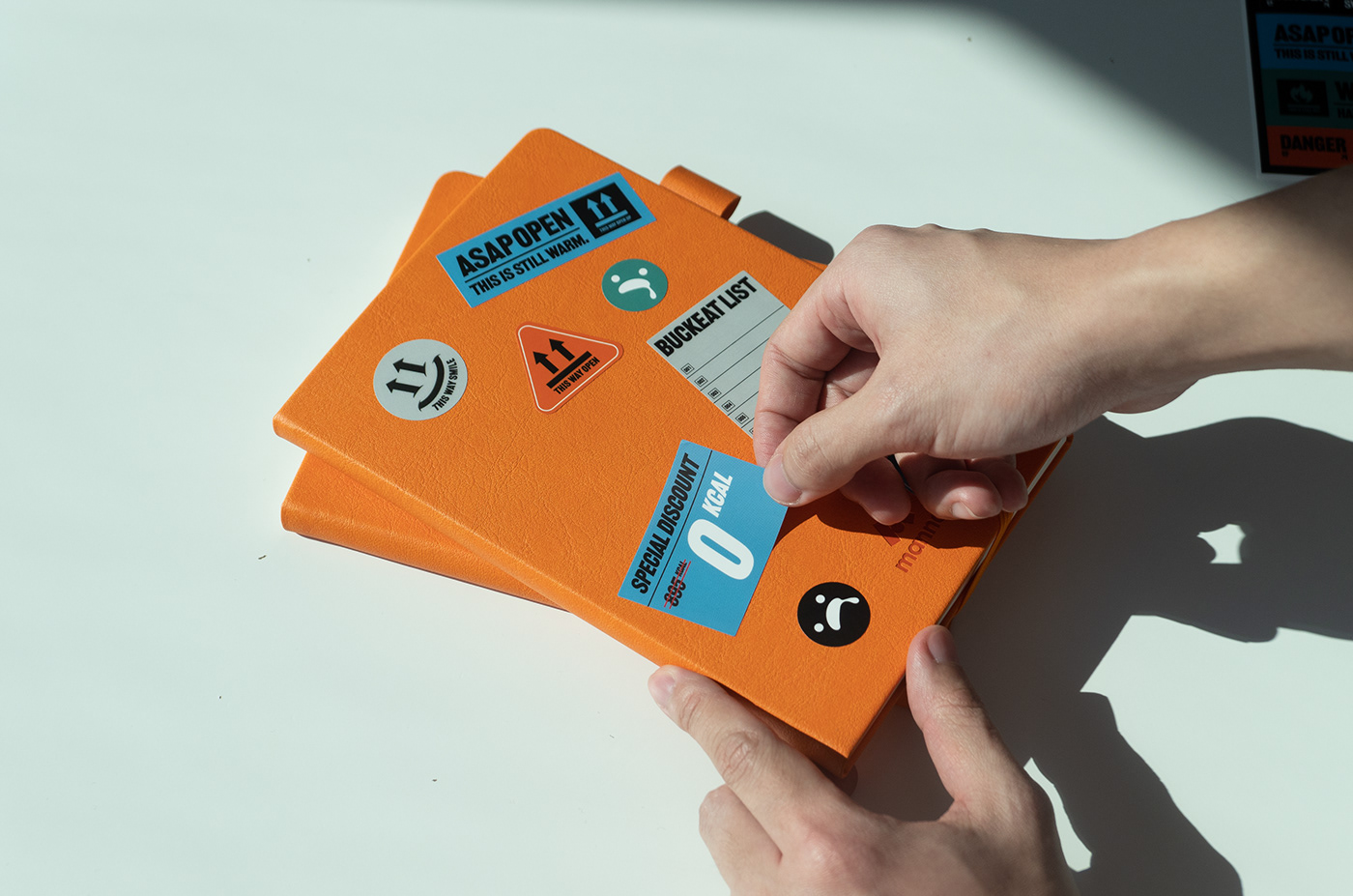
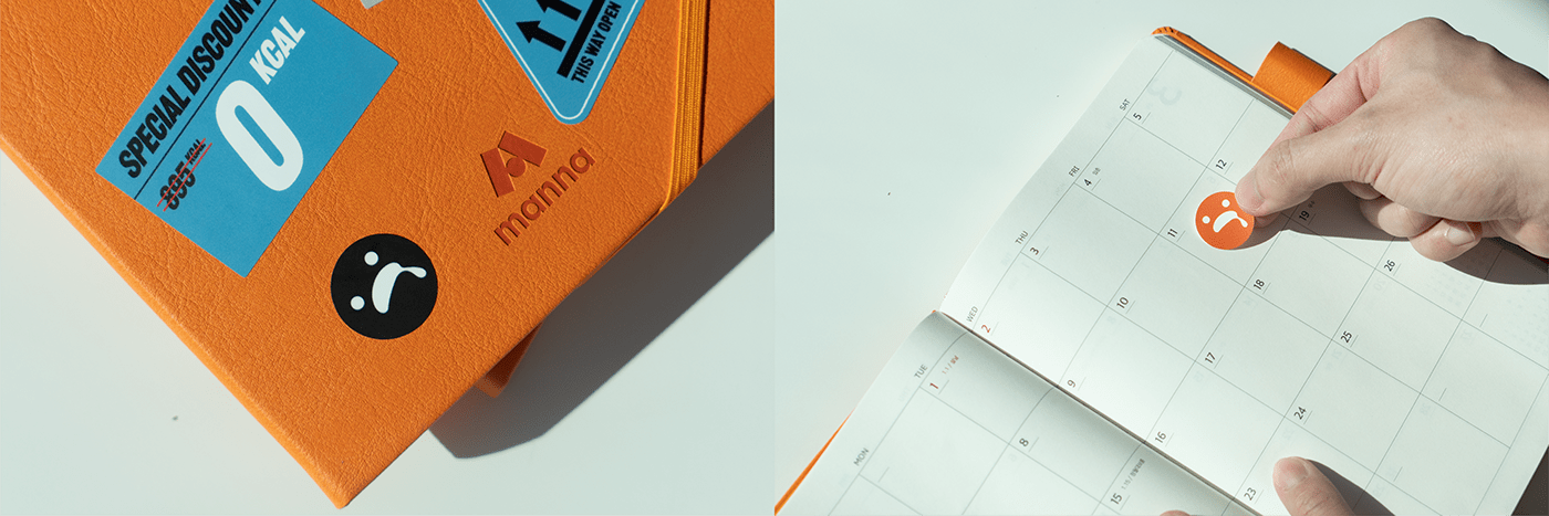
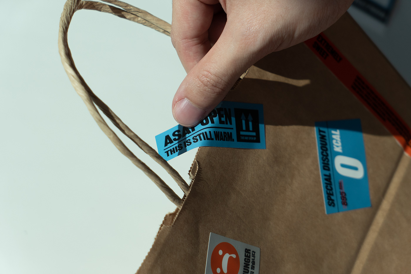
Key Visual 2
Manna's Key visual two was based on the appearance of food in delivery boxes and the gesture of attaching flyers to franchise stores. We showed the brand's core image in sticker format to further customize and reduce production costs.


Typography
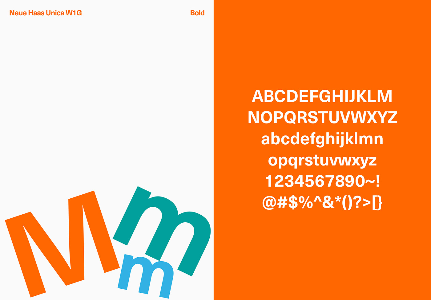
Manna's signature font is Neue Haas Unica.
Its' similarity to the shape characteristics of the logo symbol and versatility for both printing and digital media made it the ideal classic font that matches the brand's image.
Its' similarity to the shape characteristics of the logo symbol and versatility for both printing and digital media made it the ideal classic font that matches the brand's image.
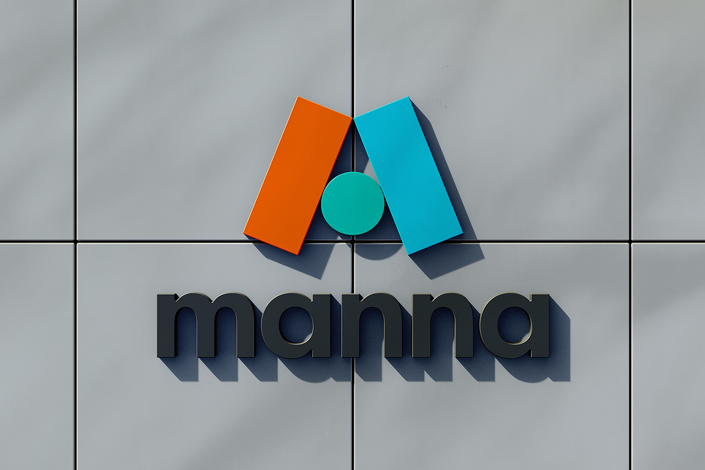
Brand Color
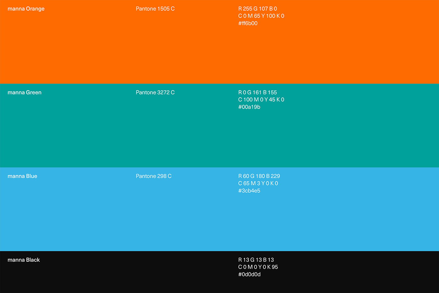
Based on Manna's management ideology, we expressed the brand concept through the color orange, which conveys positivity, hope, and energy. Green wishes for the growth and prosperity of the Manna family, and sky blue represents sustainability.
Pictogram
We expressed the design language of sportsmanship through a dynamic pictogram.
Using the tilt and color of the symbol, we considered the natural brand internalization of internal executives and employees.
Using the tilt and color of the symbol, we considered the natural brand internalization of internal executives and employees.


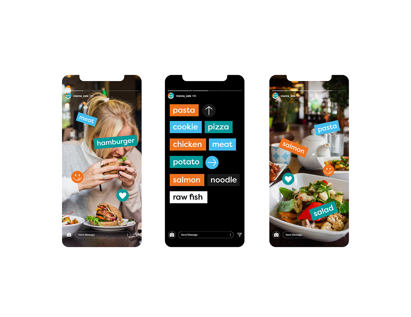
Mobile
Mobile and SNS are some of the essential points of customer contact. They display various and lively company images through sticker phrases and illustrations.


BOUD
-
Creative Directing : Jiyeon Ma
Project Manager : Sunwook Hwang
Brand Design : Arim Kim, Jiwoong Lee, Youngmin Hwang, Sunwook Hwang
3D Modeling : Jinsu Du, Chaeyoung Yoon
-
Creative Directing : Jiyeon Ma
Project Manager : Sunwook Hwang
Brand Design : Arim Kim, Jiwoong Lee, Youngmin Hwang, Sunwook Hwang
3D Modeling : Jinsu Du, Chaeyoung Yoon
Motion Graphic Design : Sookyoung Ahn
Photographer : Jinsu Du
Photographer : Jinsu Du
Clients : manna Corp.
More Projects
https://www.theboud.com/
https://www.theboud.com/


