


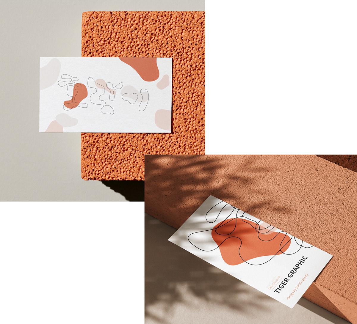
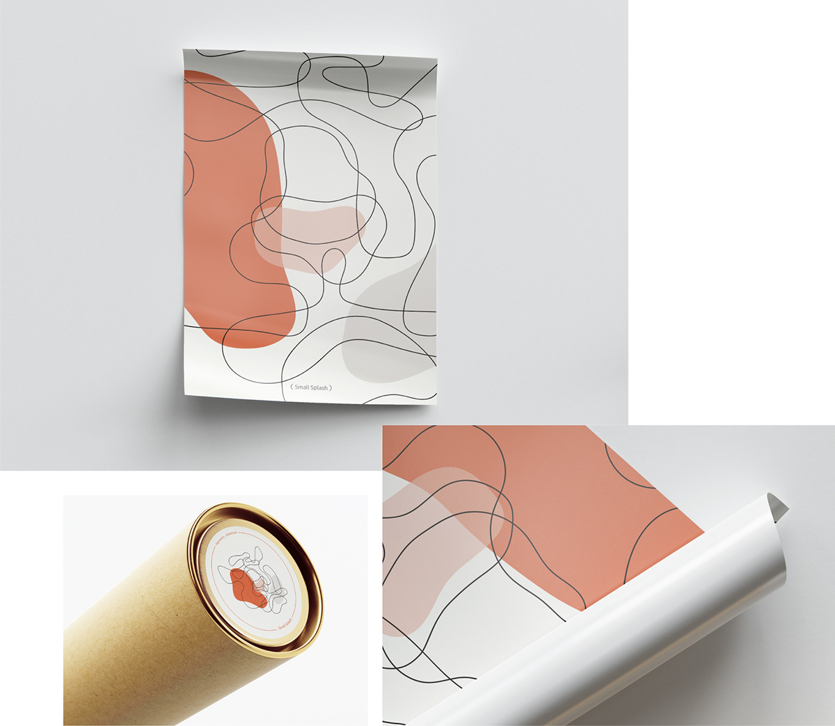
TIGER Graphic & Hand cream (2021)
Client : design house
Design by (small splash)

The Korean symbols marked "호랑이" were organically modified and rearranged to design a line that "Tiger face"
and colors reminiscent of "Tiger" were arranged in plane.
"tiger graphics" were design by harmonizing lines and plane.

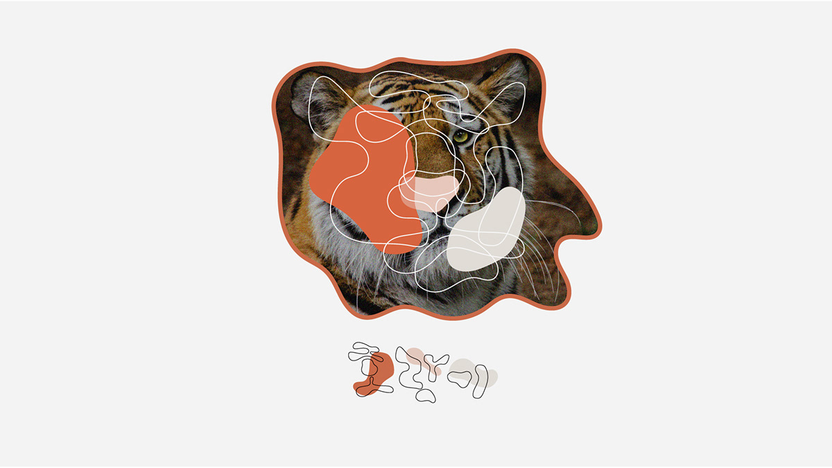
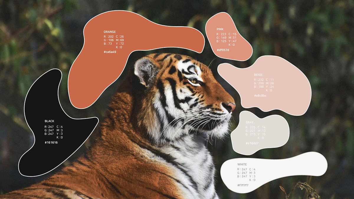


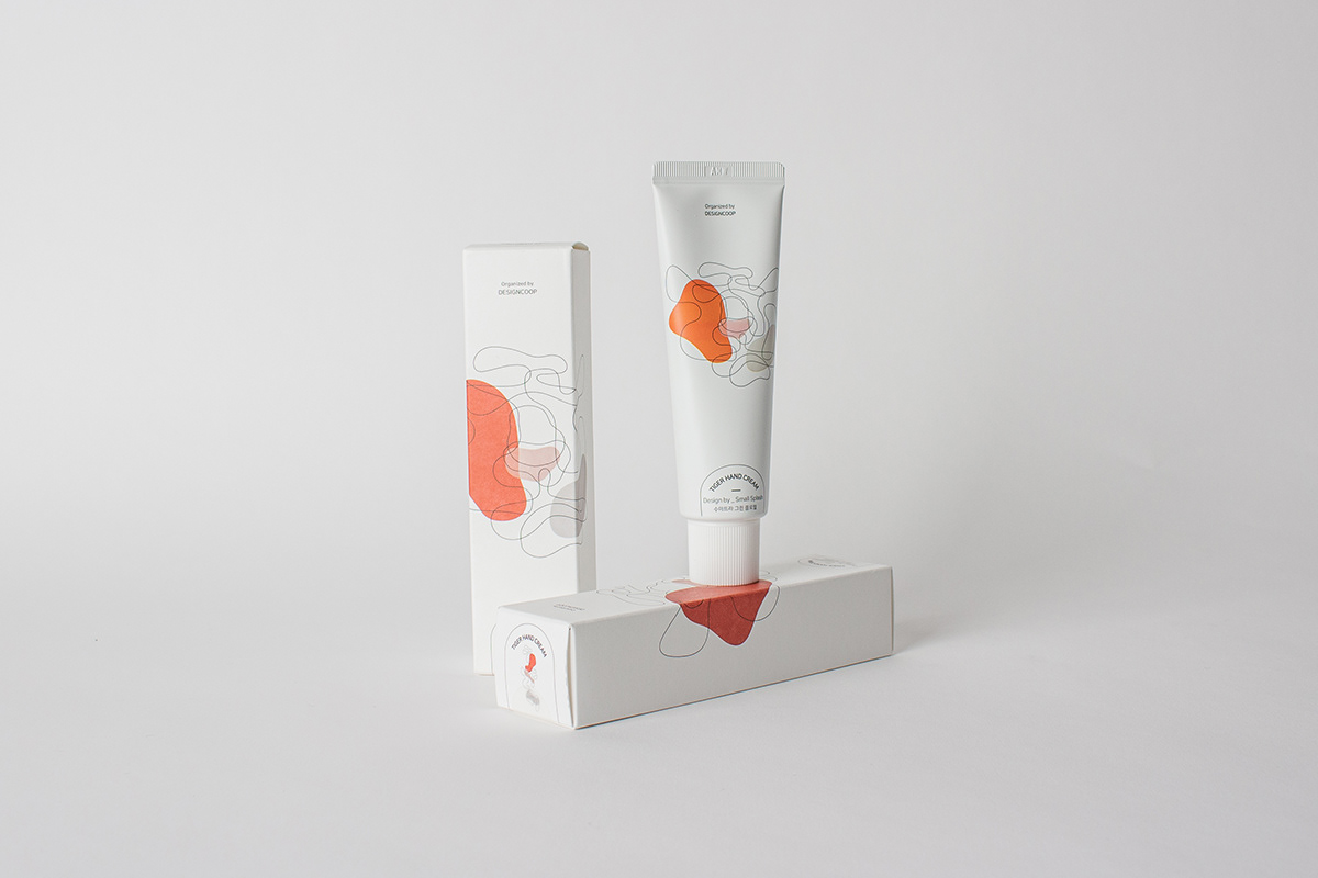


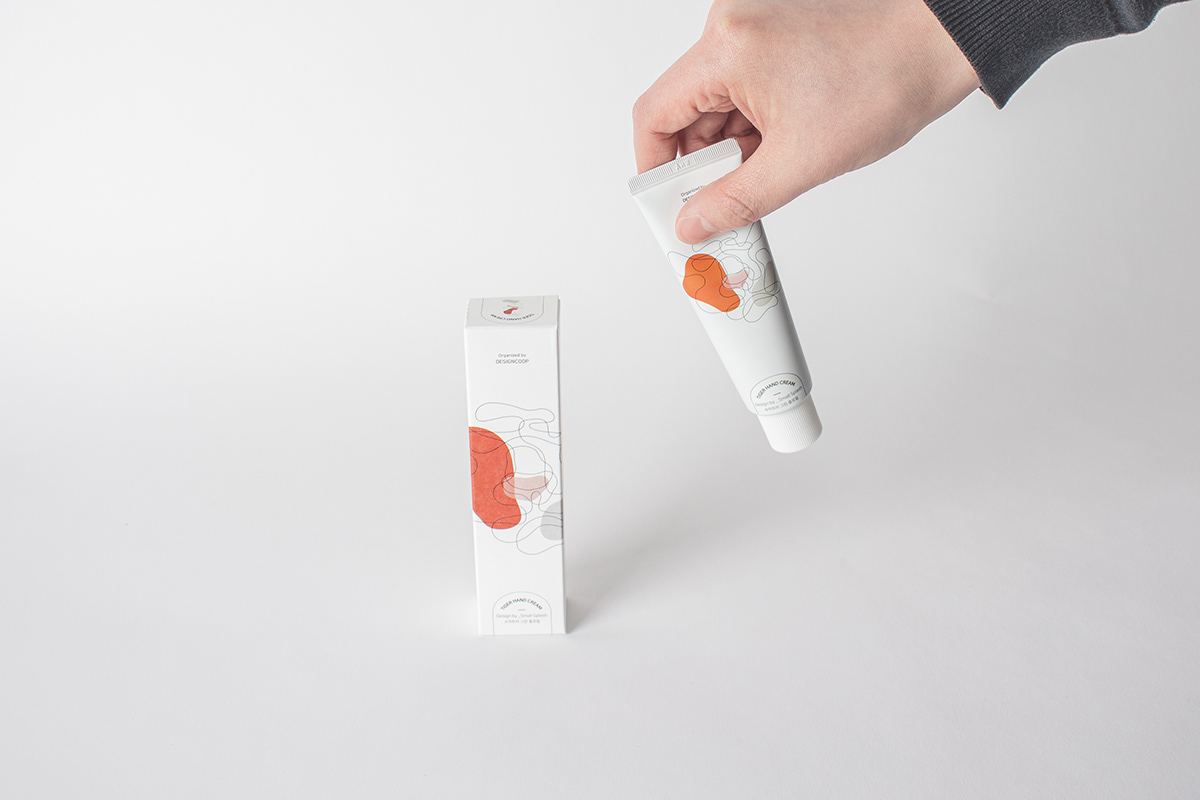
Photo by (Small Splash)


( THANK YOU )
12, Myeongdeok-ro 18-gil, Nam-gu, Daegu, Republic of Korea
hello@small-splash.com
hello@small-splash.com
ⓒ Small Splash
ⓒ design coop