


Days Travel
Logo and corporate identity for a new generation travel agency
Russia
About client
Days Travel is an agency that has been selling bus tours around Russia since 2016 - to Dombay, Adygea, Elbrus region, Altai, Buryatia and Dagestan. The guys organize tours, which include not only transfer and comfortable accommodation, but also a well-thought-out program for all days of travel, as well as the services of a professional photographer and guide.
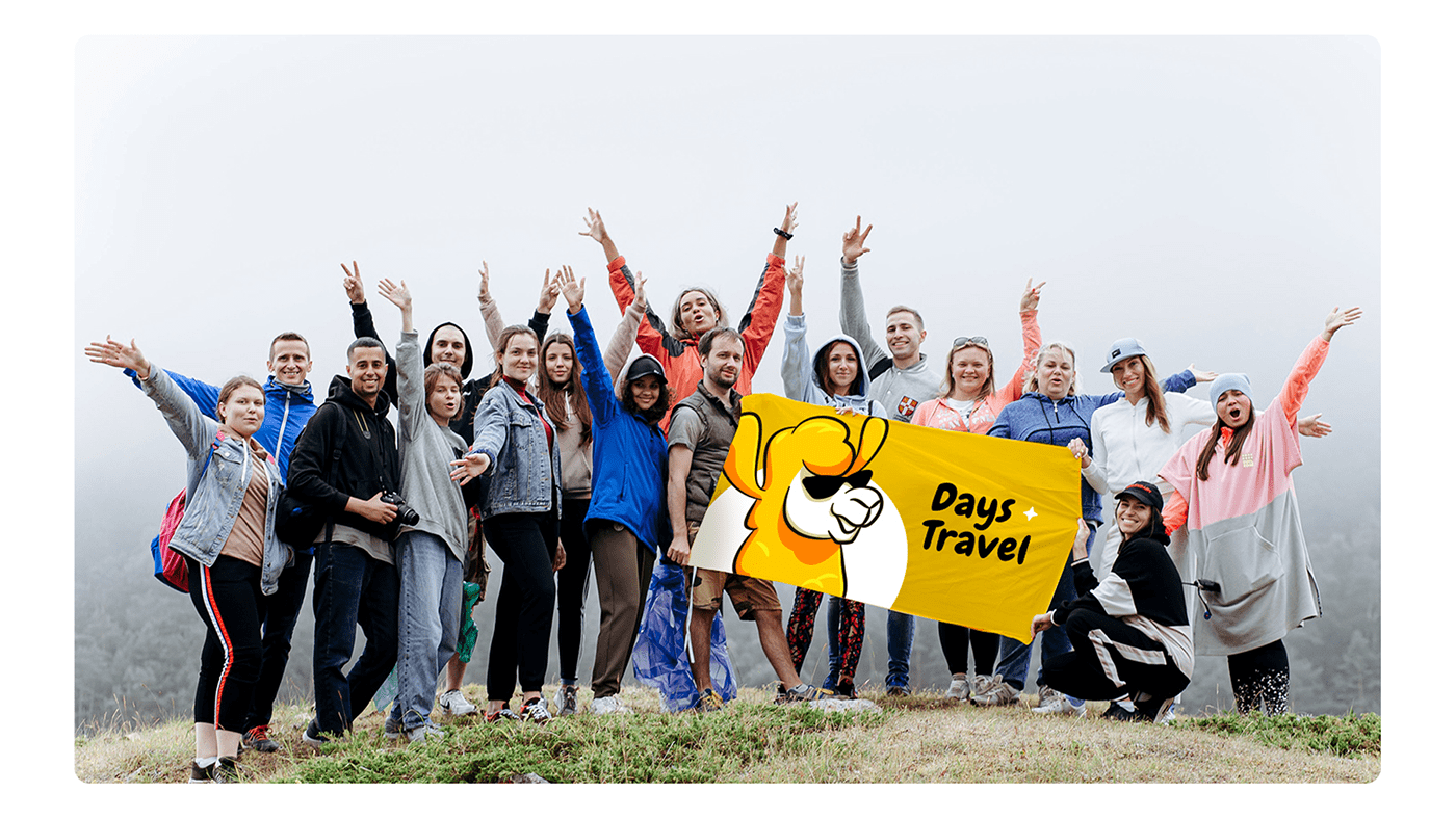
Days Travel is not only individual tours, but also large tour festivals for 200+ people, where events are held every day. The project team unites tour participants in a community: everyone can share their impressions of the trip or plan the next.
Task
Update the logo and create a corporate identity that will represent Days Travel as a successful growing business.

Solution
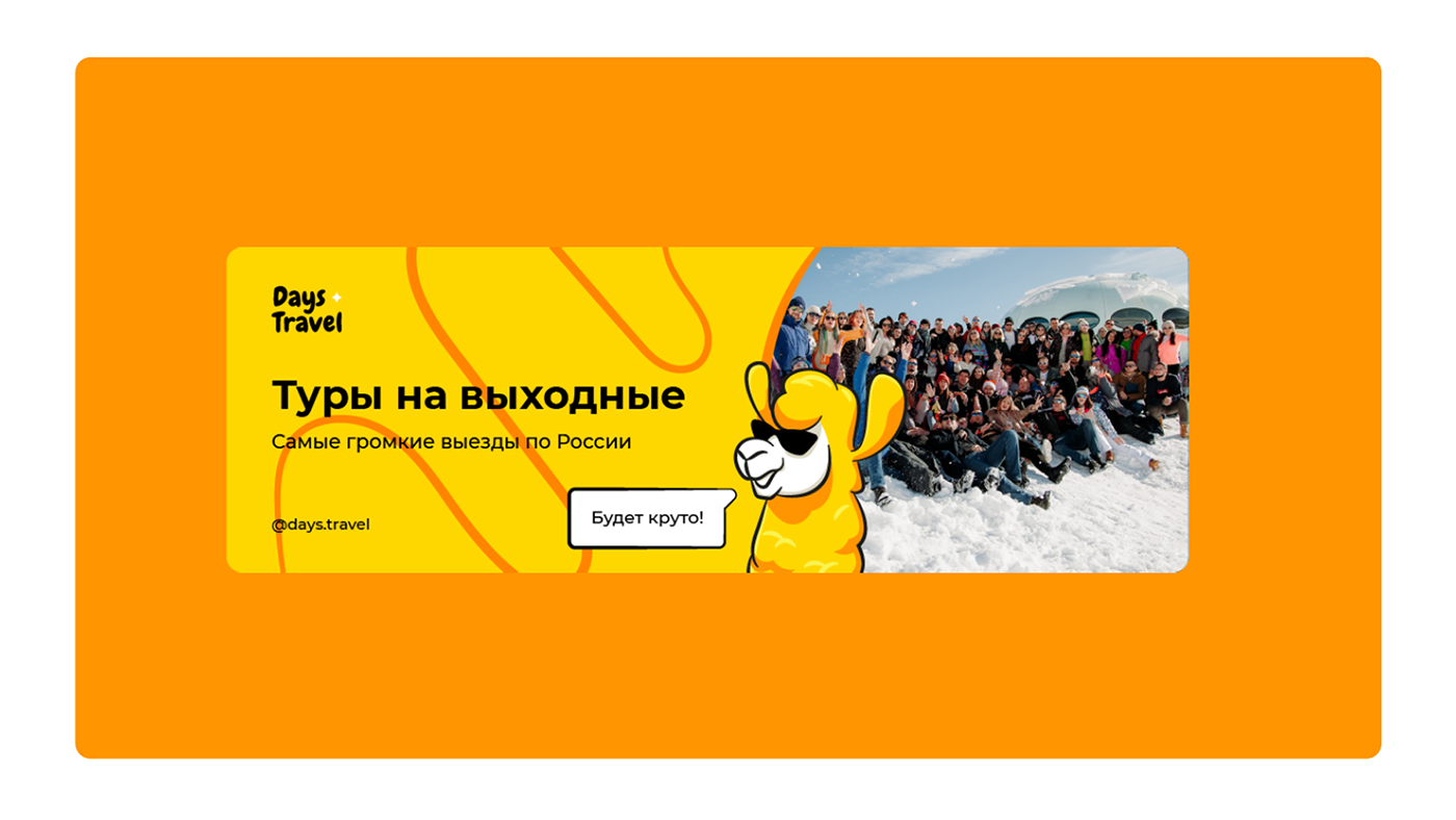
In the logo we used the image of Days Travel's “totem animal” — a llama. In the sign it is shown wearing sunglasses: the accessory emphasizes the seriousness of the project and is associated with travel, since tourists often take glasses with them on their travels. In addition, the llama allows the project to visually differ from competitors: they use images of mountains, airplanes, and the planet in their logos.
We made the lama a full-fledged mascot of the company — it is positive and energetic, loves to travel and it is interesting to spend its free time. To make it convenient for the project team to use the mascot in communication with different audiences, we have thought out several images for a llama - it can be portrayed as a surfer, guide, or traveler.
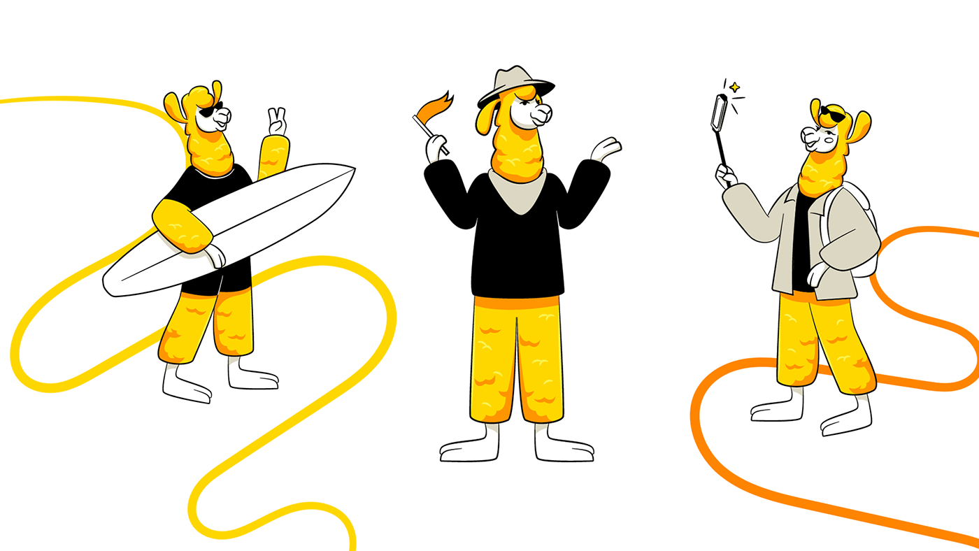

For the logo we used a grotesque Chewy font, memorable and non-standard, but at the same time soft due to the rounded lines of the letters.
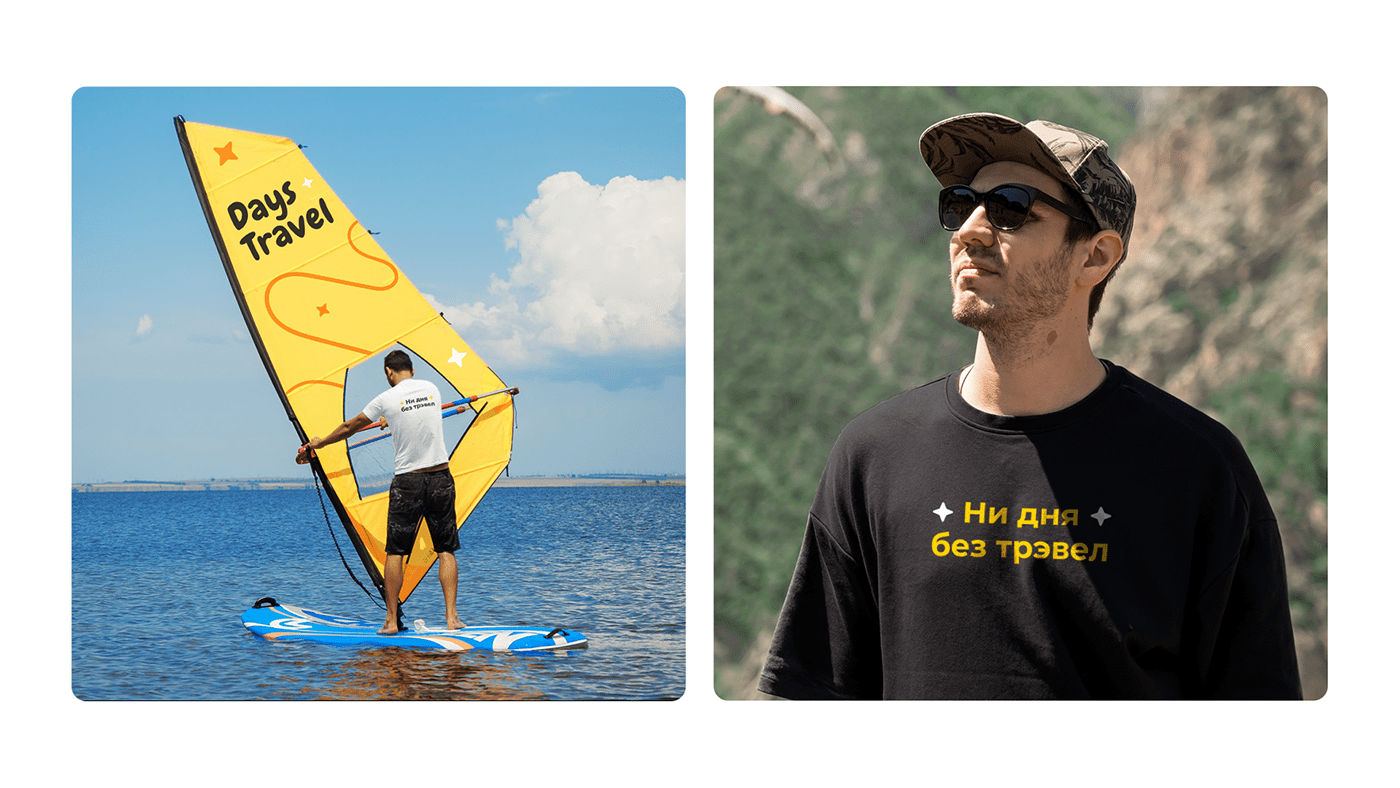
We have chosen warm shades of yellow and orange as the corporate colors of the company: they are associated with the bright sun and travel to the south. For contrast, neutral black and white have been added to the corporate colors to make the company name legible on all media.
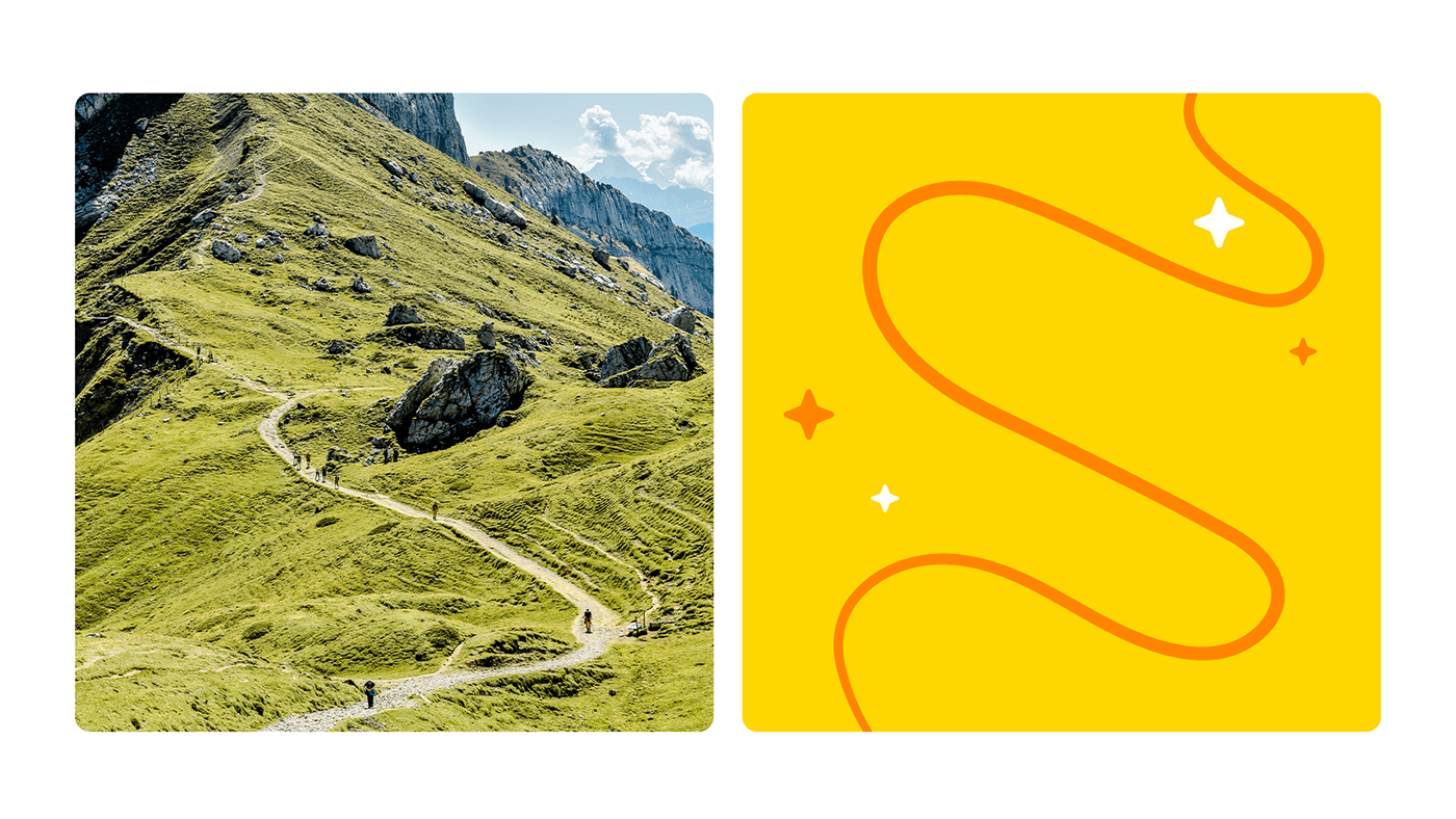
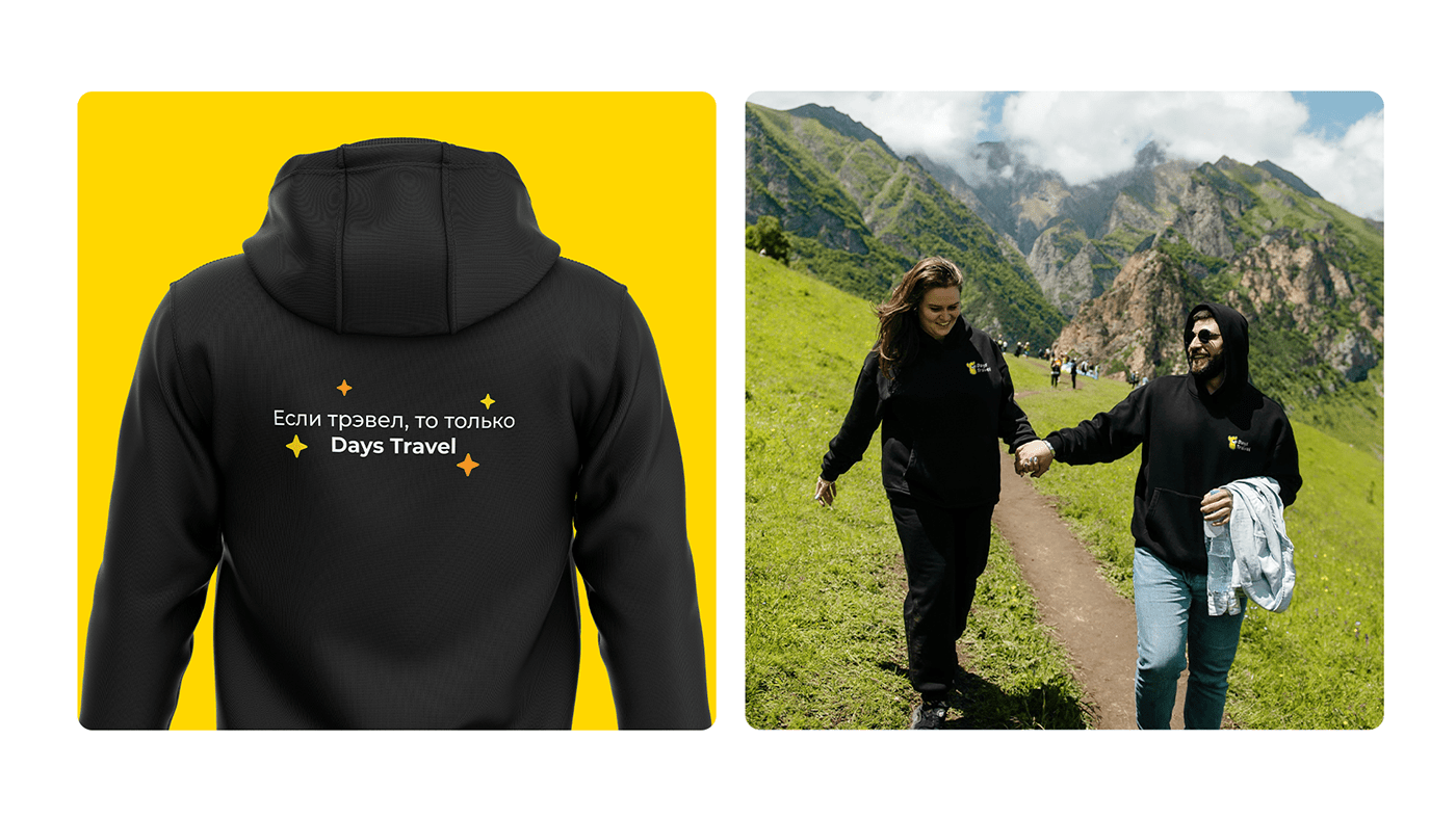
The designers put several symbols into the pattern: a curved line denotes the path, the tourist route along which the participants go, and the stars are associated with atmospheric hiking evenings and good service. Additional styling elements to the pattern are bars, which are made without sharp corners to convey brand friendliness. They are needed in order to highlight the text in the media and focus the reader's attention on it.


Want a design just as cool?
Interested?
Tell us about your project


