


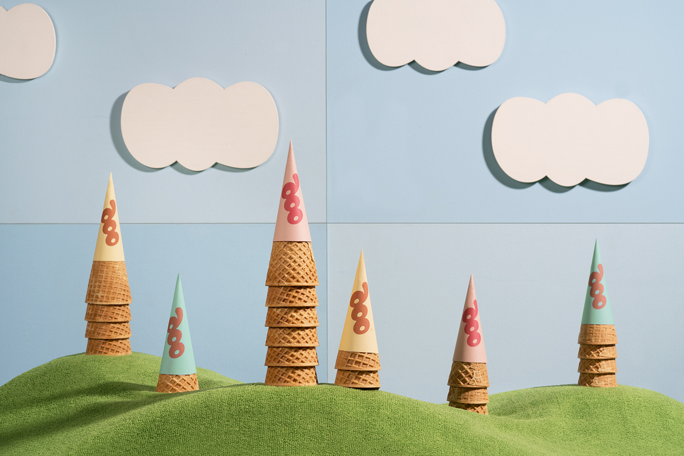


OOP is an ice cream shop based in Qatar. The concept is friendly and familiar, so we wanted to dig deep on the experience that this cool edible has offered since our childhood: comfort with a nostalgic wink.
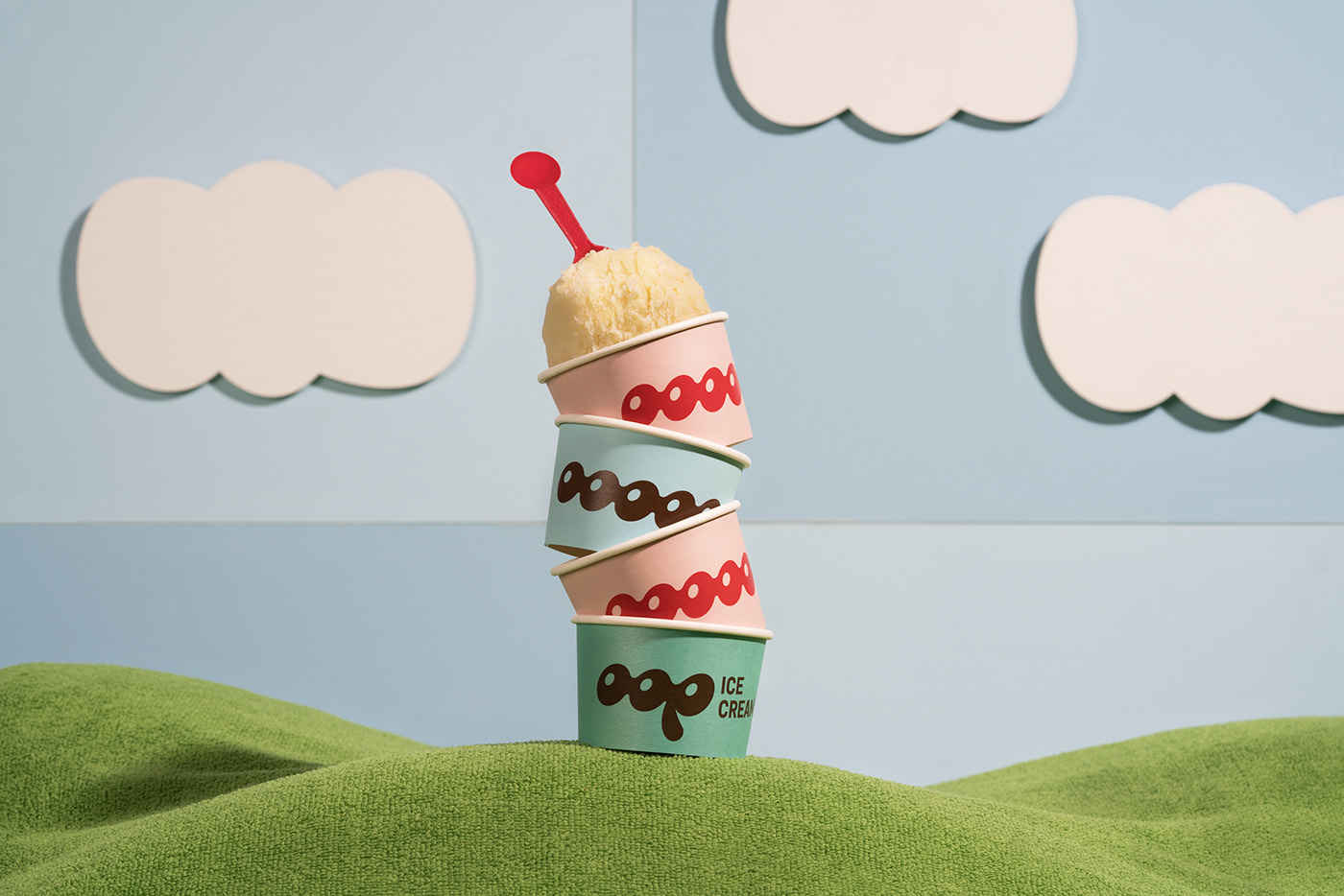
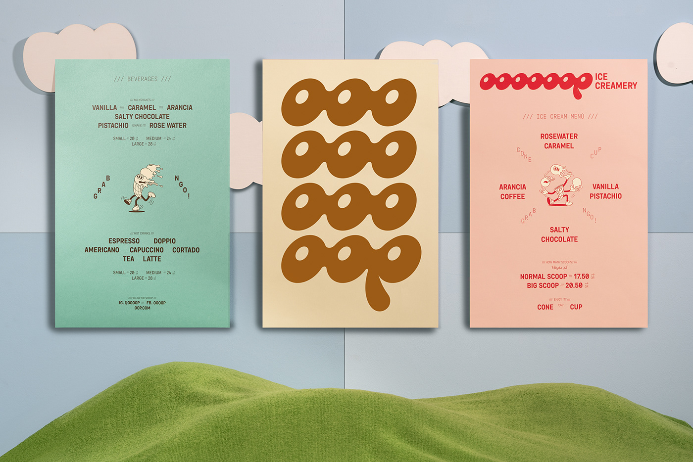
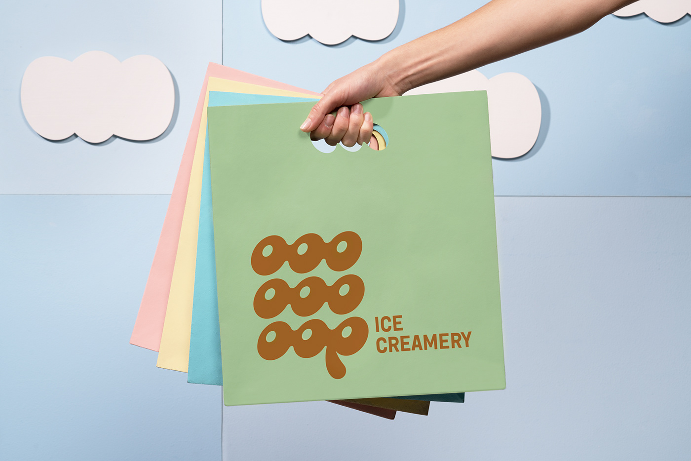
For the logotype, we played with the melting sensation of one letter into the other, personalizing the typography and avoiding edges for a round, wavy finish. Through repetition, we achieved a staple look that feels fun and lively.
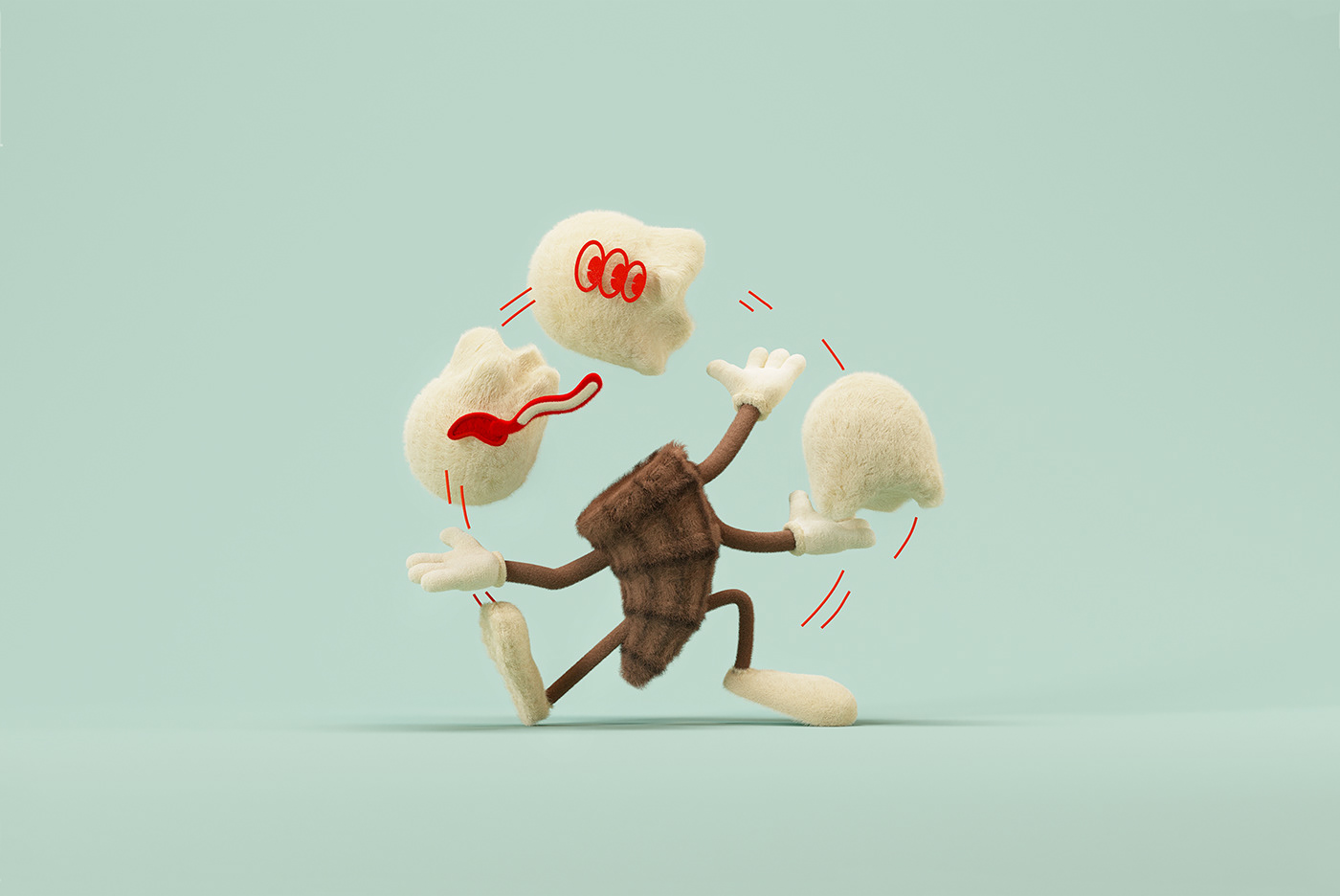
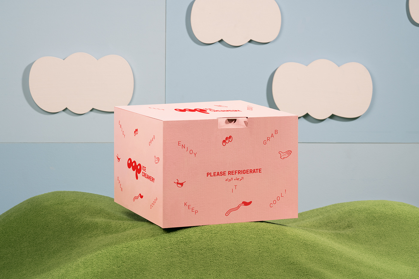
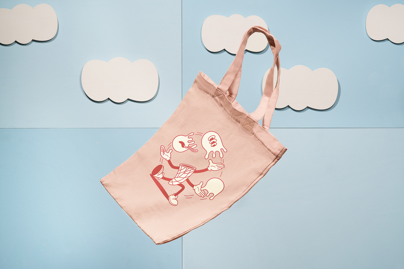
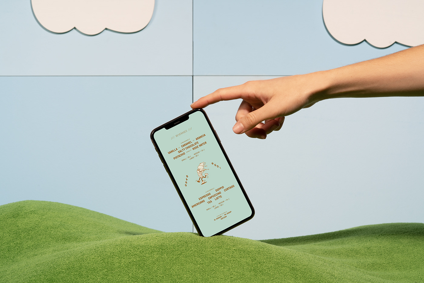
The editorial system uses a more structured, monospaced sans, that contrasts with the constant loop of the logotype. We complemented the identity with illustrations of a vintage cartoon-inspired character and a vintage ice-cream shop palette disrupted by bright tones to achieve a modern brand.
OOP, don’t let them melt.
_
Art Direction: Futura
Photography: Futura
More info: new@byfutura.com


