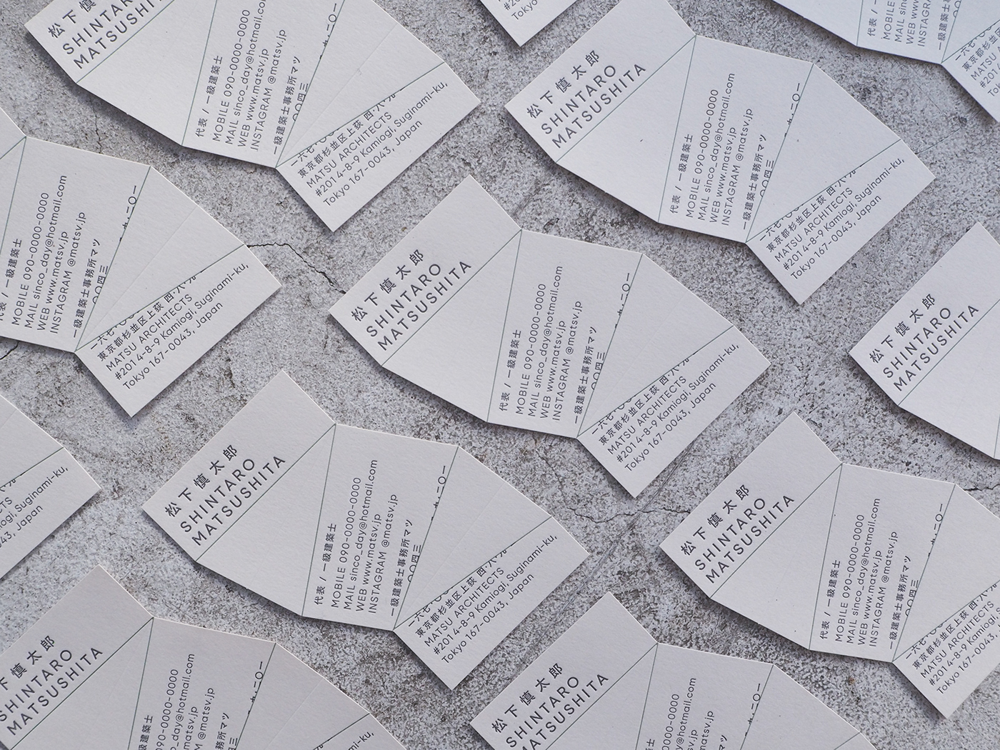

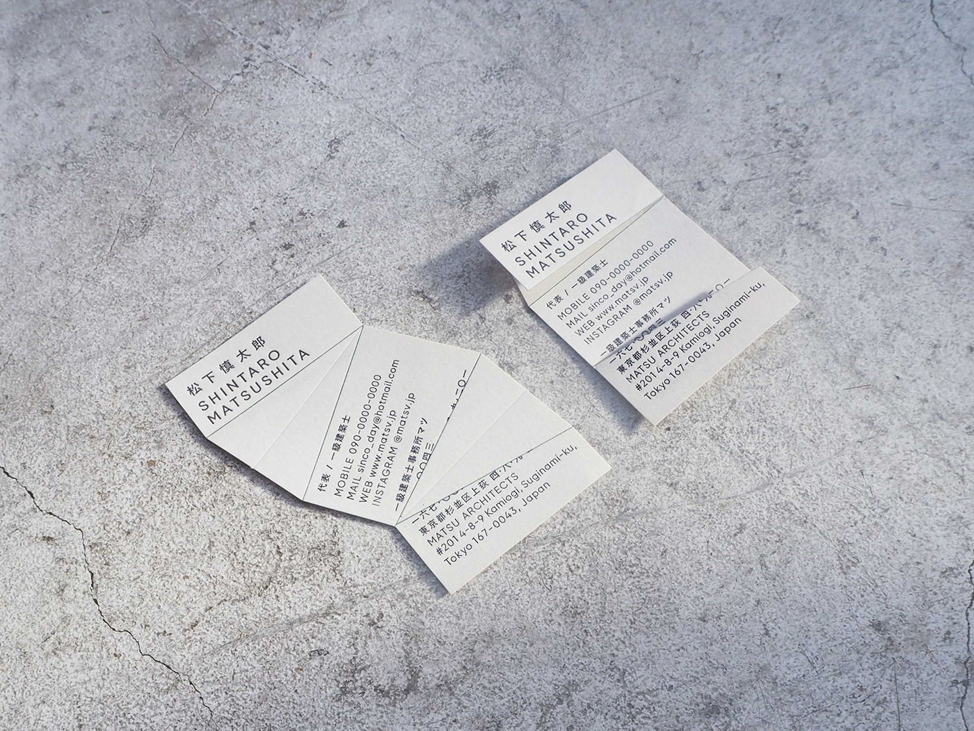
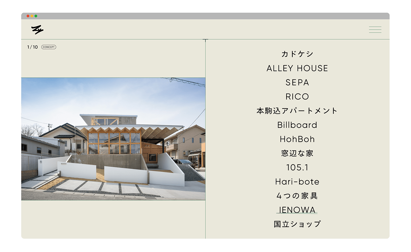
What we love about this architectural business card design is its simple yet unique layout. When folded, what originally seems to be an uneven card, becomes an informative-filled business card! Without further ado, let’s find out how the idea originated.
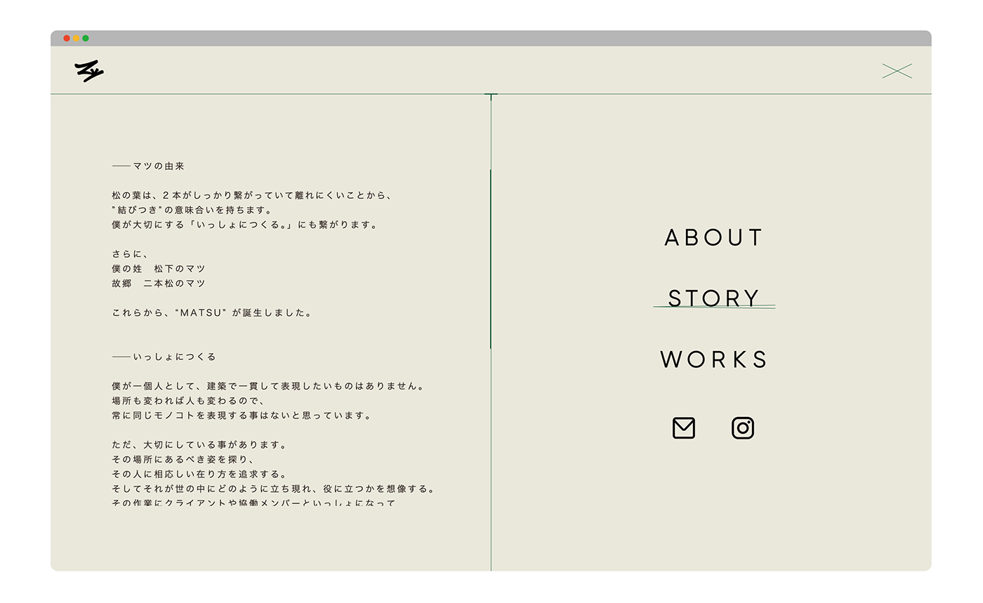
The Origin of the Brand Name “Matsu”
The brand name Matsu was chosen for several reasons.
The brand name Matsu was chosen for several reasons.
Firstly, it was derived from “the leaves of matsu”, which means “pine leaves” (pine needles) in Japanese. For this reason, the Japanese word matsu also bears the meaning of “connection” or “tie”, as the two leaves are firmly connected and cannot be easily separated.
Furthermore, the patterns of Matsu are a traditional Japanese motif and are often associated with good luck.
And Client’s surname is Matsushita (松下), whose hometown is in Nihommatsu (二本松). Both names contain the same name “Matsu”, which is the same character used in the Matsu leaves (松の葉).
Folded Business Card Inspired by Architecture
The business card is uniquely designed so that when folded, the card owner’s contact information will be revealed.
The business card is uniquely designed so that when folded, the card owner’s contact information will be revealed.
Explaining the inspiration behind this, “The folding card idea was inspired by the three-dimensional elements of architecture, which is the client’s expertise.”
“Apart from that, Matsu leaves (depicted by the green lines) are sometimes added as decoration in Osechi, a traditional Japanese meal, to give a sense of depth to the dish.”
(Note: Osechi is a type of traditional cuisine that’s served on Japanese New Year’s day.)
“Not to mention, it’s also a great way to start a conversation with customers when exchanging business cards.”
Three-dimensional objects and pine needles combined: what a clever way to express the brand!
Geometric Font & Monochrome Colour for a Timeless Design
The typeface used in the visual identity is Gilroy. It’s a simple, geometric font that gives a timeless feel, which according , has something in common with architecture.
The typeface used in the visual identity is Gilroy. It’s a simple, geometric font that gives a timeless feel, which according , has something in common with architecture.
While the brand colour is mainly monochrome, green is used for the lines on the business card as an accent colour, similar to the idea of pine needles.
“For the key green colour, we incorporated the traditional Japanese Matsuba colour,”
These business cards were letterpress printed by Cappan Studio, a printing company in Kyoto, Japan.
“To print the cards, we used three colours (3C) and blank stamping (0C), with die-cutting on NT Rasha/white rat 130kg.”

client : MATSU @matsv.jp
creative direction : maico nishikoji
art direction & design : mayuko kanazawa @kanazawa_mayuko
web develop : kai ito
creative direction : maico nishikoji
art direction & design : mayuko kanazawa @kanazawa_mayuko
web develop : kai ito
THANK YOU