

Powerbank sharing service
About the client: splash is engaged in the sharing of powerbanks, it provides an opportunity to rent a portable charge at one point of issue and return it to another. They also take care of reducing the number of lithium-ion batteries in stores, supporting the trend of a more sustainable energy system.
Task: to develop a corporate identity that will help to distance yourself from competitors, to be recognizable. The company's values are fun, self-expression and modernity.
О клиенте: splash занимается шерингом повербанков, он предоставляет возможность арендовать портативный заряд в одном пункте выдачи и вернуть в другой. Также заботятся о снижении количества литий-ионных батарей в магазинах, поддерживая тенденцию более устойчивой энергетической системы.
Задача: разработать фирменный стиль, который поможет отстраниться от конкурентов, быть узнаваемым. Ценности компании веселье, самовыражение и современность.

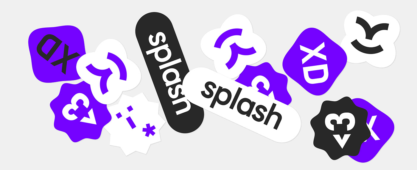
Decision: in the analysis of competitors, it was revealed that competitors mainly use blue-green colors, as well as images of batteries, plugs, lightning, so purple was taken as the basis — the color of creative and emotional people. The Splash logo is a smiling person, embodies the values of the company. The brand element is emoticons, the metaphor echoes the name - a surge of emotions. The font harmonizes with the sign due to rounded shapes.
Решение: в анализе конкурентов было выявлено, что конкуренты преимущественно используют сине-зеленые цвета, а так же образы батарей, штекеров, молний, поэтому за основу был взят фиолетовый — цвет творческих и эмоциональных людей. Логотип «Splash» - улыбающийся человек, олицетворяет ценности компании. Фирменным элементом - являются смайлы, метафора перекликается с названием - всплеск эмоций. Шрифт гармонирует со знаком за счет округлых форм.