PIK NIK, a rebranding project for a café with a modern and fun spin on the proposed logo.
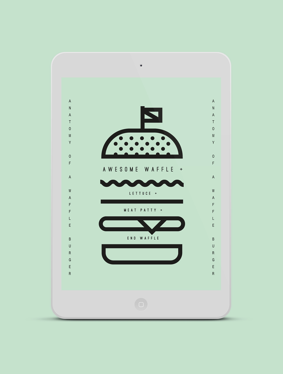
The proposals consists of callouts and descriptive words are seen throughout the menu to bring out random quirks in the food/drinks with its unique selections. Using a combination of graphical icons, bold lines, circles and a baring-it-all approach — each section carries the different plates of each food/drink type.
The project has been discontinued.