Introduction
The AOP was formed in 1968, by photographers, for photographers. Originally named The Association of Fashion and Advertising Photographers it has continued to evolve into one of the most prestigious professional photographer associations in the world.
They aim to remain the same today as they were over 50 years ago: to support, protect and inspire its members and to vigorously defend and lobby for the interests and rights of all photographers.
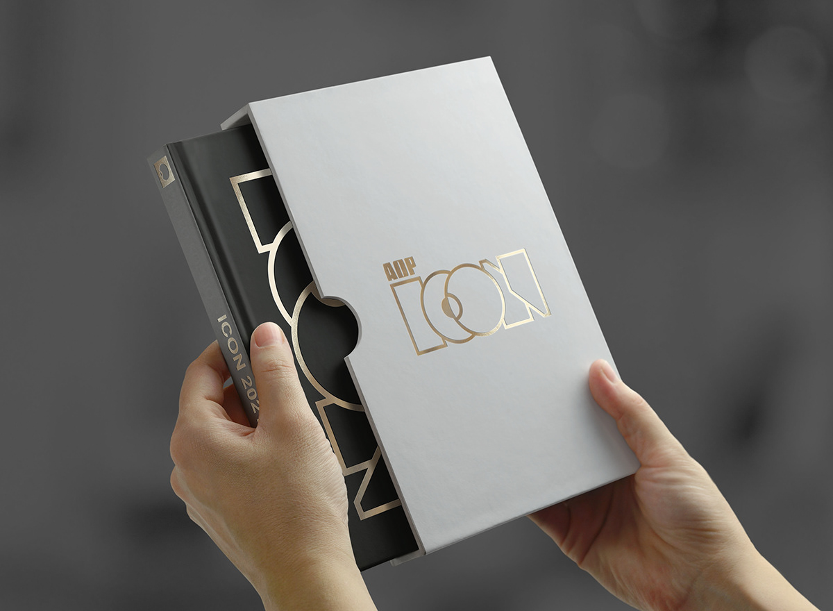
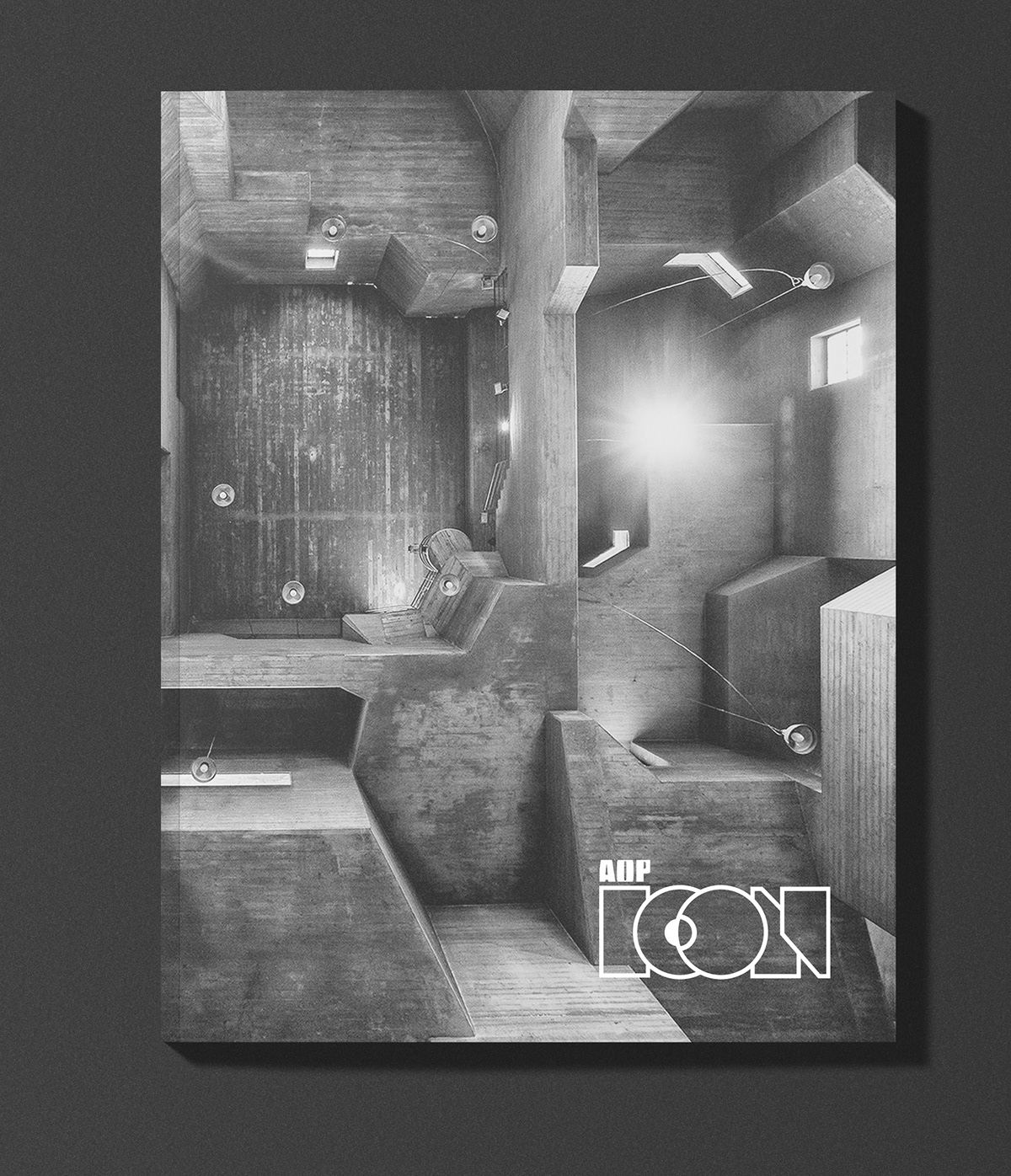
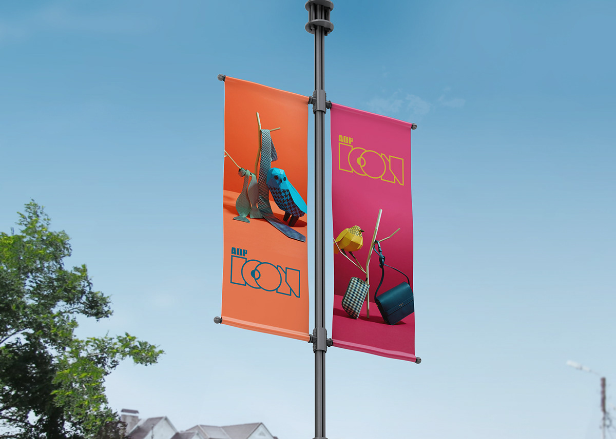
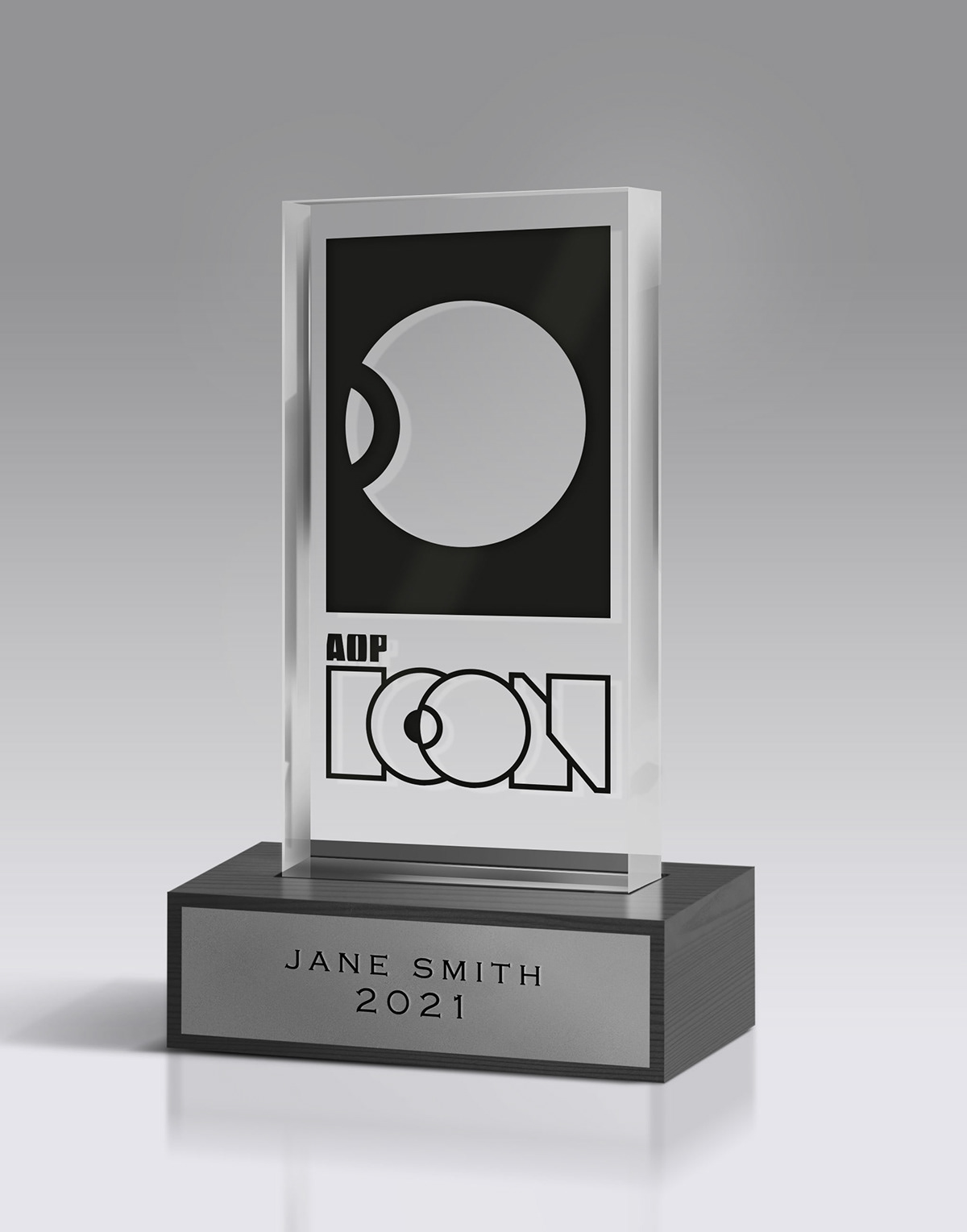
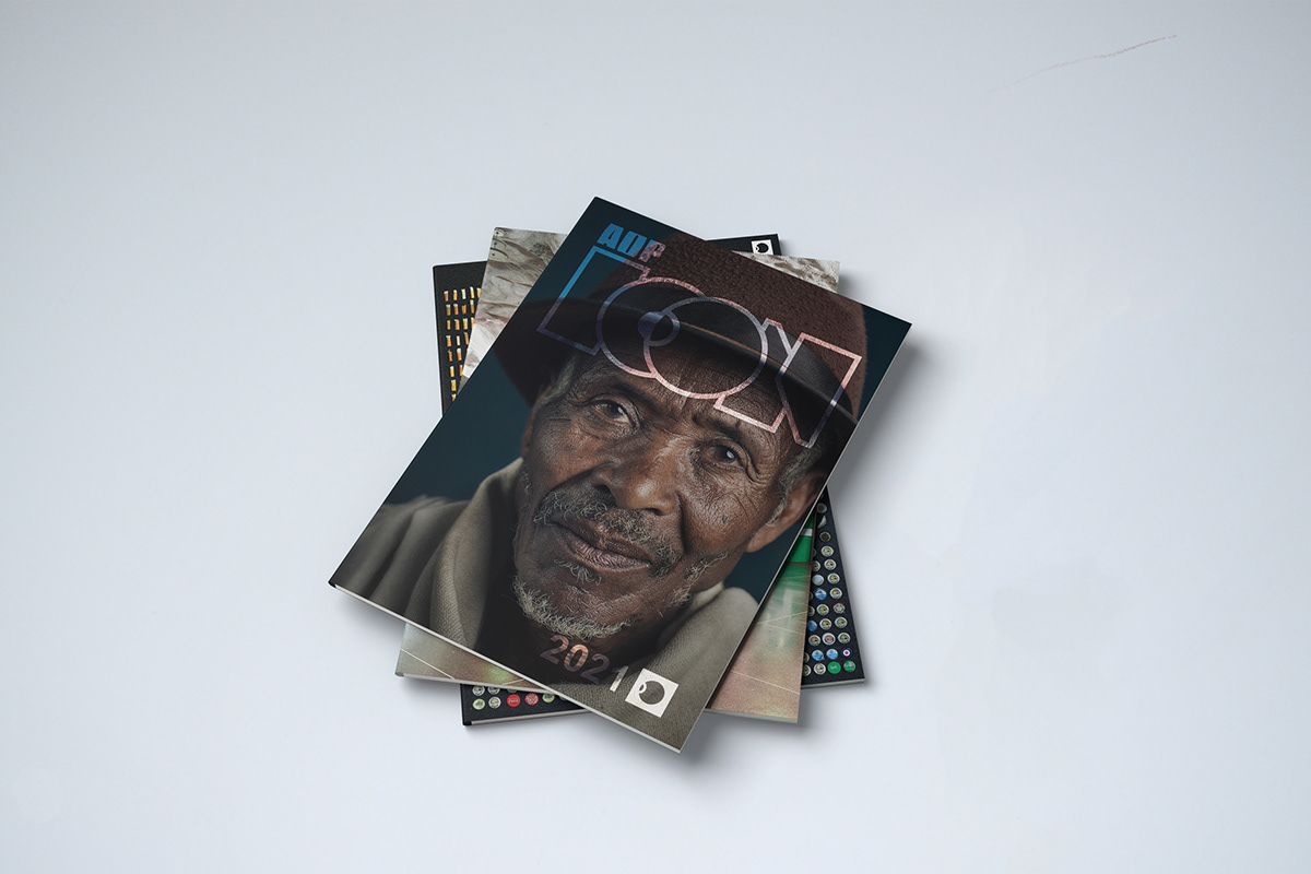
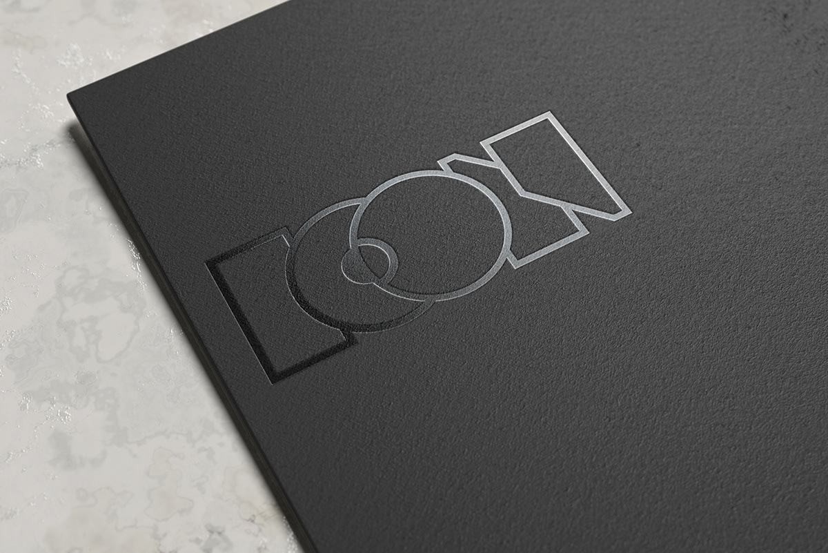
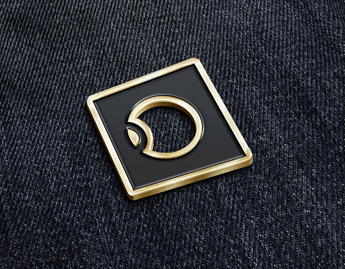
Our task was to craft a logo for their new "ICON" award;
In the creative space, there are often contributions and actions that fall outside artistic merit alone. The AOP ICON is an award of special recognition to be gifted annually to individuals and groups who have proven to be leaders within our industry and have made an important contribution to the world of photography and image-making. Each individual would gain the title of ‘AOP ICON [awarding year]’.
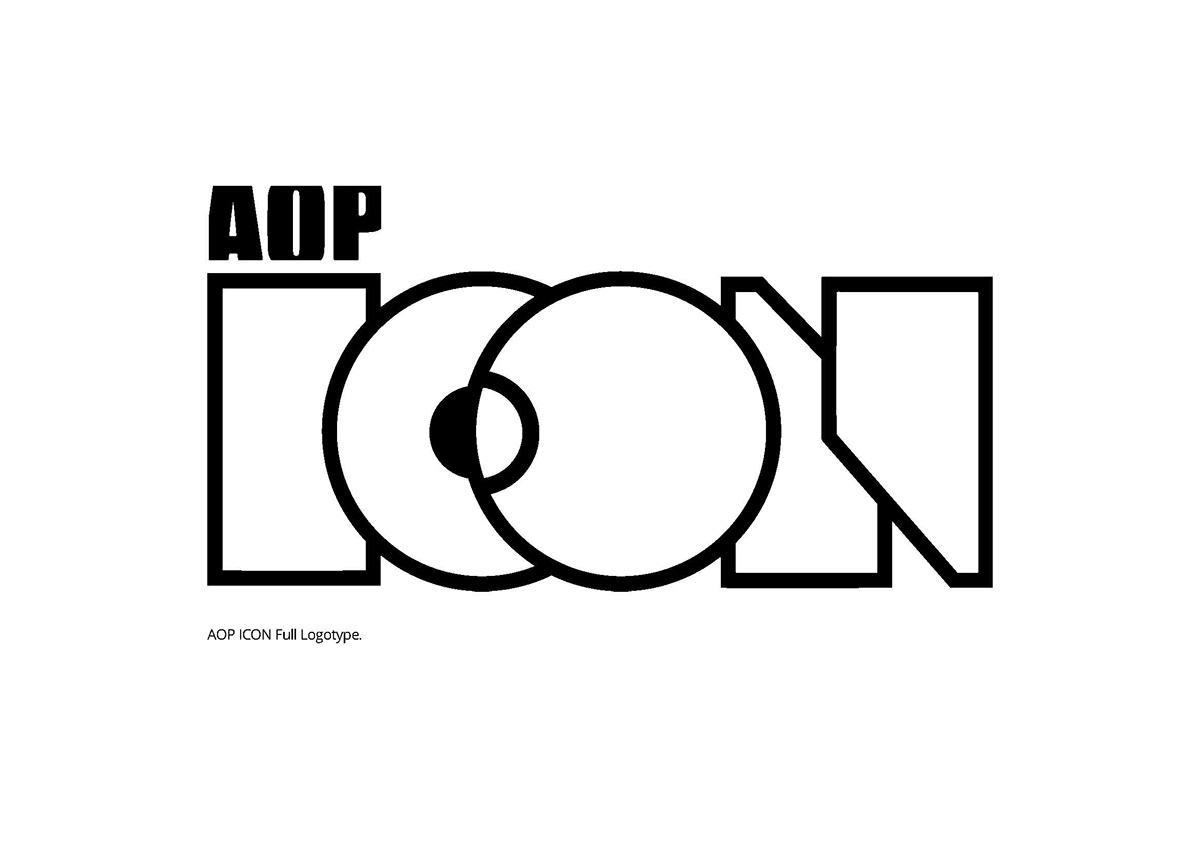


The AOP ICON mark is a responsive logotype and symbol which has been crafted to complement the recipient’s work.

"The Icon branding is exactly what we were wanting, it is clean, crisp and contemporary."
- David Harrigan, AOP Creative Director