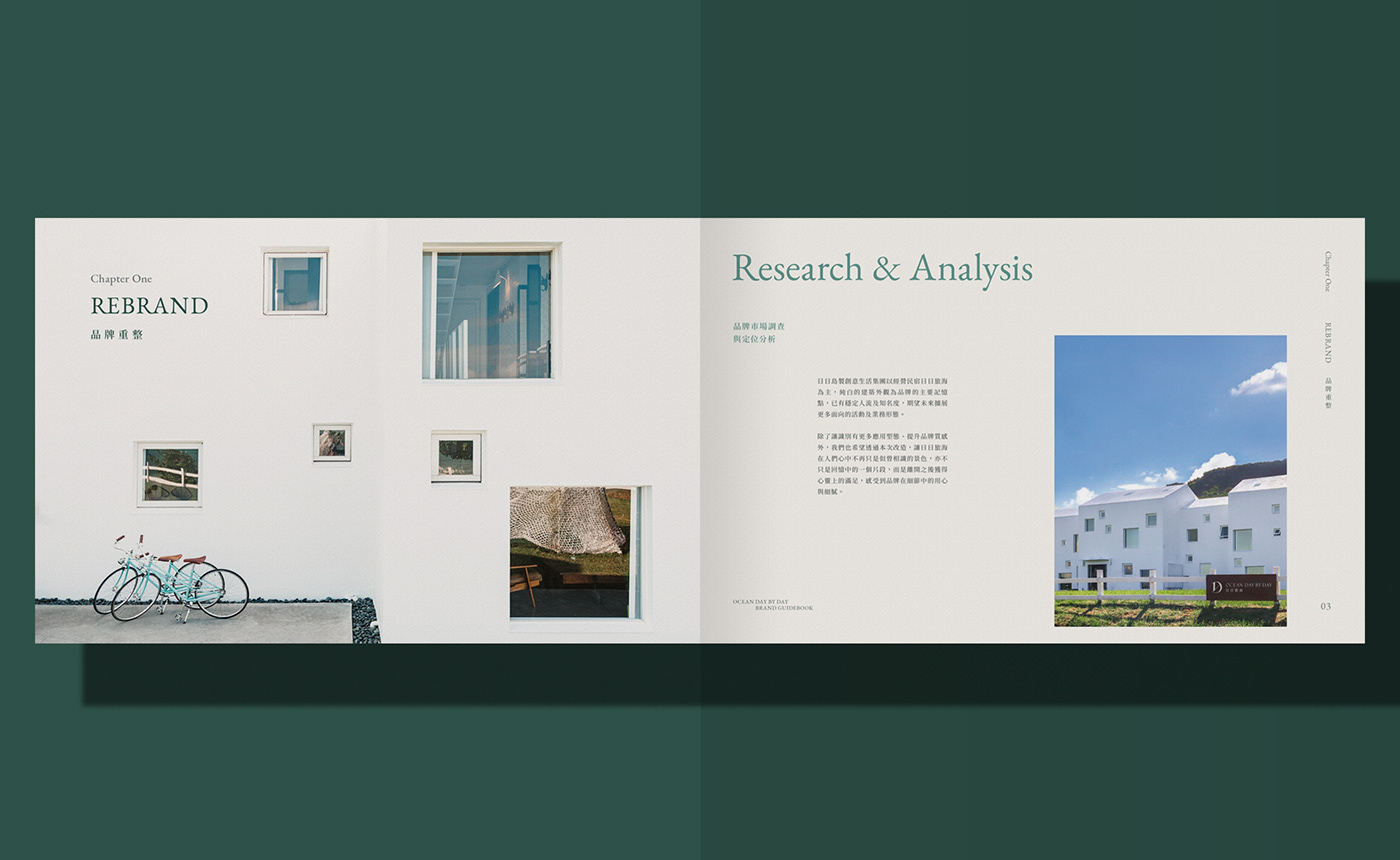
品牌簡介
環山面海、藍天綠地,日日旅海位於恆春寬闊的海岸線邊,是都市人遠離喧囂的心之所向。這裡的空氣混合著暖陽、海水與草地的味道,映著南國慢步調的寧靜風景,讓旅人不自覺地沈浸於大自然的美好之中。來到恆春,就像進入另一個世界;這次品牌重塑的目的,是希望將「感受上的轉換」直白地體現於視覺。這裡是一處生活的轉角、駛向自由的入口;無需太多思考,用心來感受這塊土地帶來的純粹。
Background
Surrounded by mountains and sea, blue sky and green land, the hotel "Ocean Day by Day" is located in Hengchun where nearby coastline, providing a getaway for urbanites to escape from the hustle and bustle. The air is mixed with dazzling sun, waving ocean and fresh grass smell, immersing travelers in the beauty of nature. It is like entering to another world while arriving Hengchun. The aim of this rebranding project is to express the concept of "Transition" straightforwardly in the visual. This place is a corner of life, the entrance to freedom; no need to think too much, but to feel the purity brought by this land.
設計方案
標誌以首字「D」及「日」為基礎,透過筆畫粗細、線條延伸,呈現「轉角」與「入口」的建築空間感;來到恆春就像轉個彎進入另一個世界,無論是環境或心境上都有明顯的不同。D 的中心斜切出 45° 的線條,象徵「入口」的概念;色調選用森林綠做為主色,填色處以粗糙邊緣增添質感,搭配架構纖細、現代的字型,展現內斂又大器的品牌形象。整體視覺除了傳遞溫潤和諧的人文氣息,也營造細膩且和諧、呼吸般自在的氛圍。
Design
The logo design is based on "D" and "日", with different stroke thicknesses and line extensions, presenting the spatial sense of "Corner" and "Entrance". The center of D is obliquely cut into a 45° line, symbolizing the concept of "Entrance". The forest green is chosen as the main color, brushed with rough edges, showing a natural and unadorned texture. The overall visual design not only conveys a warm and harmonious atmosphere, but also creates a delicate and breath-like lifestyle.