


JCA Studio
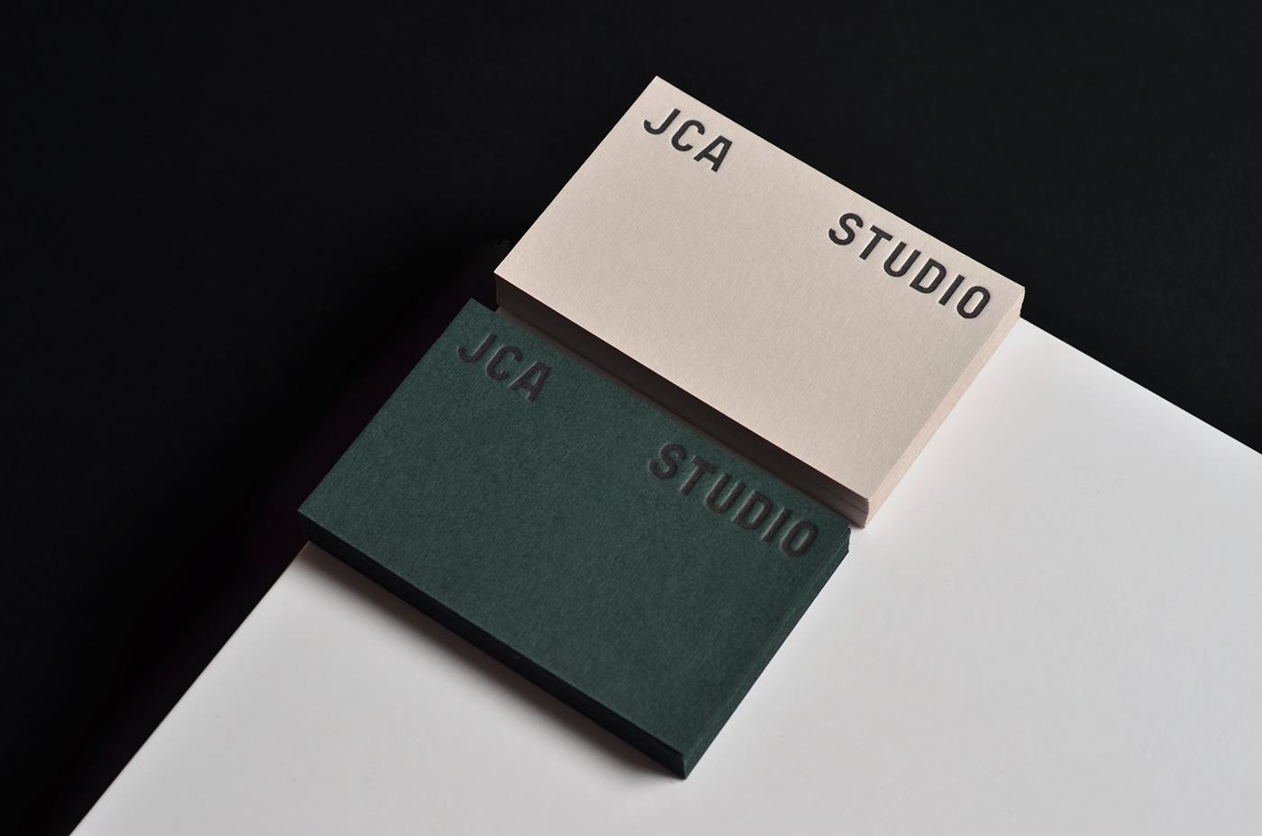
MAYK worked with Jeremy Chapman Architecture Studio to create this pre-digital office inspired identity. The branding aesthetic was driven by Jeremy’s admiration for the functional design seen in modernism and the Soviet industrial eras. Historical references from analog stationary and manually-created signage informed the typography.
The JCA Studio word mark was custom-built and is combined with authentic type and a sophisticated colour palette. This results in a considered, rational and approachable visual language that echoes the JCA Studio values.


