Communicate through music
Since 2019, the world has been affected by COVID-19, and about one-fifth of Taiwan's population (19%) has increased the frequency of using music streaming platforms. Making music reviews play an important role in the pulsation of the industry and build a bridge between listeners and creators.
2019年台灣受到 Covid-19 影響,約五分之一的人口(19%)提高使用音樂串流平台的頻率。音樂評論扮演著產業脈動的重要角色,搭建出連接聽眾與創作者之間的橋樑。

The Challenge
Bring the creative process to the table
Music creation itself is almost invisible in visible music reviews. One of the goals of my project is to reconnect with the audience and music creators. So that more information, including the creative process or thinking context, can be seen. And to bring the audience a richer musical imagination.
On the other hand, the recommendation function of the existing platform is no longer able to meet the audience. Given this, my other goal is to create a space conducive to sharing and discussion. So that music reviews can meet different music needs (preferences).
在公開可見的音樂評論中幾乎看不見音樂創作本身,而我的專案目標之一是要重新連結聽眾以及音樂創作者,讓更完整的資訊,包含創作過程或是思考脈絡能夠被看見,帶給聽眾飽滿而豐富的音樂想像。
另一方面,現有平台的推薦選項過於大量以至於無法聚焦,有鑑於此,我的另一個目標是,建立有益於分享與討論的空間,使音樂評論能夠有效滿足不同的音樂需求(喜好)。
My Role
To solve the challenges encountered, this conceptual project was completed between August 2021 and October 2021. I led UX research and UI design and was responsible for potential user interviews, IA planning, visual design, and prototyping.
為了解決上述遭遇的挑戰,這個專題從 2021 年 8 月開始,到 2021 年 10 月完成。我獨自擔任 UX 研究員以及 UI 設計師,負責從潛在用戶訪談、資訊架構規劃、視覺化到原型測試。
Kickoff
Understanding the user
At the outset of the project, the main user groupset was the start-up music creators. And the brief direction was to find more cooperation opportunities for independent creators who have no record company operating behind them.
在專案進行初期所設定的使用族群是以剛起步的音樂創作者為主,簡要的方向是提供未有唱片公司在背後營運的獨立創作者尋找更多合作機會。
—————
“A lot of unnecessary time cost or mental energy is wasted unless the creator spends enough time and money to be seen by the record company.”
「除非創作者本身花夠多的時間跟金錢去被唱片公司看到,不然很多不必要的時間成本或是精神力就是被浪費掉了。」
—————
Early Insights
After having a user need worthy of being addressed, I set up a few questions and conducted user interviews with 2 sub-groups and 6 participants. The purpose is to understand how music creators and general music listeners use music platforms and analyze past experiences. Finally, I summarized the following common pain points:
• Algorithm recommendations are confusing and repetitive
• Too many genres to filter
• Limited space for creators to develop
• Bipolar music reviews
有了一個值得被解決的使用者需求之後,我規劃幾項問題,並對 2 個分群、6 名參與者進行用戶訪談,目的是了解音樂創作者與一般音樂聽眾的使用音樂平台的方式以及分析過往經驗。最後歸納出以下幾個比較常見的痛點:
• 演算法推薦混亂且重複
• 類型繁多篩選不易
• 創作者發展空間受限
• 音樂評論反應兩極
The Discovery
Explore under the iceberg
I have observed from user interviews that whether it is from general audiences or music creators. They all have a desire to “want to be seen” as well as a need from “curiosity to different ideas”. Yet, it is always the same with human nature.
This may be the behavior that people can feel satisfied through sharing and understanding.
我從用戶訪談中觀察,不管是來自一般聽眾或是音樂創作者,他們都有「想被看見」的渴望以及來自「好奇不同想法」的需求,但誰不是呢?
這也許就是人們本質上能夠透過分享與理解,而感受到滿足的行為。
—————
“If it can be operated as a social media, let the audience or target audience know my personality and traits, that would be great.”
「如果可以像社群媒體一樣經營,讓聽眾或 TA 知道我的個性跟特質,這樣就好。」
—————
Thus, in the process of formulating personas, I can go further from “Why” to “How”. That is, how to make users willing to take part more actively. And I refer to several existing music streaming apps, thinking about how to make a difference with them.
因此我在藉由制定人物誌的過程中,也更進一步地能夠從「Why」想像到「How」,也就是說,如何讓使用者願意更積極地參與。並且參考了幾項現有的音樂串流 App,思考如何做出區別。


The end‐to‐end
I use the user journey map to imagine each touchpoint of the product and the user. Empathize with the sweets and pain points that users will encounter when completing specific tasks. Reduce the blind spots that may be encountered during design.
我採用「使用者旅程地圖」描繪產品與使用者的每一個接觸點,同理使用者在完成特定的工作任務時會遇到的甜點與痛點,減少設計時可能會遇到的盲點。

The Vision
Share music around you
My vision is to make listeners or music creators feel comfortable and valuable to share their music (thoughts, details, and even album art) by posting and sending, not to please their followers. So, I do not intend to provide any “Like” interaction. In contrast, the recommendation function is jointly operated by the circle of friends, with the purpose of helping users focus more on discovering their favorite music.
我的願景是使聽眾或是音樂創作者在感覺舒服且有價值的狀態中,以發文、轉貼的方式去分享自己的音樂(想法、細節,甚至是專輯美術),而不是為了取悅追隨者,因此我不打算提供任何貼文按讚的機制。相對的,推薦功能則是由朋友圈共同經營,目的是幫助於使用者更專注於發現自己喜歡的音樂。
The Framework
How We Got There
The earliest challenge I faced was “integrating the needs of listeners and creators.” To achieve this need, I need to refer to different music streaming apps. Choose a universal design that can achieve the goal for both user groups.
我最早面臨的挑戰是「整合聽眾與創作者的需求」,為了要達成這個要求,我需要參考不同音樂串流 App,選擇對兩個使用者族群都能夠有效達到目標的通用性設計。
After considering the sketches, UI layout, data elements, and interactive behaviors to complete the lo-fi prototype. I used a common usability test, including two groups of listeners and creators, a total of 6 different subjects, to complete the entire process of sharing music (from login).
I converted observations into insights and summarized the following three points:
• Users can login in a faster and easier way
• User needs a more obvious and identifiable prompt
• The user flow of the App needs to be clearer and simpler
考慮到草圖、UI 排版、數據元素以及交互行為完成 lo-fi prototype 後,我採用常見的易用性測試,包含聽眾與創作者族兩大群總共 6 位不同受試者,進行分享音樂的整個完整流程(從登入開始)。
我將觀察轉化為 Insights 歸納出以下三點:
• 可以用更快、更輕鬆的方式登錄
• 需要更明顯可識的提示
• App 的用戶流程需要更清晰、更簡單
Content First
In terms of actual user experience, MUSICAVE is closer to integrating social apps and music streaming platforms. I hope that in addition to listening to music, there will be more connections between users, while trying to provide only the information that needs to be seen.
在實際的使用體驗上,MUSICAVE 的型態更接近將社交型 App 與音樂串流平台合而為一。我希望除了聆聽音樂以外,能讓使用者之間產生更多的連結,同時盡量只提供需要被看見的資訊。
—————
“When most people listen to music, they should have a very clear orientation. For example, I would like to find someone who listens to music in the same style as me.”
「大部分的人聽音樂的時候應該都會有一個很明確的取向,像我會希望可以找到跟我聽差不多風格音樂的人。」
—————
I conducted the second usability test and made the following changes in the design iteration:
1. “Homepage search bar” replaces the original search tab, reducing user search steps.
2. “Search recommendation” provides music that appears in private messages with friends,
which gives feedforward from more aspects.
3. Give opinion leaders higher visibility in “Music Review” and make positive or representative
speeches more influential.
4. Add a music type badge to the “Library” page to convey the personal style.
我進行第二次的易用性測試,並在設計的迭代中做了以下幾個改變:
1. 「主頁搜尋欄」取代原本的搜尋 tab,減少使用者搜尋步驟
2. 「搜尋推薦」提供與朋友私訊中出現的音樂,給予來自更多面向的前饋
3. 在「音樂述評」給予意見領袖更高的可見度,讓正面或是具代表性的發言更有影響力
4. 在「個人頁面」中新增音樂類型 badge,傳達個人風格

Detailed Design
UI Style Guide

In the initial design phase, I started by defining the design system (fonts, spacing, color palette). The size and spacing of the components are standardized in multiples of 4px. Improve the original space arrangement to provide more breathing space on the screen.
The background uses neutral gray as the main color, and white is used to distinguish it from the background. The secondary color is calm green, and relatively bright yellow is used as the accent color. The combination of the two brings fresh and comfortable emotional memory to the user.
Round or rounded corners are used on components. Compared with sharp right angles, it can reduce the cognitive load of the user's brain and reduce anxiety during use.
最初的設計階段我先從定義設計系統(字體、間距、色票)開始,其中元件大小與間距都以 4px 的倍數作規範,並改善原本空間安排,使畫面上有更多的呼吸空間。
背景使用中性灰當作主色,並以白色與背景區別。輔助色選擇沉穩的綠色,並以相對明亮的黃色當作強調色,藉由這兩者的搭配帶給使用者新鮮、舒適的情緒記憶。
在元件上廣泛使用圓形或圓角,比起銳利的直角,更能夠降低使用者大腦的認知負荷,減少在使用時的焦慮感。
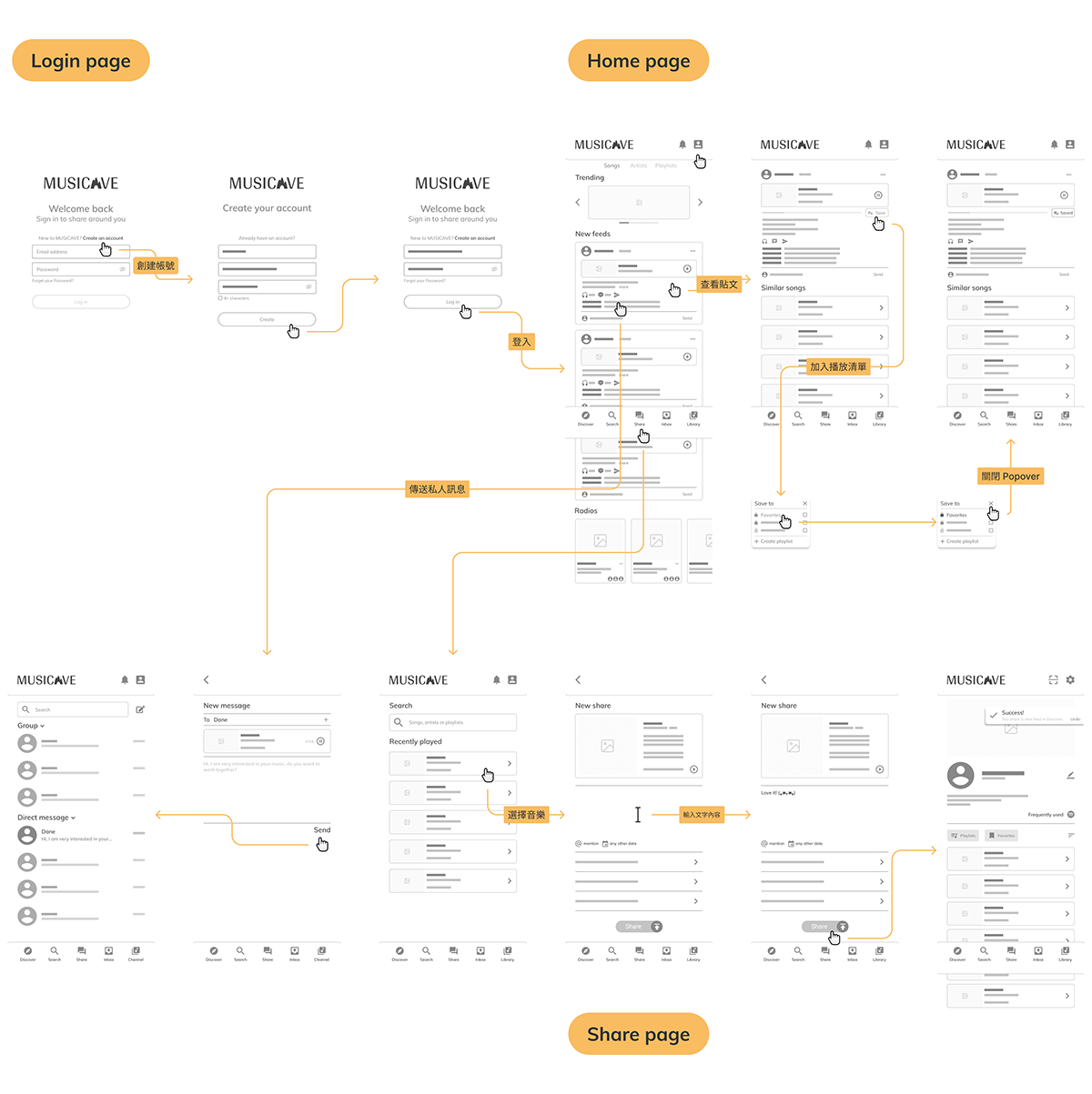
Introducing MUSICAVE
The gallery below shows the interface and illustrates design thinking.
以下將會用幾張圖來展示介面並說明設計思維。

Login and register 登入與註冊
Use bold fonts and accent colors to state clickable buttons on a green background. The size of the CTA button is also easier to click, and it is distinguished by different button stages. Even if it is pressed by mistake, an error message will display.
To reduce the discomfort caused by inputting information, a third-party login is provided. And the login and registration interface are consistent.
使用粗字體和強調色在綠色的背景中提示可被點擊的按鈕,其中 CTA 按鈕在大小上也更容易被點擊,且以不同的按鈕階段區分,即使誤按也會提示錯誤訊息。
為了減少輸入資訊而帶來的不適感,提供第三方登入,並且使登入與註冊介面維持一致。

Discover 首頁
The design is presented in cards with pictures and text, and colored and colorless shadows are used to bring out a gray background. The green is used to provide button visual cues. Finally, the lines extend the vision.
The homepage is the first page that users see. With a search bar at the top and a music recognition function to increase the efficiency of users when searching for music. Besides, after the page is pulled down. A search button will appear in the Navigation Bar, allowing the user to search without leaving the current working state.
整體設計廣泛採用圖片加上文字的卡片呈現,在灰色背景上用有色以及無色的陰影襯托,綠色則是改用來給予按鈕視覺提示,最後用線條做出視覺延伸。
首頁是使用者率先看到的頁面,頂部放置搜尋欄,以及音樂辨識功能,增加使用者搜尋音樂時的效率。另外在頁面下拉後,Navigation Bar 會出現搜尋按鈕,讓使用者要搜尋時能夠不離開當前的工作狀態。

Share 分享
Sharing is the main function of this project, so I have made more attempts in the process. For example, at the bottom of the search bar, use the toggle to switch from the music recently played to music mentioned by friends in the Inbox.
Considering that the main element of sharing is music, users can crop up to 15 seconds of music clips as the first impression to guide other users.
分享是這個專案的主要功能,因此在流程上做了比較多的嘗試。例如搜尋欄下方以條列的方式,提供最近播放過以及收件夾(Inbox)中朋友提及的音樂,並用 toggle 切換內容。
考慮到分享的主要元素是音樂,所以使用者能夠裁切最長 15 秒鐘的音樂片段作為第一印象,引導其他使用者。

Feeds 動態消息
Anyone’s article on the homepage can click to lead to the feeds page, and users can interact with music from the music player (post feeds, bookmark to the list, add to favorites). Cooperate with the animated interactions to optimize the user experience.
Music reviews include an exciting feature——sharing music playlists. Users can follow interesting feeds and discover music that is not recommended by the system. Of course, this still depends on whether other users are willing to share.
首頁中任何人的文章都可以自然地透過點擊導向動態消息的頁面,並且使用者可以從音樂播放器與音樂進行互動(發布消息、收藏播放清單、加入我的最愛),並與互動動畫互相配合優化使用體驗。
音樂評述包含一個令人振奮的功能——分享音樂播放清單,使用者能夠依循一篇有興趣的動態消息,挖掘非系統推薦的音樂,當然這還是取決於其他使用者是否願意分享。

Personal page 個人頁面
Since the personal page will be the area where listeners and creators can best create personal taste. Users can display their choices in music through customized content. And use the toggle component that is consistent with the search page in the personal page to maintain the continuity of the user's operation.
To make users more focused, I considered for a long time the choice of whether to display the number of people followed. Finally, I decided to remove it, because one of the goals of this project is to reduce users’ anxiety and fear of missing out (FOMO) in the community.
由於個人頁面會是聽眾以及創作者,最能夠營造個人品味的領域,使用者能透過自訂義的內容展示在音樂上的選擇。在個人頁面中使用與搜尋頁一致的 toggle 組件,保持使用者在操作用的連續性。
為了讓使用者更專注,我在是否顯示追蹤人數的抉擇上考慮了很久,最後還是決定移除,因為本專案其中的一個目的是,減少使用者在社群上的焦慮感以及錯失恐懼 (FOMO)。
Takeaways
The Impact
—————
“I like the concept, if I know that someone will be affected by the music I share, then I would be willing to share it.”
「我蠻喜歡的概念,如果知道有人會因我分享的音樂而受到影響,那我會很願意分享出去。」
—————
—————
“I find it very interesting because there is currently no music app to write community thoughts.”
「很有趣,目前沒有使用任何音樂 App 可以撰寫社群心得。」
—————
—————
“The idea is good! It can give people who like music a warm and small space to get to know each other.”
「構想不錯!讓喜歡音樂的朋友有個溫暖小空間認識彼此。」
—————
Reflections
The process of design iteration is endless. It is very possible that a change of conditions will require different degrees of adjustment to meet the needs of users and the market. Thus, it is very important to understand more about the background research and contextual inquiry in the early stage. And the questioning itself will become an important basis that cannot be replaced when it is transformed into a design in the future.
Throughout this project, I observed that when thinking about the overall framework. It is easy to overlook the details and how the interaction occurs. If I ask: “Should I add this feature?” I might be misled by myself.
As a user experience designer, consider whether the most complete experience can be conveyed to users in different environments or potential misunderstandings. I should understand that “the usage scenario is not only the function of the application itself”, but also needs to substitute myself into the user's expectations.
Finally, this project has many things to try in the integration of social and music. The App's prototype at this stage also has details in the process that can be added. Although MUSICAVE will not be launched, the completion of this project is an important milestone for me.
設計迭代的過程是永無止盡的,很有可能光是一個條件改變了,就會需要進行不同程度的調整以符合使用者與市場的需求。因此才更了解在前期的背景研究與脈絡訪查是相當重要的,在提出問題的本身也會成為往後在轉化成設計時不可取代的重要依據。
在整個項目中,我觀察到在思考整體框架時容易忽略細節以及互動該如何發生。如果問:「我應該加上這個功能嗎?」便很有可能被自己誤導。
身為使用者體驗設計師,我更應該了解「使用場景不僅僅是應用程序本身的功能」,還需要將自己代入使用者的期望,以考慮在不同的環境或是潛在的誤區中,是否能夠順利傳達給使用者最完整的體驗。
最後,這項專案在社群以及音樂的整合上還有許多可以嘗試的地方,現階段的 App 原型在流程上也還有細節的地方可以補充。雖然 MUSICAVE 並不會上線,但完成這個專案對我來說絕對是個重要的里程碑。


