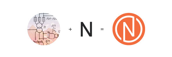
Our approach was to develop an identity, limited in color palette, that compliments the right combination of clarity, simplicity and functionality. We designed branding identity for Belarus based company “NVAcontact” that carries out deliveries and produces electrical equipment.
We developed a reversible logotype in which the firm`s first letter was represented to respond to the need for simplicity whilst also giving good flexibility for the affiliate relationships.
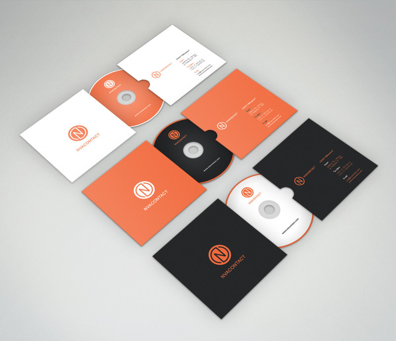
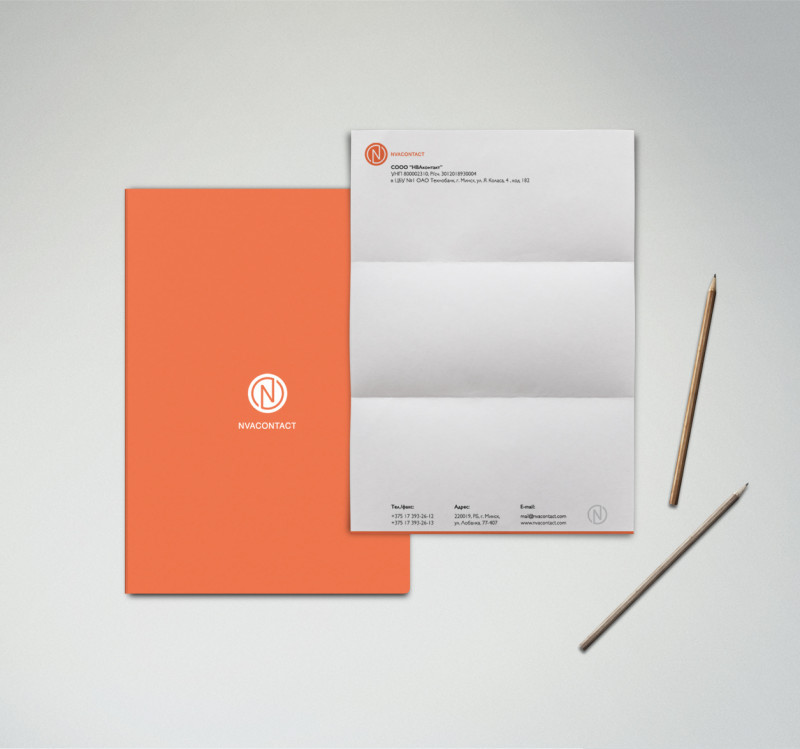
Elaboration involves designing of business cards, blanks, blocks for notes, cd covers, branded pens and memory cards, envelopes, sticker on a car, web site and its mobile version. It`s important to notice that identity style includes simple colors ( orange, white and grey ) that can be changed or combined for different needs of the company.
Overall we created a clean, strong and modern corporate brand that confirms with brand guidelines.