Client:
Milkmedic
Sector:
Healthcare - Retail
Discipline:
Digital Design
Packaging Design
Illustration
Location:
Singapore
____
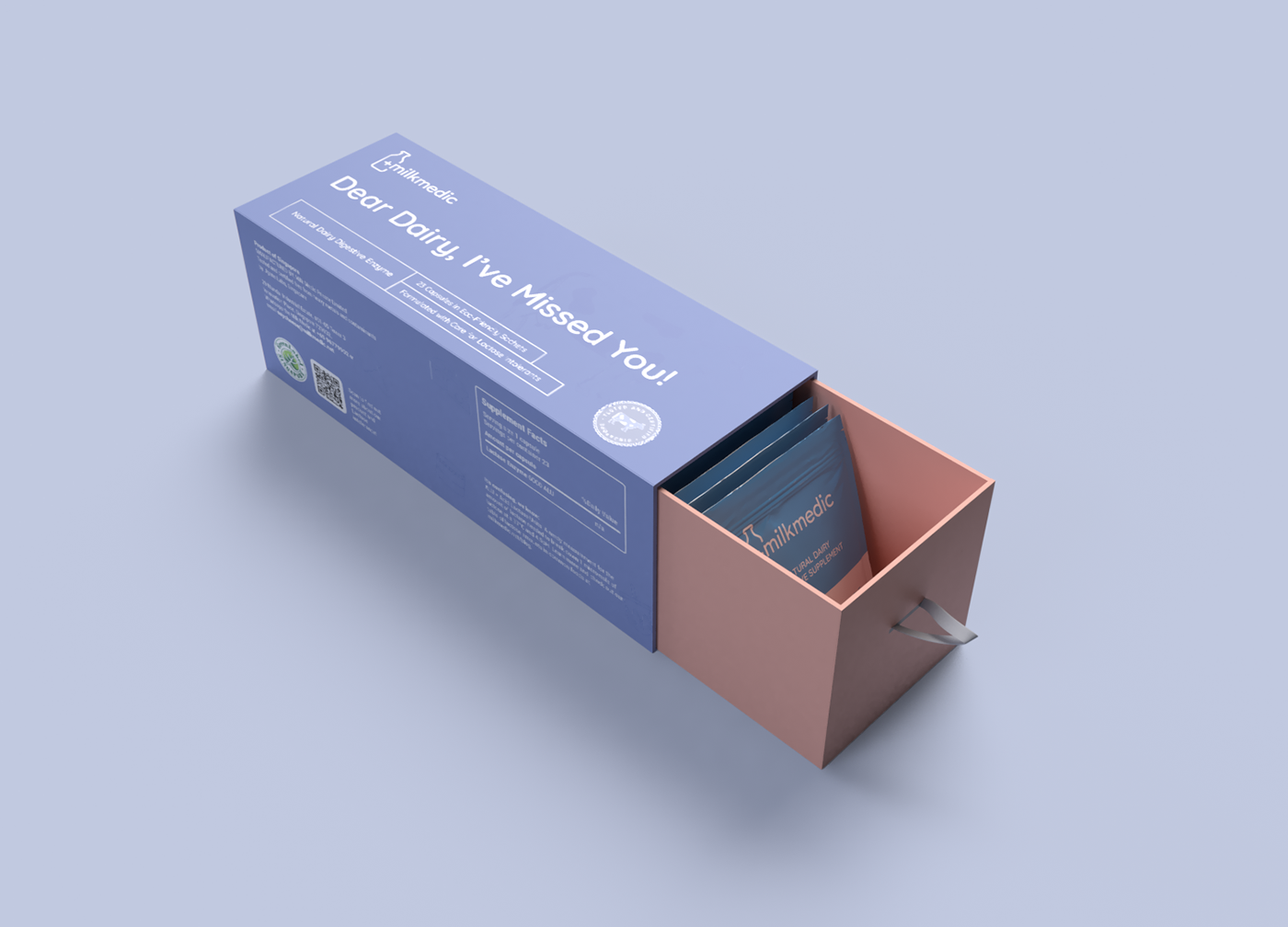
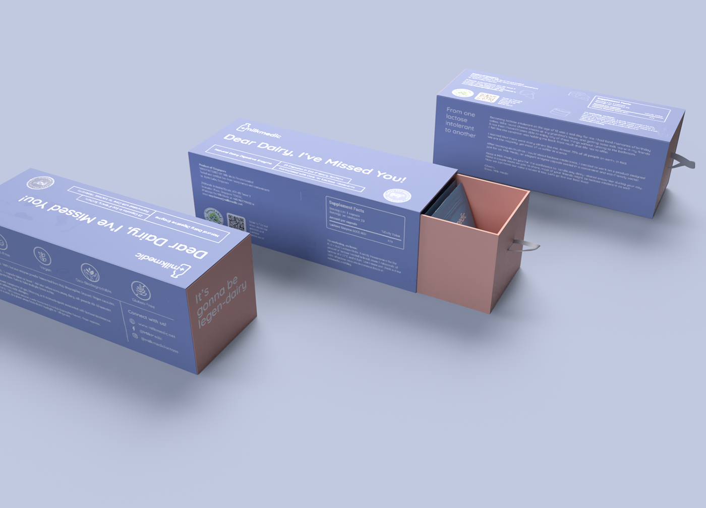
Milkmedic is a lactase enzyme capsule that allows lactose intolerance individuals to ingest dairy products without consequences. Milkmedic is able to prevent uncomfortable symptoms like abdominal cramps, flatulence, bloating and diarrhea. The individuals who lack the biological catalyst lactase, which helps digest lactose, the sugar in milk items, frequently take the capsules to evade acid reflux when eating dairy items.
The target market for Milkmedic is for younger people to adults that were part of the ‘in’ crowd. The target customers of Milkmedic belong to the group of dairy lovers and trendy customers who see modern lifestyle as a social activity that provides pleasure in their daily life, who want to follow up the trends, connect, and live a conspicuous lifestyle that is interesting without worrying about uncomfortable symptoms of lactose intolerance. They have an iconic awareness of society’s stereotypes of being minorities opulently wealthy.
Make medicine into works of art: Expect a fresh focus on placement prints that turn products into ‘art’. Consider them for spin-offs of established key products.
Minimalistic delicate pastel has warmer colors that add character to Milkmedic brand. As creatives, we don’t just stick to a color palette with a certain fixed saturation and hue level. We appreciate colors that are less saturated and muted at times too. Whether it’s in packaging, collaterals, decorations, or structures, we feel that highly saturated colors can sometimes take too much away from the natural beauty of its raw colors. This is why pastel colors are a growing trend and suitable for growing global brands.