wanpy
顽皮
—
A meaningful rebranding for a Chinese pet food brand. The design highlighted the significant value of the brand-new symbol and unified the brand image as a whole. As the pet food brand under the China-pet group branch and with tens of years of history, Wanpy has built a consistent quality and reliable brand image for consumers. In order to extend the market as well as get closer to the modern and younger audience, Wanpy wants to renew its brand image.
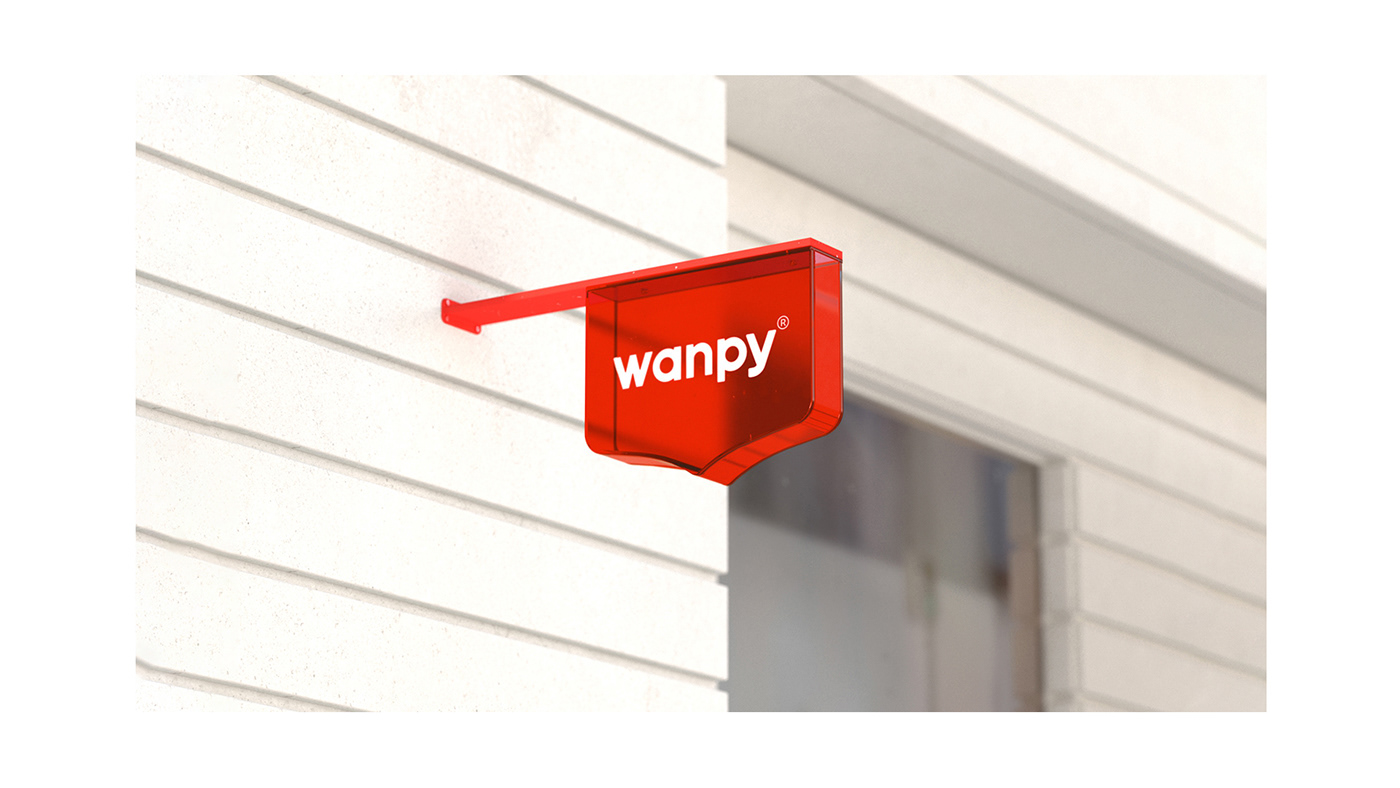
The strategy of the rebranding is based on the two keywords of succeeding and reforming. Within tens of years of business, the existing brand image of Wanpy has been memorized by its past consumers, and parts of the brand identity have become Wanpy’s brand assets. Through our research, we clarified the most important brand assets of the existing brand identity: the brand red color and the badge-like brand logo. However, because of the hard and sharp shape of the logo and the uncertainty of the meaning, the existing badge shape logo shows a serious and conservative image, especially with the dark red brand color, generating a feeling of distance. Regarding the issues of the existing brand image, the goal of the reforming is clear: We want to break the cold and distanced brand image by adjusting the shape of the logo and graphic, what’s more important, to present the brand-new symbol with conceivable meanings, which can be the brand’s value that appreciated by the consumers.
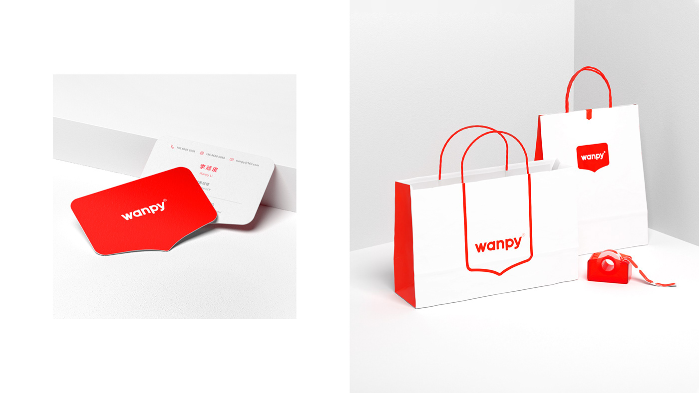
“Pet is our friend and our family” has been Wanpy’s brand proposition since the beginning. We believe that the importance of our friends and family is about communication, which is the key to bringing everyone closer and creating harmony. The interpretation of the communication led to the design of the dialogue box-shaped logo, which succeeded in the existing visual recognition of the brand and empowered the brand with deep and appreciable meanings. With the brand-new logo, the softer and rounder font, the brighter color, and, more importantly, the meaningful connotations, Wanpy has revived a younger and more vibrant brand image for the future.
—
作为中宠集团旗下并有着几十年历史的猫狗粮品牌,为了更好的拓展市场,塑造更为当代且契合年轻消费群体的需求,wanpy希望通过品牌重塑来实现焕新。
品牌重塑的设计策略围绕继承和创新这两个关键词展开,我们通过调研明确了品牌形象中最为核心的两个元素,即品牌色和其具有代表性的类似徽章的符号,然而,由于视觉上过于尖硬,以及缺乏内涵的表达,原来的徽章符号给人一种严肃且传统的感受,尤其搭配现有的较深的品牌色,给人距离感。“宠物,是朋友即是家人”是顽皮一直以来的企业主张,朋友和家人的共性是沟通,与爱宠的沟通在于对它更多的了解,更多的陪伴和关爱,设计推导出沟通框这样的符号,一方面在视觉是延续了顽皮品牌既往的识别,另一方面赋予了品牌深刻且匹配的内涵,从而实现了价值传达的意义。
—