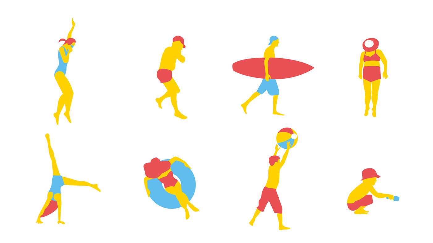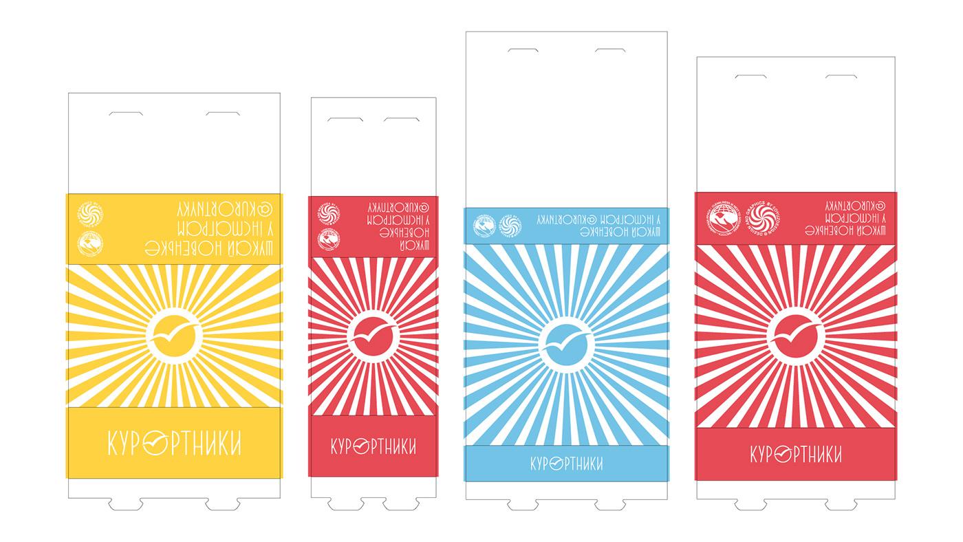

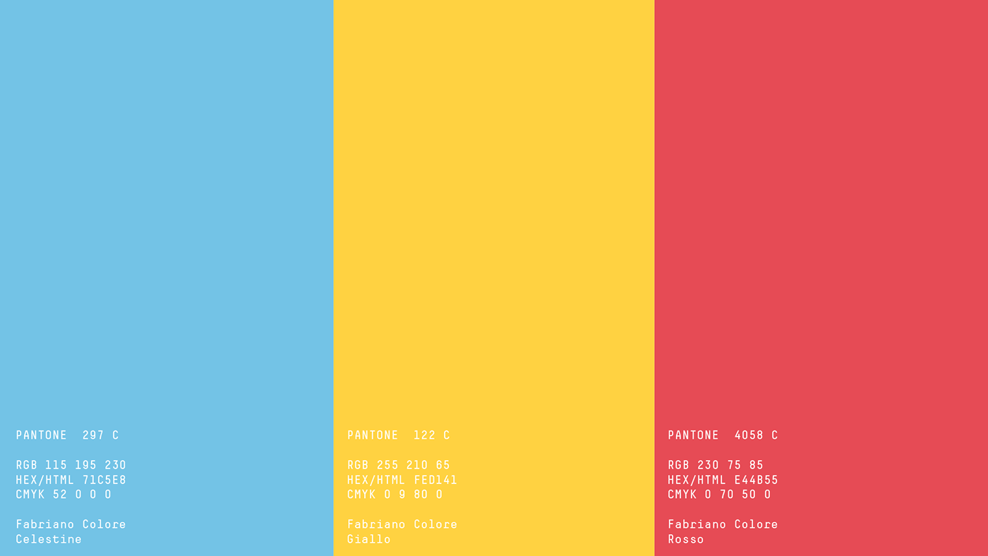
Kyrortnyky (from ukrainian Vacationers) is a gastrobistro from Kharkiv with the idea of a place where it is always as warm, sunny and delicious as at your favorite resort. The image of a seagull chosen as the sign is a symbol of the sea and rest. The illustrations used on postcards, packaging and content depict typical silhouettes of people at the resorts.
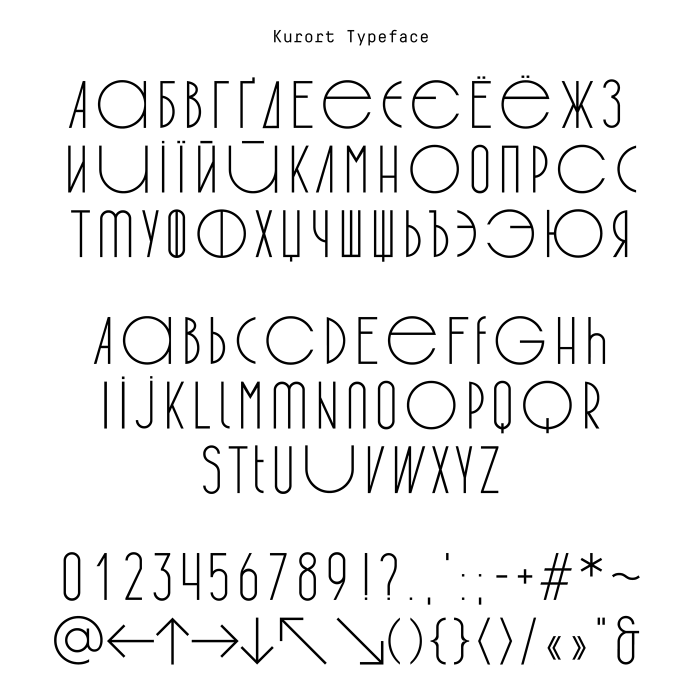
Kurort is a condenced custom grotesque font inspired by the fonts of the 70's. It is used in the logo and in the headings or short messages to emphasis the unique “voice“ of the brand. A feature of the headset is the presence of the individual monospaced letters. Together with the narrow ones, they form a unique rhythm in the words and sentences similar to
a variety of people on vacation.
The Soyuzdesign team created a graphics, which was inspired by memories from the childhood of the vacations with family.