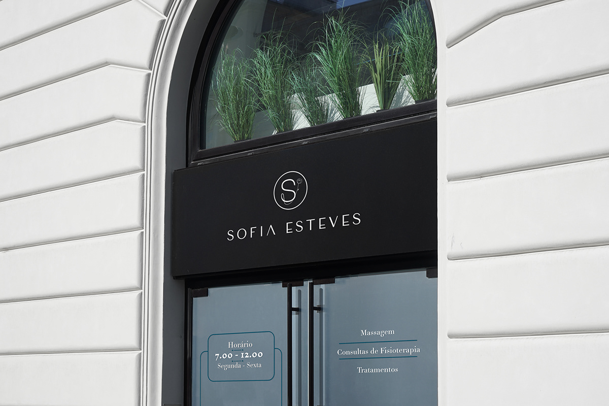

Briefing:
Este trabalho é sobre uma empresa de fisioterapia e massagens terapêuticas.
Foi-me pedido um logotipo em que o objectivo seria juntar os 2 mundos, a fisioterapia e a massagem terapêutica. Esta empresa de momento utiliza um serviço personalizado com deslocação ao domicílio “Home Health Care” mas querem também no futuro abrir um espaço próprio, onde possam aplicar os seus serviços. No Briefing referiram também que queriam que representa-se uma marca de luxo, com uma projeção premium e focada nesse público alvo.
Briefing:
This work is about physiotherapy and therapeutic massage company.
My client asked for a logo where the objective would be to bring the two worlds together, physiotherapy and therapeutic massage. Currently, this company uses a personalized service with "Home Health Care", but they also want to open their own space in the future. The briefing also mentioned that they wanted to represent a luxury brand with a premium projection and focused on this target audience.
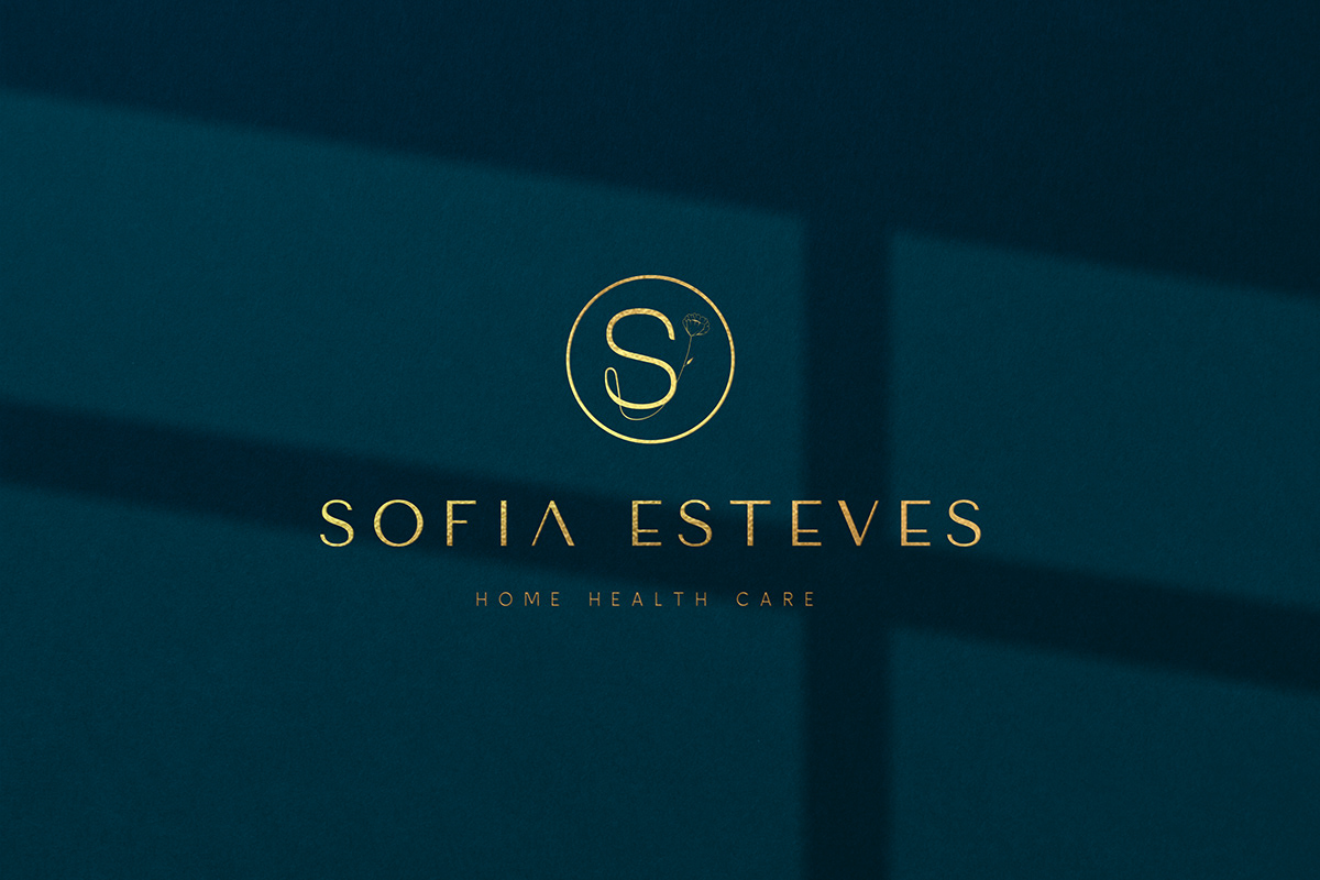
Solução:
Foi então que decidimos fazer 2 versões do logotipo com e sem o slogan home health care, para dar mais funcionalidade e longevidade ao logotipo.
Solution:
I decided to make two versions of the logo with and without the "home health care" slogan to give more functionality and longevity to the logo.
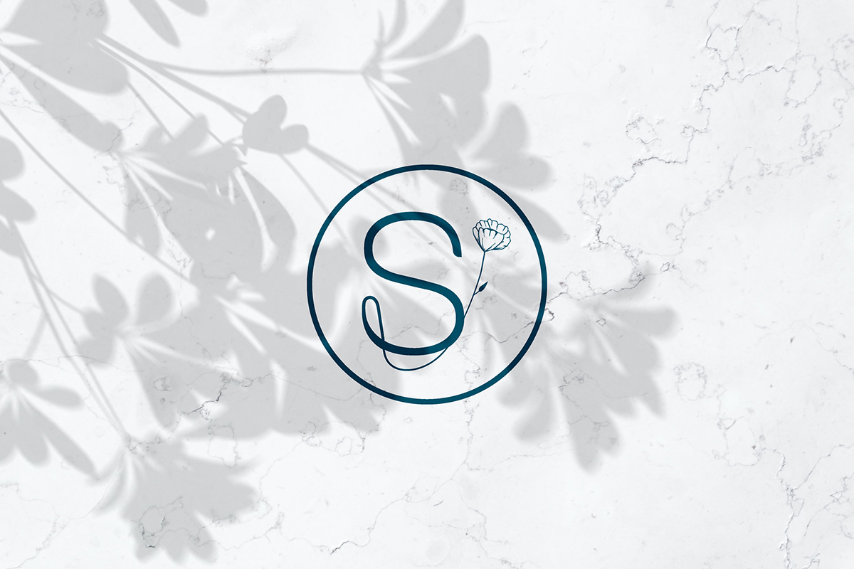
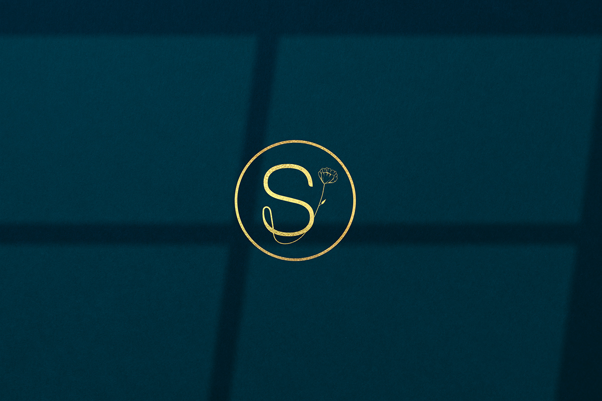
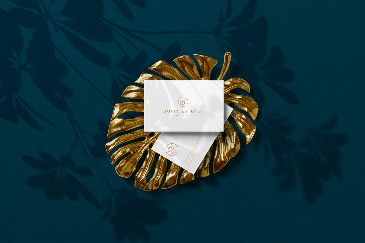
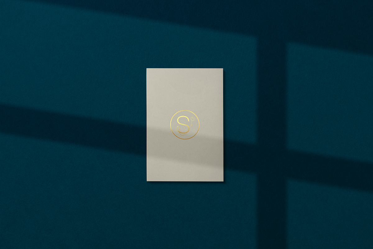
Símbolo:
Na criação do símbolo o foco principal foi representar a delicadeza e o cuidado através da flor, ela desenhada manualmente com um aspecto orgânico através de linhas finas e naturais. A flor além da delicadeza e do cuidado representa também uma ligação com a vida fazendo ligação com a profissão de fisioterapia. A letra “S” e a flor entrelaçadas formam a letra “E” na sua base, formando o monograma S+E de Sofia Esteves.
Symbol:
In creating the symbol, the main focus was to represent the delicacy and care through the flower; it was hand drawn with an organic look through fine and natural lines. Yet, in addition to delicacy and care, the flower also represents the connection with life, making sense of physiotherapy; the letter "S" and the flower intertwined form the letter "E" at its base, forming the monogram S+E by Sofia Esteves.
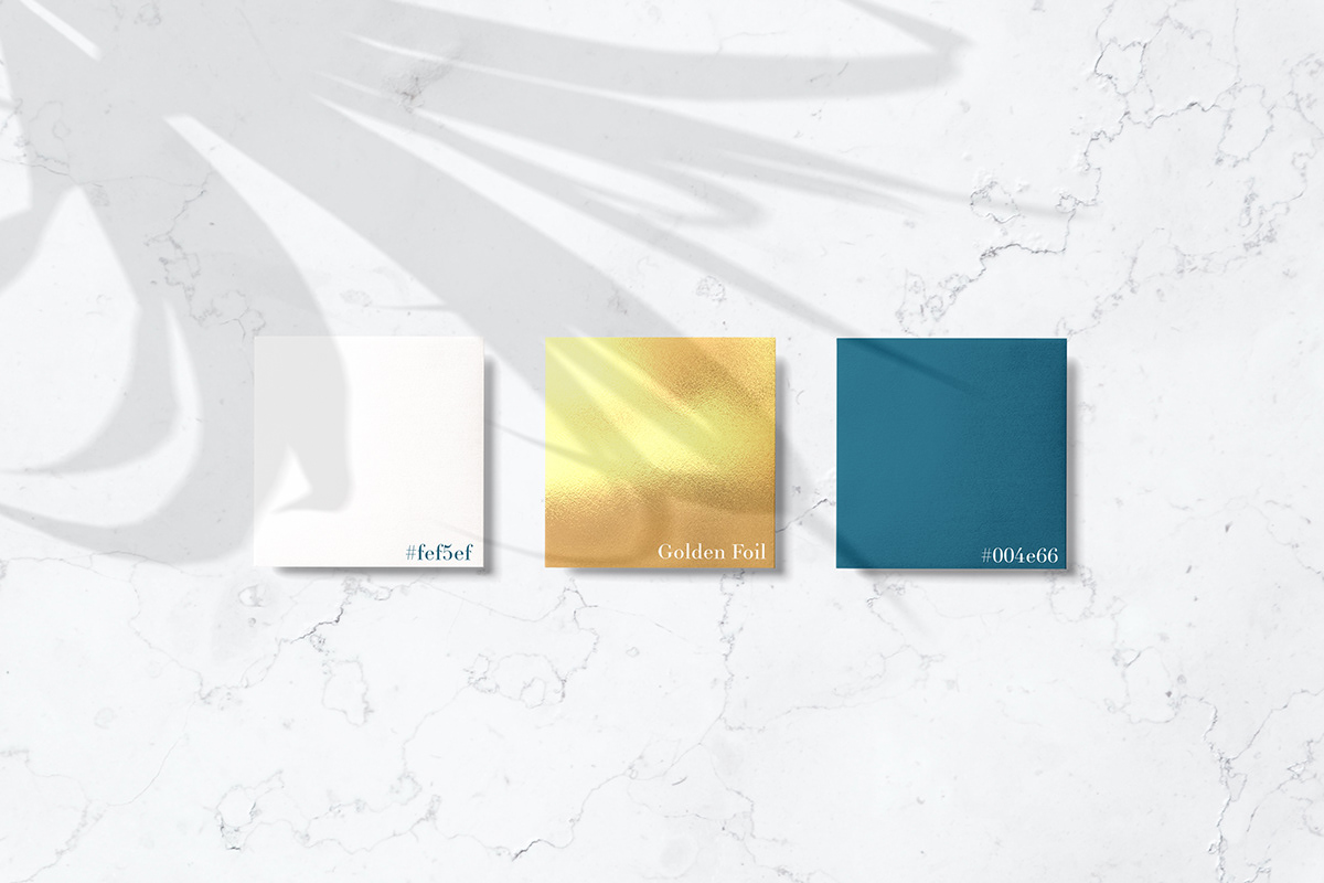
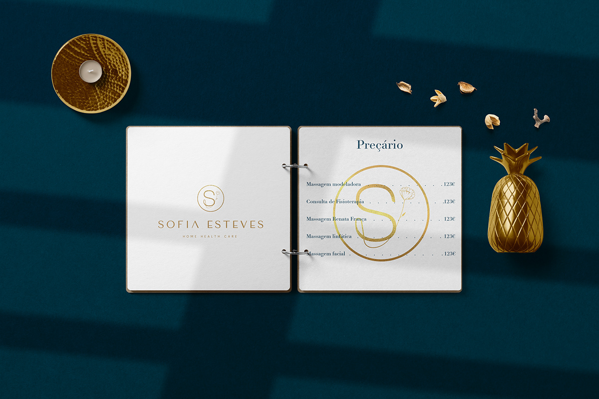
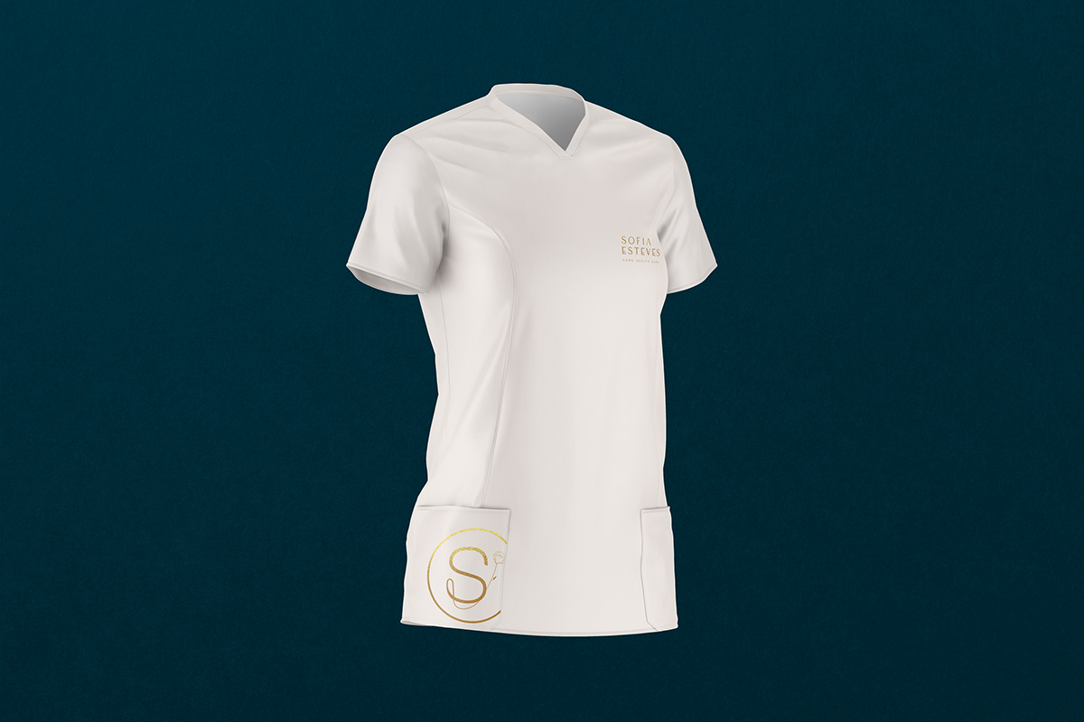
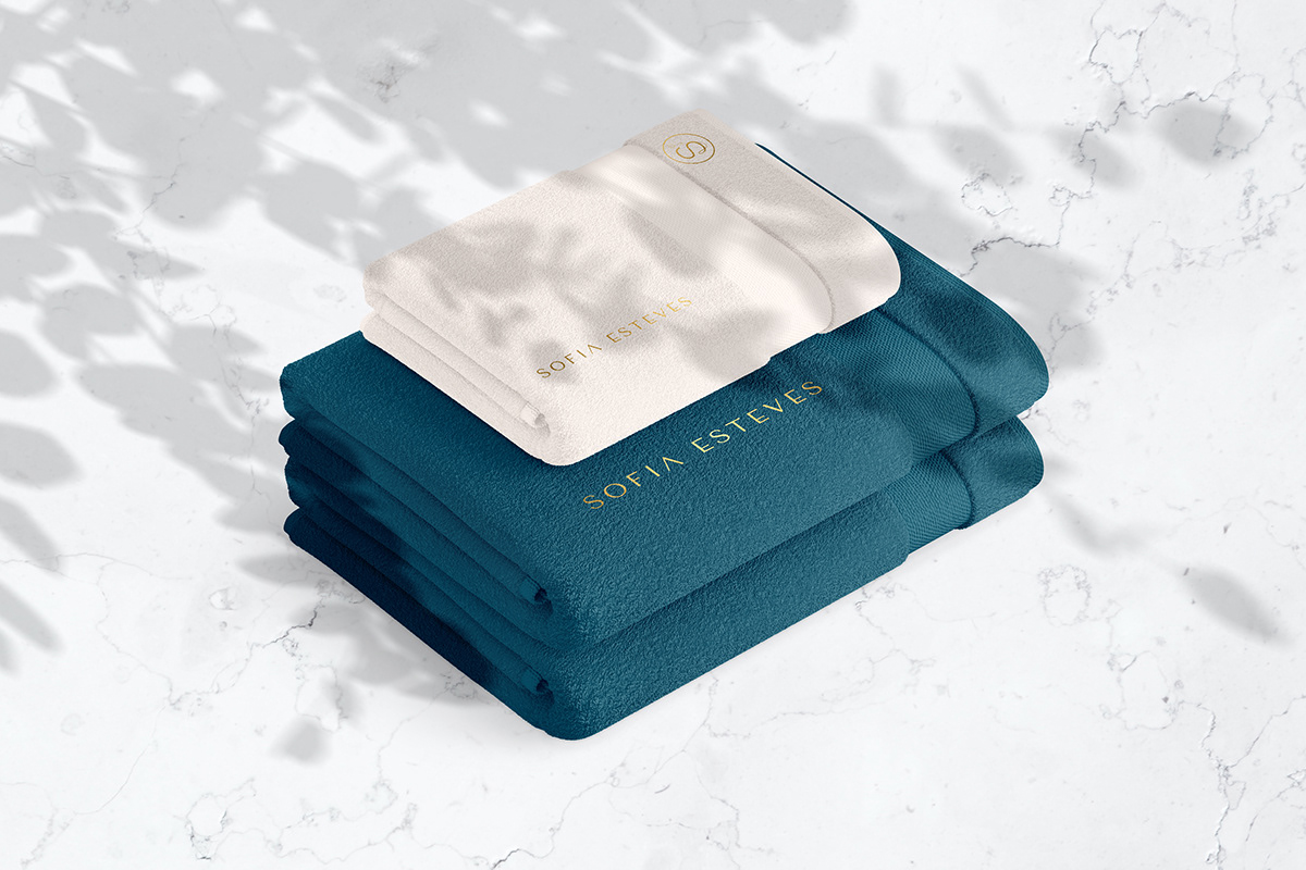
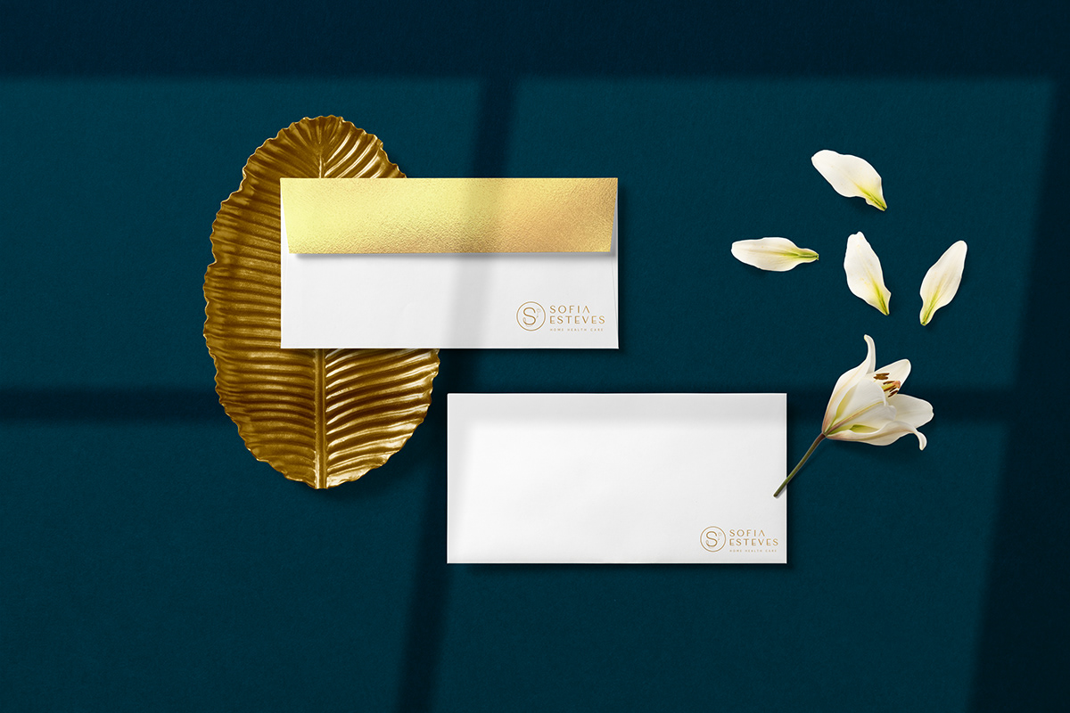
Cores:
Nas cores foquei-me em representar o luxo através delas. Decidi colocar um golden foil na identidade visual, juntamente com o azul escuro onde o azul está ligado à saúde e ao cuidado, e o bege neutro à delicadeza. O golden foil mais ambos os tons de azul e bege ganham harmonia e dão uma visão de luxo e cuidado à identidade.
Colors:
In terms of colors, I focused on representing luxury through them. So I decided to put a golden foil in the visual identity, the dark blue, where the blue is linked to health and care, and the neutral beige to delicacy. The golden foil and the shades of blue and beige work in harmony and give the identity a vision of luxury and care.
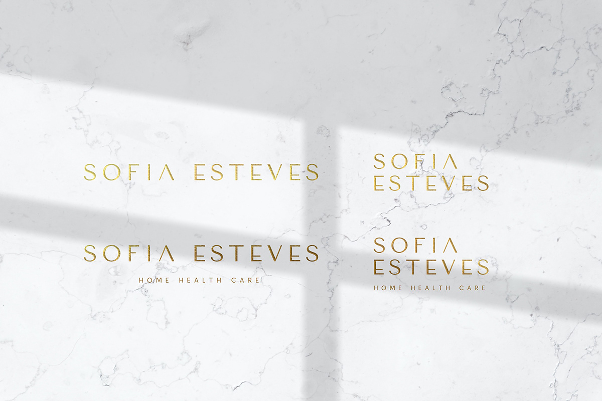
Tipografia:
A tipografia escolhida foi a Tenor Sans. A escolha foi com base na projeção de uma imagem moderna e estruturada. Decidi personalizar esta letra modificando as letras A e E, com o objectivo de torná-la um pouco mais séria e com um impacto mais forte e fora do vulgar.
Typography:
The chosen typography was Tenor Sans. The choice is based on the projection of a modern and structured image. I decided to customize this typography by modifying the letters A and E to make it a little more serious, more substantial, and more remarkable.