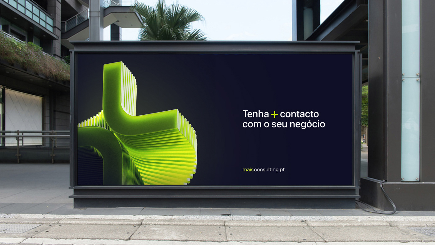
We designed a graphic identity that shows the concept of the brand in its look.
With a strong presence in the sector, +Consulting is looking to strengthen even more it’s place in the market, by creating a group to include all it’s companies.
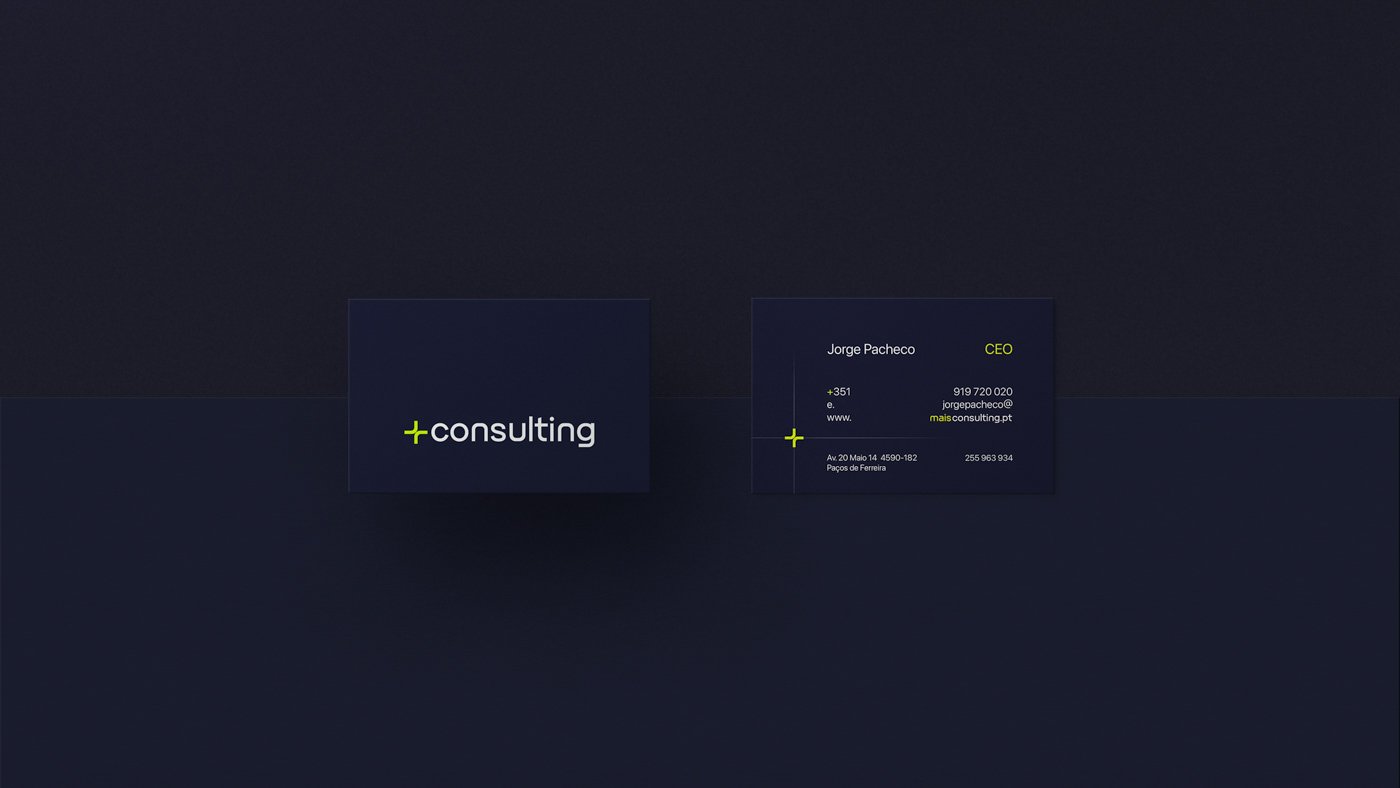
The main idea for the concepts of this branding came from the name itself, we used the “+” as a graphical element and tried to give the rest of the branding a unconventional approach.
The challenge was to develop a strong and communicative image, that is different that we are used to see but it’s just as credible.
We developed a custom typeface that uses the same curves as the icon. By using the same style in both the icon and the typeface we guarantee that they work well together and are easily recognizable as a whole.
The colors where picked mainly for the digital world, to reinforce the unconventional characteristics of the branding and help distinguish from the other companies in this sector.