The idea with "Folkets Hus" (The People's House) started with the emergence of Sweden's national labor movement at the end of the 19th century. When the first unions were formed, there was a great need for meeting facilities. Mostly for labour union meetings, but also for education and cultural events. There are more than 500 Folkets Hus throughout Sweden – each of them with its own history, traditions and personality.

Årsta Folkets hus was inaugurated in 1953 and is, together with the adjacent square, a national cultural heritage. The place has a unique and beautiful 50s architecture and is one of Sweden's earliest examples of a so-called neighborhood unit, with the town square as the "living room" for all citizens. Folkets hus is a commercial, social and cultural meeting point for all ages, which became an important model for the Swedish community building during the post-war period.
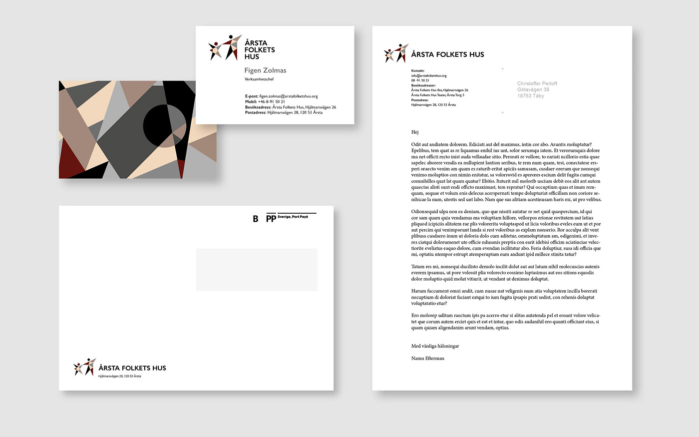
When I was commissioned to create a new visual profile for Årsta Folkets hus, I wanted to connect Folkets Hus' history and the look & feel from the surrounding architecture to the graphic design identity. It was also important that the interaction between people, joy and activities should be expressed in the logotype.
The Tangram-inspired shapes and colors of the two figures in the symbol come from the cultural heritage protected mural on the facade. They symbolize diversity and community. The dance movement symbolizes dynamism, joy and activities. The symbol as a whole is reminiscent of a star shape, which in turn associates with events and showbiz.