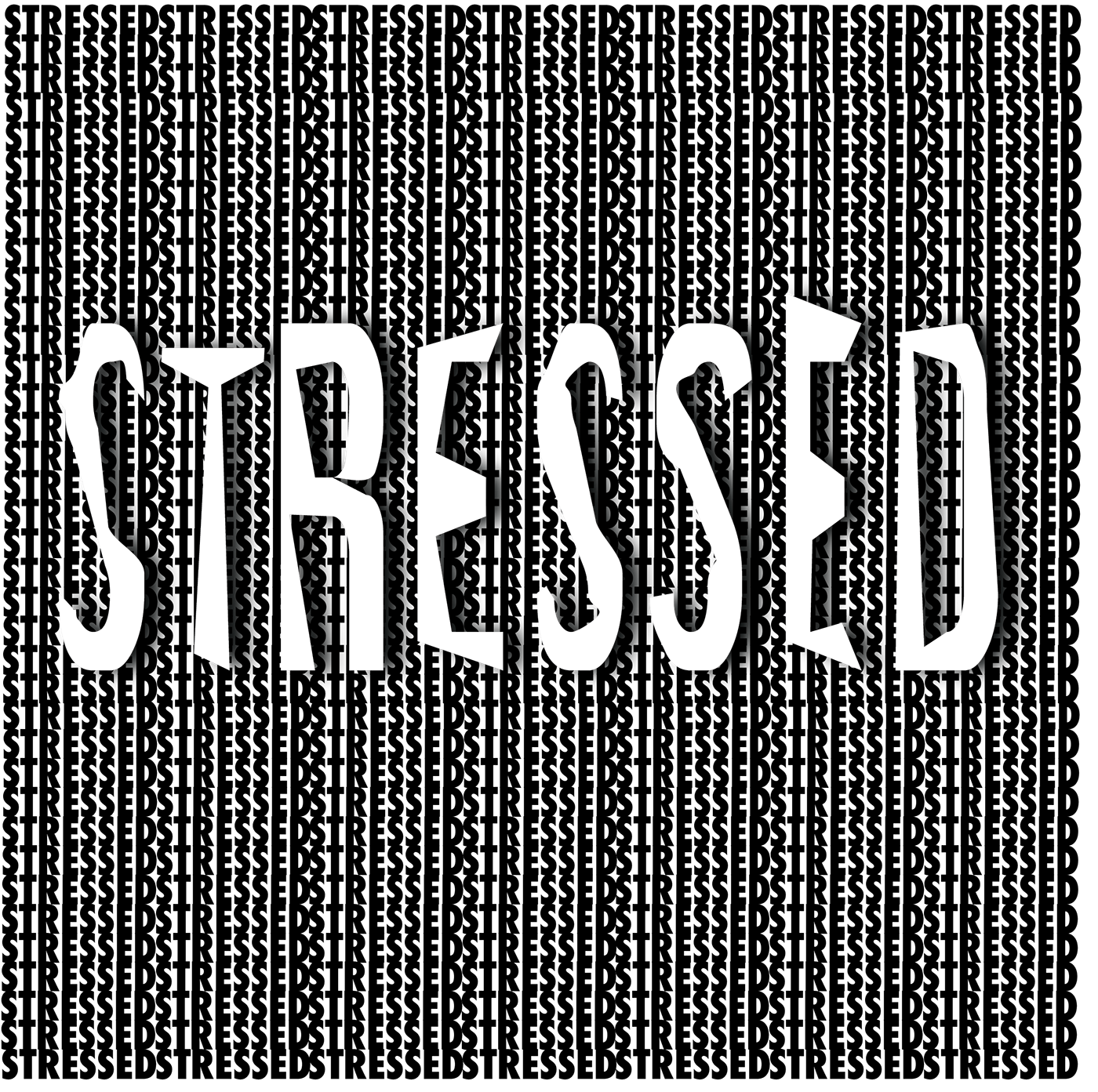
This project in my Typography class was called TypeEmotions. We had to use a word that relates to a specific emotion and the typeface of it needs to match the emotion. For example, if I were doing the word happy, it would probably appear in fancy, colorful, cursive letters. In this case, I did the word stressed. Doing black and white shows off how it looks incomplete because of no colors have been added. Have the word "stressed" right next to each other will hurt the viewer's because because they will not know where to look first and that will frustrate them, especially with not knowing where the word ends or even begins. And have the word "STRESSED" in the center and big can also be stressful because its blocking the view of the words and plus, its letters are sloppy and not perfect. Overall, viewing this picture about the topic "stressed" is supposed to make the viewer stressed while examining it.
