I created a new identity for Richmond's bus system, the GRTC.


FOREWARD
This identity change was meant to bring some life and joy into a vital part of Richmond that often times has a negative view. Many people ride the bus out of necessity everyday and this system will turn a normal and sometimes stressful every day activity into an easier and more enjoyable experience. A goal was to make using the bus an experience that people would want to have, as opposed to not using the bus system, because the more people that use it, the more efficient the buses can be. The system as it was, was confusing and hard to find within the city. My aim was make the buses and street signage have a higher level of contrast with thier surroundings to make them easier to spot. To do this, I used a bright color scheme to make them more identifiable. The clean edges and blocks of space used through out the system provide further contrast from the cluttered environment. Another aim was to provide more information on the bus and street signage so the user was more aware of how the bus system worked. Using color, space, and line an attempt was made at creating a better system for the GRTC bus system.

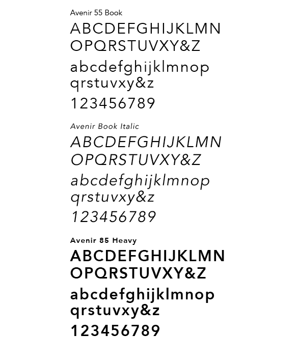
TYPEFACE
Avenir was chosen as the typeface for its’ simplicity and minimal points of change in its capital letterforms which lent itself well when creating the logo that relies heavily on the use of figure ground. The logo was created using the heavy version of Avenir for its thick strokes. The thickness of its strokes are relatable to the negative space of the letterforms which alsolent itself well in creating the logo. Avenir Heavy is used for titles, headers, and all immediately important information such as bus route names and numbers. Avenir Book Italic is used in accompaniment with the main logo when the full brand name is necessary, as well as for secondary information such as sub-titles. Avenir Roman is used primarily with tertiary informarmation like body copy.


COLOR
This warm color scheme of yellow, orange, and red were chosen for multiple reasons, and each holds a meaning pertaining to its use in the system. Yellow and red are the primary colors used as yellow represents busroutes running East and West, and red represents bus routes running North and South. I used these colors in a directional line design in which they overlap, like a bus would cross through intersections, and thus the orange was logically introduced as a secondary color in the system. Yellow and/or red are always used, while orange is used as a supplemental color to add another level of color planes. For example, in the main logo orange is used to help balance the level of color by use of a gradient-like scheme from yellow to red, while providing an emphasis on the solid black letterform "T" for transit.


The bus wrap was created in the intention to have a deep contrast from its environment by use the bold colors and graphics. You would really be able to see it coming down the street and is easy to identify. The use of the arrows is meant to reinforce the idea of movement and direction.

The GO card system is color coded per price level to make it easily understandable. The direction of the arrows indicate how to put the card in the ticket reader.


The uniform was designed so the driving attendant would be easily identifiable for riders needing help. In accompaniment to the uniform, a series of buttons were generated so the attendent would have multiple options.


The street signage was created in the atempt to make signs easier to find on the street and easier to understand. Again red runs North/South and yellow runs East/West and the signs correspond withthis. With directional arrows, it tells whether buses coming to said stop are northbound, southbound, etc. Another addition are the bus route numbers that pass said stop, a to clarify to the rider that they are at the right stop.


