W Galleries
Branding for a touring art gallery
These images show the design development process of a poster design and branding that I created for a metaphorical gallery. The gallery had no name, and no real discription, only that they used disused warehouses as venues for short term exhibitions across the country. My aim was to produce an exciting campaign strategy and use of the brand image within it.
This project is actually a work in progress so the current depth to the mediums in which the branding is shown is shallow at present, but there are site specific examples of the branding being shown in public spaces on a larger scale.

This is the image that began the journey of the design. The ceiling structure of the warehouse in this image was the starting point of the logo's design process and the subsequent images can be seen below.

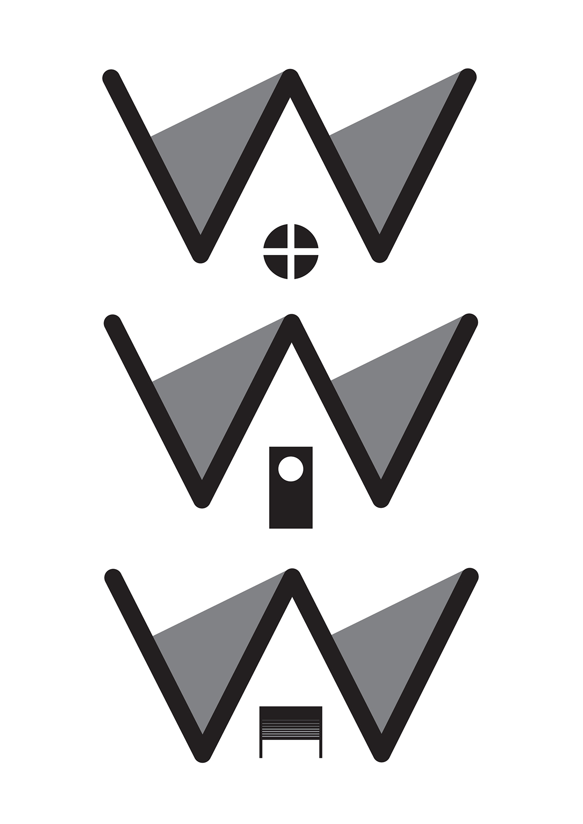

After disgarding the ida of using more complex three dimension illustrated logo ideas I opted for the W with 4 squares. I felt it was the best compromise between simplicity and effectively conveying the symbolism of the word "warehouse"

This stage in the design process came as a result of working with the idea of time as a factor within the company. The short term nature of the exhibitions and the nomadic nature of the company meant that time could and should be a key factor within the concept of the brand's image.
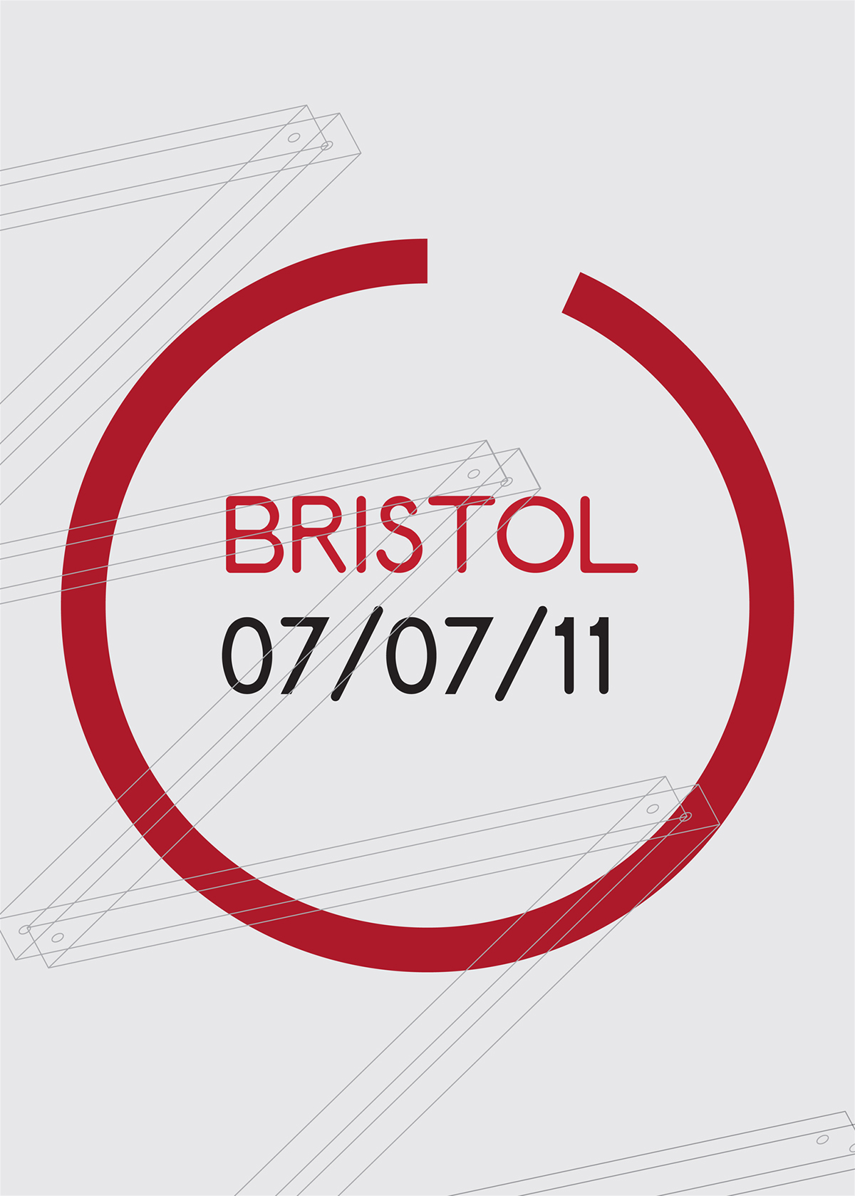
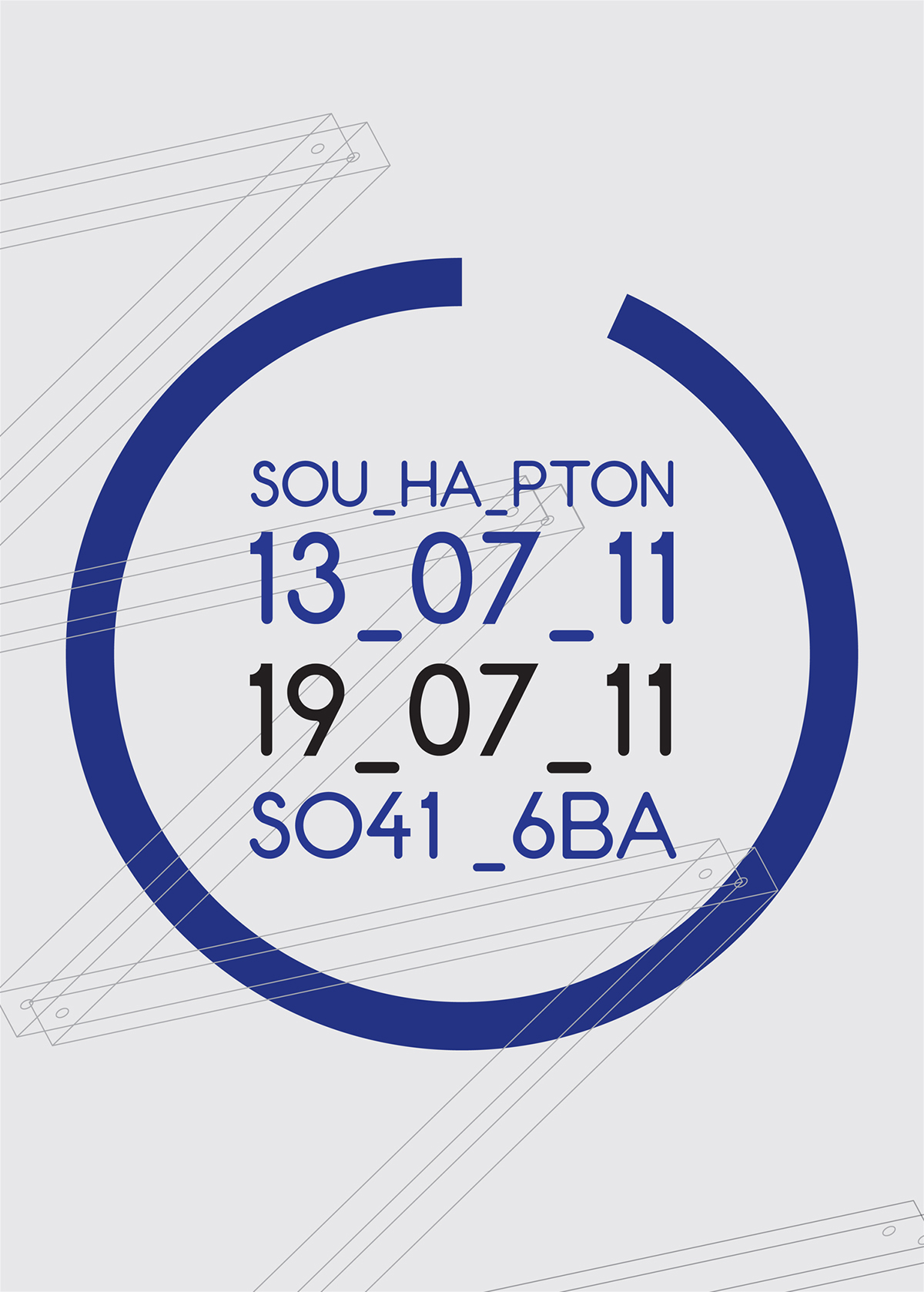
The pie chart type shape sitting beneath the W represents the movement of the hand on a clock. The fact that the hand doesn't make a full cycle represents the temporary status of the shows.


Simplifying the image down to a stroke rather than a block shape makes the overall outcome of the design more transferable into a variety of situations and scales. Having a simple rounded shape to the logo also makes it more pliable as an icon.

As well as having a logo, I decided that from that logo I wanted to take a section of it and have that appear as a constant throughout outcomes of the campaign. I wanted the campaign to have an anonymous theme. No name, no responsibility, no credit. This enables me to employ more controversial advertising tactics within the campaign. To aid me in doing this I will present this more simplified version of the logo within these advertisements. Most of the printed advertising won't actually feature the full logo, simply this incomplete circle.