03 Typography: ISTD
Project Summary
For this project, we had to create a typographic piece that creates an indirect experience that celebrates our connection to natural elements. Biophilia aims to connect people with their environments and communities through nature elements. By looking to nature as our muse to enhance our designs, we needed to create and educate the viewers in a certain way. The goal of this project is to reconnect and strengthen the bod between humans and natural elements in such a way that it can create a positive impact on their health and well-being.
List of technical specifications
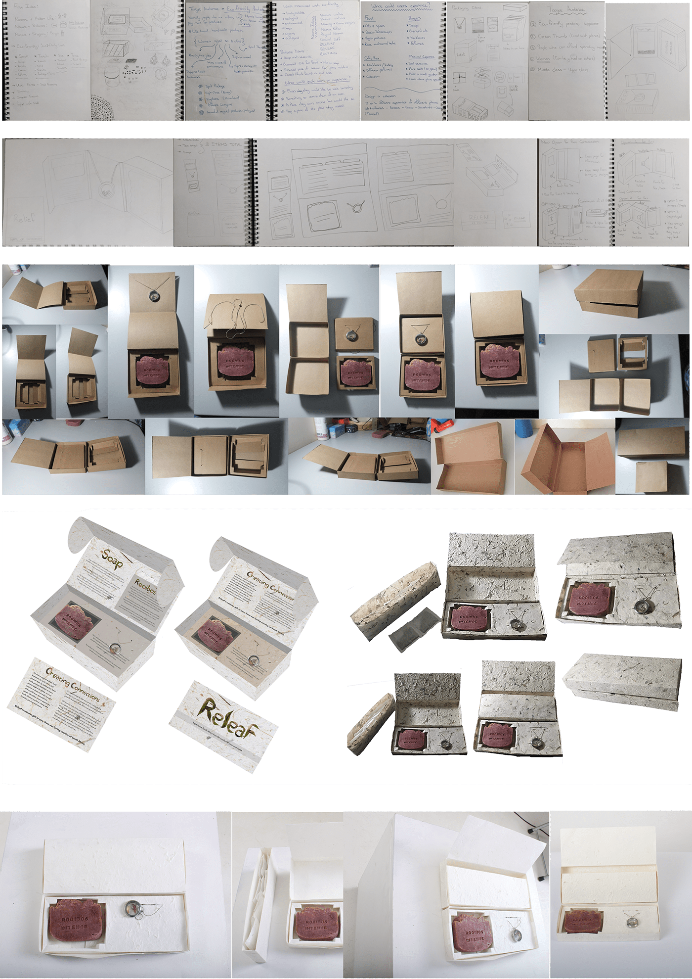
01. Journal and process work
02. Strategy and specifications
03. Concept and design development
04. Final outcomes (packaging design)
05. Supporting images
Design strategy
In a world filled with technology and concrete jungles, Releaf strives to reconnect you to the natural world and stir within you a long dormant Biophilia. Nature can offer you numerous benefits not only to your health but also to your creativity. That is why our main purpose is to relieve you of any stress and to improve your overall wellbeing. With our product we can create a connection to the original world of nature that you long for.
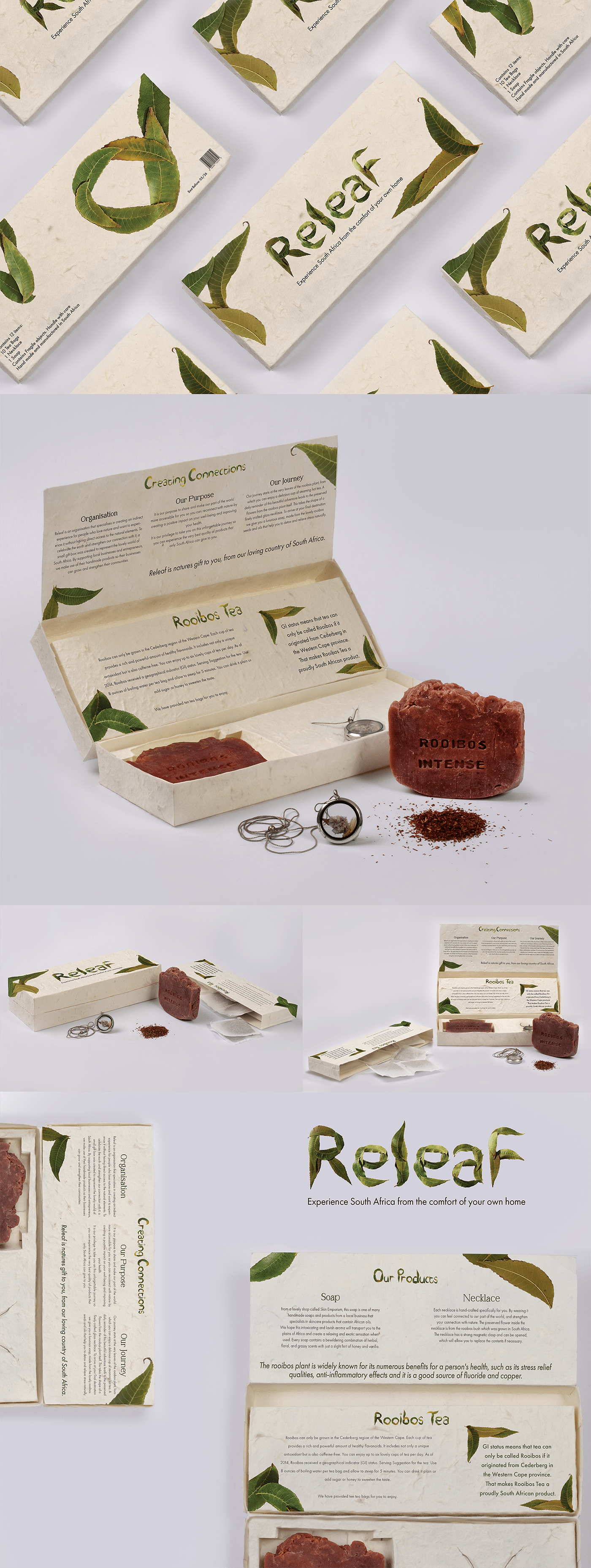
Releaf is a proudly South African product which contributes to local businesses on a various scale. The product is designed for a rather wide variety of clients, who enjoys indulging in luxurious products and who aim to support local entrepreneurs. I strived to create an indirect experience by activating all your senses. It starts with the texture of the box in your hand, to the lovely smell of Rooibos soap and makes a full journey to your taste buds with our delicious rooibos tea. The necklace is meant to be worn and represents the flowers seen in South Africa. I looked to nature to further strengthen the connection with nature by creating a font out of leaves to visually represent the natural state of paper that I used in the designs.

Process Work and Development

Most of the research conducted was lead to improve the general wellbeing of the people who makes use of the product. The breakthrough moment happened when I used rooibos products as my main source of natural elements. Rooibos is commonly known for its numerous benefits and stress relieving qualities. The packaging provides information about the plant and its healing properties and its design can help inspire people to buy proudly South African products all over the world.
Releaf is a product meant for a wide variety of clients, from the prestige ladies of the upper class to any nature lover who enjoys supporting foreign eco friendly products. The journey begins with the client seeing the box on a shelf of any beauty or cosmetic store. The client would purchase the product and engage with the product by touching it with their hands. After opening the box they will be introduced to the product and lead through the journey of Releaf. They will be able to open the package directly after purchase and indulge on the contents inside.


Final Outcomes (Product Design)
The main thought of the packaging and products I chose to use were to focus on the person’s senses to give them the ultimate experience of nature without leaving the comforts of their home. The packaging itself engages a persons sense of toutch and sight with its seeded texture and leaf generated typeface, specifically designed to influence the first experience with the gift box packaging.
The box is made from a seeded paper that has a lot of texture on the outside. The box is cut, folded and glued in the allocated areas with the products placed inside. The typography would be screen printed on the thick paper to link to the hand made feel like the rest of the products.

Mockups
Releaf is a proudly South African product which contributes to local businesses on a various scale. Our product is designed for a rather wide variety of clients, who enjoys indulging in luxurious products and who aim to support local entrepreneurs.
We strive to create an indirect experience by activating all your senses. It starts with the texture of the box in your hand, to the lovely smell of Rooibos soap and makes a full journey to your taste buds with our delicious rooibos tea. The necklace is meant to be worn and represents the flowers seen in South Africa. I looked to nature to further strengthen the connection with nature by creating a font out of leaves to visually represent the natural state of paper that I used in the designs.


