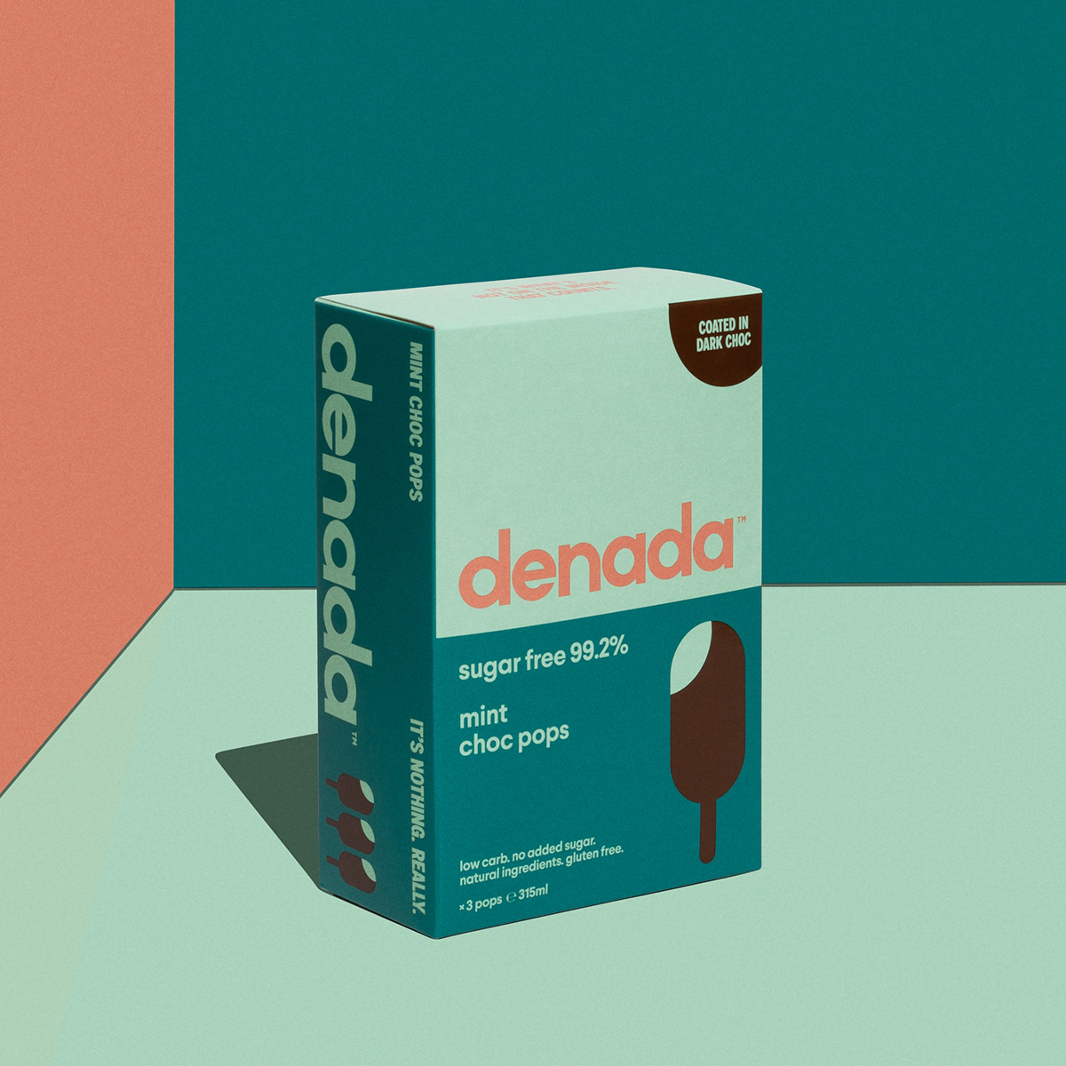
Denada
Perth, Australia
Perth, Australia
Branding, Packaging Design + Art Direction
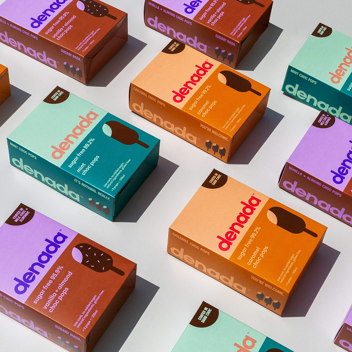
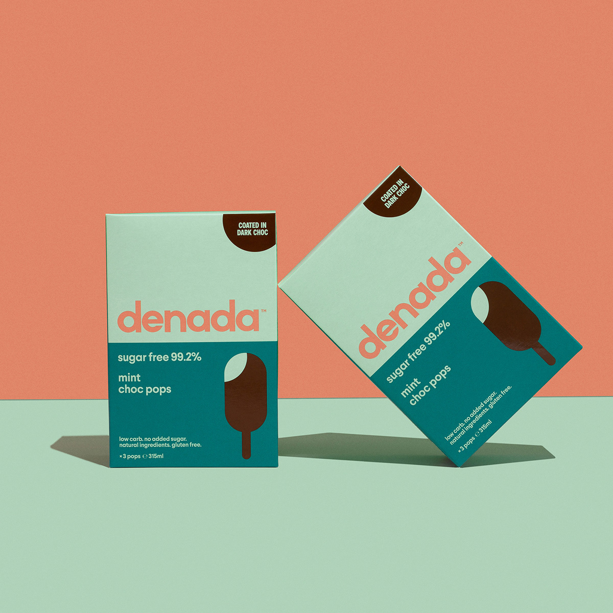
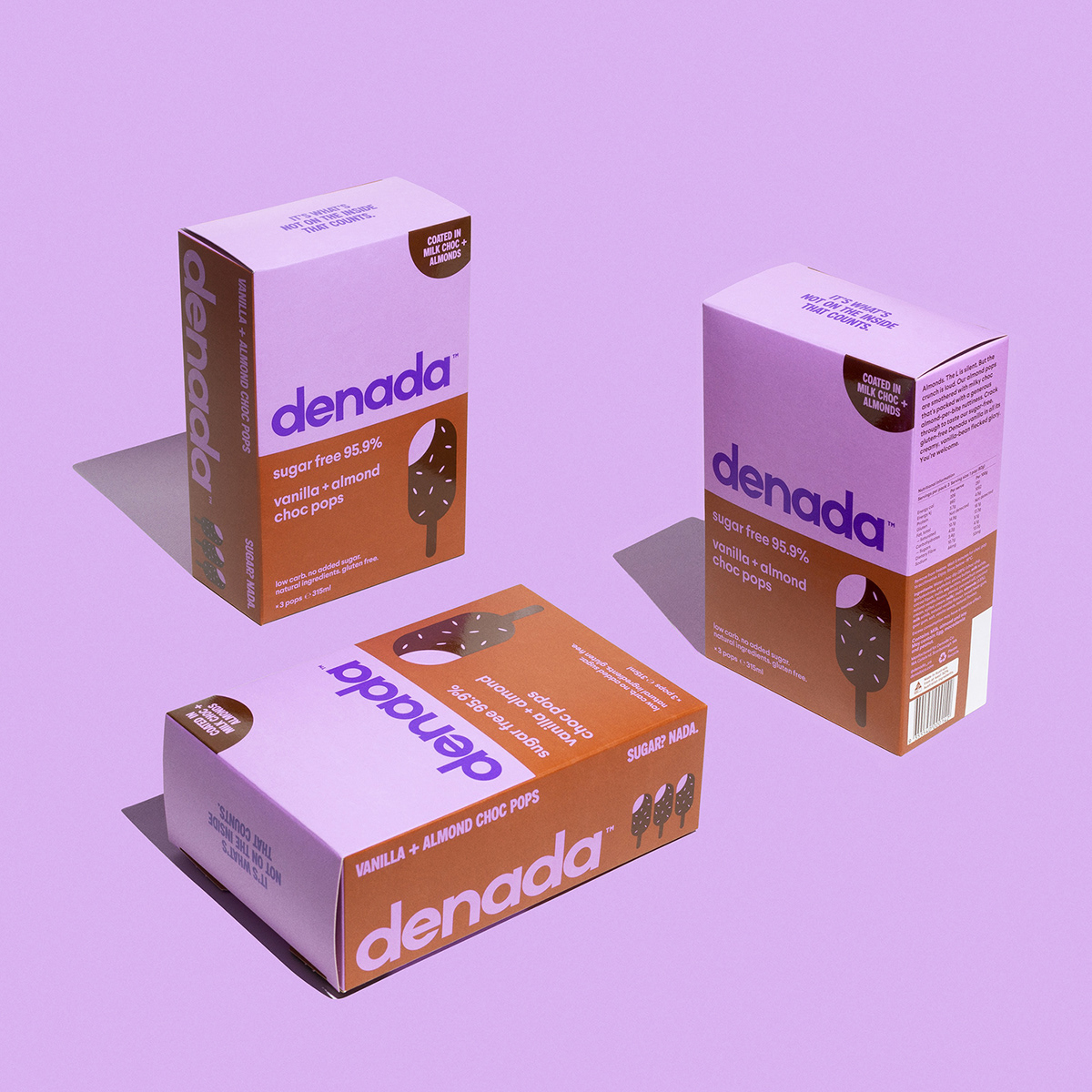
Denada translates to ‘It’s Nothing’ so like the product itself the design is stripped back of any additives. The ingredients are all natural with no surprises and the packaging reflects the same philosophy. Something minimal, yet sophisticated.
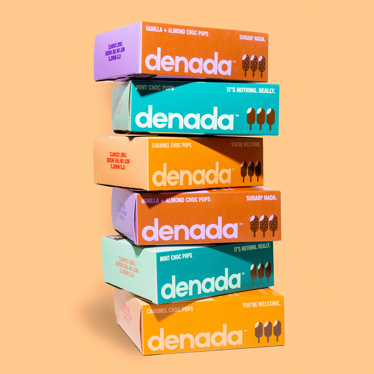
Through the design process there was always consideration to how the entire range looked on the shelf together and not just as individual tubs which stemmed from being a new product and needing a point of difference to have some impact in the marketplace.
Inspiration and research covered everything from modern interior colour design trends to retro Japanese medical packaging.
Photography by Simone Ruggiero