


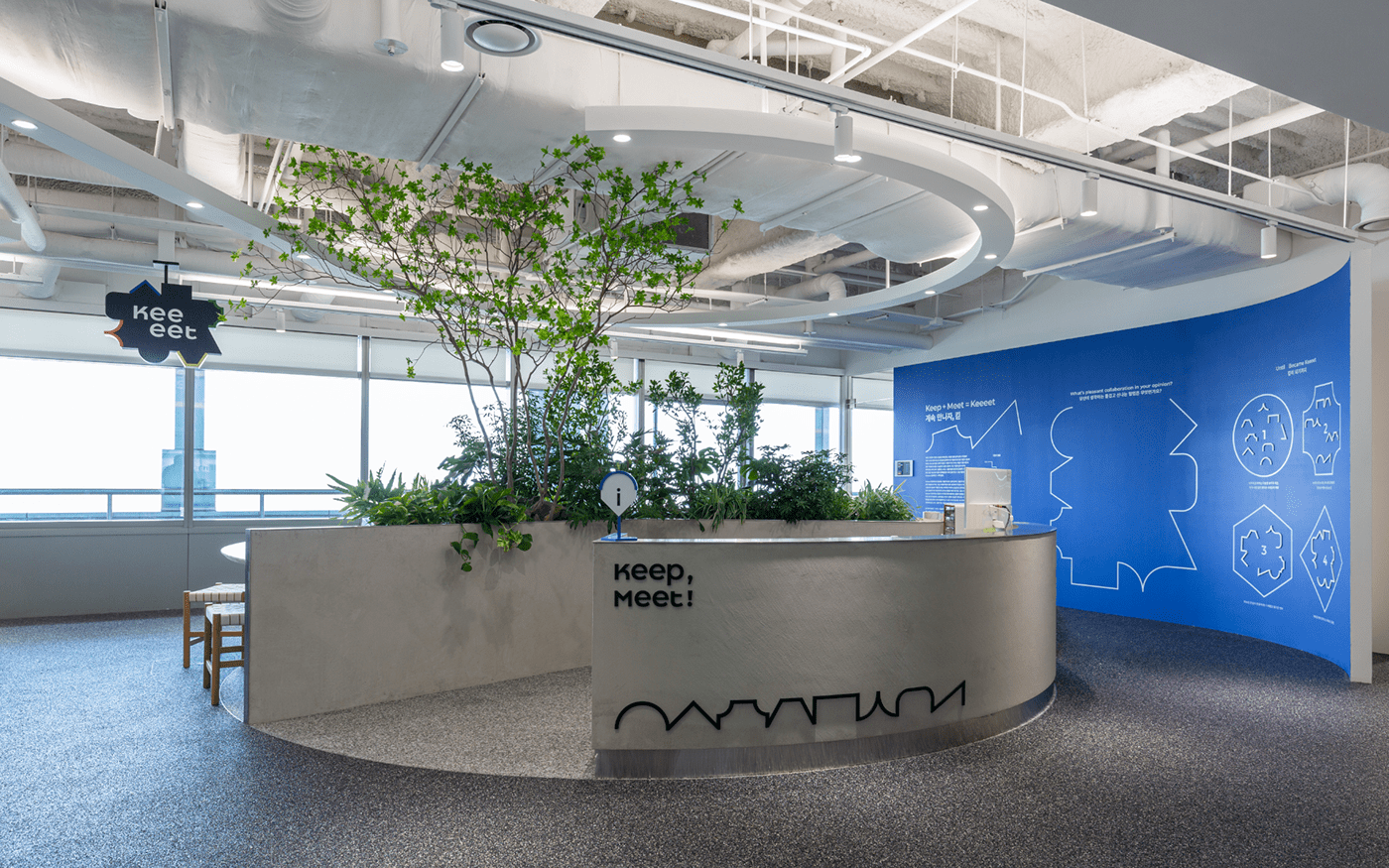
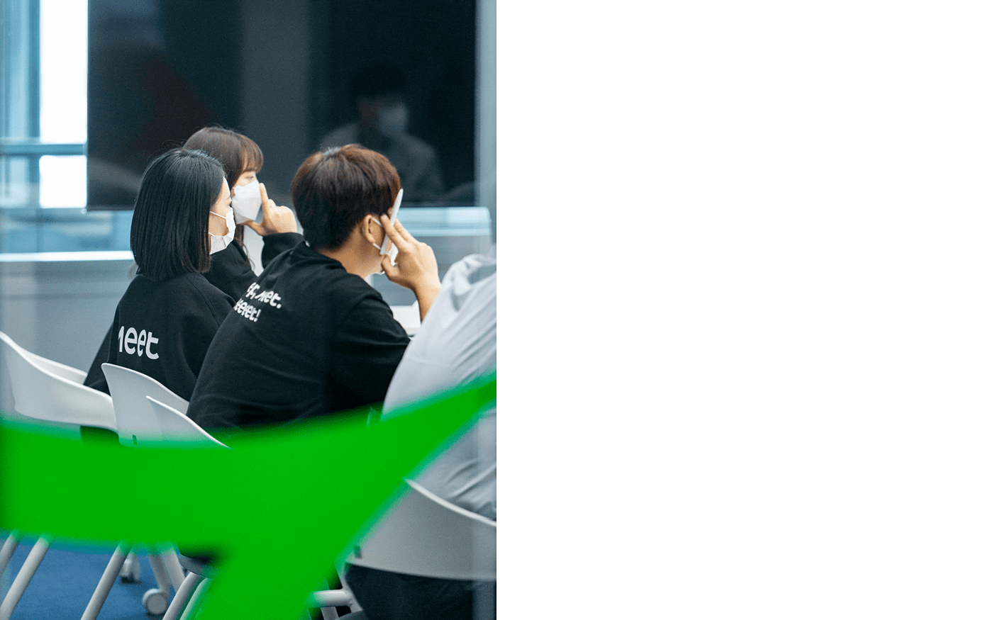
Keeeet is a collaboration space located on the 25th floor of GS Tower. It helps working smoothly together between inside members also outside personnel. It breaks away from the usual way of collaboration which is separated and vertical. It aims horizontal and complementary collaboration culture. We visualized flexible working culture and the positive energy people exchanged each other in Keeeet and applied it to brand identity.

Logotype & Symbolmark.
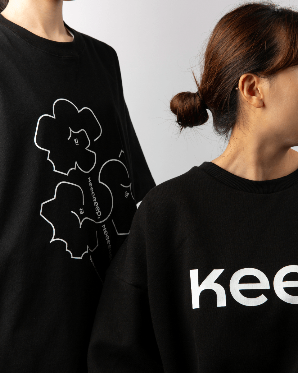
We develop a logotype expresses working together with close communication by morphological feature of ‘keeeet’ has 4 ‘e’ and decreasing the space between letters. The symbolmark created by combining various types of Keeeet cap means variety process of collaboration made by meeting of difference work methods, abilities and diversity of opinions.

Naming & Slogan.
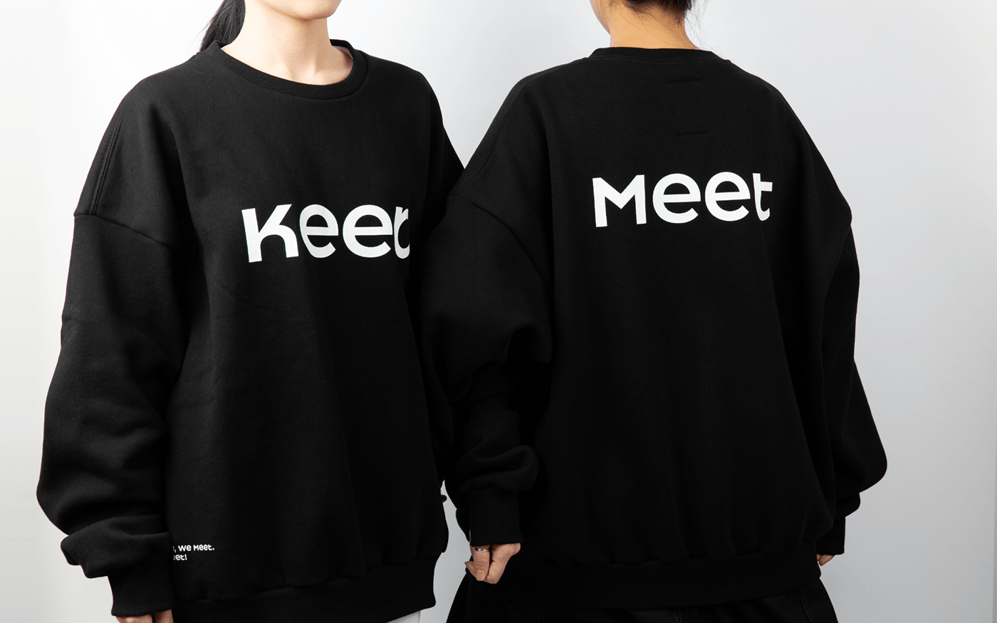
Keeeet is a compound word of 'Keep' and 'Meet'. This means 'continued meeting', which is the core of collaboration. We named it with a pleasant perspective to suit the space wanted to be a fun and exciting place for people starting new changes. The shape of repeated ‘e’ represents gathering and the positive energy generated from that. And we also made an Intuitive slogan ‘Keep, Meet. Keeeet!’ to make up for the name could be a little unfamiliar. And it helps people to understand what’s Keeeet

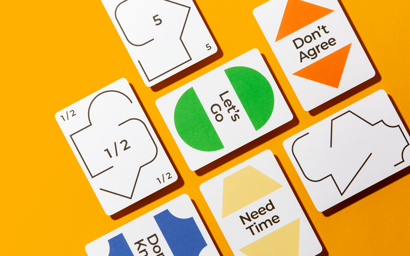
Color.
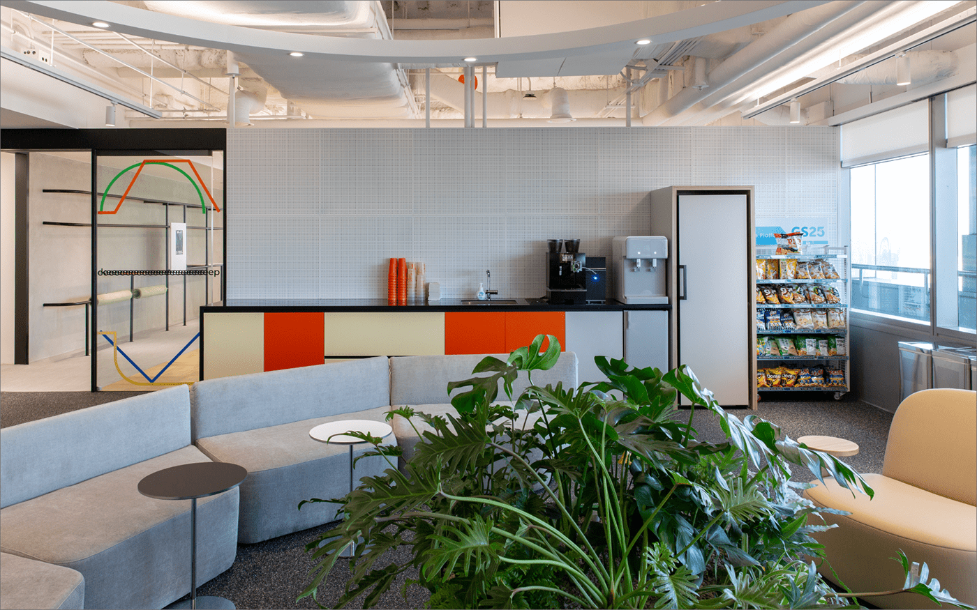
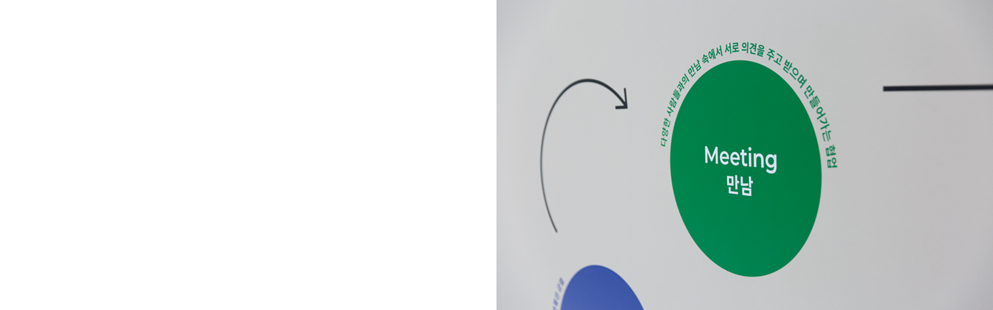
We classified the activities that happen in Keeeet and accordingly defined the colors. We use blue symbolizes a pleasant crack that breaks the framework of existing collaboration, green symbolizes meeting between various people. orange symbolizes the passion and concentration and yellow symbolizes the time to think for work as point color. And black and white symbolize embracing every activity and people there for main color. These 4 point colors naturally appear in the space and encourage their new tries

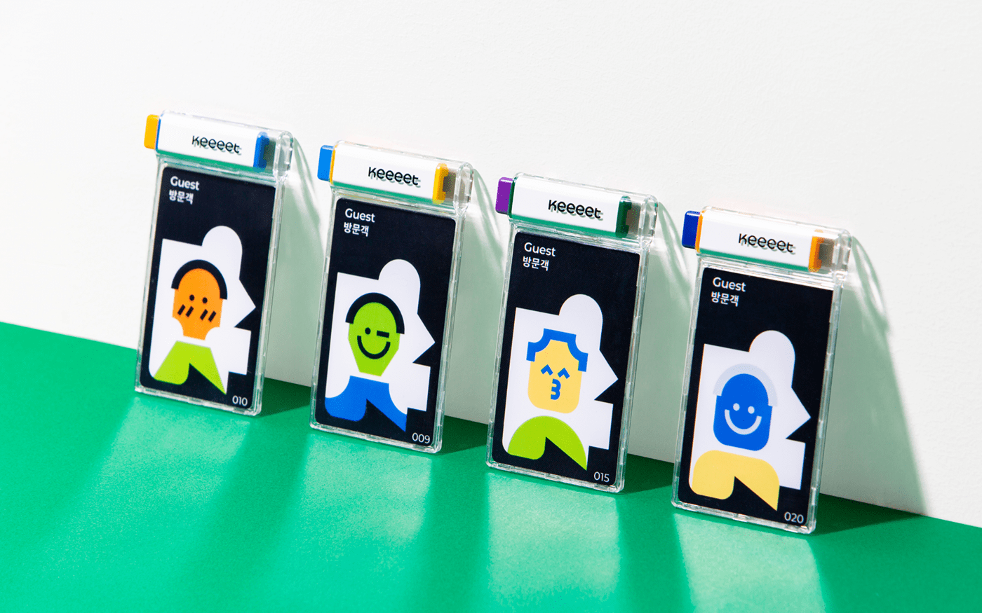
Keeeet-Cap.
Keeeet-Cap graphic started from morphological feature of ‘keeeet’. And it symbolizes various thought, different method of working and capability of each person. When Keeeet-Cap freely combines, it makes colorful looks. Some parts of it’s opened and some part of it’s connected and some parts of it’s smooth and some part of it’s Angled. We want to show the changes made by meeting through this graphic.


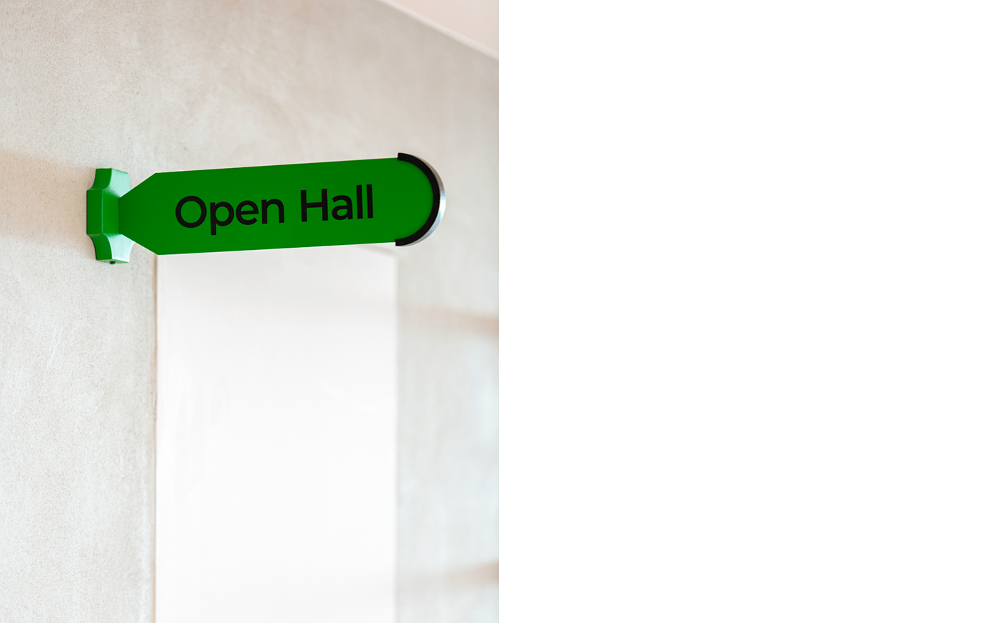


Pictogram & Map.
We created a space map and pictograms have opened shape by combining various shapes of Keeeet cap. The map painted with the colors defined by the activities clarifies the space division and it tells us their spatial roles.


Year. 2021
Work Scope. Identity, Naming, Signage, Pictogram, Window Graphic, Wall Graphic, Print, Goods
Client. (주)GS
Design. Manual.Graphics
Photography. Manual.Graphics
Motion Graphic. Manual.Graphics
Space Design. Glad


