


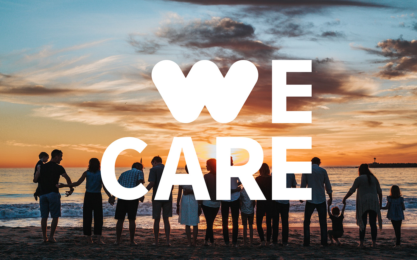
WeCare - MB Ageas Life - 2021
WeCare là một thông điệp xuyên suốt của các hoạt động truyền thông cho Công ty TNHH Bảo hiểm nhân thọ MB Ageas (MB Ageas Life) trong tương lai lâu dài. “We“ không chỉ là MB Ageas Life, mà là cộng đồng, là khách hàng. MB Ageas Life chỉ là người phất cờ và cộng đồng sẽ tham gia vào phong trào WeCare chứ không phải tham gia vào một - hoạt - động - nào - đó của MB Ageas Life.
WeCare is a cross-cutting message of communication activities for MB Ageas Life Insurance Company Limited (MB Ageas Life) in the long-term future. “We“ is not just MB Ageas Life, but the community, is customer. MB Ageas Life is just a flag-raising person and the community will participate in the WeCare movement, not participate in one - activity - that of MB Ageas Life.


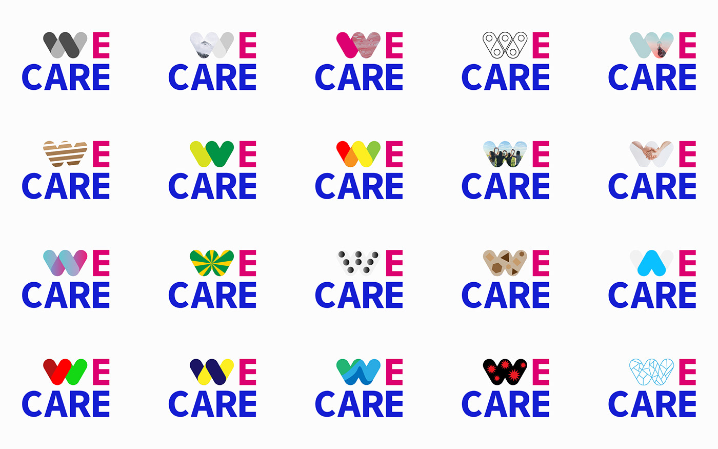
Concept WeCare Logo
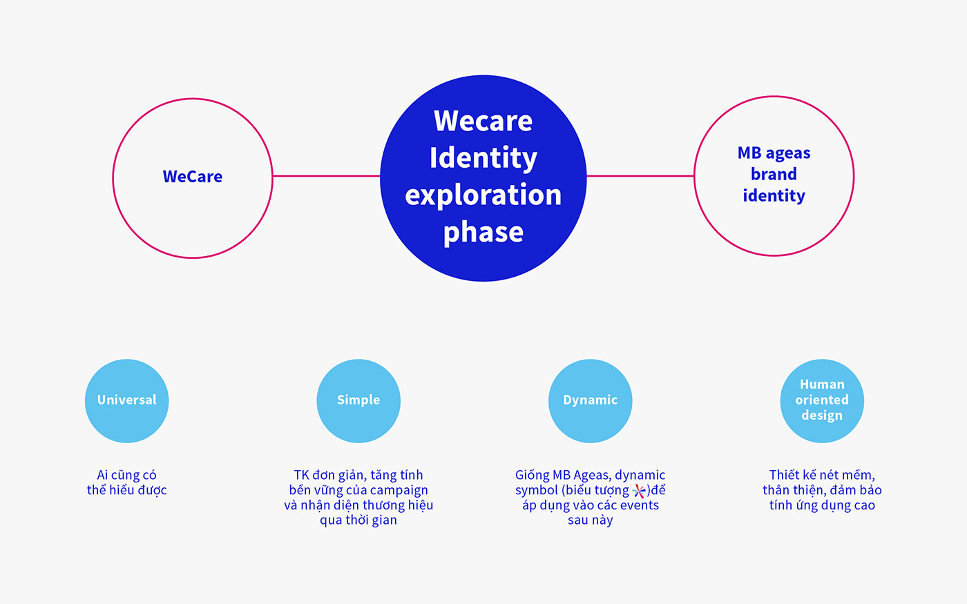
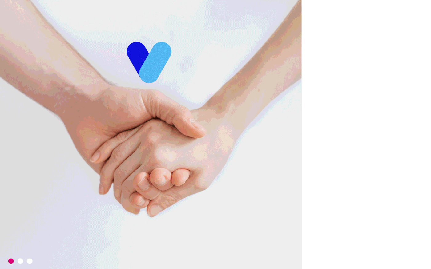
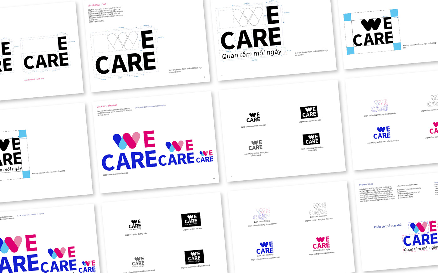
Cách thiết kế logo hiện đại và đơn giản để có thể tập trung vào 2 tiêu chí quan trọng là: sự cộng đồng và quan tâm. Vì thế logo sẽ được thiết kế dựa trên 4 mục bao gồm tính Universal (ai cũng có thể hiểu được), Simple (đơn giản, tăng tính bền vững của nhận diện thương hiệu qua thời gian), Dynamic ( dynamic symbol để áp dụng vào các events) và Human oriented design ( nét mềm, thân thiện, đảm bảo tính ứng dụng cao). Chữ W trong WE đã được cách điệu đơn giản vừa liên tưởng đến hình trái tim và hai cánh tay nắm lấy nhau. Hình trái tim thể hiện sự quan tâm chân thành đến mọi vấn đề trong cuộc sống, từ sức khỏe cho đến tinh thần. Hai cánh tay thể hiện sự kết nối, gắn kết cộng đồng, không phân biệt tuổi tác, giới tính,... Logo sử dụng cấu trúc hình chữ nhật mang lại cảm giác vững chắc, thể hiện sự tiếp nối và lâu dài của thương hiệu.
The way to design a modern and simple logo can focus on two important criteria: community and care. Therefore, the logo will be designed based on 4 items including Universal (can be understood by anyone), Simple (simple, increasing the sustainability of brand identity over time), Dynamic (dynamic symbol to apply). events) and Human oriented design (soft, friendly, ensuring high applicability). The letter W in WE has been simply stylized to refer to the shape of a heart and two arms holding each other. The heart shape shows sincere concern for all issues in life, from health to spirit. Two arms represent connection, community cohesion, regardless of age, gender,... The logo uses a rectangular structure to bring a sense of solidity, showing the continuity and longevity of the company.


WeCare Color
Màu xanh đậm và nhạt thể hiện cho sự tin cậy, gắn kết cộng đồng, thể hiện cái “We”. Một cộng đồng không phân biệt tuổi tác, giới tính,...cùng nhau phát triển các hoạt động có nghĩa cho cuộc sống, xã hội. Màu Hồng và hồng nhạt mang ý nghĩa yêu thương, gần gũi và quan tâm về mọi mặt trong xã hội như sức khỏe, tinh thần,... Đó chính là tình yêu cuộc sống, tạo sự khác biệt và những ngọn lửa nhiệt huyết.
Dark and light green colors represent trust, community cohesion, and "We". A community regardless of age, gender,... together develop meaningful activities for life and society. Pink and light pink colors mean love, closeness and concern in all aspects of society such as health, spirit, etc. That is the love of life, making a difference and the flames of enthusiasm.


WeCare Dynamic
Với cấu trúc thiết kế vững chắc và đơn giản, WeCare logo có thể trở thành dynamic logo một cách dễ dàng. Sử dụng dynamic logo sẽ giúp brand thể hiện nhiều thứ mới mẻ, phù hợp với các tiêu chí đề ra, thể hiện nhiều nội dung phù hợp với từng social camp.
With solid and simple design structure, WeCare logo can become dynamic logo easily. Using a dynamic logo will help the brand show many new and appropriate things with the set criteria, display a lot of content suitable for each social camp.


WeCare - Keyvisual
Định nghĩa “Quan tâm mỗi ngày” là...
1. Pay attention to the little things.
2. Never stop believing.
3. Support each other even if they are not next to each other.
4. Give each other valuable things forever.
1. Để tâm đến những điều nhỏ nhặt.
2. Không bao giờ ngừng tin tưởng.
3. Tiếp sức cho nhau dù không ở cạnh bên.
4. Cho nhau những điều giá trị mãi về sau.
2. Không bao giờ ngừng tin tưởng.
3. Tiếp sức cho nhau dù không ở cạnh bên.
4. Cho nhau những điều giá trị mãi về sau.
1. Pay attention to the little things.
2. Never stop believing.
3. Support each other even if they are not next to each other.
4. Give each other valuable things forever.
Motip cho 4 định nghĩa của quan tâm mỗi ngày có thể được kết hợp theo pallete màu và cách sắp xếp vị trí các symbol trái tim. Các trái tim có thể sử dụng set màu theo symbol WeCare (Cặp set xanh - cặp set hồng) hoặc sử dụng một màu 4 màu solid riêng biệt.
The motifs for the four definitions of interest each day can be combined according to the color palette and the arrangement of the heart symbols. The hearts can use a color set according to the WeCare symbol (Pair set of blue - pair of pink set) or use a separate solid color of 4 colors.


Brandmanifesto

Idea/ Logo Design: Cuong Luu (DeSai)
Key-visual/ Social Design: Bảo Linh (Oiliviatruong)
Project Management/ Video/ Brandmanifesto: OSMI
La Grafik Studio x OSMI - Brand Identity, Campaigns - 2021
------------------------------------------------------------------------------
Special thanks
Photographer - Thank you for everyone's photos.
Other Designers - Thanks for everyone's mockups.
Photographer - Thank you for everyone's photos.
Other Designers - Thanks for everyone's mockups.


