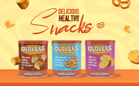


The visual identity of Cravers Snacks is a celebration of humor, health-conscious indulgence, and an exciting snacking experience.
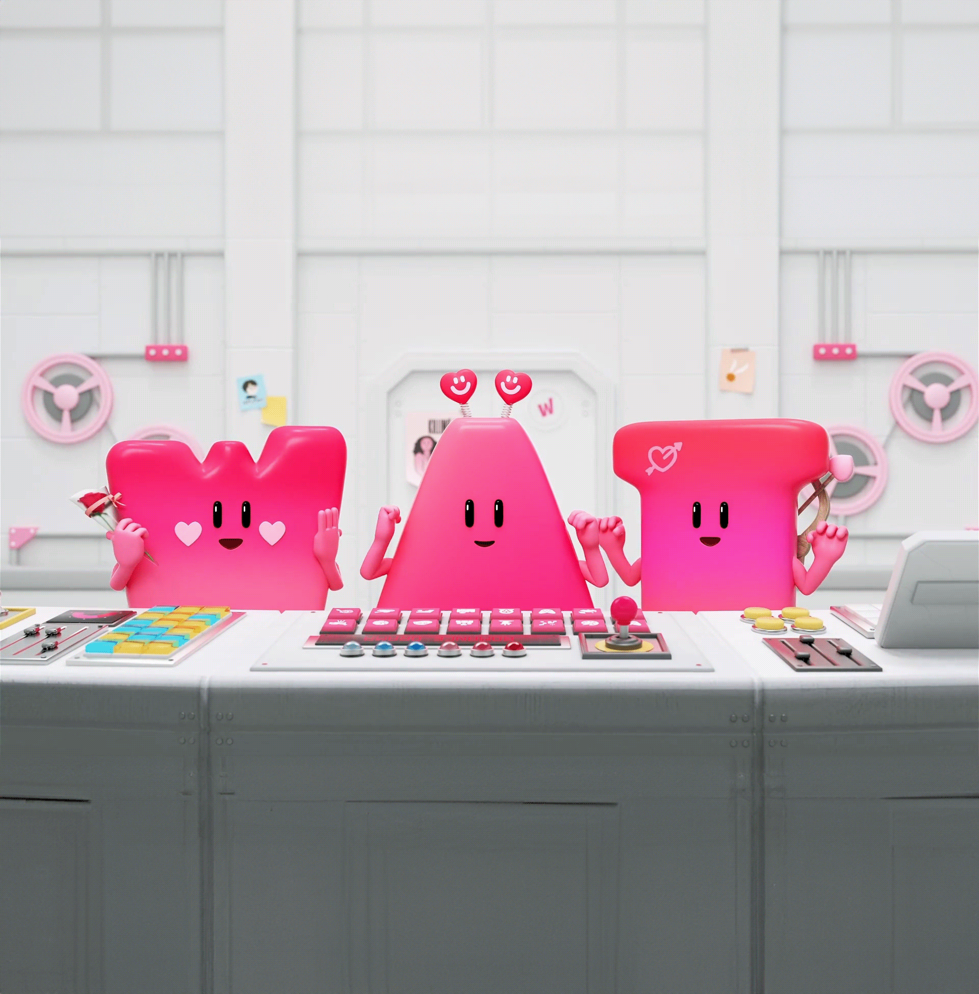
Our approach centers around injecting a generous dose of humor into every design element. From packaging to typography, we aim to make consumers smile and embrace the joy of snacking. The choice of vibrant and eye-catching colors reflects the excitement that every bite of Cravers promises.
Whimsical illustrations and clever graphics are seamlessly integrated, adding a playful touch that makes snack time an adventure. Taglines are witty and engaging, ensuring that the brand's humor is carried through.
Cravers Snacks is committed to healthy snacking, and this is reinforced through its visual identity. It's a promise to consumers that, amidst the fun and laughter, there's a serious dedication to quality, natural ingredients.
In essence, the visual identity of Cravers Snacks is a harmonious blend of humor, health-consciousness, and a whole lot of fun. It's an invitation to embark on a flavorful journey, where cravings are conquered with a smile and a healthy dose of laughter.


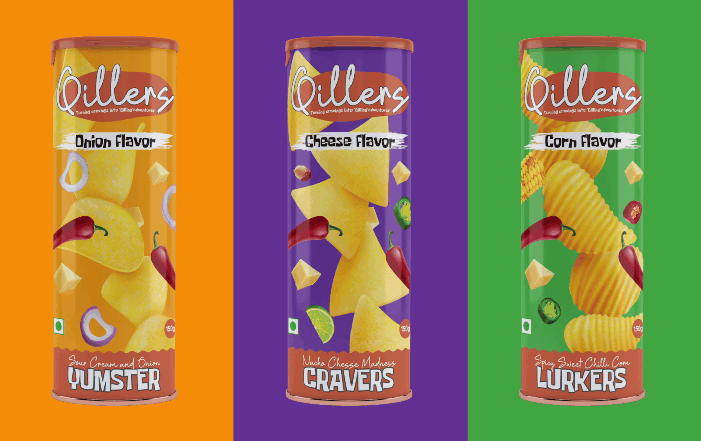
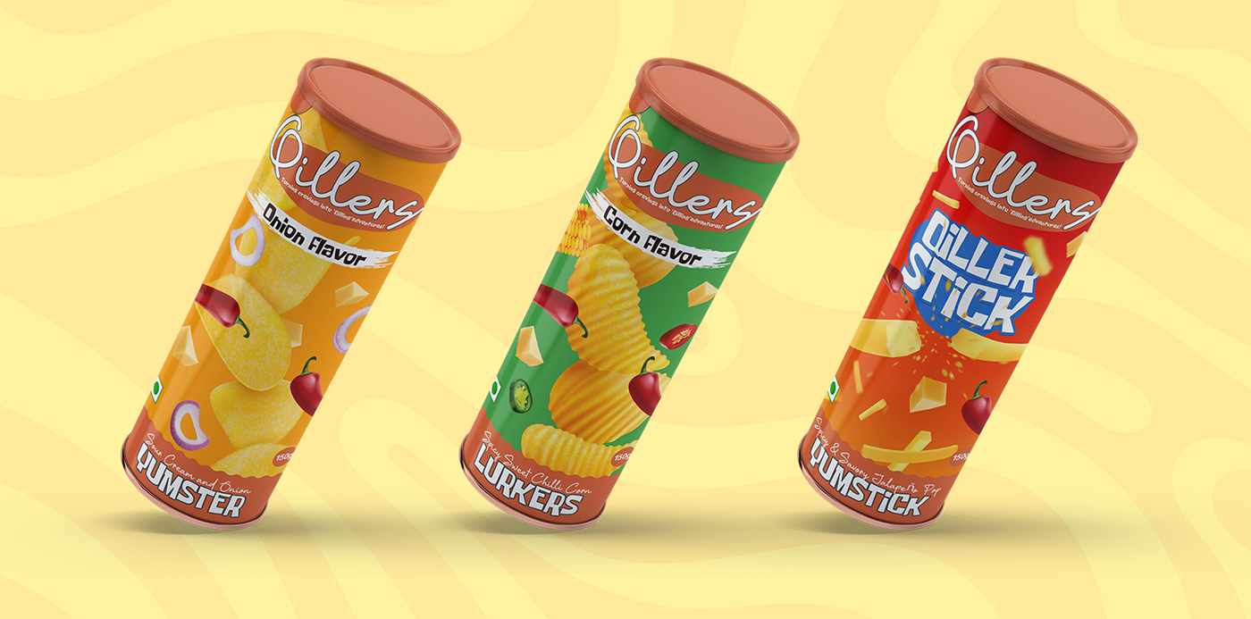
Cravers - Turning craving into a 'quilling' adeventure!
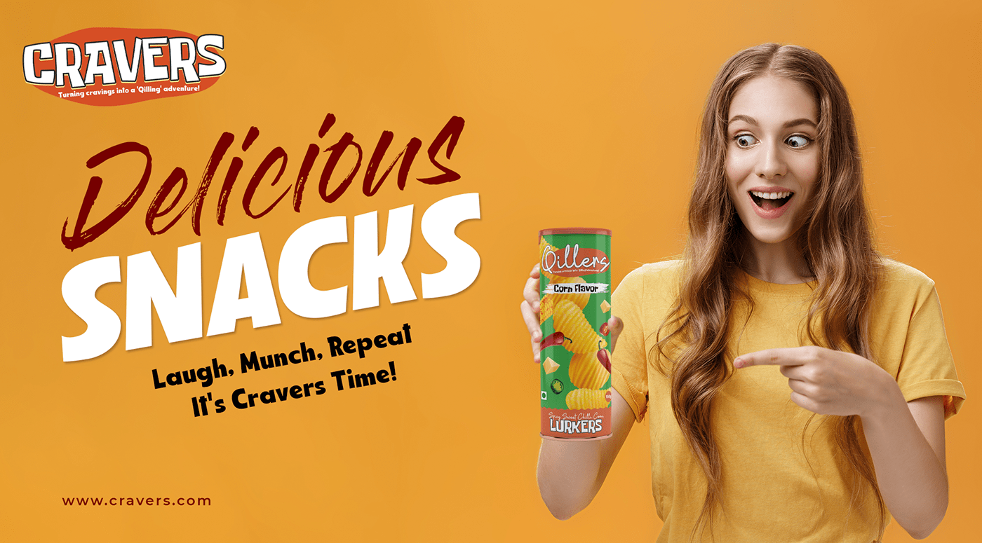
At Cravers, we're on a mission to put an end to those relentless hunger cravings, and we're doing it with a crispy twist. Imagine snacking on our fiery Qillers chips as they conquer your cravings, making them vanish without a trace. It's like the ultimate 'Qillings' of your hunger cravings!
Why Cravers?
Because we believe that snacking should be a joyful moment in your day. Whether you're craving the fiery zest of spicy sweet chili or the creamy goodness of sour cream and onion, Cravers has a flavor that speaks to your soul. We're here to make your snacking journey unforgettable, With Cravers, your cravings don't stand a chance – we're here to 'Crave' them with flavor, fun, and a touch of witty 'Cravings.' Join us on this spicy journey of satisfying your monstrous appetites in a smart, delicious way!


As a designer, working on the visual identity of Cravers Snacks has been an exciting creative journey. It's been all about bringing humor, healthy snacking, and a sense of adventure to life through design.
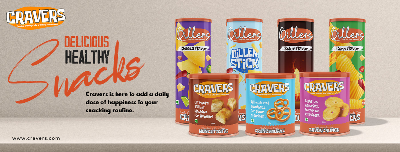
For Cravers, we wanted to capture the essence of fun and excitement. Vibrant color palettes were chosen to evoke enthusiasm, instantly drawing the eye and creating a sense of anticipation. The packaging features whimsical illustrations and clever graphics, injecting playfulness into the design and reminding consumers that snacking can be joyful.
Typography played a crucial role in conveying a lighthearted vibe while maintaining readability. The taglines were crafted to add a touch of humor and zest to the overall packaging.
In summary, the visual identity is a reflection of the harmonious blend of creativity, humor, and a dedication to healthy snacking. They serve as an invitation to savor both the taste and the experience of these delightful snacks.