


Transformational Change practice focusing on regenerating the human spirit so that we can regenerate the planet.
Creating the conditions to serve humans with getting time back, feeling more fulfilled and navigating life with more ease through transforming their connection to themselves, to others and to systems at large.

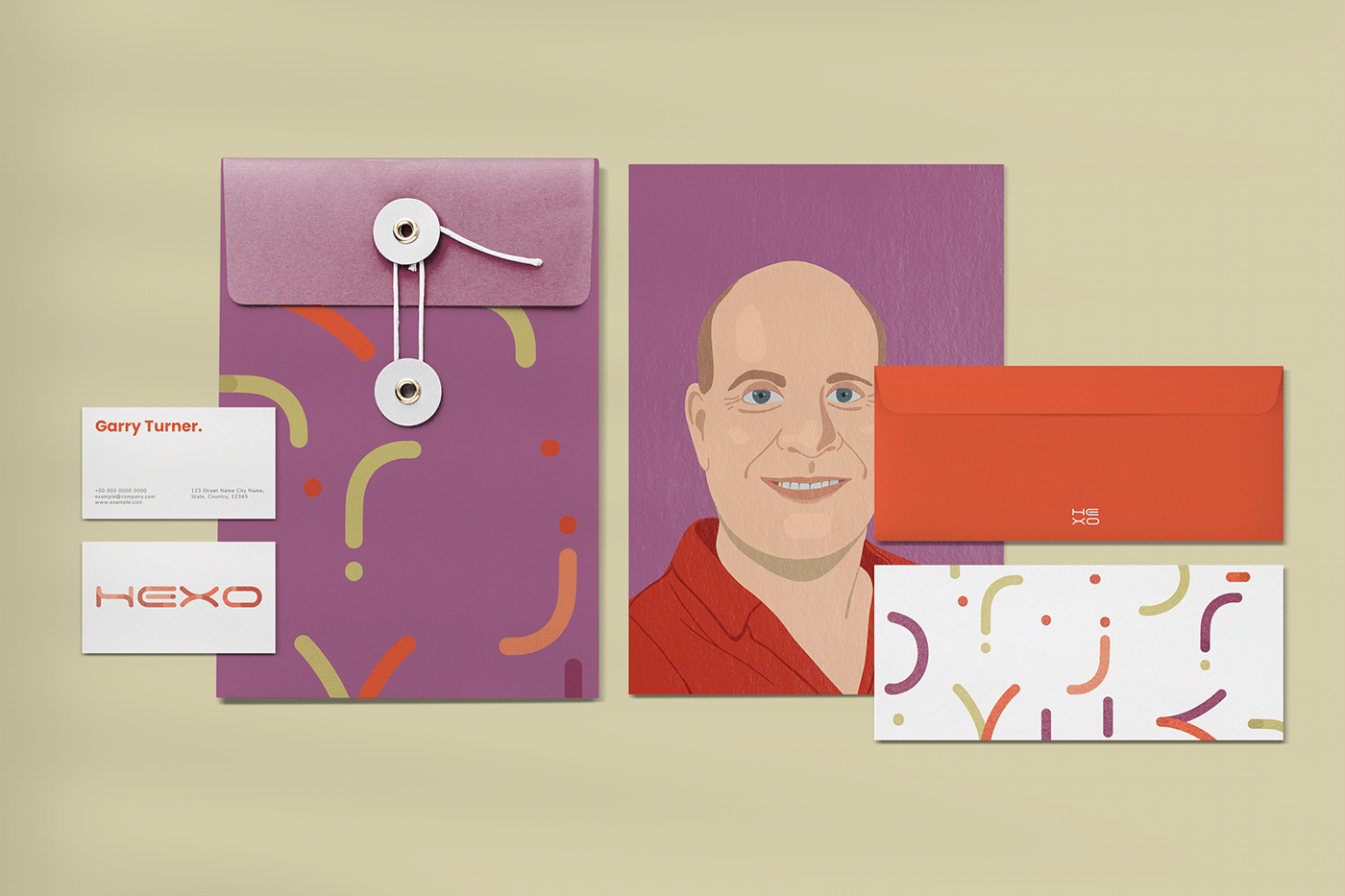
Design Concept.
The concept of the brand comes mainly from the idea of connection. The logo is built like if it is formed by cables connected - since the target audience of the brand are tech startups and young clients. There is also the idea of different and diverse shapes coming together to form a whole, different creation. HEXO Talks and HEXO Events are sub brands of HEXO, used for youtube videos and podcasts (Talks) and immersions, retreats and courses (Events).
The graphic elements are created from the deconstruction of the words from the logo.The color palette was chosen to be disruptive and young while also being elegant. Orange brings a creative and adventurous vibe, while green reminds of nature and connection. Purple means intuition and emergency, which are also characteristics of the HEXO brand.


Applications.


Thank you!


