


Federal network of escape rooms in Germany 🇩🇪/ Федеральная сеть эскейп-румов в Германии 🇩🇪
Black Room
Black Room
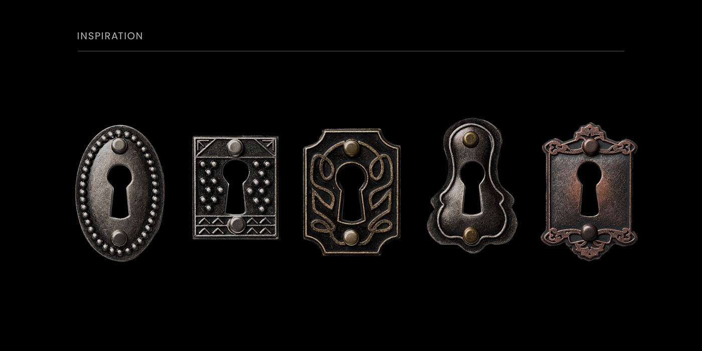
A new entertainment format for the country. The task: to make it as simple as possible to inform the consumer about the essence of what will happen during the game, namely - solving puzzles, solving problems, and most importantly - finding a way out. The trademark uses the association of the first order - the keyhole.
Новый для страны формат развлечений. Задача: максимально просто донести потребителю информацию о сути того, что будет происходить во время игры, а именно – разгадывание головоломок, решение задач и, главное, поиск выхода. В фирменном знаке использована ассоциация первого порядка — замочная скважина.
Новый для страны формат развлечений. Задача: максимально просто донести потребителю информацию о сути того, что будет происходить во время игры, а именно – разгадывание головоломок, решение задач и, главное, поиск выхода. В фирменном знаке использована ассоциация первого порядка — замочная скважина.


Graphics / Графика
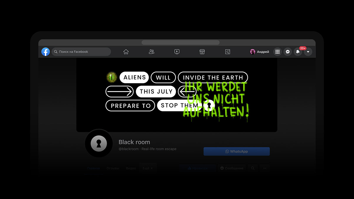
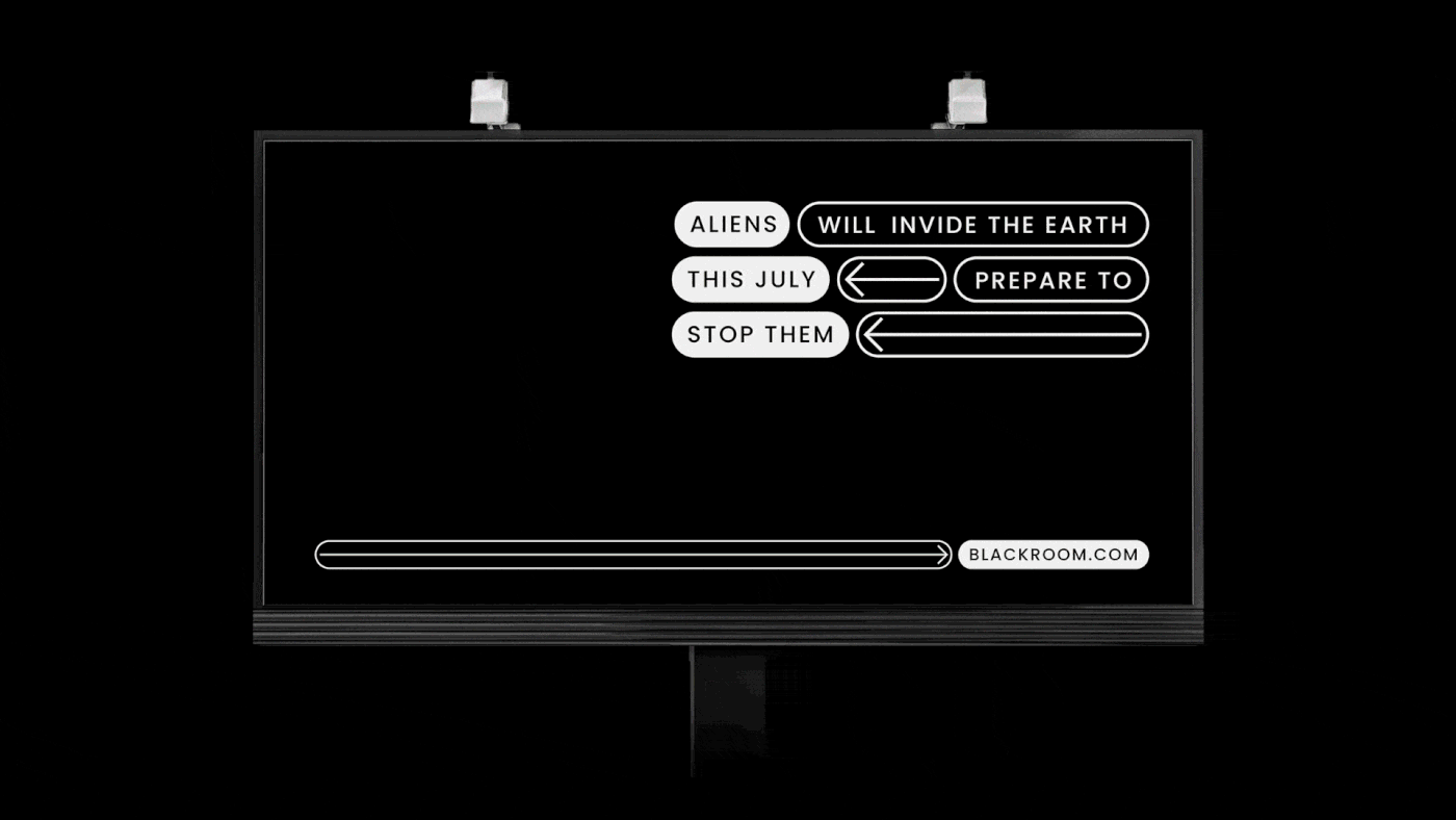
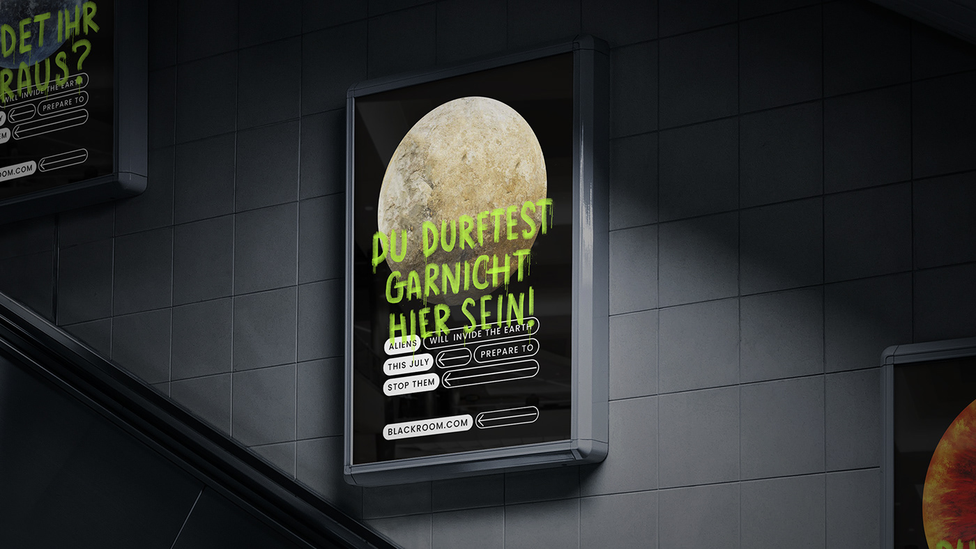
The main goal of any escapist quest is to find a way out. This task is very difficult, but interesting. The same as finding the way to the main attraction of the city or the exit to your terminal for boarding the plane. The corporate style is based on the navigation elements (arrows, icons, texts), the same as in any city/metro/airport. The style is understated and functional.
Главная цель любого эскейпа (квеста) — найти выход. Задача сложная, но интересная. Точно такая, как поиск пути к главной достопримечательности города или выход к своему терминалу для посадки на самолет. Фирменный стиль строится на элементах навигации: стрелках, пиктограммах, текстах — как в любом городе/метро/аэропорту. Стиль получается сдержанным и функциональным.
Главная цель любого эскейпа (квеста) — найти выход. Задача сложная, но интересная. Точно такая, как поиск пути к главной достопримечательности города или выход к своему терминалу для посадки на самолет. Фирменный стиль строится на элементах навигации: стрелках, пиктограммах, текстах — как в любом городе/метро/аэропорту. Стиль получается сдержанным и функциональным.


Handmade font / Фирменная гарнитура
Выверенная функциональная графика должна подкрепляться эмоциями, чувствами, живыми ощущениями! Представьте: вы только что прошли квест и спешите поделиться полученным адреналином — берите в руки баллон краски и выплескивайте всё на город вокруг вас! Для этого в рамках проекта разработан уникальный шрифт, который призван добавить "жизни" в мир, живущий по написанным правилам и сценариям.


Art Director, Designer / Арт-директор, дизайнер → Andrew Sklyar
Designer / Дизайнер → Roma Akaev
Designer / Дизайнер → Roma Akaev
Creative Director / Креативный директор → Alexey Danilov
Manager / Менеджер проекта → Yana Antonova


