


Client
Troyan Scrubs is a medical scrub company that is dedicated to bringing the best,
most comfortable scrubs to healthcare professionals.
The task is to develop a modern and minimalistic logo. In the future, the logo will be used
on all clothing, business cards, website, social media, and other products sold on the website
Brand slogan: “Life is short, shifts are long, wear good scrubs”
Solution
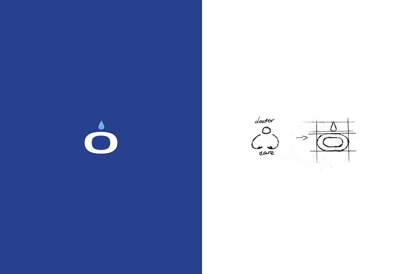
A typography logo was developed. It was based on a sans serif font.
The color blue for the logo was chosen for a reason: it is associated with tranquility
and harmony, which is important for doctors.
The letter O in combination with a drop resembles a person whose hands are in the position in which they usually hug. Thus, this symbol creates an association with caring.


Contacts:
mashazhurova943@gmail.com | telegram | instagram
mashazhurova943@gmail.com | telegram | instagram


