HÄNDVÆRK
(Branding)

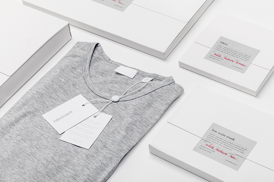
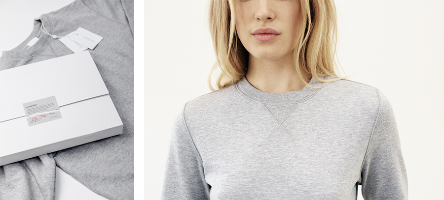
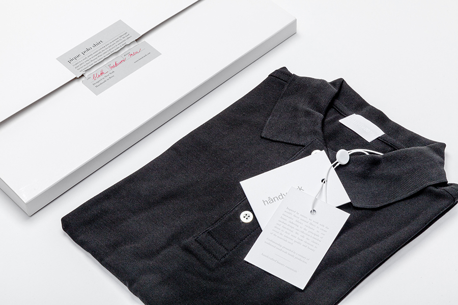
Håndværk stands for handmade, handcrafted, artisanal and craftsmanship. It looks for the best materials around the world, promoting its New York origin and working tirelessly to offer the best quality garments.
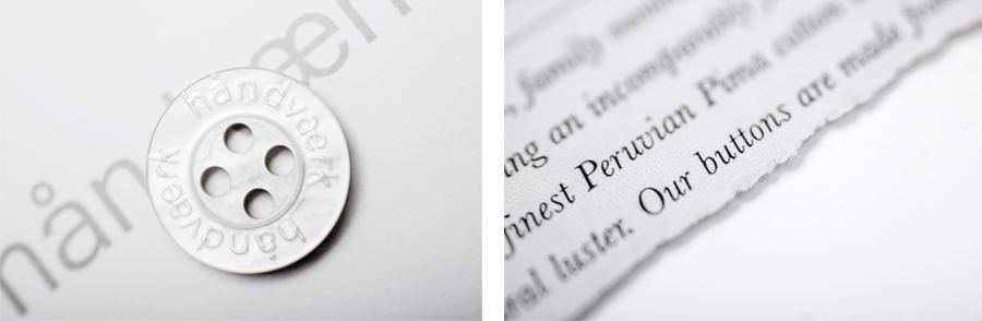
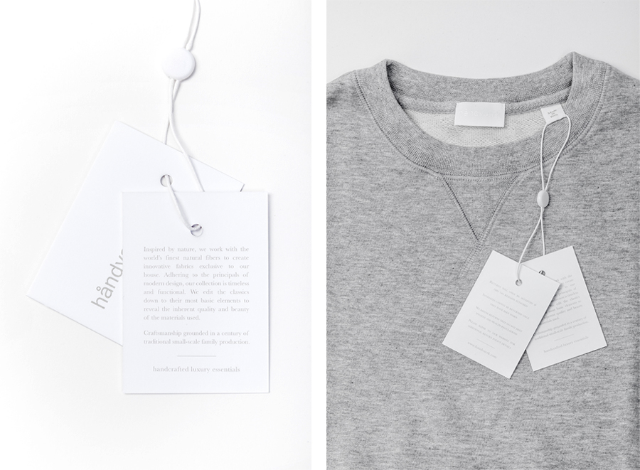
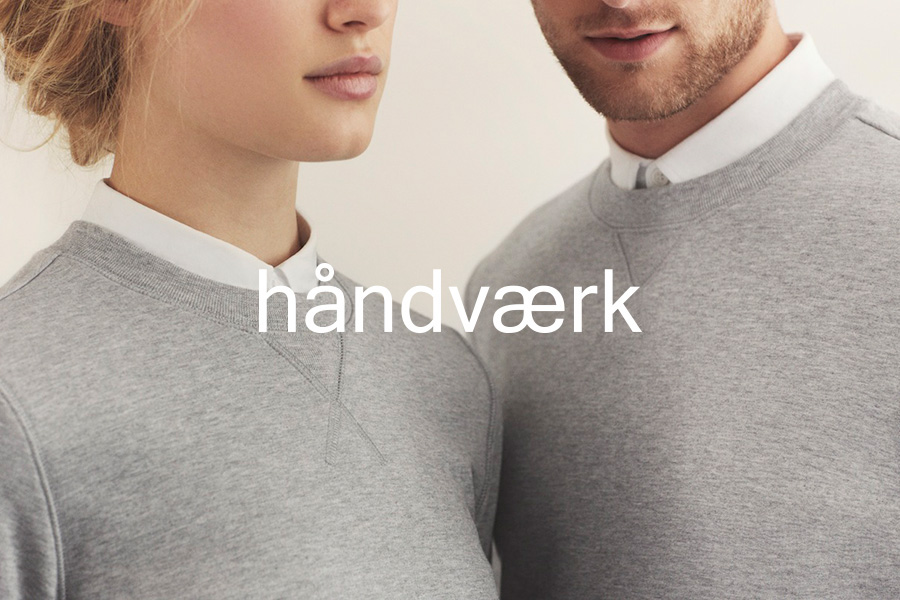
The branding reflects Håndværk's nature: elegant simplicity. Clean lines and a simple typographic treatment based on minimal scandinavian and japanese aesthetics. The symbol itself is an abstraction of the Håndværk logo, using its most significant element – the ring above the letter A – thus coinciding with the brand’s principles of editing everything to their very core.
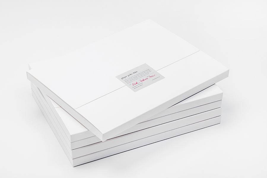
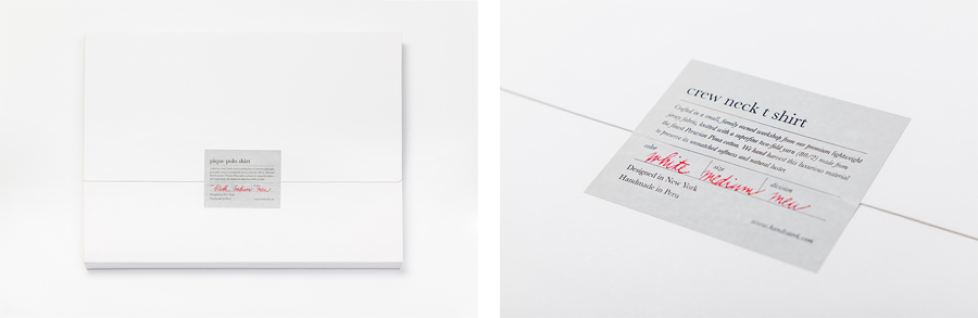
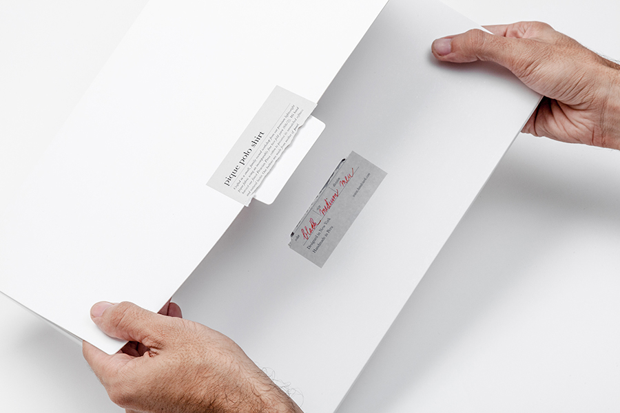
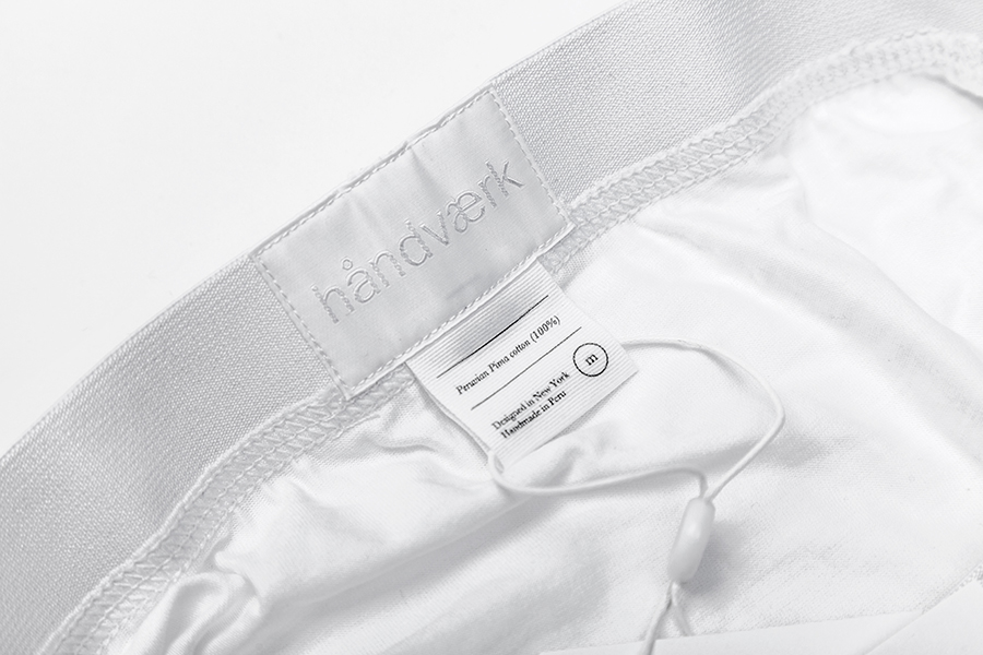
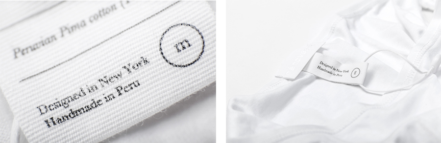
Håndværk’s products, simple in their aesthetic nature, use only the best quality materials, mostly perceived through touch. We have communicated this through a graphic language that is based on minimal aesthetics, predominantly white. Their principle of simplicity and upmost quality is always reflected in all supporting materials, from their packaging to the language used for their texts.
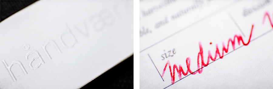
Through simple yet elegant finishes, such as embossing, we achieve to communicate key brand values of simplicity, luxury, quality and truthfulness – it’s about communicating in a subtle manner; just like these values, it’s about understatement through its tactile principle.
A functionality that blends with its aesthetics. Understated luxury essentials.