


Nomen Nescio, Helsinki
Visual Identity for Helsinki based fashion design brand Nomen Nescio conceived and designed by Stefan Gandl in close collaboration with Erno Forsström and Timo Leskelä of Nomen Nescio, Helsinki. Nomen Nescio was founded by the design couple Niina and Timo Leskelä in 2012 with the aim to create timeless, thoughtful and long-lasting design. The company’s name, the latin term “nomen nescio” and its acronym “N.N.”, stands for “name unknown”.
Visual Identity for Helsinki based fashion design brand Nomen Nescio conceived and designed by Stefan Gandl in close collaboration with Erno Forsström and Timo Leskelä of Nomen Nescio, Helsinki. Nomen Nescio was founded by the design couple Niina and Timo Leskelä in 2012 with the aim to create timeless, thoughtful and long-lasting design. The company’s name, the latin term “nomen nescio” and its acronym “N.N.”, stands for “name unknown”.
The developed visual identity touches everything from clothing labels to storefront logo, business cards to posters, print to web design, static and motion design. Logo, logotype and care icon system conceived and designed by Stefan Gandl as integral element of the developed corporate typeset Nomen Nescio Pro Regular, a custom version of NB Akademie Pro.
The Nomen Nescio Manifesto
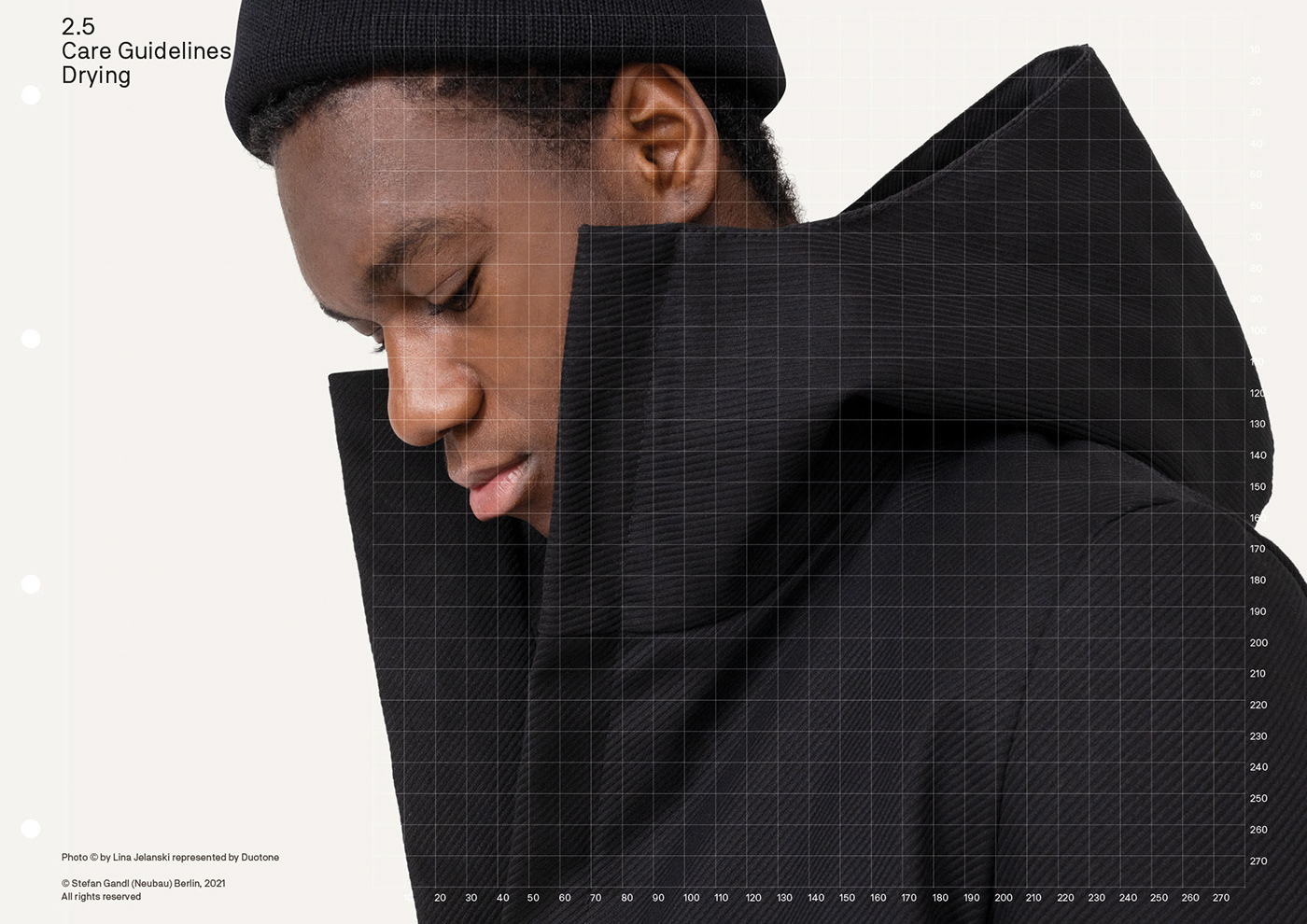
Nomen Nescio is a Helsinki based design studio focused on minimalist aesthetics and values. The collection is an evolving composition of seasonless gender neutral black clothing. Pieces have no external, internal or applied elements pointing any specific sex, age or status. It is about thoughtful design, highlighting the relevant to create effortless meaningful wardrobe. The collection is made of sustainable premium materials, manufactured with responsible producers in Europe. Nomen Nescio way of thinking starts and ends in the same place, in freedom, joy and peace.
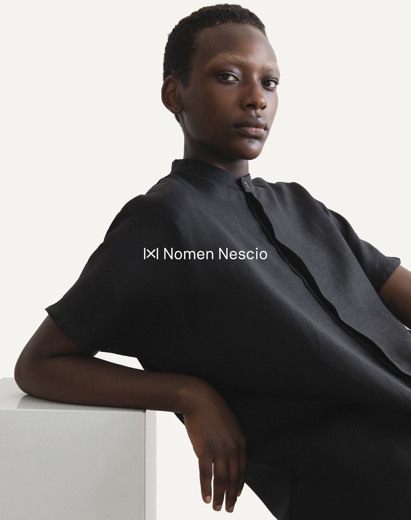
Nomen Nescio (N.N.) Logo
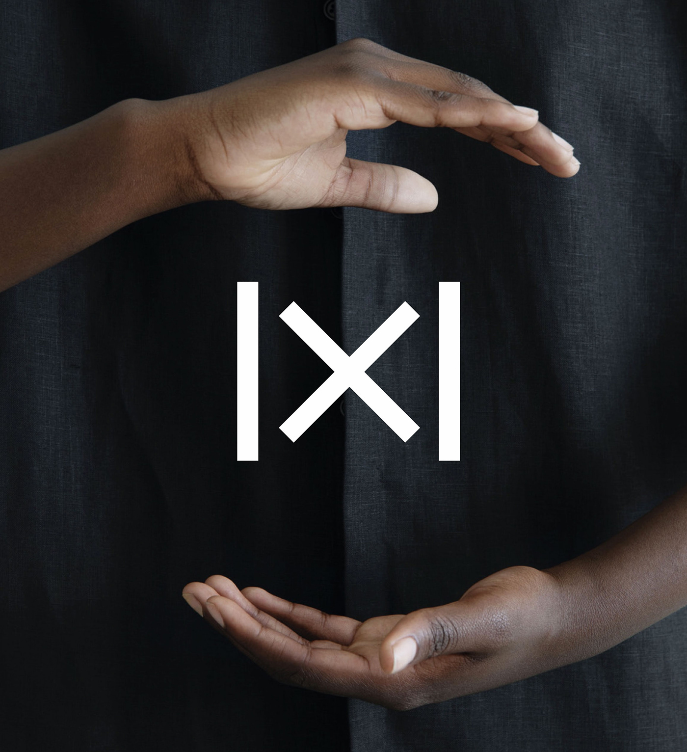
The concept for the logo design follows the paradigm of Nomen Nescio’s manifesto and minimalist design ethos approach. The new symbol is defined by four equal bars combined within an imaginary square. The logo is based on the construction elements of two mirrored and overlayed capital N-glyphs. Combined with the logotype, type set in the corporate font Nomen Nescio Pro Regular — a timeless sans serif typeface, the Nomen Nescio brand is based on one homogeneous stroke size. Ideal for best results when a logo needs to be resized.
Symbolism & Meanings
• “×” (cross-stitch) → oldest form of embroidery that can be found all over the world since the middle ages. Cross-stitch is a form of sewing and a popular form of counted-thread embroidery in which x-shaped stitches in a raster-like pattern are used to form a picture
• “×” (multiply symbol) → maximisation
• “x” (glyph) → represents a person while its name is unkown/or a secret
• “x” (glyph) → “indeterminate/unspecified” sex in passports available since 2012
• “x” (glyph) → placeholder
• “x” (glyph) → unknown quantity or a variable
• “∞” (infinite symbol) → endless possibilities
The Nomen Nescio Brand and Applications
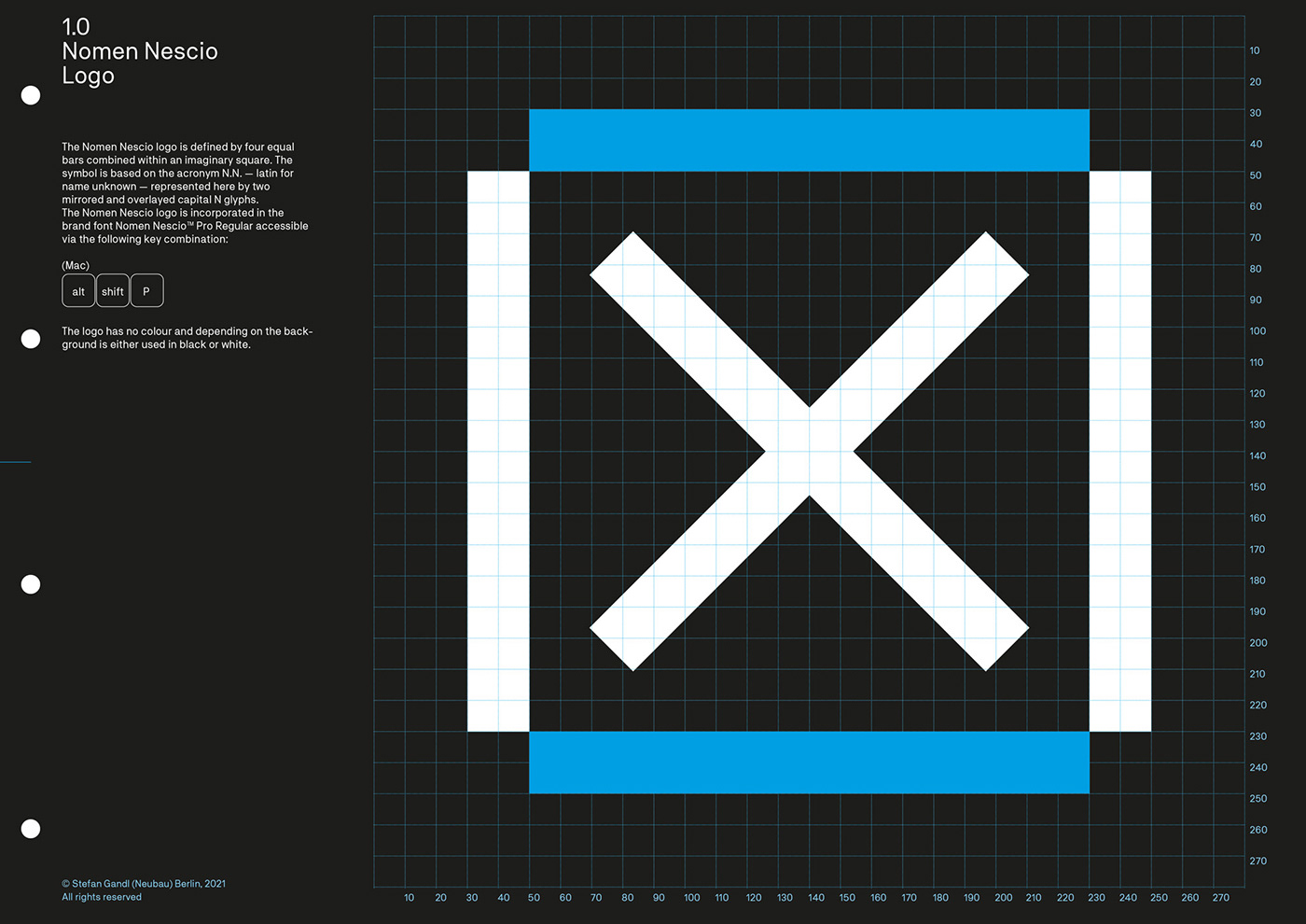
The Nomen Nescio logo is defined by four equal bars combined within an imaginary square. The symbol is based on the acronym N.N. — latin for name unknown — represented here by two
mirrored and overlayed capital N glyphs. The Nomen Nescio logo is incorporated in the brand font Nomen Nescio™ Pro Regular and depending on the background is either used in black or white.
mirrored and overlayed capital N glyphs. The Nomen Nescio logo is incorporated in the brand font Nomen Nescio™ Pro Regular and depending on the background is either used in black or white.
Nomen Nescio Design Standards Manual
Excerpts from the brand design guidelines including logo, logotype, corporate font, icon system, corporate design and brand applications for print, on screen and retail experiences.


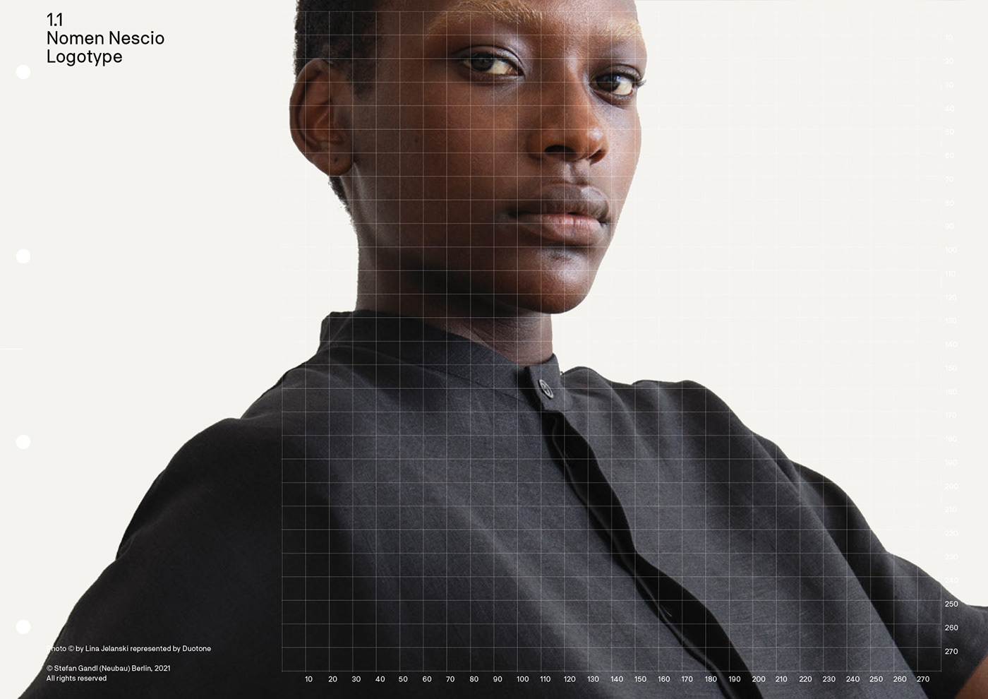
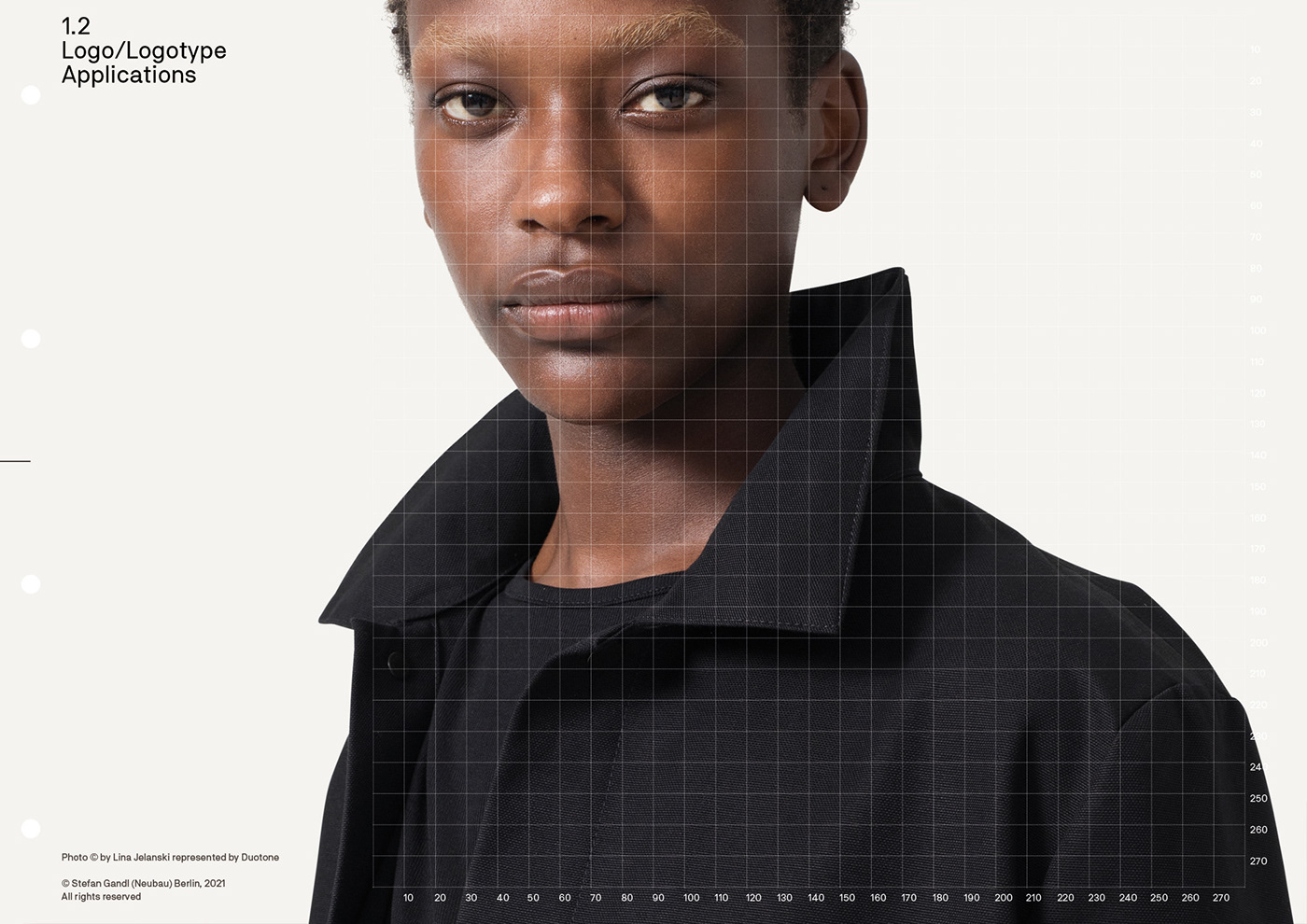
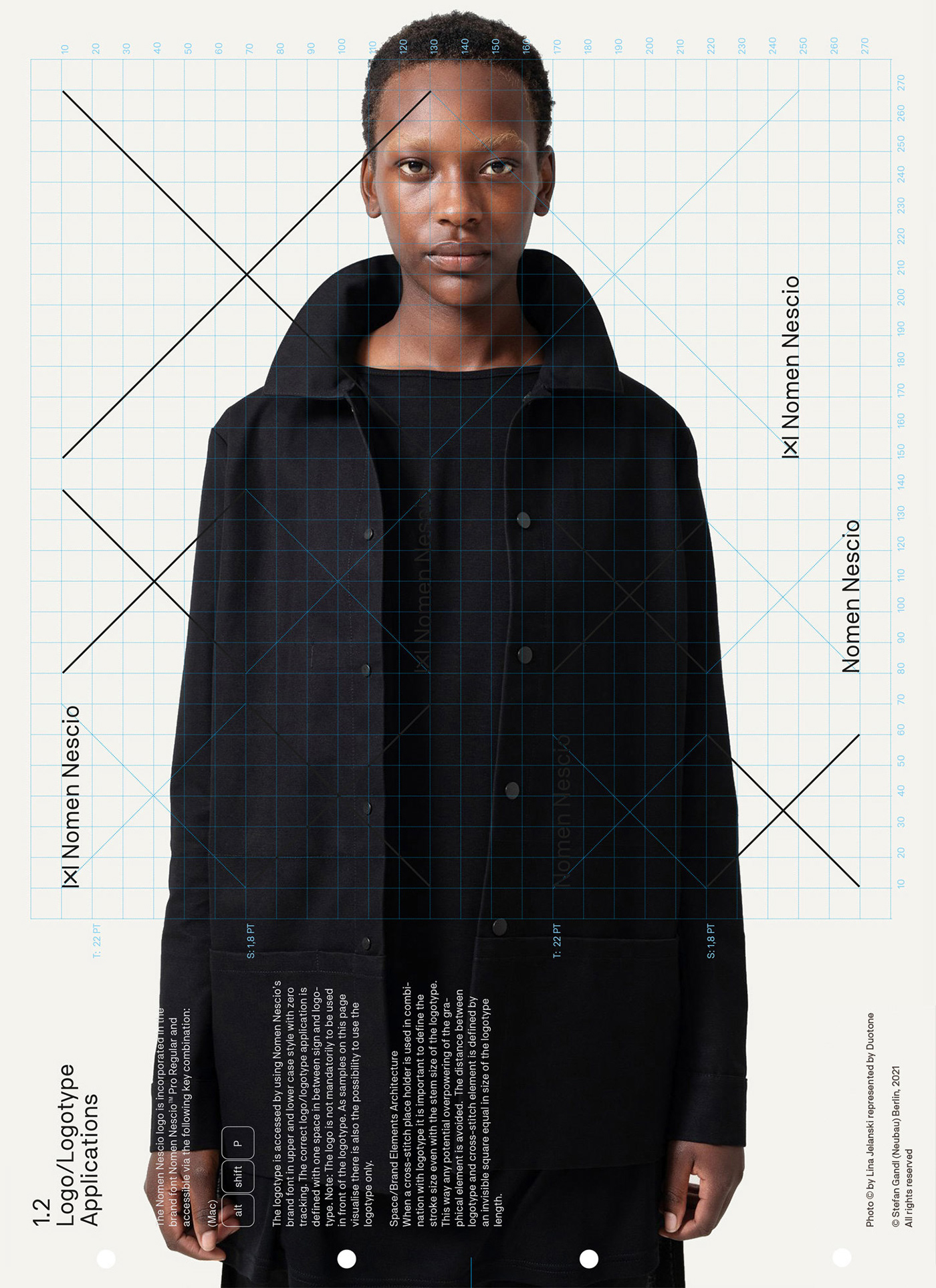
1.1 Nomen Nescio Logotype
The Nomen Nescio logotype is accessed via the brand font Nomen Nescio™ Pro Regular and used with either in black or white with default settings and zero tracking.


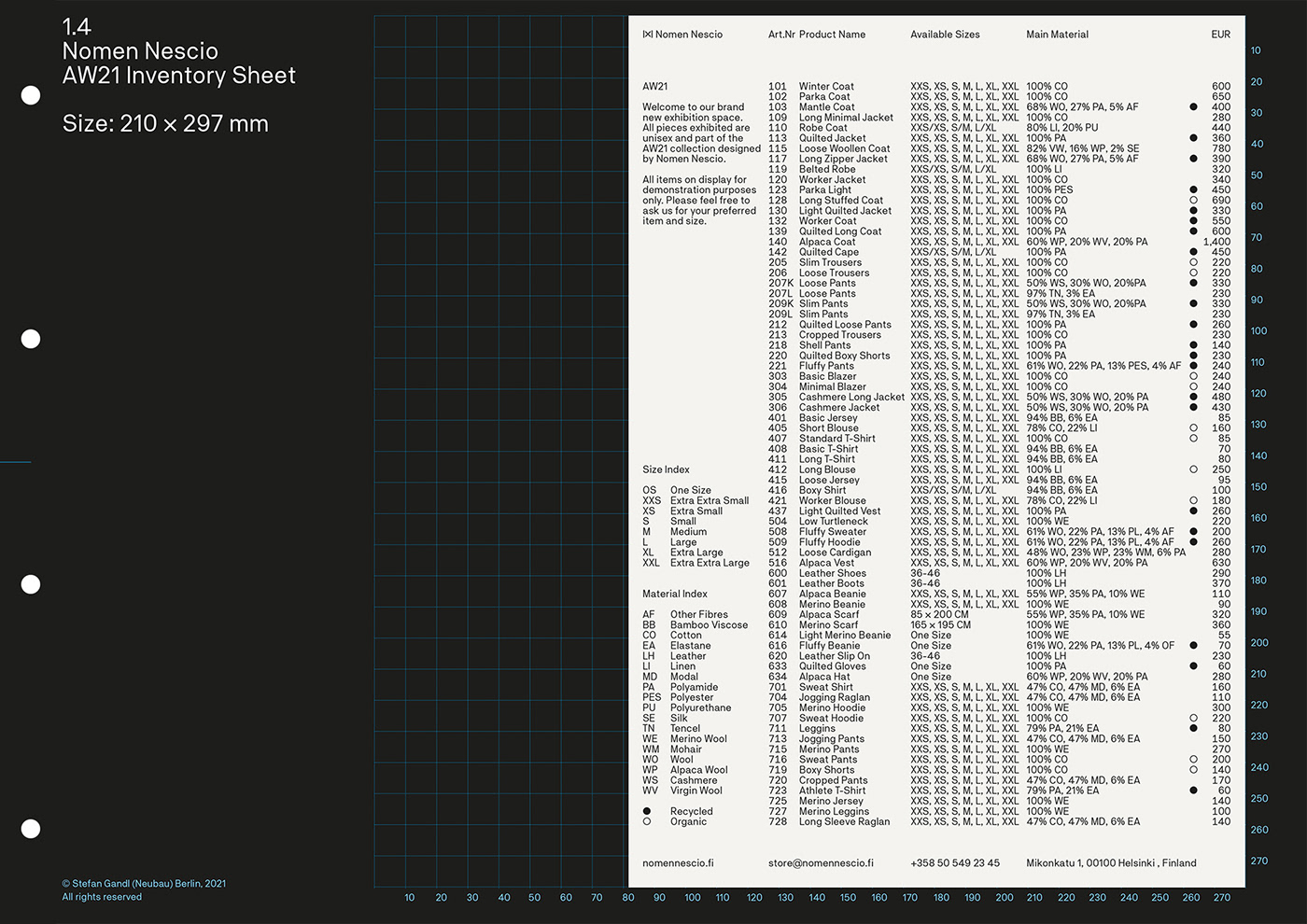
1.4 Nomen Nescio Corporate Design
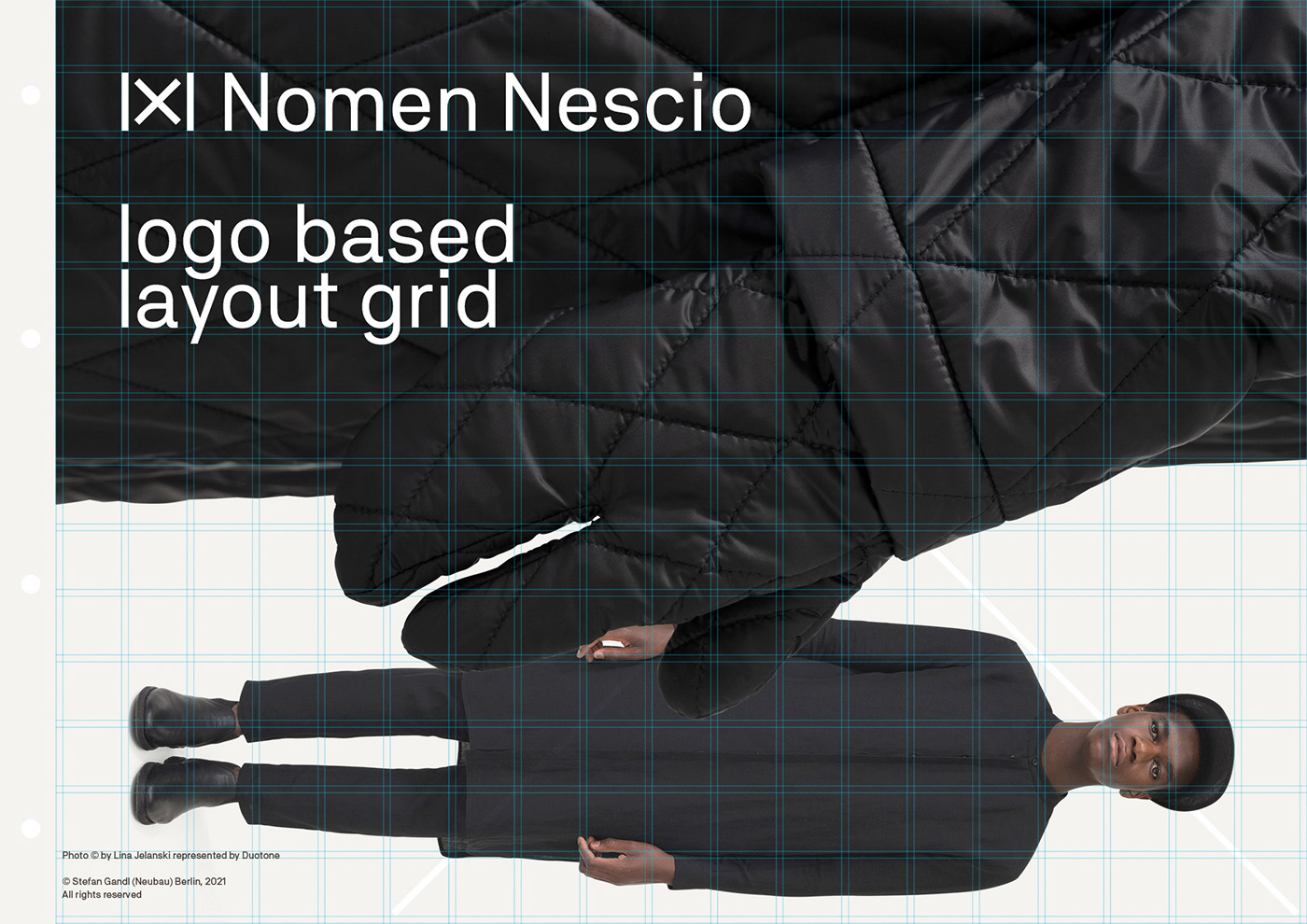
As with Nomen Nescio’s clothing the corporate design is unagitated and restrained. The corporate design is unified in one powerful core design tool, Nomen Nescio™ Pro Regular, applied in one style only — incorporating the logo, logotype, a character set supporting 104+ latin based language systems and Nomen Nescio’s signature layout grid.


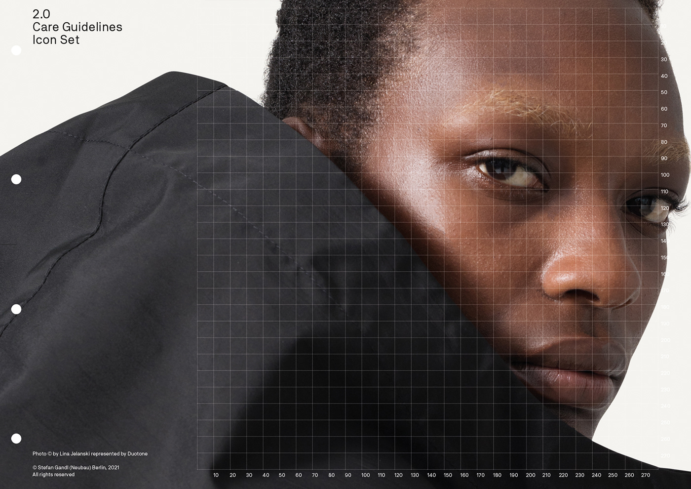
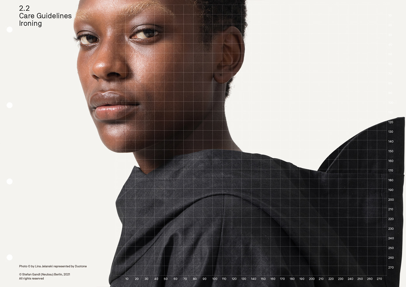
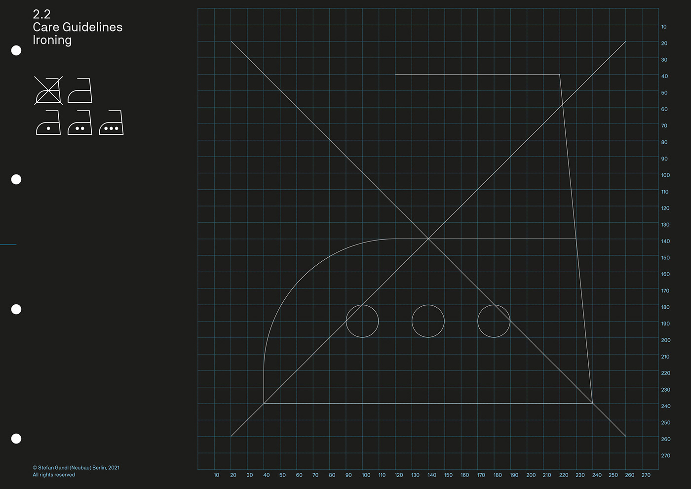
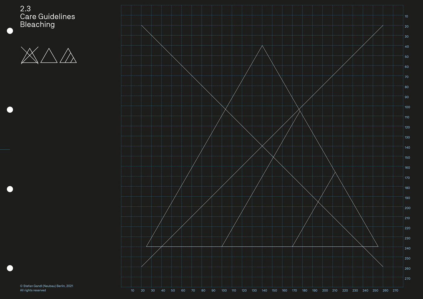
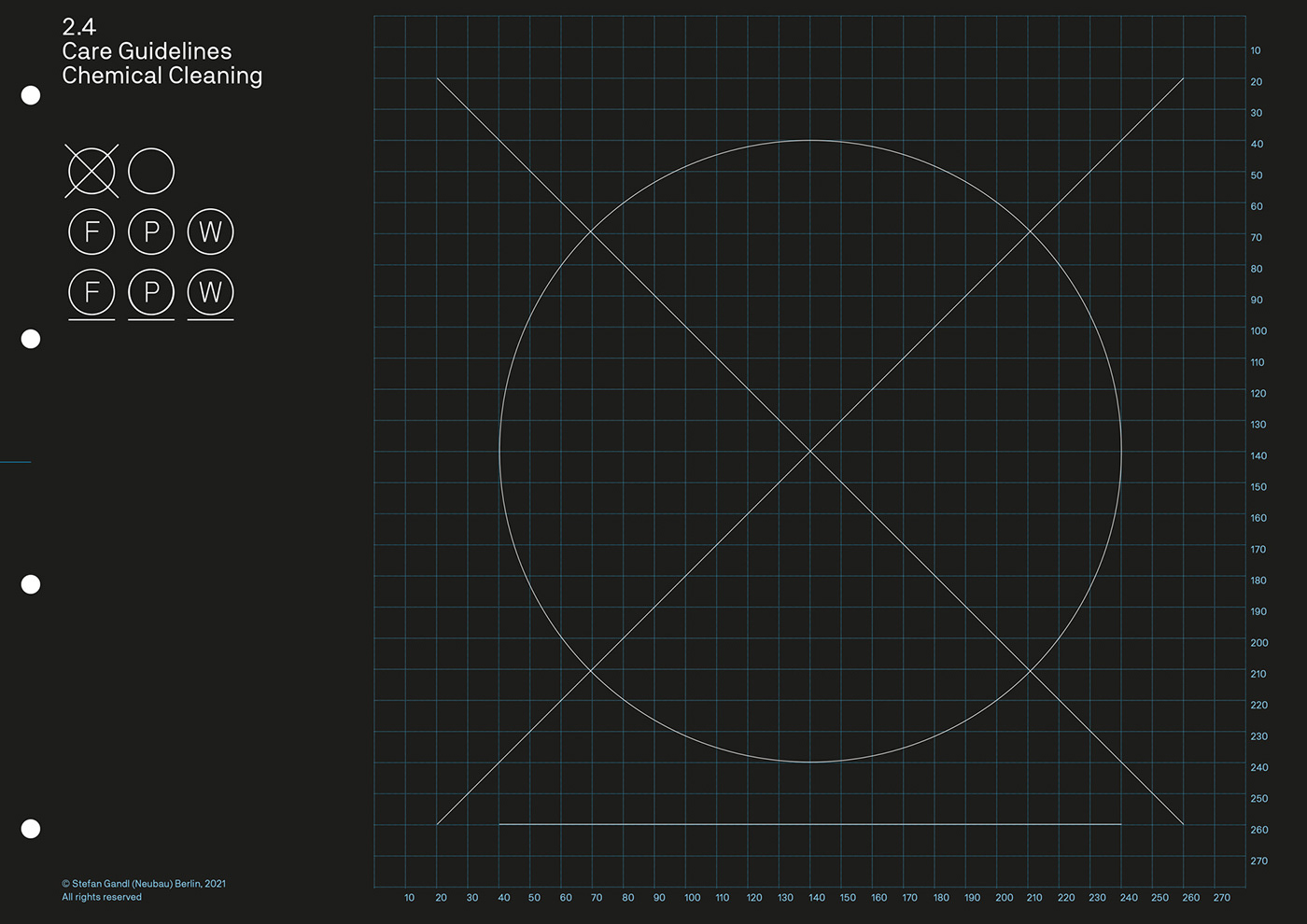
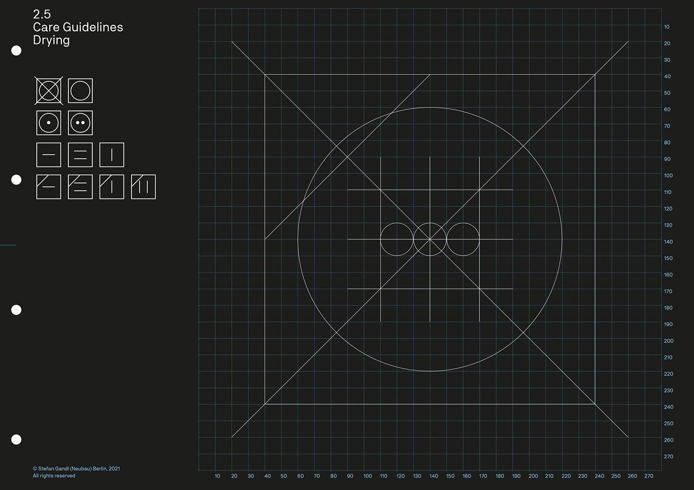
2.0 – 3.0 Nomen Nescio Icon System
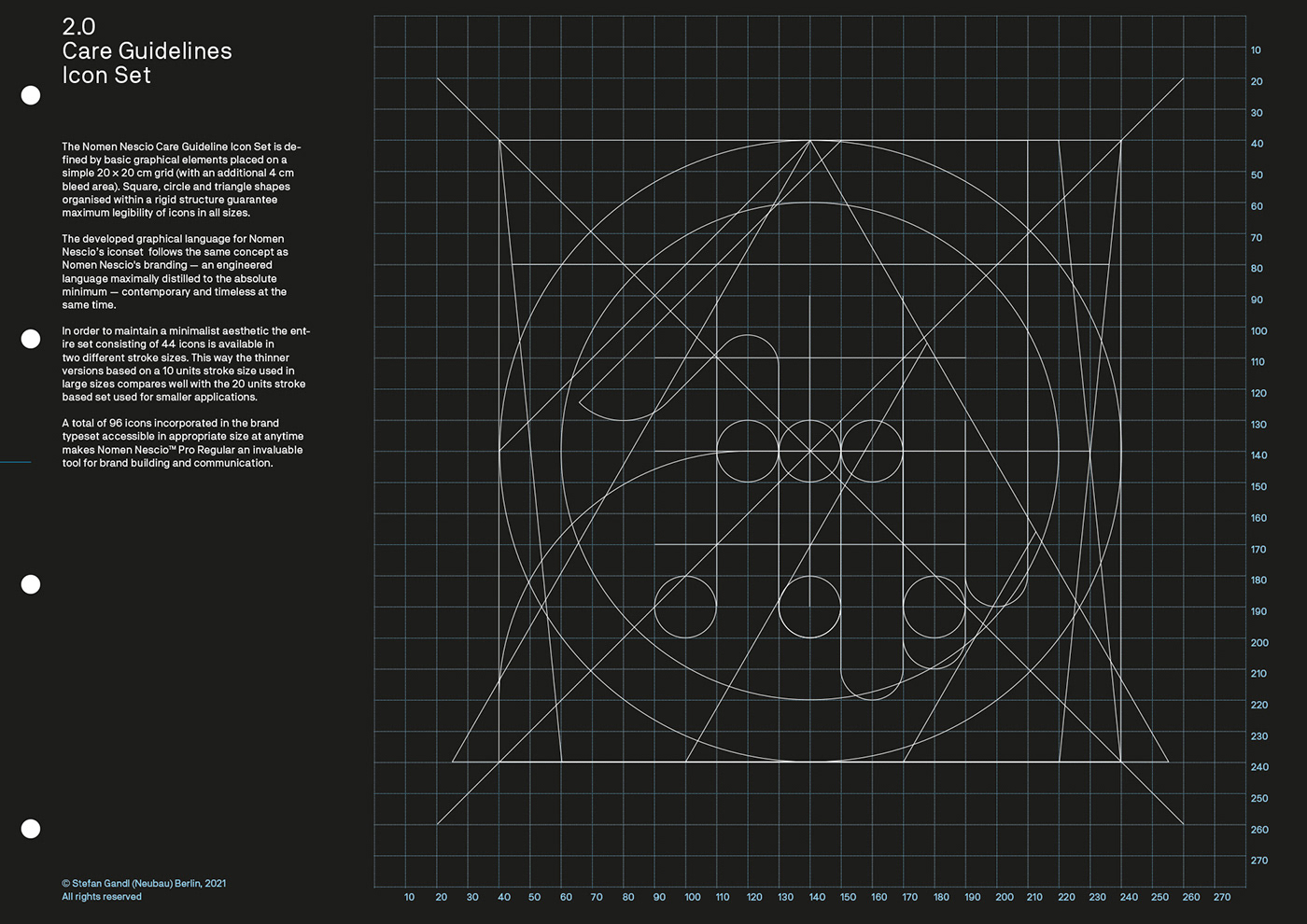
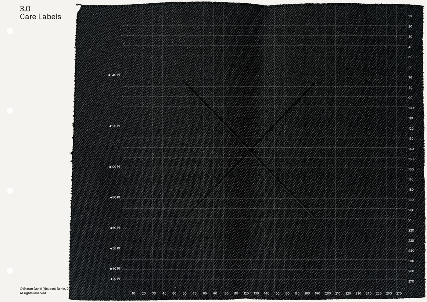
The Nomen Nescio Care Guideline Icon Set is defined by basic graphical elements placed on a simple 20 × 20 cm grid (with an additional 4 cm bleed area). Square, circle and triangle shapes organised within a rigid structure guarantee maximum legibility of icons in all sizes.
The developed graphical language for Nomen Nescio’s iconset follows the same concept as Nomen Nescio's branding — an engineered language maximally distilled to the absolute minimum — contemporary and timeless at the same time.
In order to maintain a minimalist aesthetic the entire set consisting of 44 icons is available in two different stroke sizes. This way the thinner versions based on a 10 units stroke size used in large sizes compares well with the 20 units stroke based set used for smaller applications.
A total of 96 icons incorporated in the brand typeset accessible in appropriate size at anytime makes Nomen Nescio™ Pro Regular an invaluable tool for brand building and communication.


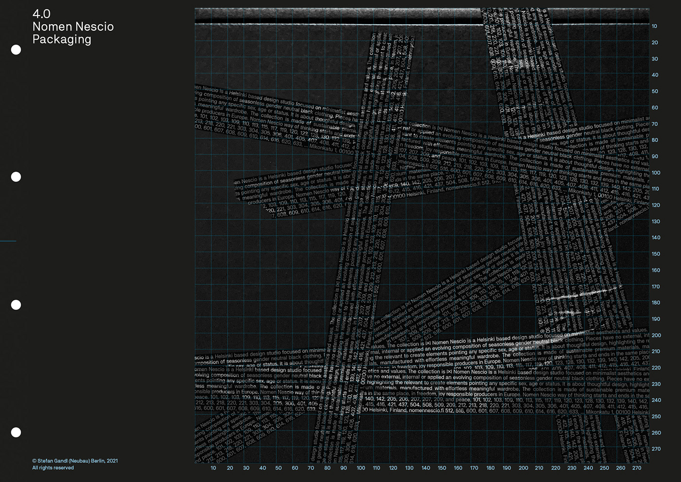
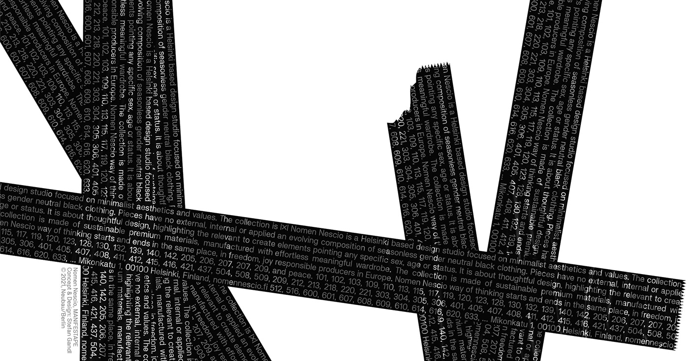
4.0 Nomen Nescio Manifestape™
A Manifesto that sticks.
The Nomen Nescio Manifesto
Nomen Nescio is a Helsinki based design studio focused on minimalist aesthetics and values. The collection is an evolving composition of seasonless gender neutral black clothing. Pieces have no external, internal or applied elements pointing any specific sex, age or status. It is about thoughtful design, highlighting the relevant to create effortless meaningful wardrobe. The collection is made of sustainable premium materials, manufactured with responsible producers in Europe. Nomen Nescio way of thinking starts and ends in the same place, in freedom, joy and peace.
Nomen Nescio is a Helsinki based design studio focused on minimalist aesthetics and values. The collection is an evolving composition of seasonless gender neutral black clothing. Pieces have no external, internal or applied elements pointing any specific sex, age or status. It is about thoughtful design, highlighting the relevant to create effortless meaningful wardrobe. The collection is made of sustainable premium materials, manufactured with responsible producers in Europe. Nomen Nescio way of thinking starts and ends in the same place, in freedom, joy and peace.


5.0 Nomen Nescio AW21 Promo Video
Promotional video for Helsinki based fashion design brand Nomen Nescio supporting the launch of Nomen Nescio’s visual identity coinciding with the launch of their Autumn/Winter 21 collection and the opening of Nomen Nescio’s new exhibition space & store at Minokatu 1 in Helsinki, Finland.
The visual concept for the video follows the minimalist design ethos of Nomen Nescio and is based on a chronological listing of their collection’s autumn/winter 2021 products with corresponding product codes type set in Nomen Nescio Pro, a custom version of NB Akademie Pro.
Audio Recommendation
Video best viewed with “Richtig Gutes Zeug” [Instrumental] by Deichkind.
Video Credits
Concept and design by Stefan Gandl
with visuals by Lina Jelanski represented by Duotone
Typeface: Nomen Nescio Pro by Stefan Gandl
Nomen Nescio Exhibition Space Launch, Poster Campaign
Launch posters for Helsinki based fashion design brand Nomen Nescio supporting the launch of Nomen Nescio’s visual identity coinciding with the launch of their Autumn/Winter 21 collection and the opening of Nomen Nescio’s new exhibition space & store at Minokatu 1 in Helsinki, Finland.


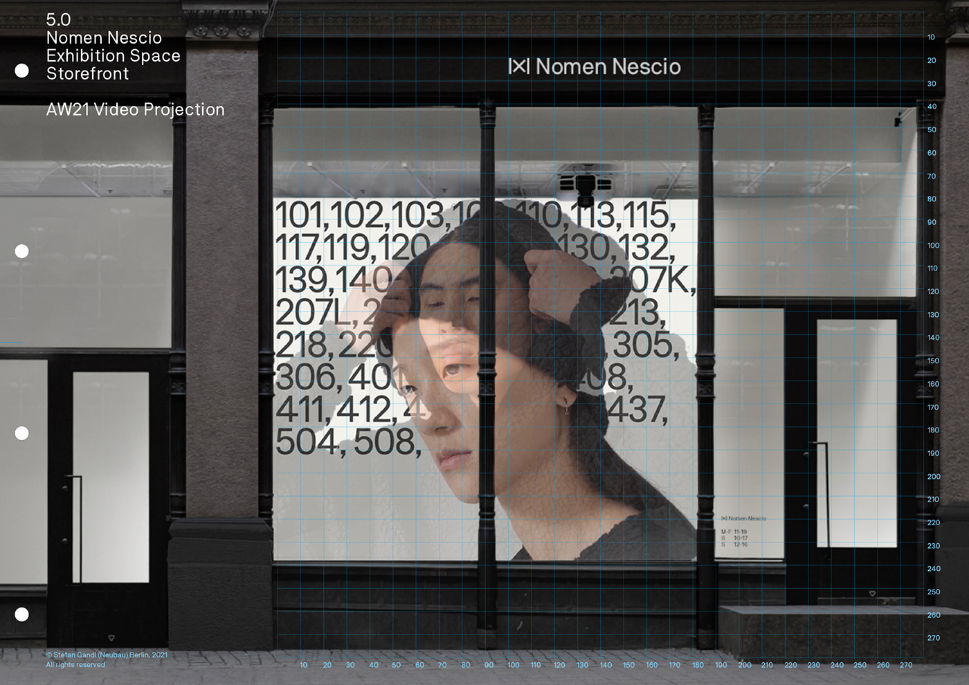
Nomen Nescio Exhibition & Retail Space
Promotional video projection supporting the launch of Nomen Nescio’s visual identity coinciding with the launch of their Autumn/Winter 21 collection and the opening of Nomen Nescio’s new exhibition and retail space at Minokatu 1 in Helsinki, Finland.
Credits
Visual Identity & Design: Stefan Gandl in collaboration with Erno Forsström
Concept, Logo & Logotype, Icon System Design, Type Design, Print Design, Label Design, Launch Poster Design, Promo Videos, Design Standards Manual: Stefan Gandl
Website Design: Erno Forsström
Website Development: Viiksimaisteri
Campaign & look-book images: Lina Jelanski represented by Duotone
Producer: Pasi Korström
Print Production: Gallery Print (hot foil stamping, debossing, …)
Typeface: Nomen Nescio™ Pro by Stefan Gandl via abcneu
Case study Nomen Nescio Visual Identity
Neubau Instagram
Thank you. Take care, stay safe and healthy.


