


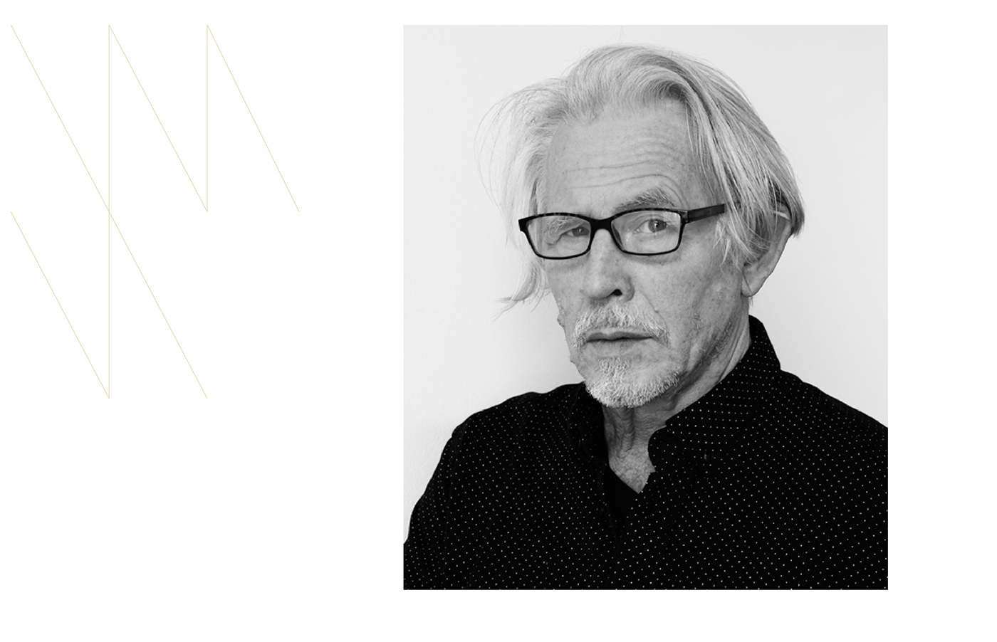
The Artist
Wincenty Dunikowski-Duniko was born in 1947. In 1974 he graduated from the Academy of Fine Arts in Kraków. The highly acclaimed artist gained international recognition in the mid-1970s for the series of works Albums, Projections, and Moment Art. His works were awarded repeatedly at prestigious international exhibitions. An active member of the Neo-Avant-Garde movement, he is the founder of the fictional Artistic Program Centre Duniko (1972) and the creator of the term Moment Art.


The Project
The artistic achievements of Wincenty Dunikowski-Duniko, consisting of a rich body of work, exhibitions around the world, articles, and awards, require an adequate presentation. There were two main areas of focus for the project. On the one hand — the technological side — an advanced information architecture and management system were crucial to cope with huge amounts of data and media assets. What may come a bit of a surprise is the fact, that despite being very content-rich, the project is fully realized in the spirit of Jamstack. A set of technologies which allow building extremely fast sites at the same time being very conservative on the required resources.
On the other hand, the creative opportunity that arises when dealing with a rich body of work of an avant-garde artist is exceptionally high. While we always aim for the unconventional in our work, for a project like this, breaking the norm becomes a default core requirement.As we believe that true design is so much more than just craft, we opted for an intellectual extension of the artist’s work expressed in an invented design language which sets up a dialog with the artist’s explorative character.
Many of Duniko’s works contain references to the history of art. A derivative process he often refers to as the self-mythologization of art, which, determined by art reacting upon art, makes the intellectual play and expressiveness self-contained.In this context, our design work should be understood as a further extension to this very process. We speak our own invented design language, but we make subtle references to Duniko’s groundbreaking art or even more broadly to the history of art and design in general, especially that rooted in the Avant-Garde and Neo-Avant-Garde movements.


Information Architecture
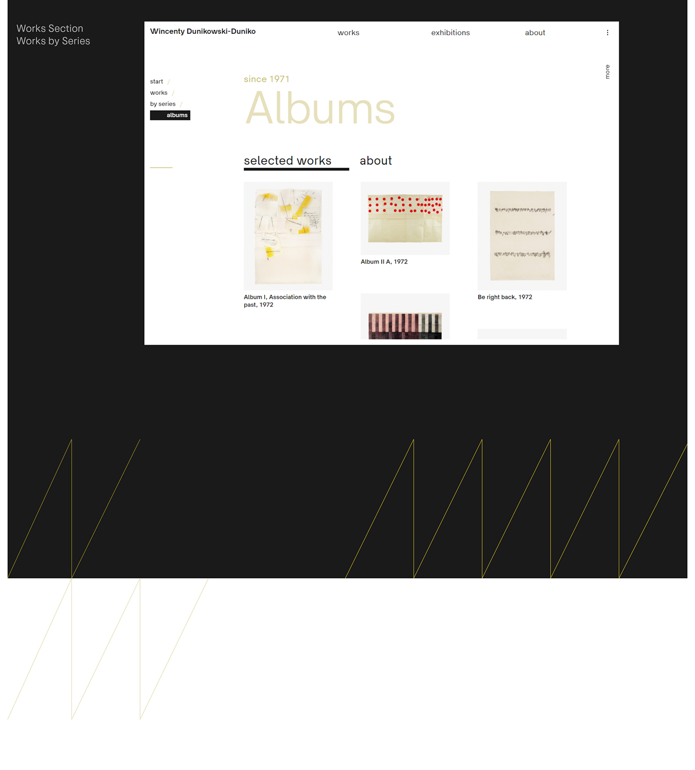
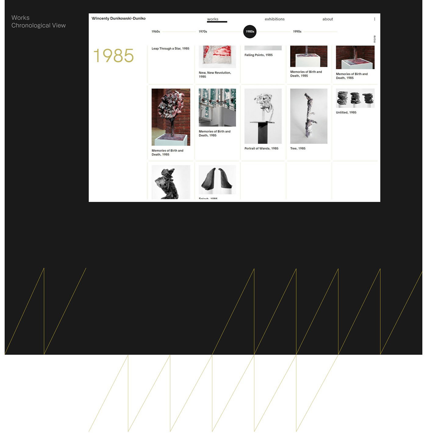
Due to Duniko’s impressive artistic output, the layout had to take into account large amounts of data and corresponding suitable views. Navigating through all sections of the website is pleasant and effective.
The design uses a five-column grid as the foundation to maintain consistency in layout and to visually organize the data. The date is an inseparable attribute of an artwork, placing it in the right historical context. Therefore, most views (works, exhibitions, bibliography) are arranged chronologically. In addition, the works are also presented by series, which were an important part of the artist’s characteristic way of work.
Colors
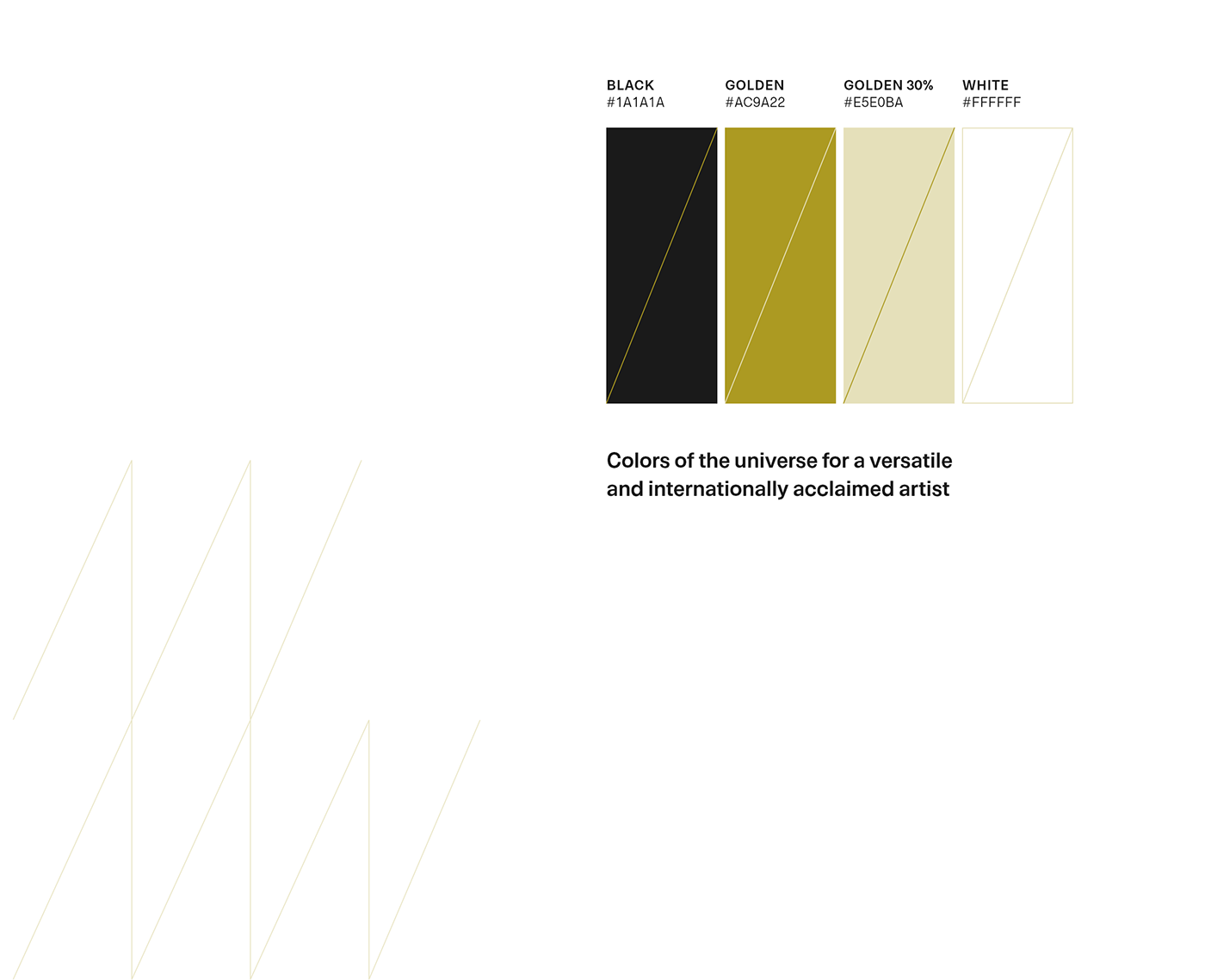
Colors of the universe for a versatile and internationally acclaimed artist
The color combination of black, gold and white introduces the recipient to a metaphysical universe of arts. A unique atmosphere of color proportions, where white creates balance and harmony and black adds contrast and strength, emphasizing artistry and strong character.
But while white and black dominate the background and set the structure, the leading — narrative color — is gold, exhibiting the richness of creativity, thoughts and the artist’s unquestionable contribution to the history of art.

Typography
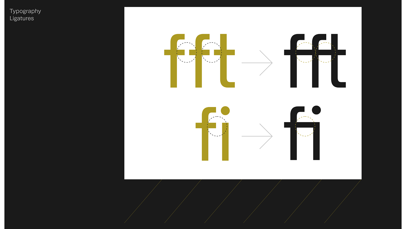
The choice of the HK Guise™ font for the project was based on the equivocal personality of this beautiful, yet unconventional typeface. A sense of avoiding the obvious results in a font which bridges clarity and substance associated with Swiss typography and adds a layer of intelligent complexity by introducing energizing proportions, character-laden descenders and ink traps as well as harmonically toned geometric numerals.
HK Guise™ is a low-contrast sans-serif rooted in Swiss typographic design. Very readable, suited for both, texts and interfaces, yet characterful, expressive and distinctive.


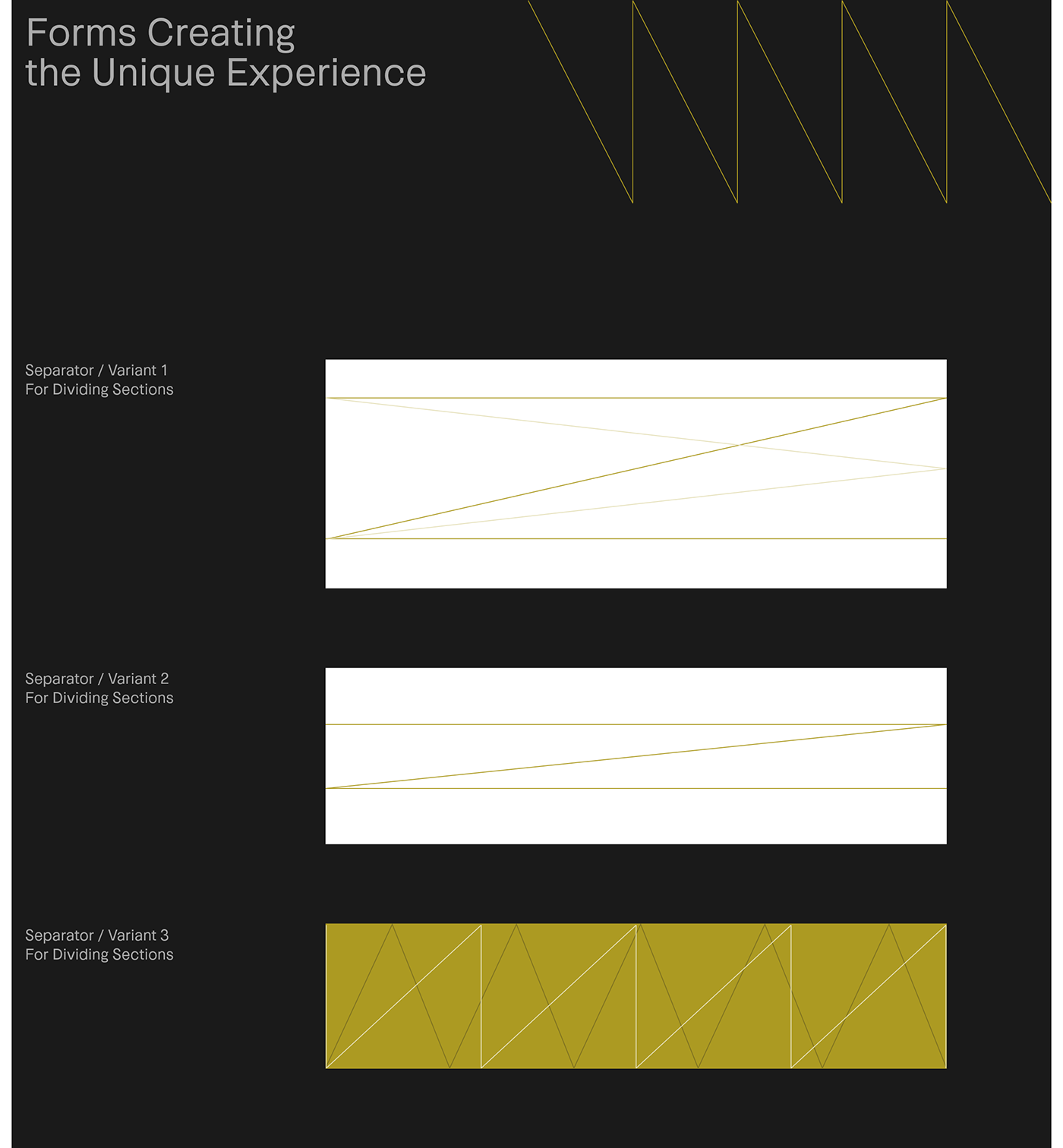
Forms
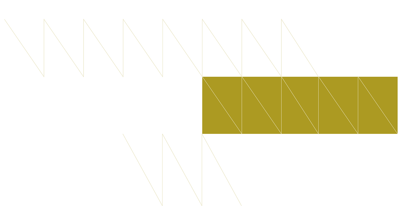
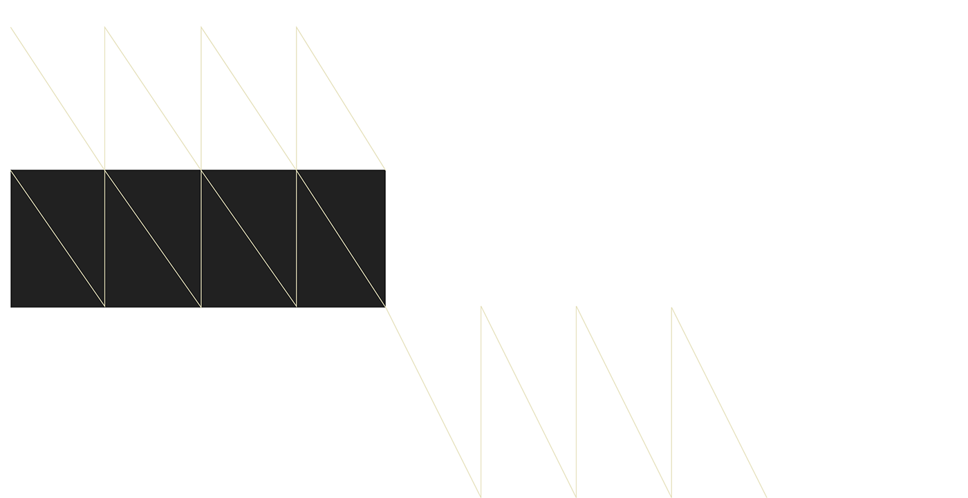
Mutating and unsteady forms used consistently throughout the project accord with the artist’s attitude, expressed through his mottos: To Be is to Be Different (1972), To Be is to Be Against (1972), I am Always Changing (1972).
Abstract visual systems, consisting of dynamic structures of triangles, slashes, arrows and tensions between them, set up an intellectual dialog with references to the artist’s body of work. The mutating design becomes the narrator of a fascinating story of an artistic attitude based on constant change, unsteadiness and juxtaposition.
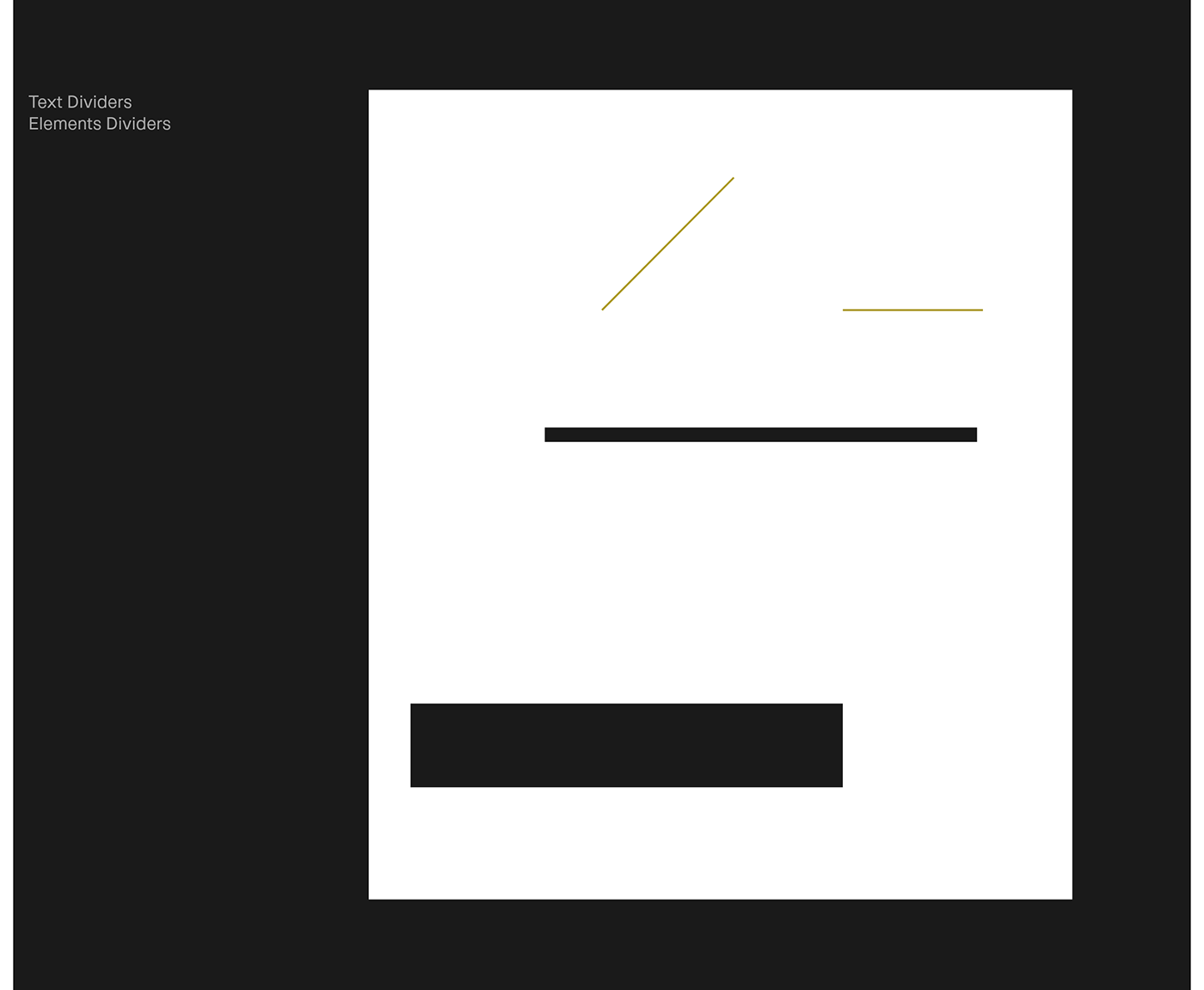

Iconography
The project involves the use of relatively large, delicate 1 pixel icons that match the stroke weight of other forms used throughout the project. Icons are used sparingly in the design, mainly to aid navigation of the website, the photo galleries and also to logically separate text elements (arrows, slashes).


Choreography
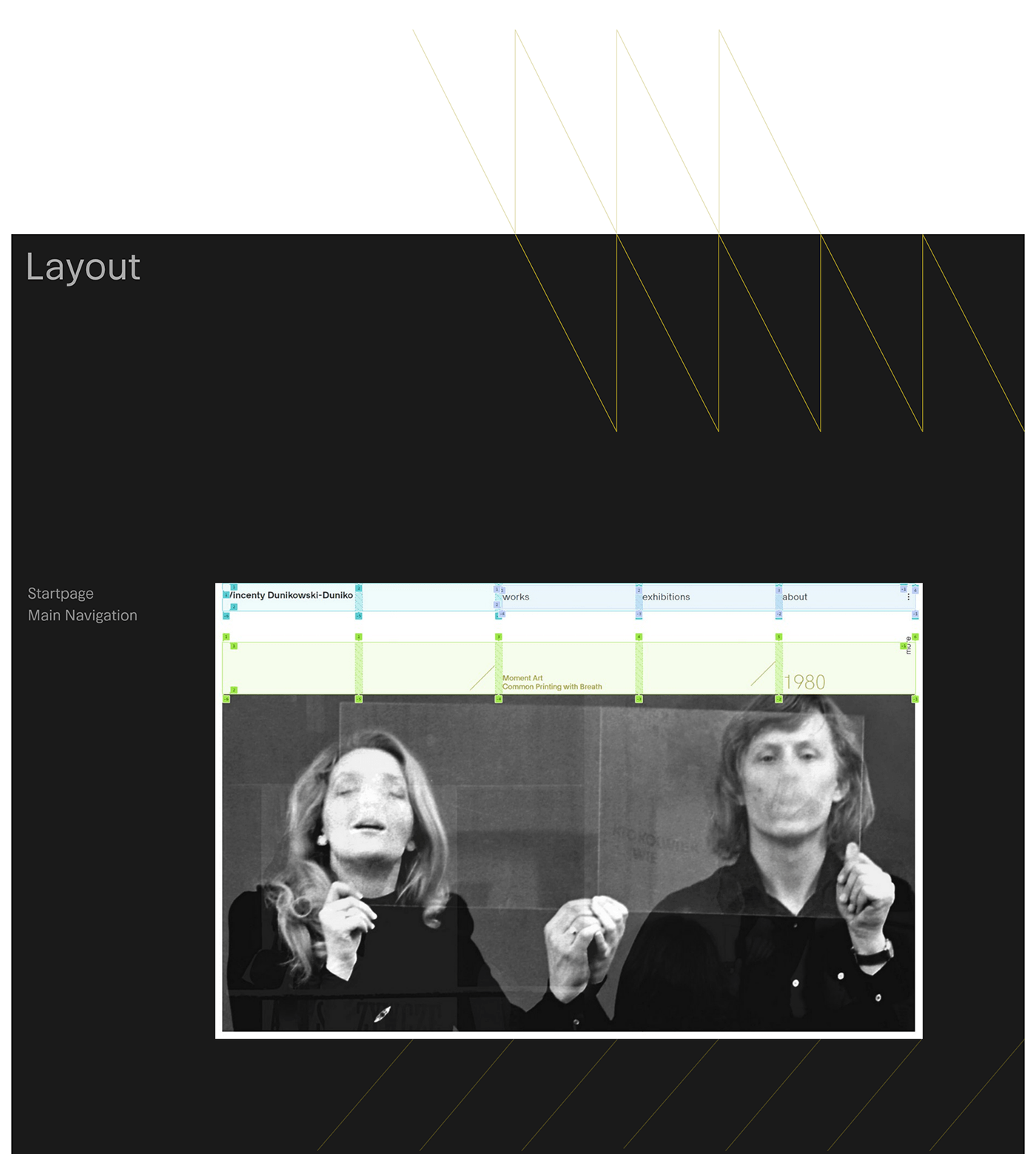
Site navigation is realized in accordance with the Modulus Active Surface Design System philosophy. It provides a smooth and pleasant visual transition between sections, and also a transcendent feeling of softness and flowing. All that contributes to an immersive and highly-engaging user experience — there is no friction to the information flow, so visitors browse the site with genuine uninterrupted pleasure.
Forms consisting of thin lines, arranged in mostly triangular shapes, animate in a magnetic, contracting way and involve the recipient upon interaction. In addition, subsequent fragments of the texts are drawn onto the screen while scrolling, encouraging the reader to further explore the content of the artist’s presentation.
An expressive play with forms evolving in time results in one of the main characteristics of the invented design language and an important philosophical statement. To experience the unsteady design, time is of critical essence, since it provides a natural flow to the succeeding sections.
The aspect of the perception of time comes forward as an experience of time. The design only defines its temporarily fixed form during a pause state, just to mutate it again after the next interaction of the recipient. That way, time, inconstancy and mutation become equally important design building blocks of the project and constitute an intellectual point of reference to Wincenty Dunikowski-Duniko’s body of work.


⸻⸻⸻⸻
Project
Wincenty Dunikowski-Duniko
The Artist’s Online Presence
Client
WDD Archives
Year
2019/2021
Art Direction & Design
Mikołaj Dunikowski
Zofia Dunikowska
⸻⸻⸻⸻
Scope
Digital Strategy / UI/UX Design /
Custom DAM System /
Application Development
Digital Strategy / UI/UX Design /
Custom DAM System /
Application Development
Photo Credit
duniko.art
Project website
Project by
Modulus / modulus.vision
Modulus / modulus.vision


