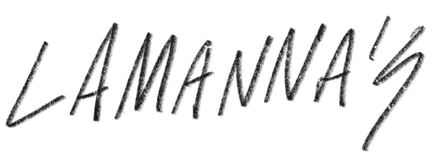

LAMANNA'S
In the city of Toronto, a restaurant exists built upon generations of old world Italian family recipes fused with the idea that nothing is sacred. An identity refresh called for bold statements in line, color and texture as a way to punctuate the fact that Lamanna's is anything but traditional.
Web design & development: Jon Vio
Client: Lamanna's Bakery
Deliverables: Strategy, brand, identity, packaging, illustration, web
Deliverables: Strategy, brand, identity, packaging, illustration, web

Originally hailing from Monteleone, Italy, the company's previous logo featured a lion atop a mountain, or as the town's name loosely translates, "mountain lion." Constructed with traditional type and stiff imagery, the company knew a rebrand was necessary to reflect the true nature of their product—which is anything but traditional.
The new logo reflects a stylistic nod to an era of classic Italian art deco with a modern, emotionally-charged twist. The mountain lion now sits within the square of a standard pizza box, roaring and ready to take a bite while the remaining negative space forms a hidden monogrammed "L."

Logomark color variations
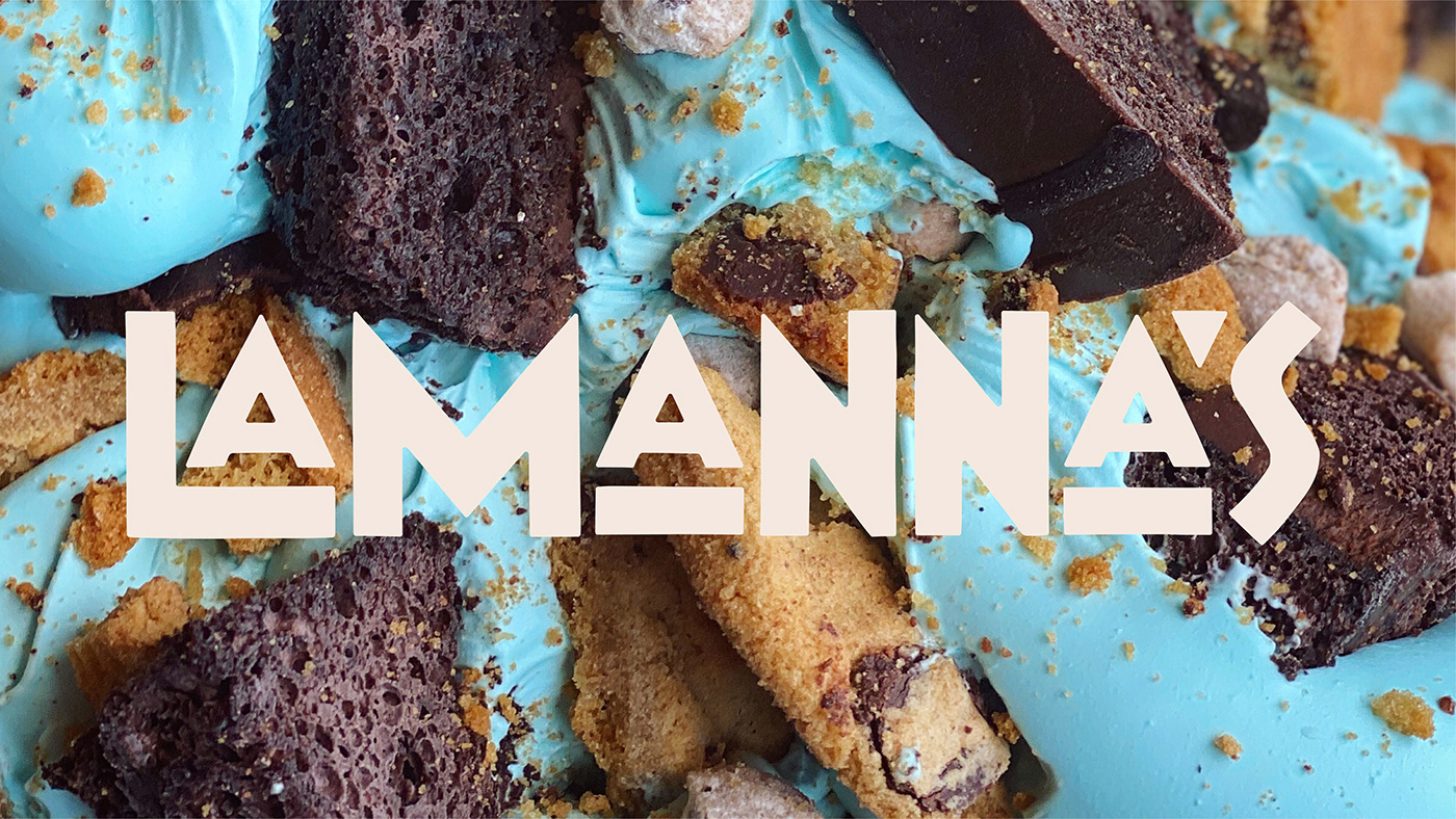

The role of color in the rebranding of Lamanna's is the secret workhorse. Sure the logo means a lot and the wordmark is legible, but in order to truly communicate the idea of sweet and savory, a connective tissue needed to be formed that would not only play nice with the marks, but also the product itself.
A fiery mix of rich browns, burning oranges and melting yellows sit alongside soothing creams and luscious pinks to create the perfect blend of dinner and dessert.


Not everyone is able to get to Toronto to experience the unrivaled decadence of a Lamanna's meal, which is why we helped them to create a variety of tomato sauces and coffees available for shipping.


Locally roasted, whole bean coffee. Typically this wouldn't be the preferred beverage of choice to accompany a slice of pizza, but nothing about Lamanna's is typical.


